FeliApple
macrumors 603
I still think it looks ugly, I’m not liking this Liquid Glass redesign. I like the iOS 11-17 version a lot better. iOS 18 too, but the previous one has something I like.
That said, I’m notoriously resistant to visual changes to my operating systems. I don’t update anything AND I tend to use iOS devices for years on end even after upgrading, so change isn’t easy for me.
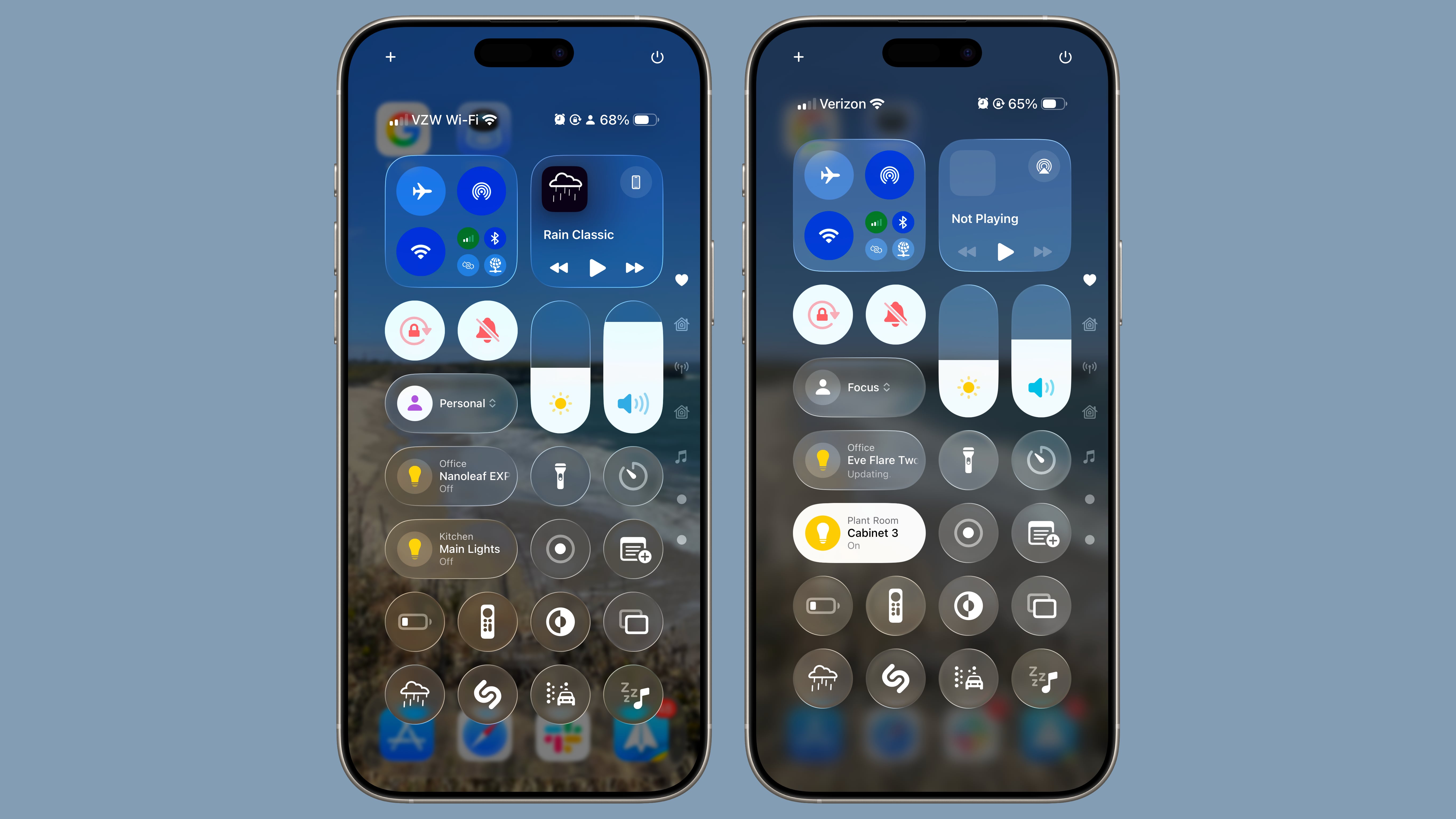
My opinion given... this is my Control Centre on my iPhone Xʀ running iOS 12:

And for comparison... this is iOS 26 beta 2 from the user above:

I don’t know, I like mine on iOS 12 a LOT more. Perhaps it’s just a matter of getting used to it...
That said, I’m notoriously resistant to visual changes to my operating systems. I don’t update anything AND I tend to use iOS devices for years on end even after upgrading, so change isn’t easy for me.
My opinion given... this is my Control Centre on my iPhone Xʀ running iOS 12:
And for comparison... this is iOS 26 beta 2 from the user above:
I don’t know, I like mine on iOS 12 a LOT more. Perhaps it’s just a matter of getting used to it...