greg624
macrumors 6502a
My bad I was too overzealous and didn’t read far enough 😂😂😂That’s why I ended the message with /s 😂
My bad I was too overzealous and didn’t read far enough 😂😂😂That’s why I ended the message with /s 😂
You have a white back ground with the background on the lightest setting and light clear apps. You don’t have to set it like that.My god this is awfull. You just have to put a white wallpaper to obtain this … thing. Why Apple hates contrast now ?
It matches with the new tab bar design like in photos, in music, App Store, etc.Has anyone else noticed that the swiping to change modes (now only by default in beta 5) in the camera app is completely different from any other swiping action in the rest of the system, for example swiping between tabs in Safari, or swiping between apps using the Home Bar?
I realize I’m very much two months late to it, but it just occurred to me all over again with beta 5 introducing a toggle for “classic mode switching”.
And actually, as I’m typing this, I’m realizing that the new default gesture for switching camera modes behaves identically to dragging between tabs in other tab bars across the system.
That once again asks though, why the two different swiping directions? (pushing out of the way vs pulling over top)
(There was no little things thread this year?)
That was just ridiculous. I wish there was a way to totally remove that childish garbage off my phone. I get it maybe fun for some but the amount of hoopla around it made me cringe. 😬On a positive note, at least they aren't pushing stickers and emojis like with previous OS versions when you really knew the OS was getting stale when those were noteworthy mentions lol.
Still VERY readable.
It honestly feels like apple has various teams working on different aspects and they never get together to see what the other is doing so we get this mismash of random things in every app (and the worst offenders are the in house apple apps). Like why not bounce ideas off eachother between teams so there is some consistency. IOS is a hot mess.That was just ridiculous. I wish there was a way to totally remove that childish garbage off my phone. I get it maybe fun for some but the amount of hoopla around it made me cringe. 😬
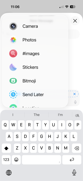
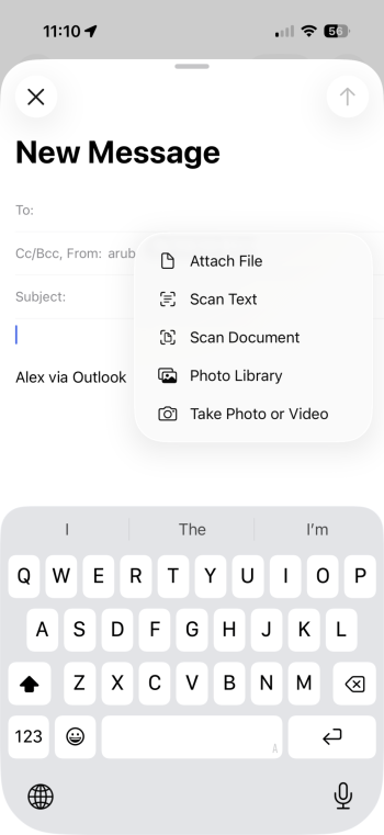
Oh, also though of one more stupid design choice. When you want to include a photo or something else in a text message, you get this absolutely terrible picker list. Nowhere else in iOS it looks so bad. Why not fix it?
Make it look like the one in mail app. Less loud, less bloated.
Apple will 100% release a buggy x.0 version of iOS 26 at the start of the week the iPhone 17 launches, pre-installed on said devices. Let's not kid ourselves or be delusional ahaha.Only if Apple insists on crunch culture and shipping another broken x.0 release. Maybe they will learn their lesson and ship the 17-series with 18.6 and just keep working on it for another couple months. Probably not, but it's nice to dream.
That’s what it feels like. BUT, don’t they have their own iPhones that they can look at after release or few years after release and say to themselves or their bosses that these inconsistencies do not look good. But who are we to dictate to Apple 🍎. I understand it’s a very large and complicated software, but there should be a new position at Apple called Application Consistency Compliance Officer. That would look at software and call out all inconsistencies across the iOS. I am willing to volunteer for that position. I am also sure a few of us here would make a fine ACC team.It honestly feels like apple has various teams working on different aspects and they never get together to see what the other is doing so we get this mismash of random things in every app (and the worst offenders are the in house apple apps). Like why not bounce ideas off eachother between teams so there is some consistency. IOS is a hot mess.
I thought that's what they do, because Apple is so afraid of leaks that they separate each team and only combine the work in the end release.It honestly feels like apple has various teams working on different aspects and they never get together to see what the other is doing so we get this mismash of random things in every app (and the worst offenders are the in house apple apps). Like why not bounce ideas off eachother between teams so there is some consistency. IOS is a hot mess.
That is probably true, but all those developers and managers can take a look at their own phones after the release and see all the inconsistencies that they have created. Couldn’t post Delivery team get together and look at all these inconsistencies that have been created and address them.I thought that's what they do, because Apple is so afraid of leaks that they separate each team and only combine the work in the end release.
If it's coming today, you have 30± minutes to go.Is the new public beta out yet?
When I want to send a pictures or video in iMessage, I just hold down the + icon and avoid that UI altogether.That was just ridiculous. I wish there was a way to totally remove that childish garbage off my phone. I get it maybe fun for some but the amount of hoopla around it made me cringe. 😬
Oh, also though of one more stupid design choice. When you want to include a photo or something else in a text message, you get this absolutely terrible picker list. Nowhere else in iOS it looks so bad. Why not fix it?
Make it look like the one in mail app. Less loud, less bloated.
That was just ridiculous. I wish there was a way to totally remove that childish garbage off my phone. I get it maybe fun for some but the amount of hoopla around it made me cringe. 😬
Oh, also though of one more stupid design choice. When you want to include a photo or something else in a text message, you get this absolutely terrible picker list. Nowhere else in iOS it looks so bad. Why not fix it?
Make it look like the one in mail app. Less loud, less bloated.
They could have tried to make it less ugly. 🤬With the menu in Messages it does behave differently. You can rearrange menu items for example when you hold down, and it's also a home to Messages mini apps. Essentially it's a app launcher so I can see why they want it to look visually distinct from a normal menu such as the one in Mail.
Then again I do think it could be a bit less padded and also would be nice if it provided a way to uninstall/remove Messages apps you don't want.
By clicking frantically on UI elements in the half second window between launching and crashing, I managed to escape the crash loop. It turns out Sidebar > Pinned > Media Types being expanded causes the app to crash for me. Collapsing it stabilized things.Alas my phots app still crashes when I open it! New feedback sent.