Now if only they would add the ability to turn on the fan for those of us that don't have AC but want to use the heater fan to move air through the home. I have to use the Google Home app to turn it on for our thermostat, and apparently if you have ecobee you have to use their app to do it.Apple Home/HomeKit HVAC mode selectors have changed in beta 5 -- this is an improvement over previous iOS betas and versions, much easier to select. Also changed in macOS Tahoe beta 5.
Got a tip for us?
Let us know
Become a MacRumors Supporter for $50/year with no ads, ability to filter front page stories, and private forums.
iOS 26 Beta 5 ― Bug Fixes, Changes, and Improvements
- Thread starter Banglazed
- WikiPost WikiPost
- Start date
- Sort by reaction score
You are using an out of date browser. It may not display this or other websites correctly.
You should upgrade or use an alternative browser.
You should upgrade or use an alternative browser.
osay isyay igpay atinlayYou don’t like it, cool. Still readable.
Performance is so much better compared to beta 4, but nowhere near as smooth as 18.6. Hoping the next few betas can get it there!
Maybe for you- but how about people with vision impairments?Haha, “justify”.
If that was illegible, I wouldn’t be able to read that the address is cnn.com.
It’s amazing how some people go completely over-the-top hyperbolic if not outright ignore what words mean, not going to lie.
You don’t like it, cool. Still readable.
Edit: Just now exploring the settings again for the first time since beta 1- they’ve actually gotten significantly better. Default out of the box experience is still an issue though.
Last edited:
Waldo/Wally in Where's Waldo/Wally is visible.Haha, “justify”.
If that was illegible, I wouldn’t be able to read that the address is cnn.com.
It’s amazing how some people go completely over-the-top hyperbolic if not outright ignore what words mean, not going to lie.
You don’t like it, cool. Still readable.
I see it. But it seems to go away when you move side to side. So must just be a visual bug. But at least there’s a workaround for now.Question. Trying to figure if this is just me.
When in Dark Mode, swipe down to trigger Spotlight search. Type in the field (e.g. Safari). Click on the field, as if to "edit" the text and move the cursor. Does it "glow" so bright you can't see anything? It does for me, but can't seem to screenshot it properly.
Are you visually impaired?Maybe for you- but how about people with vision impairments? Even with reduce transparency etc. 26 is an accessibility nightmare for those with vision impairments.
It does. I can replicate it easily on my 16 PM, but if you try to screenshot it, it comes out looking fine. I tried doing it on my iPad Mini A17 Pro, but I can’t replicate it on that as it looks fine.Question. Trying to figure if this is just me.
When in Dark Mode, swipe down to trigger Spotlight search. Type in the field (e.g. Safari). Click on the field, as if to "edit" the text and move the cursor. Does it "glow" so bright you can't see anything? It does for me, but can't seem to screenshot it properly.
No, but designing software that accommodates for people with visual impairments is my day job.Are you visually impaired?
Look at this and tell me that it’s readable again, totally unacceptable. /sYou don’t like it, cool. Still readable.
Attachments
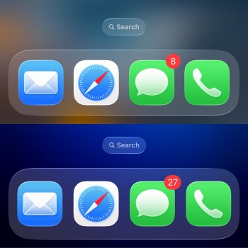
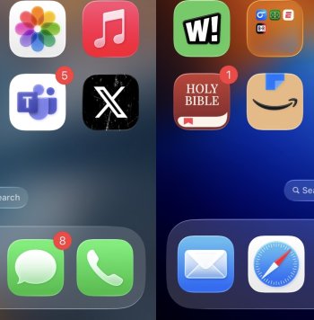
I really do hope they allow some kind of "scaling" of the blurs and transparency - I think this is the only way to save this. The "Reduce Transparency" mode helps, but it's so buggy everything flickers a lot, and has since b1.Look at this and tell me that it’s readable again, totally unacceptable. /s
Otherwise, if it goes public like this there's going to have to be a huge amount of gaslighting to justify it. "It's not unreadable - it's that your eyesight is bad, peasant."
What a fantastic update, on my end! Much smoother, App store updates are smooth and correct again, Contacts sync between all gear now works.
I've used it all day, and this feels better than most 'final' releases to me =)
I've used it all day, and this feels better than most 'final' releases to me =)
When I invoke Spotlight, it keeps blinking after displaying the suggested apps and actions for 1 second. I can't do anything, and I have to lock my phone to exit. Reinstalling with an ipsw file doesn't solve or improve the problem.
On the other hand, watchOS 26 beta 4 didn't automatically connect to my Wi-Fi network. This problem persists in beta 5 and is a real pain, as I have to manually connect to the network even though I have automatic connection enabled.
On the other hand, watchOS 26 beta 4 didn't automatically connect to my Wi-Fi network. This problem persists in beta 5 and is a real pain, as I have to manually connect to the network even though I have automatic connection enabled.
They should fix the reduce transparency/accessibility settings for those with vision impairments.Maybe for you- but how about people with vision impairments? Even with reduce transparency etc. 26 is an accessibility nightmare for those with vision impairments.
They can do that without changing the default.
From hyperbole to false equivalence.Waldo/Wally in Where's Waldo/Wally is visible.
Your subjective opinion about the design doesn’t change the fact that the text is readable—excepting vision impairments—and therefore not “illegible” by definition.
I get it, it’s hard(er) to read for you and some others. You don’t like the design as a result. I’m not denying your (or their) experience, I (and others) just don’t share it. It’s silly and histrionic to use words like “justify” when talking about pixels on a screen that neither of us nor anyone here invented/designed themselves.
You and some others apparently have difficulty reading it. I and others have no problem at all. That’s it, not a big deal.
Jump on the Dev train today. Other than some light stuttering with swipes and opening apps, most everything seems to be working fine. Still getting use to the new Phone app and visual voicemail not having it's own section...🤔
Maybe it's just me but the battery life has greatly improved in this new beta, so far.
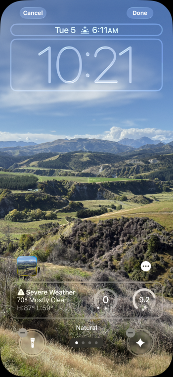
I think it's related to the font you've chosen for the clock.Does anyone have any idea why I don’t have the option to extend this clock down? I have other photo wall papers where it lets me.
Ok so several hours later impressions. Pretty smooth so far, doesn’t stutter as much. One odd thing, Amazon doesn’t load right and freezes on Safari. It looks like the mobile site at the top, but the middle graphics render too big. As if it’s half desktop, half mobile. Safari itself is a little buggy too. It gets stuck sometimes (not a lot) and I have to force close it.
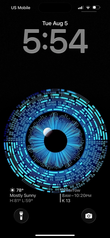
We’re getting close to weekly beta releases and I know what I signed up for when going down the beta route. Liquid Glass looks good too. Some small refinements. Still funny it says Verizon instead of TFW like it did in iOS 18. Total Wireless and an iPhone 16 Pro Max.
We’re getting close to weekly beta releases and I know what I signed up for when going down the beta route. Liquid Glass looks good too. Some small refinements. Still funny it says Verizon instead of TFW like it did in iOS 18. Total Wireless and an iPhone 16 Pro Max.
Last edited:
but do you need to read it? You clicked on the search button, and you see the search bar pop out from it. Does that interaction leave you so confused that you still need to read the word “search” every time to know what the search bar is for?Search fields are now beautifully legible. /s
View attachment 2534809View attachment 2534810View attachment 2534811
This is why I think the reactions to all the legibility concerns with Liquid Glass are overblown. These are elements that you may have to read once or twice when first getting acquainted with an app, but from then on you’ll remember what they do. All you need is an indication of an area to click.
calculator app crashing when changing the currency. Reported to feedback app
that is a bug, where the text disappears.Look at this and tell me that it’s readable again, totally unacceptable. /s
Register on MacRumors! This sidebar will go away, and you'll see fewer ads.


