Become a MacRumors Supporter for $50/year with no ads, ability to filter front page stories, and private forums.

MacRumors

macrumors bot
Original poster
Apr 12, 2001
68,798
39,740


The most notable change to iOS 26 is the Liquid Glass design overhaul, which is the first major iOS design update since Apple rolled out iOS 7 back in 2013. There are new features in iOS 26, of course, but added functionality has definitely been sidelined in favor of the design refresh.

iOS-26-Guide-Feature-2.jpg

We've compiled a walkthrough of Liquid Glass, so you know what to expect when you install iOS 26. A lot of what's here is also applicable to iPadOS 26 and macOS Tahoe too.

Keep in mind that Apple is still refining Liquid Glass and some of the design could see further changes, but we'll update this guide with each revision.

Overview

Liquid Glass is translucent, and it's meant to behave similarly to real glass. It allows light and color to filter through, so you'll see bits of the background behind buttons, menus, and other interface elements.

Liquid-Glass-Dark.jpg

Light is subtly reflected off of Liquid Glass buttons, which is noticeable when you move your iPhone. Apple says that Liquid Glass is designed to use real-time rendering to dynamically react to movement with reflective highlights.

App Icons

App icons are meant to look like layered glass, giving them a subtle depth. Apps like Messages, Weather, Photos, and Maps have a top layer icon design over a bottom color, for example, so you can see a hint of a 3D look.

ios-26-home-screen.jpg

Apple designed icons to have the same general colors as iOS 18, but there is an option to turn on an all-glass icon look by choosing the "Clear" option in the Home Screen customization interface.

Lock Screen

Liquid Glass is unmistakable from the moment you pick up an iPhone running iOS 26. The Lock Screen features Liquid Glass Control buttons (which are customizable like before), an option for a Liquid Glass design for the clock, and translucent notifications that use a more frosted variant of Liquid Glass.

ios-26-home-screen.jpg


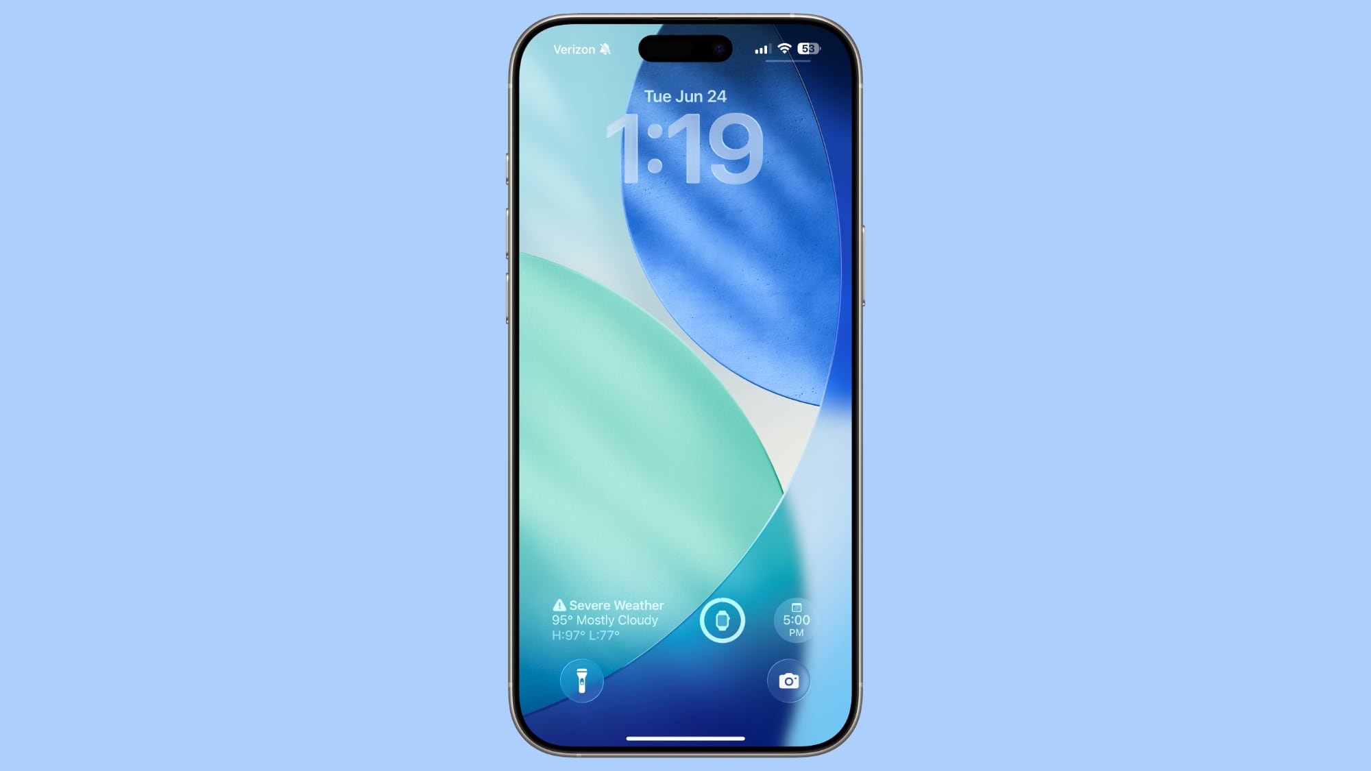
The Clock is particularly interesting, because Apple designed it to merge more seamlessly with your wallpaper. If you use a photo wallpaper, the time readout will change in size to fit inside the empty space on the display.

ios-26-lock-screen-time.jpg

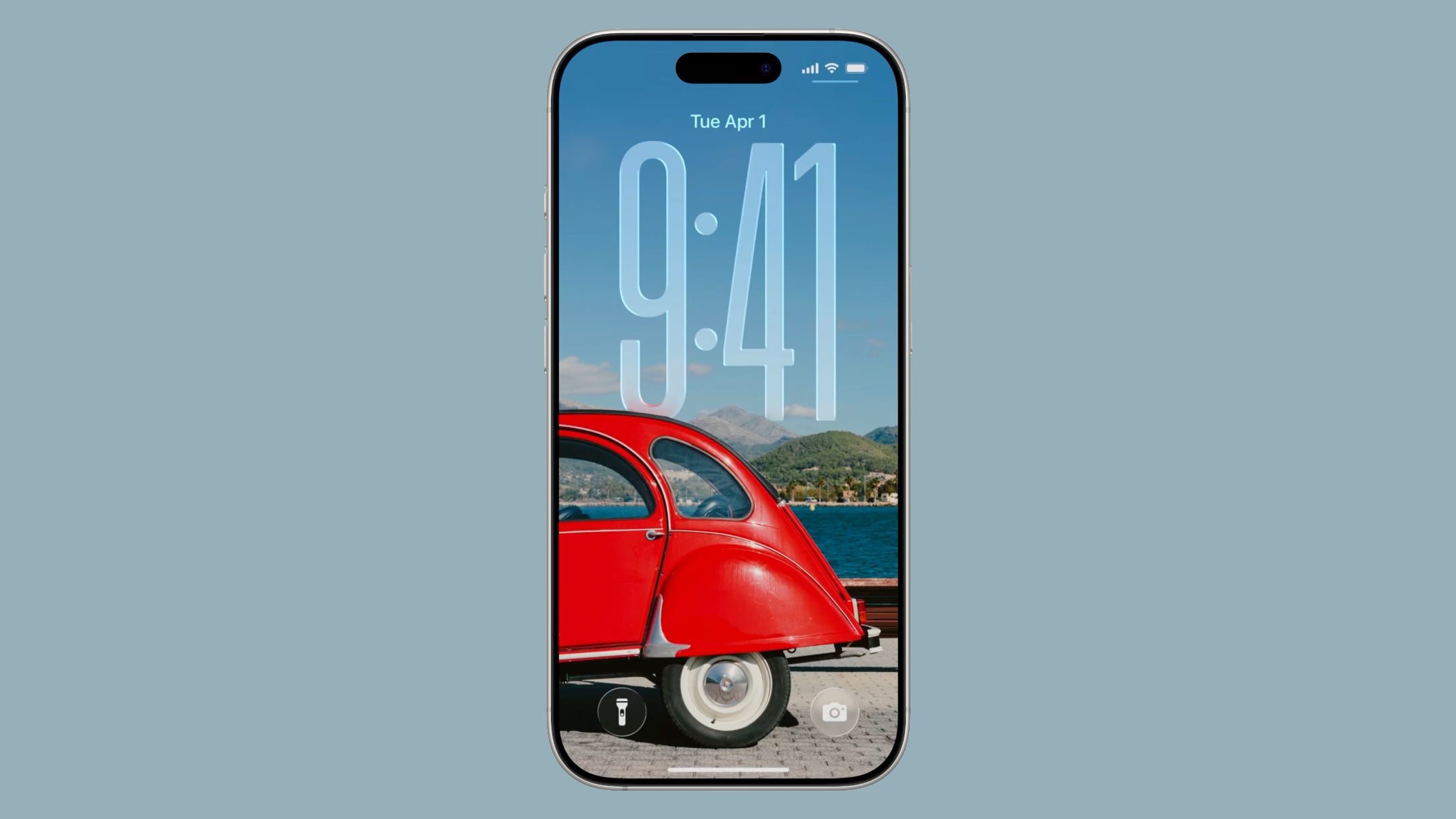
Widgets that are on the Lock Screen also have a Liquid Glass design, with widgets, the Control Center buttons and the time reflecting the light with the movement of your iPhone.
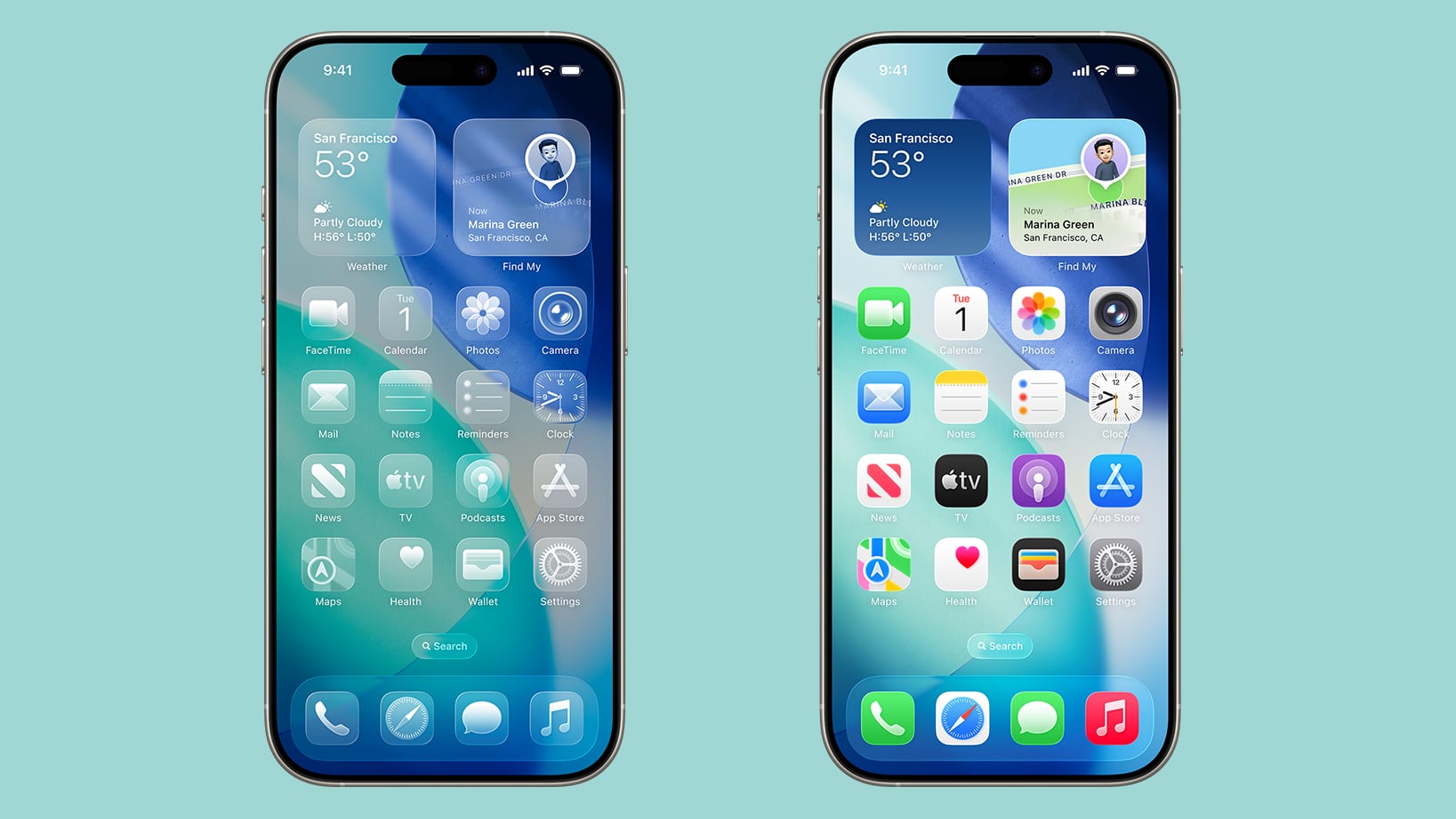
Home Screen

App icons have the aforementioned layered look with the option for entirely clear icons, and widgets have the same design. When you turn on the clear icon option, widgets also adopt a much more translucent Liquid Glass design.

ios-26-home-screen-standard.jpg

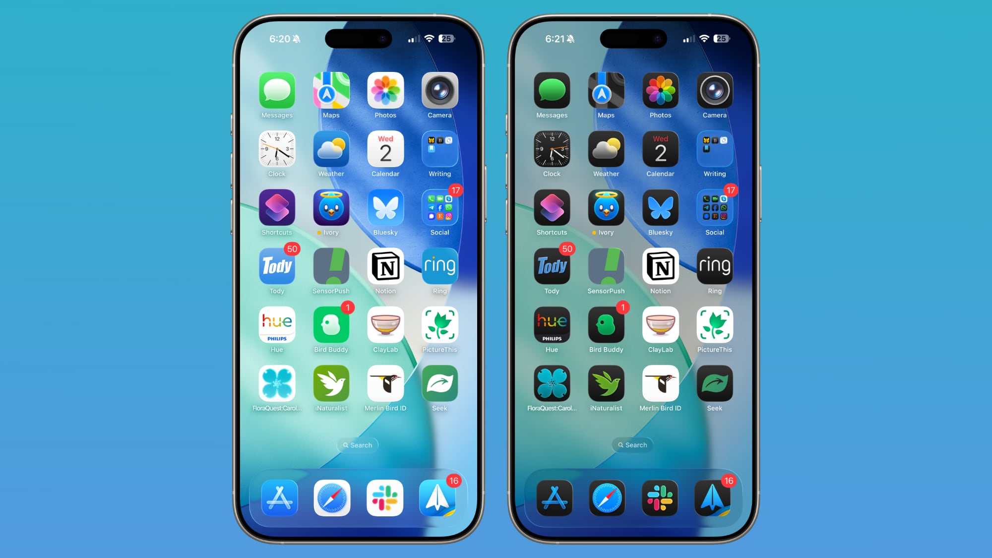
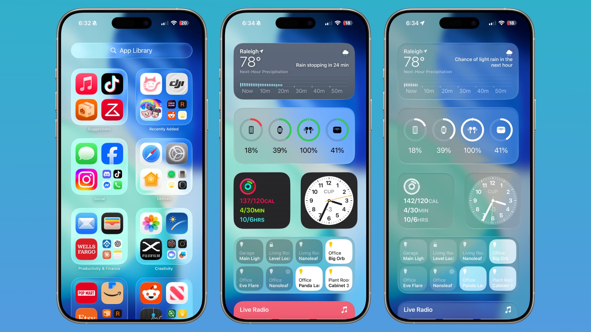
The dock is transparent and blends into the background behind it, and the same is true of the search interface. App folders have a soft, frosted Liquid Glass design that changes tint based on your wallpaper. The App Library has a similar look.

ios-26-home-screen-clear-icons.jpg

As you tilt and move your iPhone, you can see subtle glints of light reflecting off of the app icons, dock, folders, and search bar.

ios-26-home-screen-features.jpg


[*]iOS 26: What's Changed With the iPhone's Home Screen

Control Center

When Apple released the first beta of iOS 26, Control Center was so translucent it was almost unreadable. Apple made the Control Center buttons darker and more opaque, improving readability.

ios-26-control-center-colors-beta-3.jpg

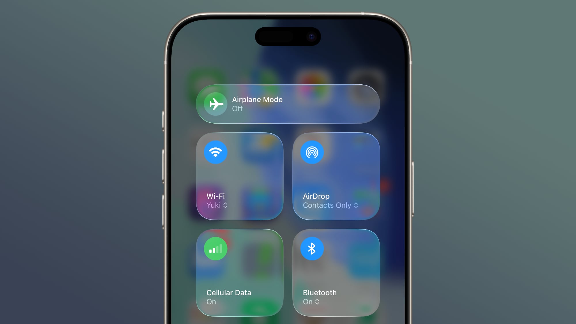
Control Center buttons now have a frosted glass look, but you can still see hints of what's in the background behind them.
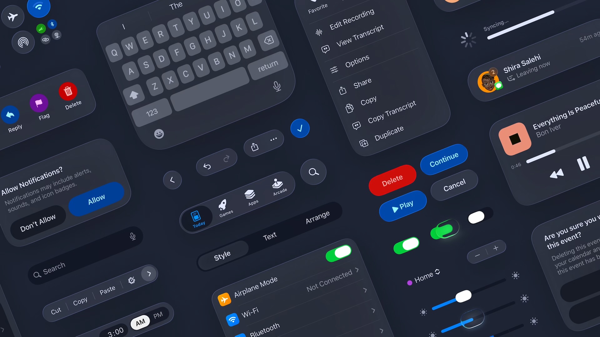
Apps

In apps, Liquid Glass is noticeable in menu bars, navigation bars, and buttons. Most of Apple's apps have received a Liquid Glass update, and you'll see Liquid Glass almost anywhere there's a button, bar, or menu. Apple wanted navigation bars and menus to appear to be floating over the content in the app, and there is a distinctive layered look to navigation elements.

safari-liquid-glass.jpg

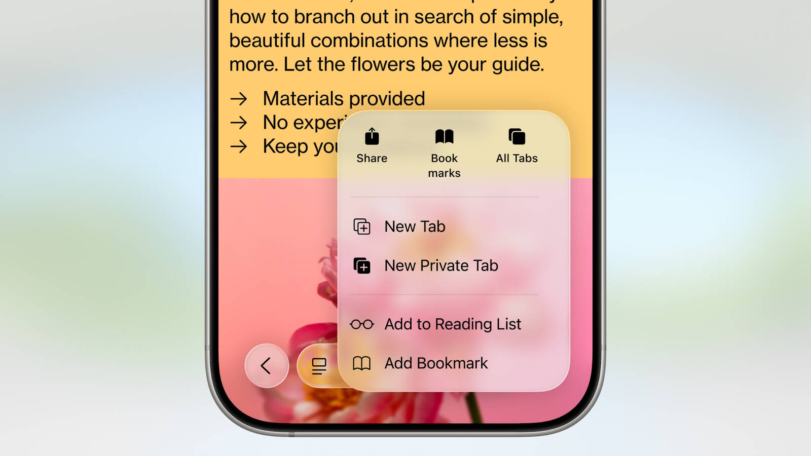
Navigation bars in apps are translucent and you can see some of the app's background behind them, especially when scrolling. Interface elements tend to fade more into the background to put the focus on content. Liquid Glass is accompanied by design changes in the form of pop out menus, rounded button designs, and disappearing navigation bars in select apps, with some of the more notable changes listed below... Click here to read rest of article

Article Link: iOS 26: Everything You Need to Know About the Liquid Glass Redesign
 
I'm using the betas on both my iPad and Mac mini, and it's ugly as hell, lot's of troubles with readability and transparencies. I hope apple comes to its mind and fixes this abherration. As for stability, both OS are very stable and I didn't suffer from any crashes or freezings. Smooth as butter. I'm just complaining about the UI. Reminds me of those android cheap themes with all icons backgrounds...
 
I have it on my iPad, and it looks nice. I don't find it to be any more or less readable than before. I'm waiting for a later beta to try it on my phone, if not the full release.
 
It sounds really cool. It also sounds like it takes a lot of CPU cycles too. What's its impact on battery life? What's the point of it?
 
  • Like
Reactions: Muzical
running the public beta on my iPad and imho most of the negative comments are exaggerated.
I had "increase contrast" and "reduce transparency" on prior (on non-beta iOS 18) and I do not have legibility issues with iPadOS 26 ...

Edit: added "most of" in front of negative comments ...
 
Last edited:
People have strong opinions about Liquid Glass. Some love the novelty of a fresh look, and others think that it's a usability nightmare that's almost unreadable in some situations.
This feels like it implies equal legitimacy for both positions. Whereas in reality, if anyone thinks novelty is more important, or even as important, as usability when it comes to UI design, they are simply wrong.
 
It's really odd reading an article titled "Everything you ned to know" -- when there's no reference at all to any of the WWDC Session videos where Liquid Glass and the design refresh are discussed. Instead of the "evolution" section which basically describes how things looked as the apps and other parts of the UI fixed their bugs, it would have been better to draw upon the authoritative
[Meet Liquid Glass - WWDC25](https://developer.apple.com/videos/play/wwdc2025/219/) and [Get to know the new design system](https://developer.apple.com/videos/play/wwdc2025/356/) videos, which show what the design and appearance actually are -- and highlight how Liquid Glass hasn't actually changed.
 
running the public beta on my iPad and imho the negative comments are exaggerated.
I had "increase contrast" and "reduce transparency" on prior (on non-beta iOS 18) and I do not have legibility issues with iPadOS 26 ...
Unless the acts of screenshotting and screen recording make things worse (which would be its own problem) then I don't think my complaints were exaggerated. They're based on clear issues I saw OS as they appear in screenshots and videos.
 
It is known which features will be available (or not available in this case) for older models?

Just want to see if my 13 Mini will receive everything a 16 will, for example.

I remember in past iOS releases that there were some features here and there that wasn’t available in older models
 
  • Like
Reactions: Jumpthesnark
I have yet to see the ios26 glass look in person, but in the various photos, it looks to me like a solution in search of a problem. I don’t like it, and I would probably turn the whole effect off if I could. That is the problem with a mature platform. They perfect it after many years of evolution, but they feel that they still need to tinker with it.
 
I've used every version of iOS since the og iPhone in 2008 and liked every iteration until now. The design of iOS 26 is horrendous. It isn't even the "glass" look to everything that irks me, but rather all the UI changes that make things more difficult to access and far less intuitive. Honestly no idea what is happening with Apple here, but I feel like this does not bode well for the future.
 
I have yet to see the ios26 glass look in person, but in the various photos, it looks to me like a solution in search of a problem. I don’t like it, and I would probably turn the whole effect off if I could. That is the problem with a mature platform. They perfect it after many years of evolution, but they feel that they still need to tinker with it.
It looks MUCH better on the phone than it does in the pictures. I'm using it now.
 
Unless the acts of screenshotting and screen recording make things worse (which would be its own problem) then I don't think my complaints were exaggerated. They're based on clear issues I saw OS as they appear in screenshots and videos.
There are way too many news articles/threads on the liquid glass topic and thus posts that I would remember each and every one.
What I do know is that any image that is displayed here on MR is compressed and as such does not really represent the original, leave alone that it will look different on the variety of monitors (incl iPhone/iPad model).

I will admit that my wording was poor, I should have said "most of the negative comments" .
 
It is known which features will be available (or not available in this case) for older models?

Just want to see if my 13 Mini will receive everything a 16 will, for example.

I remember in past iOS releases that there were some features here and there that wasn’t available in older models
It's fully funtional on my 11Pro.
 
There are way too many news articles/threads on the liquid glass topic and thus posts that I would remember each and every one.
Totally fair, I wasn't meaning to imply that you were calling me out personally.

What I do know is that any image that is displayed here on MR is compressed and as such does not really represent the original, leave alone that it will look different on the variety of monitors (incl iPhone/iPad model).
That in itself actually highlights another issue with liquid glass. While I haven't just looked at stuff from here (I've seen uncompressed screenshots and videos from friends who run the betas that exhibit the exact same issues as the ones one Macrumors), the facts that these liquid glass screenshots become illegible when lightly compressed when that was basically never an issue with prior design paradigms is yet another instance of this change resulting in overall worse outcomes.

I will admit that my wording was poor, I should have said "most of the negative comments" .
🤝
 
Register on MacRumors! This sidebar will go away, and you'll see fewer ads.