Got a tip for us?
Let us know
Become a MacRumors Supporter for $50/year with no ads, ability to filter front page stories, and private forums.
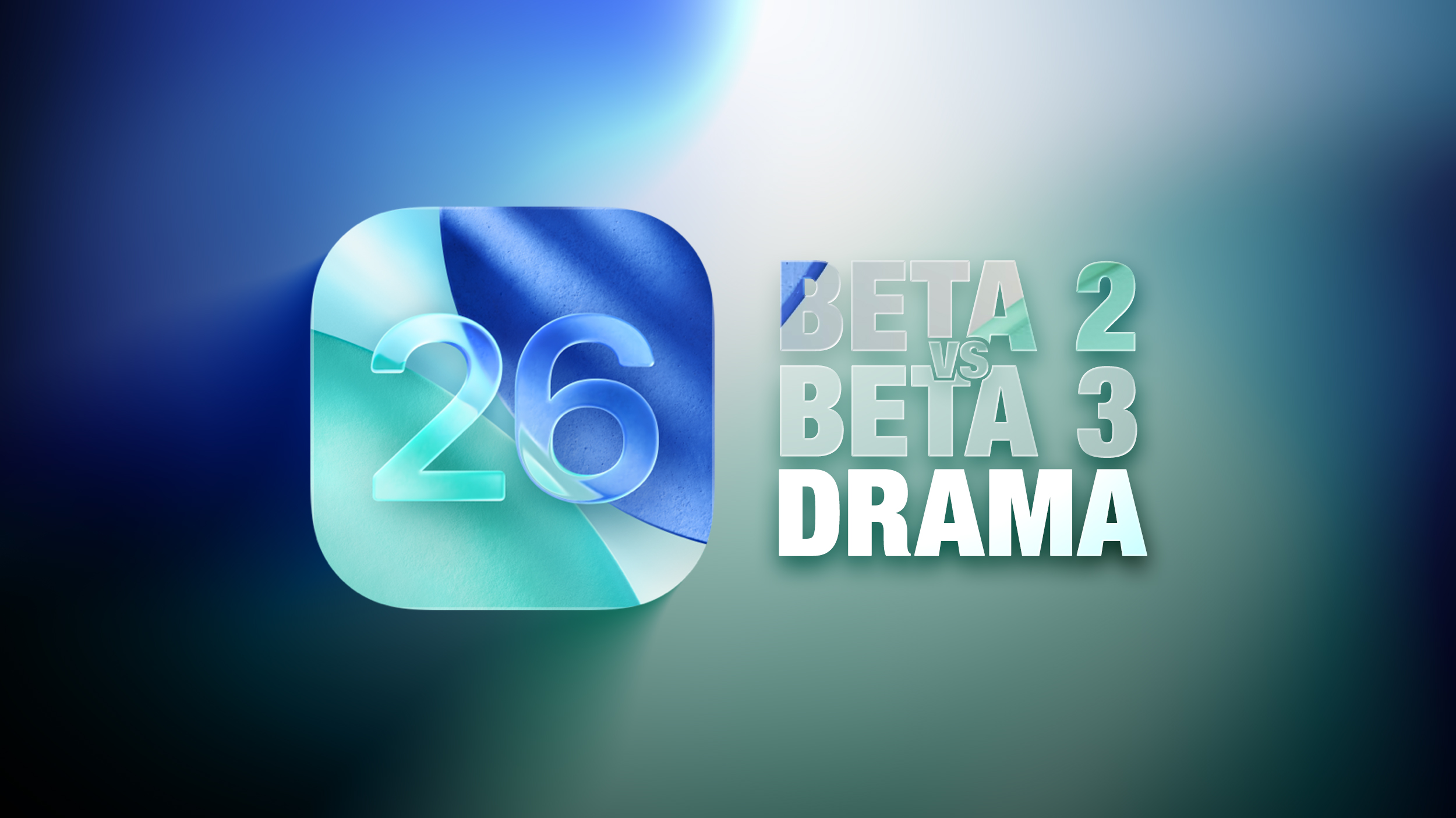
iOS 26 Liquid Glass Design Drama: Beta 2 vs. Beta 3 Changes in Every App
- Thread starter MacRumors
- Start date
- Sort by reaction score
You are using an out of date browser. It may not display this or other websites correctly.
You should upgrade or use an alternative browser.
You should upgrade or use an alternative browser.

I'm just waiting for the release in the Fall. I will say that it's different. So just have to wait for the firsthand experience and see how it goes.
You don’t have to change things for the sake of change.
Change for the sake of change is necessary for the executive, manager, engineer, or designer who is assigned to a working, stable system. Unless you find things to change, your job could be eliminated or your group could be downsized. Your changes should be significant or noticeable. If your work doesn’t have a big impact, your raise will be smaller and your chances for promotion almost non-existent. If you are in management, your area could be eliminated or moved under a different executive. The incentives to fix what ain’t broken are real. They are measured in dollars and ego.
I find Beta 3 is more readable. Less noise from the background cluttering the text.Preferred the look of beta 2, it seems a little inconsistent now.
I prefer the glassy look of beta 2 however I understand why they would move in this direction of beta 3 (and beta 3 is infinitely more usable on my device so aesthetics aside, I prefer it on that basis alone)
Perhaps there is some middle ground between the two
Perhaps there is some middle ground between the two
It’s just… bad. And I’m getting sick of the blur/fog on the edges already.
To be fair, they didn't roll it back at all. They adjusted the transparency to make it more readable and they did so before any release was made.Well. I didn’t particularly like the design, but to roll back on it after making it the showpiece of WWDC is a bit embarrassing. What’s next, delaying it by a year?
Beta 2 was about just right. Beta 3 is super boring and just looks like iOS 18 but takes up more room and feels heavier lol. Bring Beta 2 levels back!!
Personally, I think they can take Liquid Glass and stick it where the sun don’t shine. Not a fan because it is distracting.
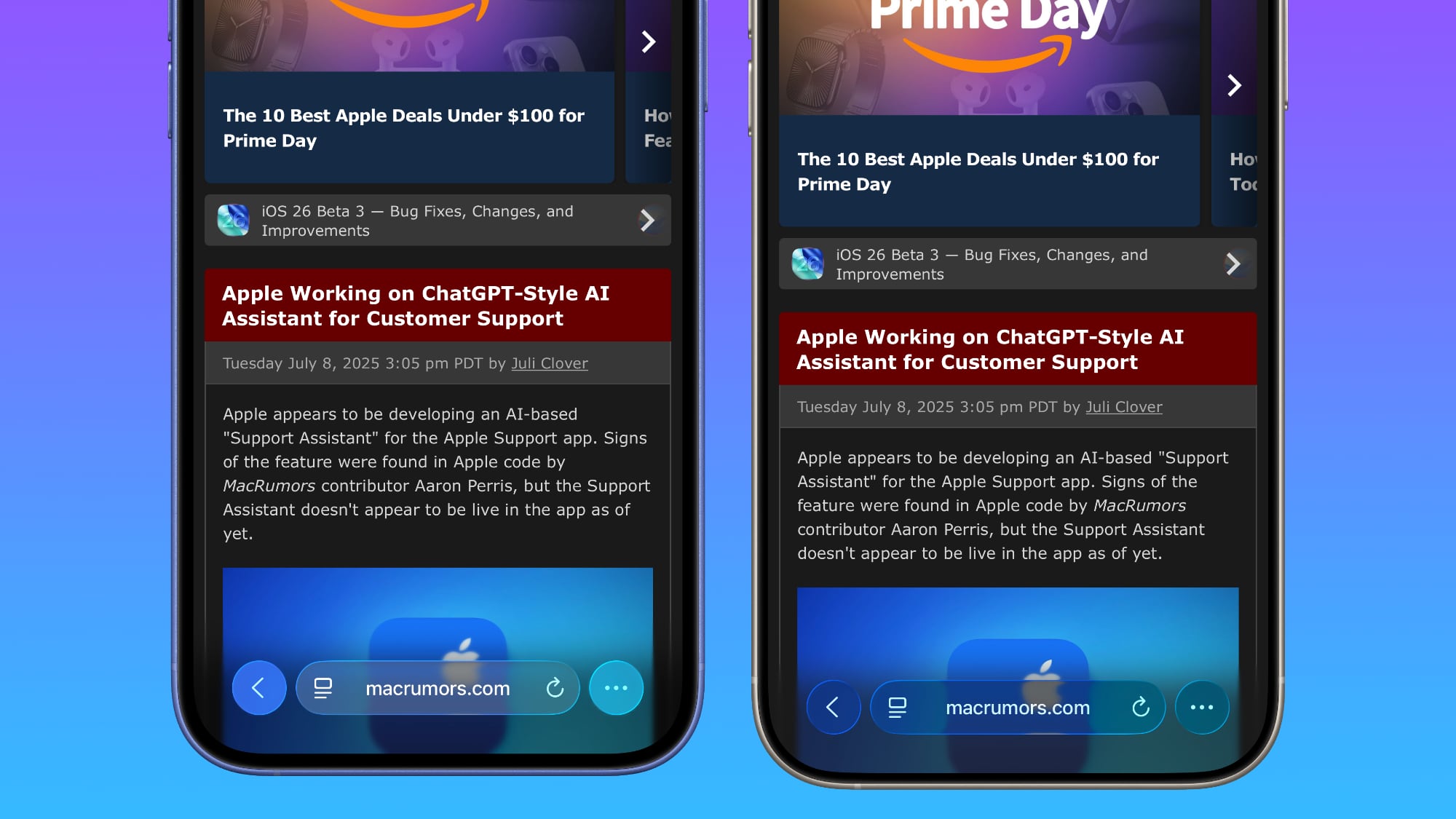
Apple has been refining Liquid Glass during the developer beta testing process, and both beta two and beta three have introduced some major tweaks. There was little outcry over the updates that Apple made in the second beta, but the third beta's design updates have frustrated some users who feel that Apple is removing too much of the Liquid Glass aesthetic.
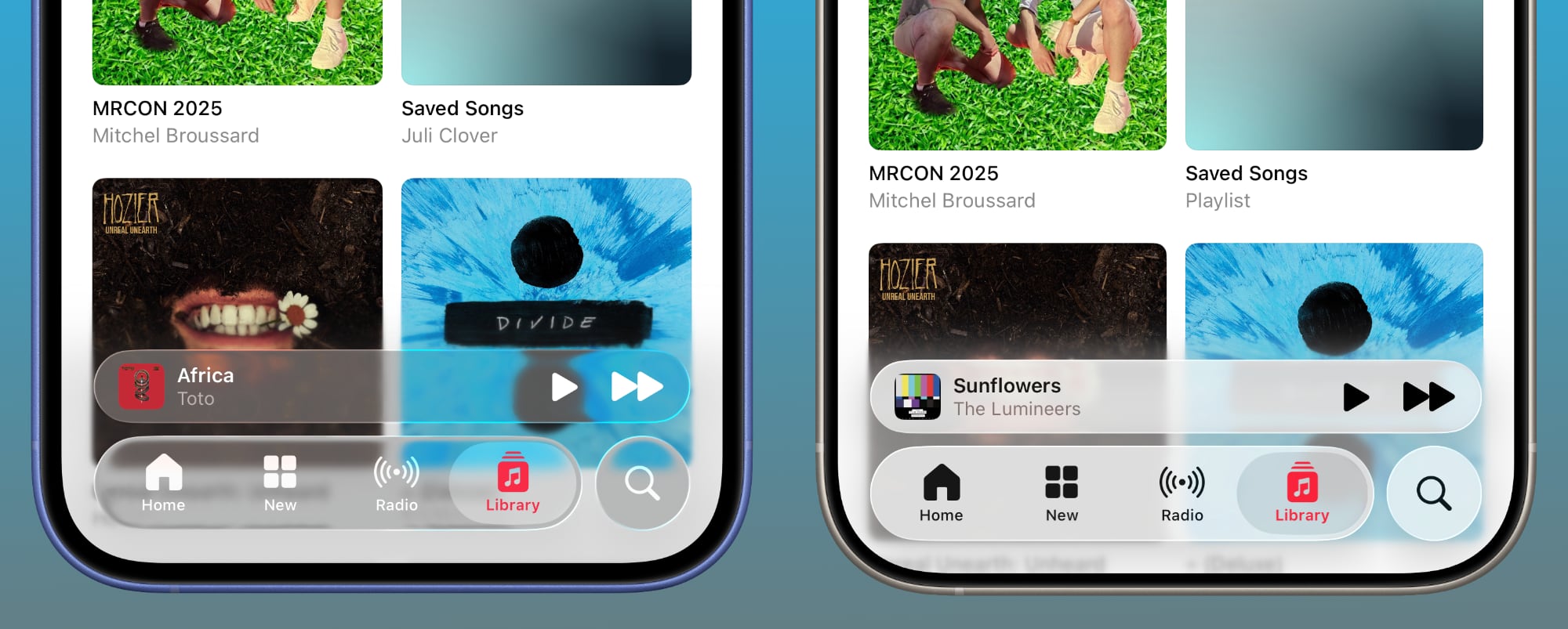
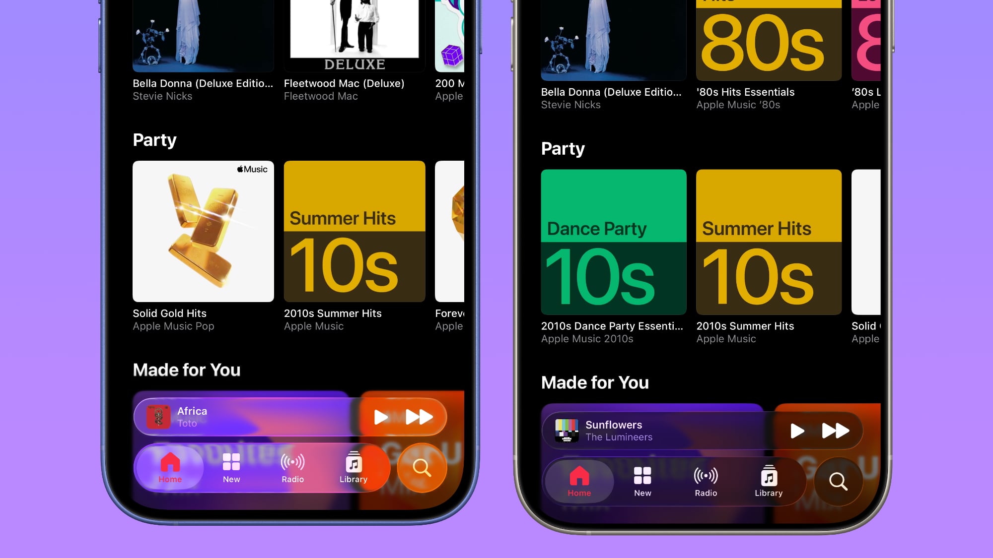
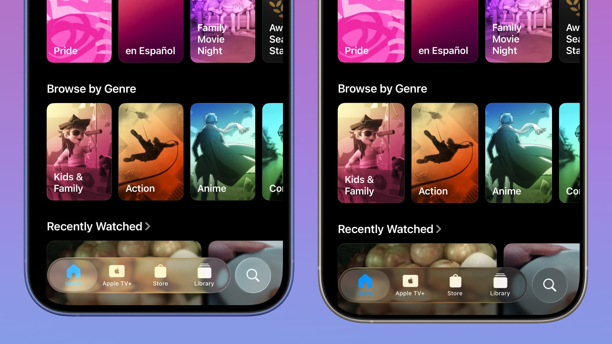
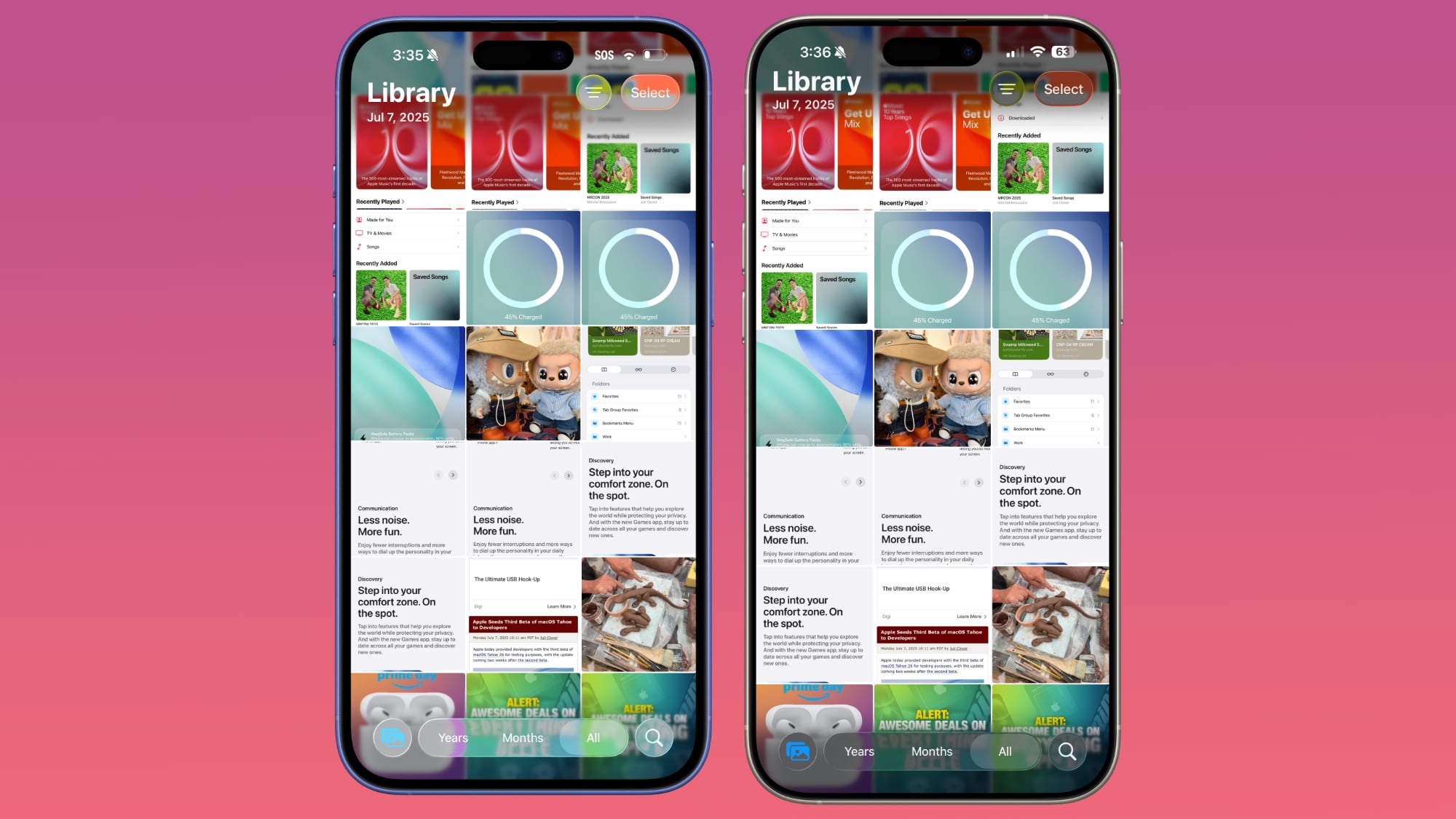
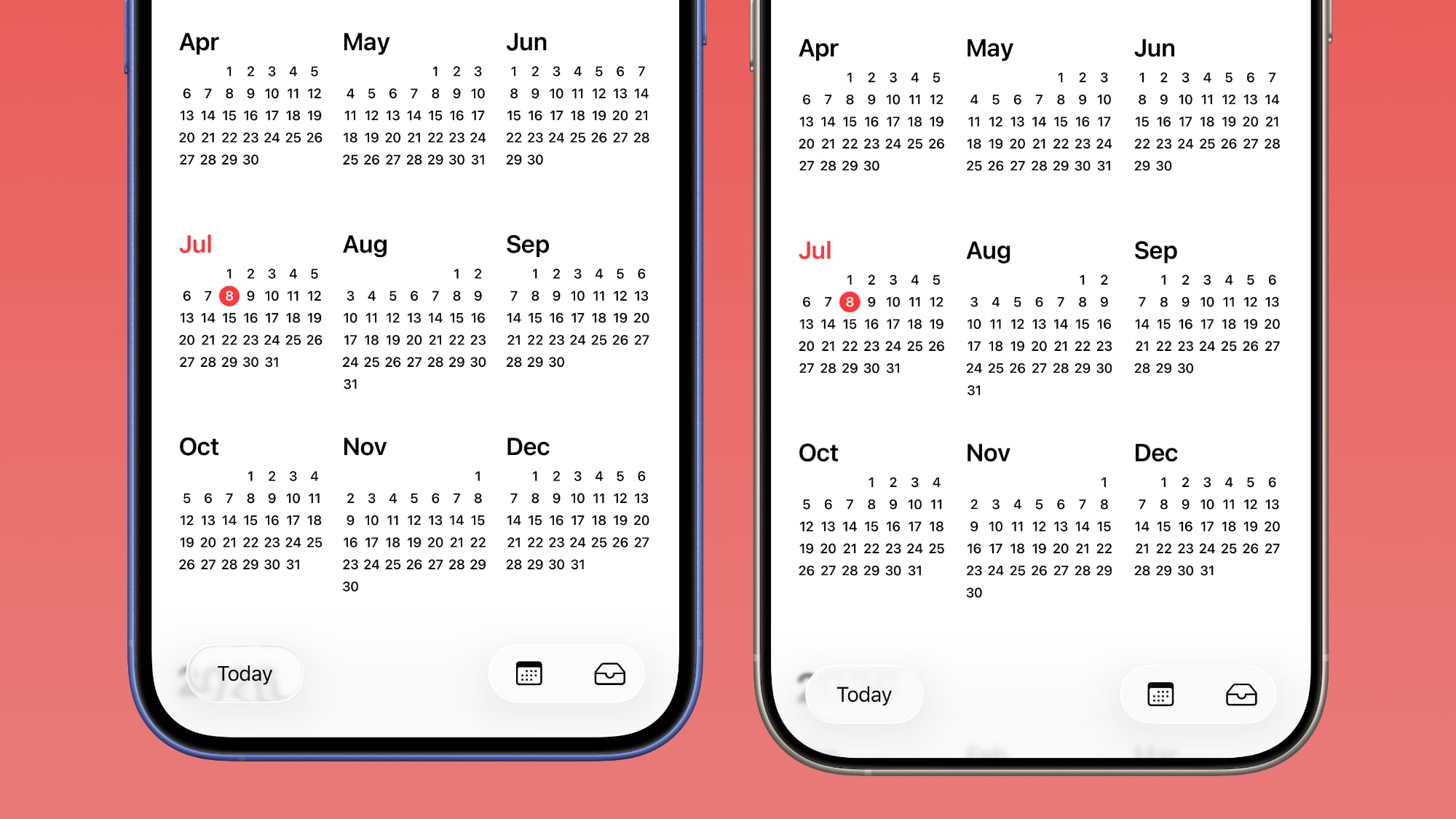
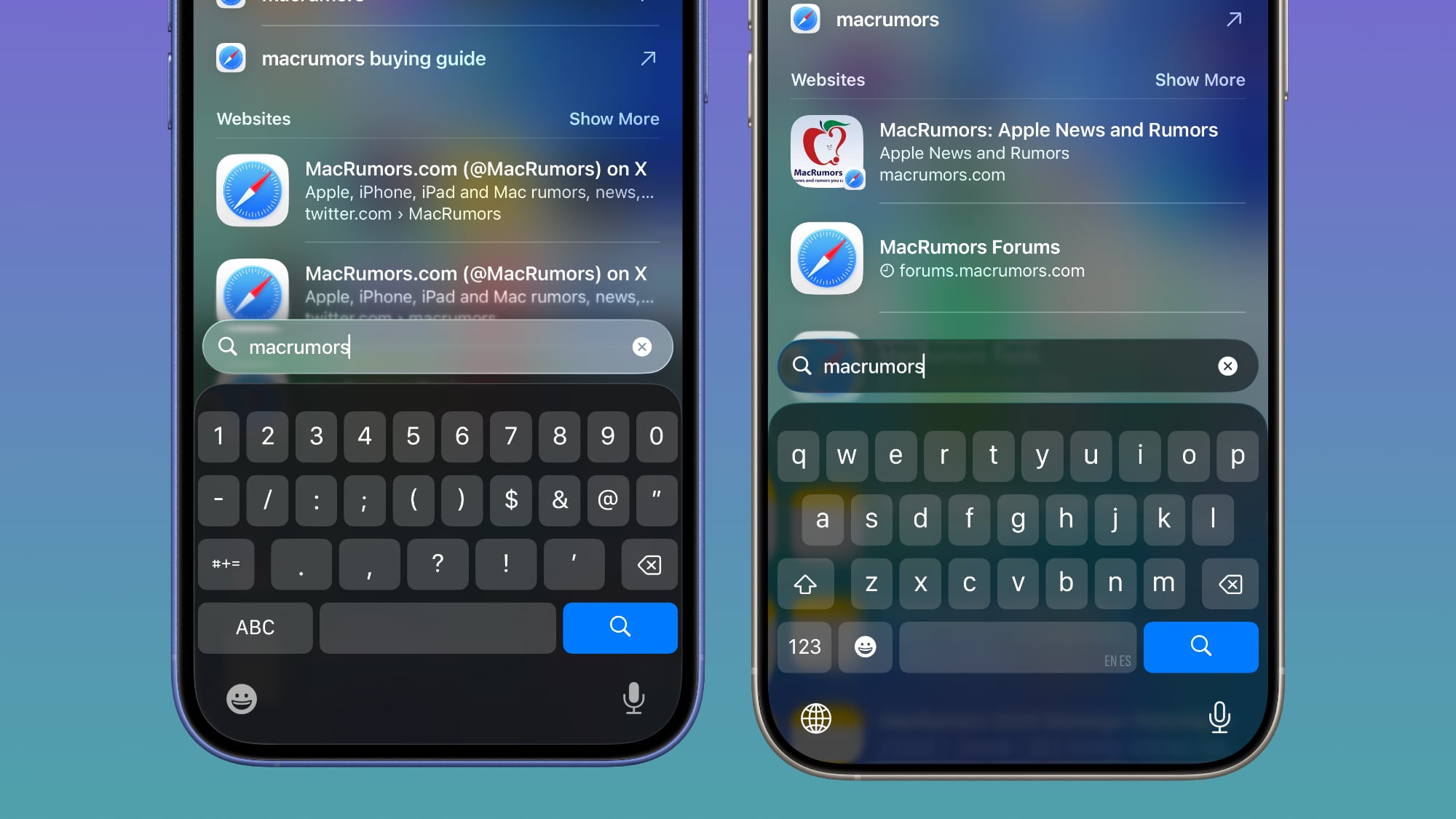
For context, Apple made navigation bars more opaque across many apps in iOS 26 beta 3, and we've got a series of side-by-side comparisons that demonstrate what's different. In all of the comparison images, beta 2 is on the left and beta 3 is on the right.
Apple Music
Apple Music's bottom navigation bar is more opaque, and it has the frosted glass look that Apple is now favoring. The change is most noticeable when scrolling over a background that has color. In beta 2, the navigation bar was almost translucent, allowing much of the background color to shine through. That effect is significantly reduced in beta 3.
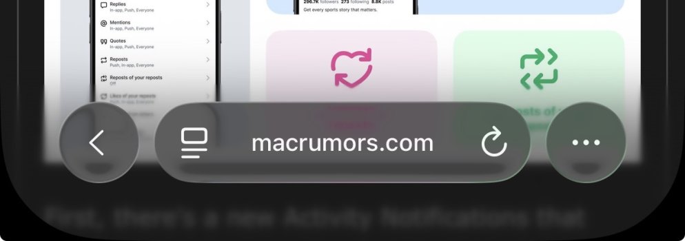
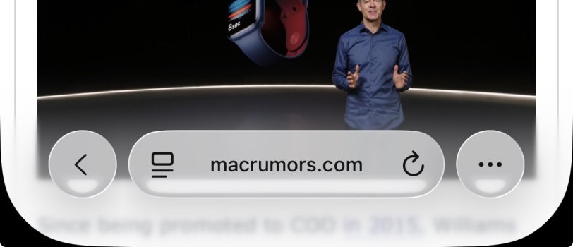
Safari
The changes in Safari vary depending on what you're doing, the background color of the website, and which Tab View design you're using. In general, the URL bar is more opaque and less prone to notable shifts in color. Less of the background comes through.
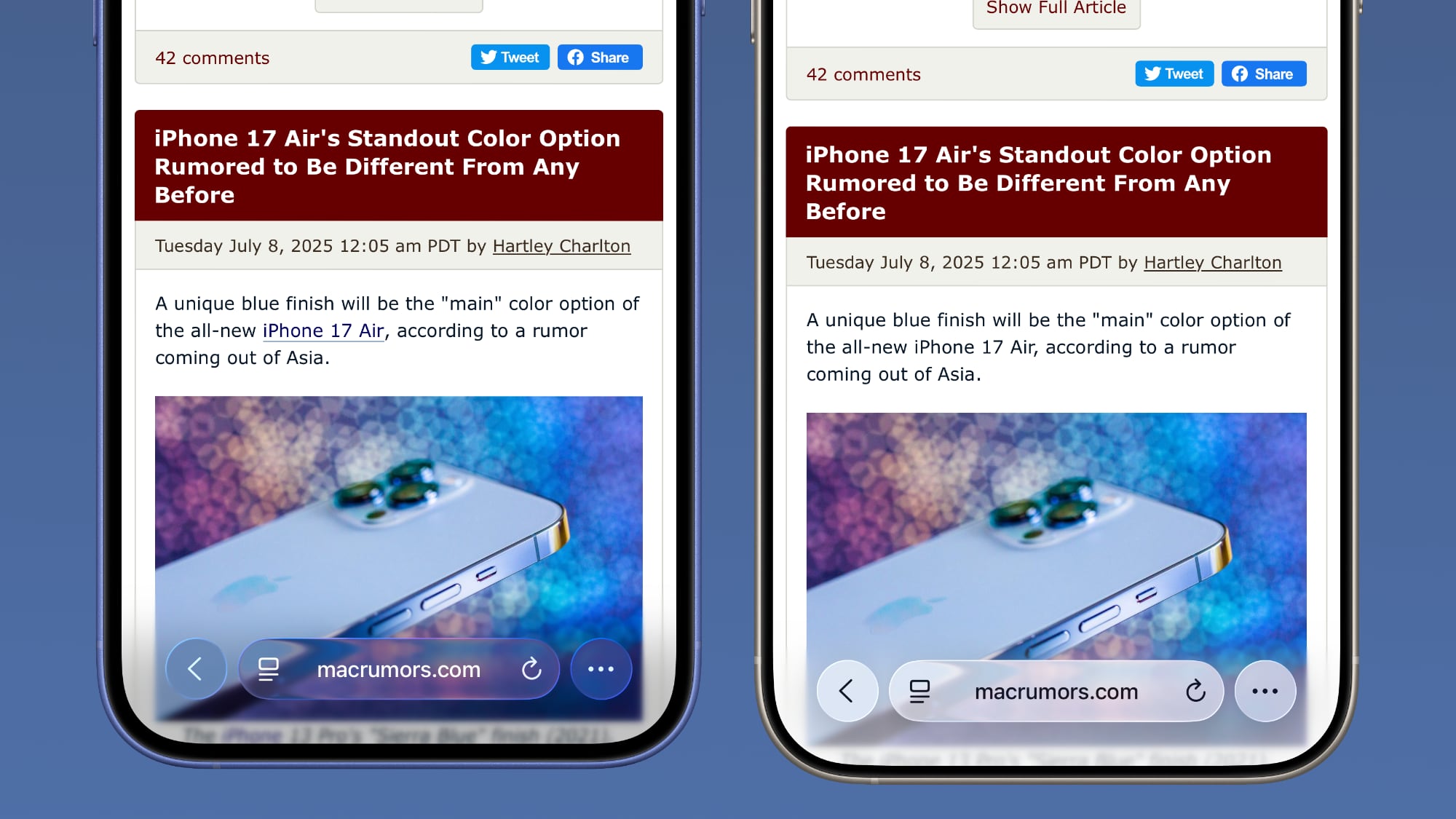
The URL bar will still change from light to dark if the content you're scrolling over is predominantly dark, but there's a higher threshold for that to kick on.
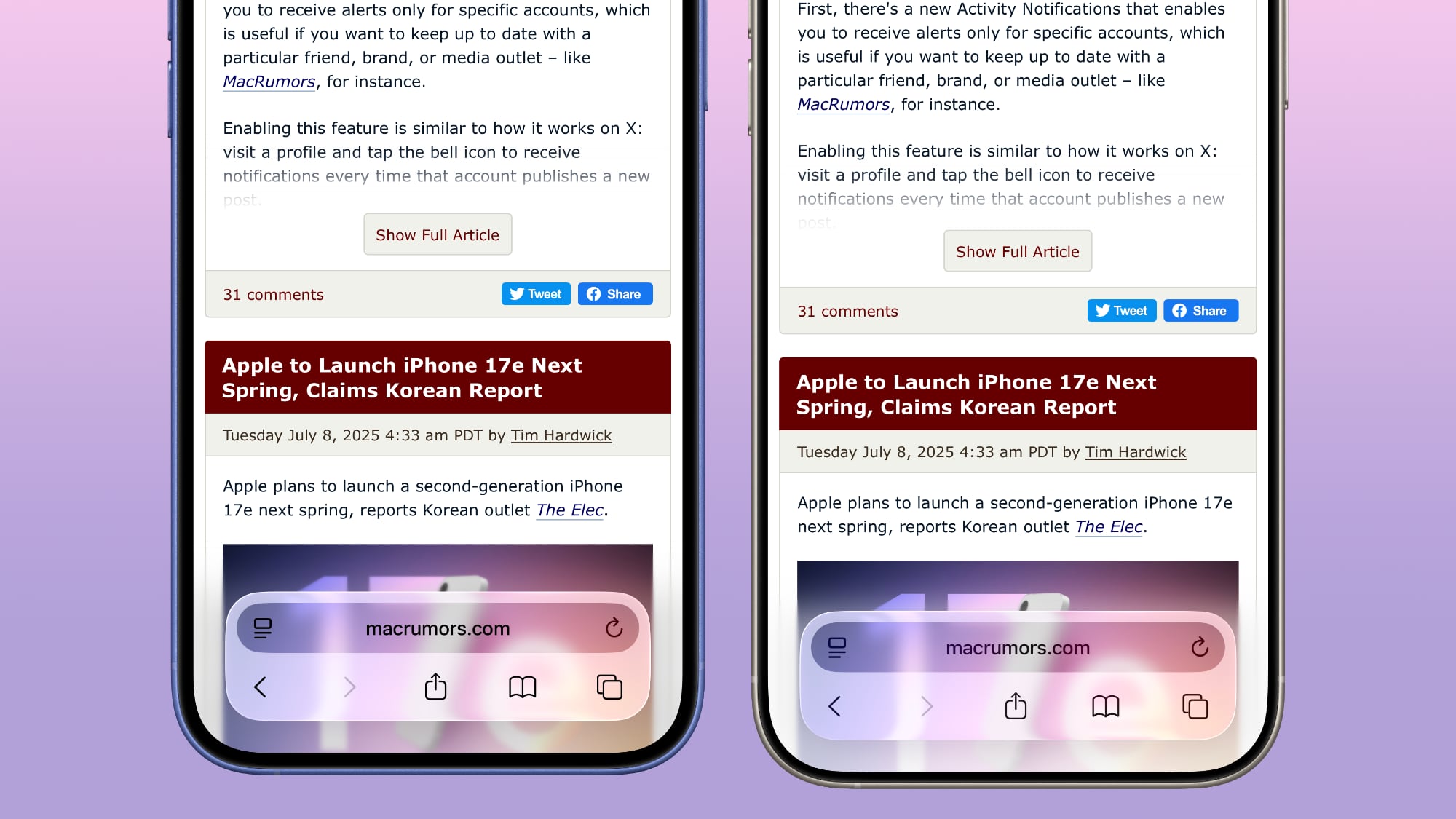
It's easiest to see the difference with the Compact View, because it was the most translucent view to begin with.
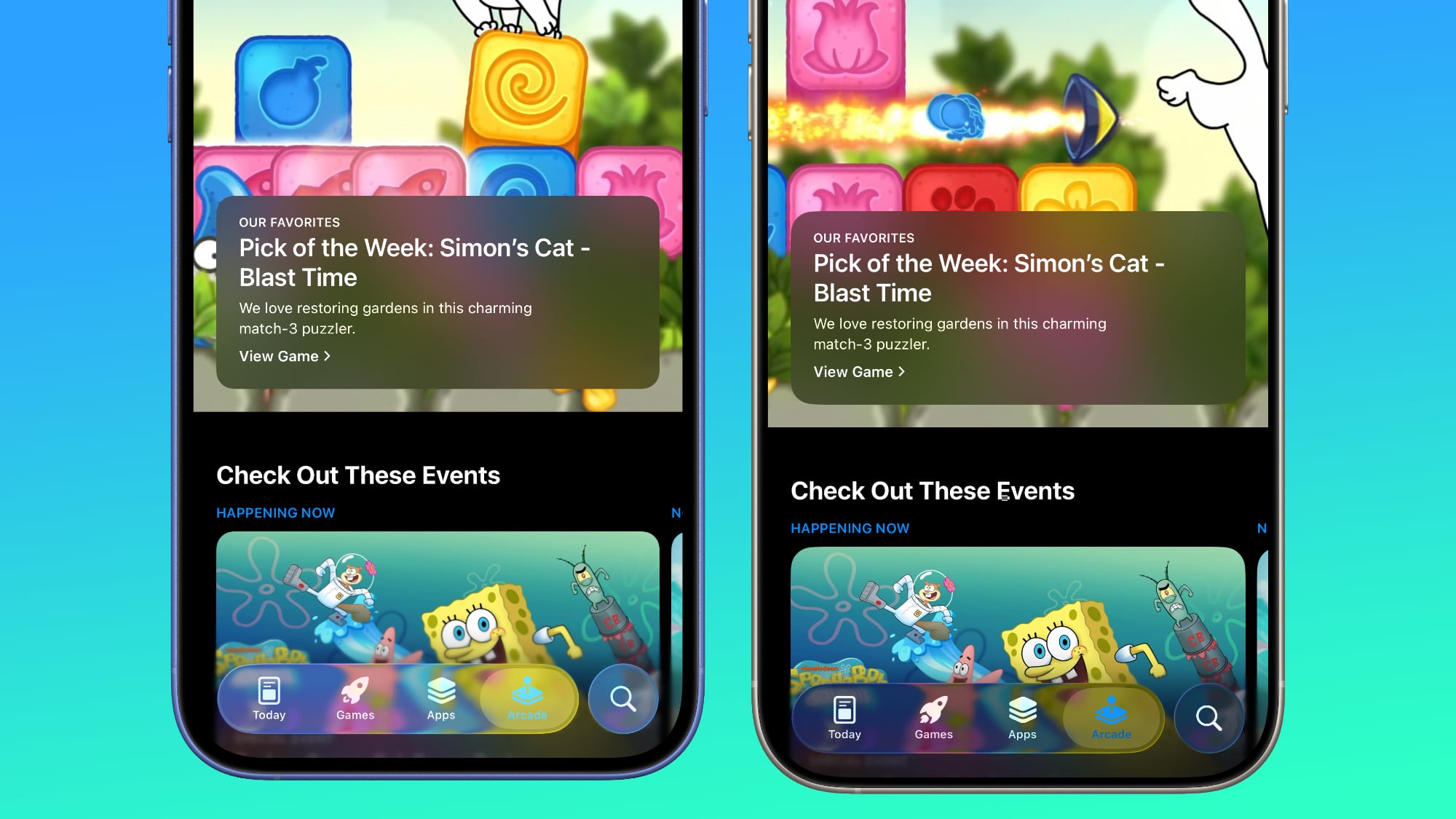
App Store
The App Store's navigation bar has one of the most noticeable changes, and it's almost entirely opaque now.
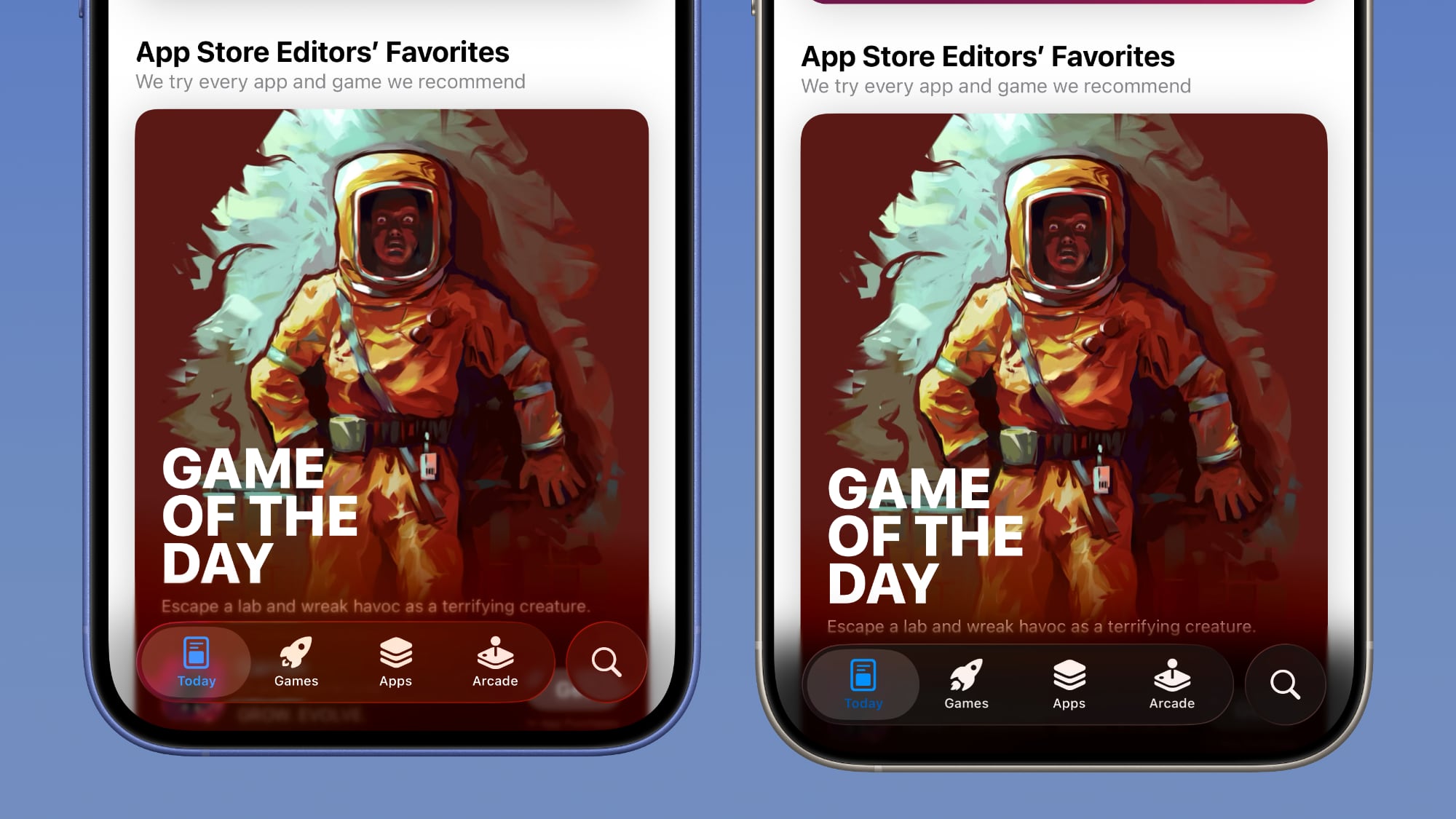
Light Mode
Dark Mode
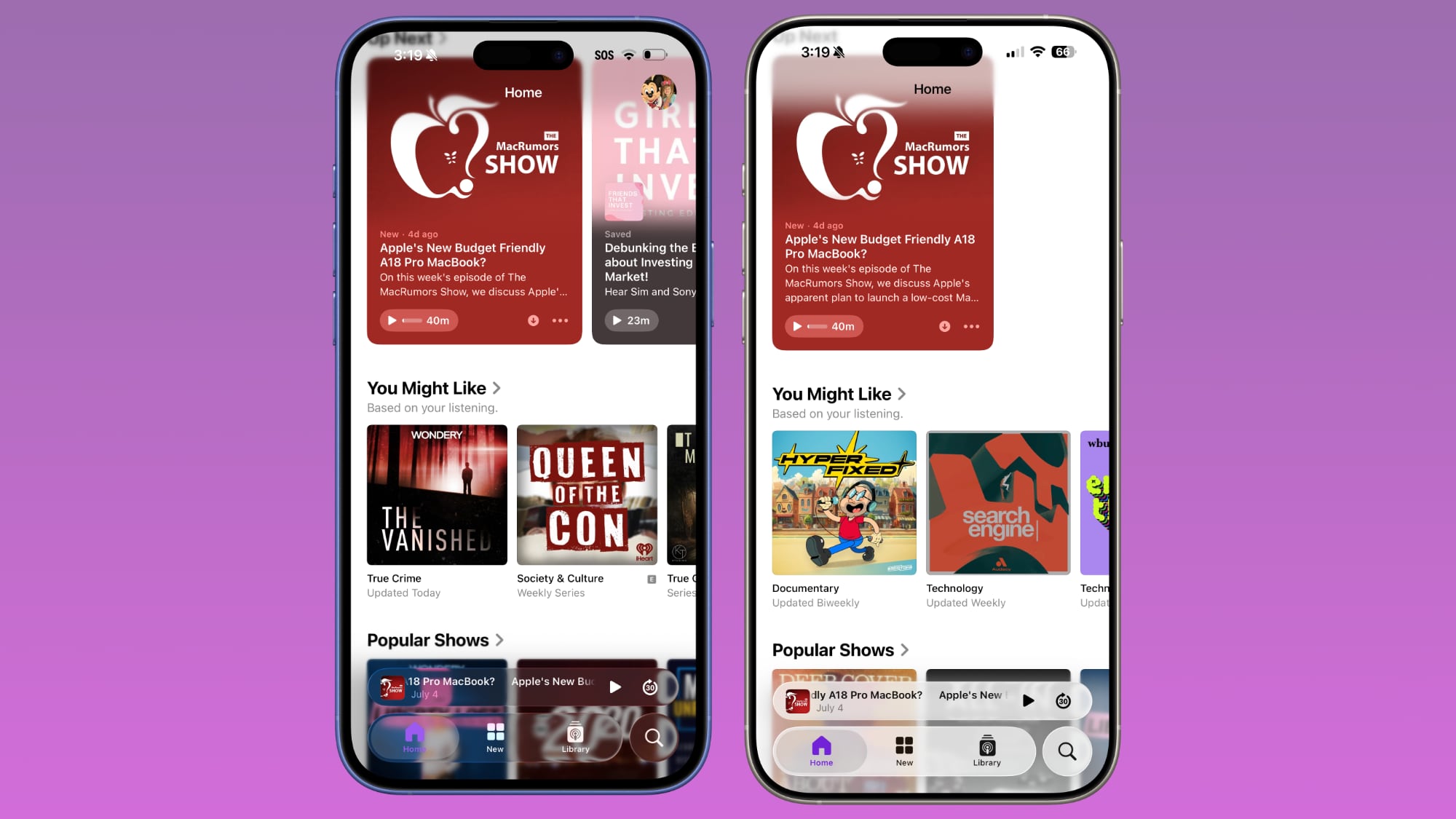
Podcasts
As with Apple Music, translucency has been almost entirely eliminated in the Podcasts navigation bar. The change is easiest to see with backgrounds that have color.
Apple TV
The Apple TV app has a darker background and the change is more subtle. The overlaying navigation bar is a darker glass color, but transparency appears to be similar.
Photos
For the Photos app, Apple tweaked the design in a similar way to the Apple TV app. The navigation bar is darker, but there's been little change to transparency.
Calendar
Calendar's navigation buttons are more opaque, both in Light Mode and Dark Mode.
Keyboard
The Spotlight Search keyboard is both more and less translucent. The keyboard itself has slightly more background visible, but the search bar is darker.
Dark Mode
Dark Mode has retained more transparency than Light Mode for the most part, so you may see less of a difference if you have Dark Mode enabled permanently. Some menu bar elements are darker than before, but white text on a dark background is more readable so Apple had to increase the opaqueness less.
This isn't true for all apps, though, and there are areas with dark navigation bars that also have less translucency.
Color Dependency
The difference that you see between beta 2 and beta 3 can vary quite a bit depending on the color in the background. With some white backgrounds, it's hard to tell that the Liquid Glass has a more frosted appearance, and the updates are mostly noticeable with light colors.
Over content that is are darker, navigation bars will often transition to their Dark Mode view that appears more translucent, as can be seen in the Safari screenshot below. This is the same effect you'll see with Dark Mode enabled.
Notifications, Lock Screen, and Home Screen
On the Lock Screen, the time is ever so slightly more opaque than it was before. With some background colors, notifications also have a darker background than before, but this isn't always noticeable. Home Screen and Control Center haven't changed much if at all.
For App Library, the search bar doesn't have blurred edges when scrolling, which makes it easier to see. Apple hasn't changed translucency... Click here to read rest of article
Article Link: iOS 26 Liquid Glass Design Drama: Beta 2 vs. Beta 3 Changes in Every App

I like them both, and ideally a slider for users to set their own transparency would be ideal, though unlikely. Overall, I like the new aesthetic.
I’ll say it again: if a UI design element needs extensive background blur or color changing background gradients to make it legible, it’s NOT a good design element.
Why blur the content behind a transparent title bar in stead of, you know, just use a title bar? What problem does blurring solve? All that blur takes up precious screen real estate because it extends beyond the space a title bar used to have.
iOS 18 (and macOS sequoia) solved it perfectly with a kind of, well, frosted glass effect to have to content shine through a title bar or navigation bar. No need to blur the content or add extra layers of gradients that annoyingly switch from black to white when scrolling.
So now there is: less clear hierarchy, more distraction because there is more blurred content everywhere, less usable screen space.
And that’s only naming practical things. There’s a lot more to complain about aesthetically. Like how they add little ‘glass’ edges to every logo on every icon. How dare they do that to big brands that carefully crafted the shape and color of their logos…
Seriously what is this mess. It baffles me that Apples culture of good design is so lost.
The Liquid Glass effect wasn't consistent in the last beta either. I'm beginning to think this is just some beta related bug that will be fixed before the final release. People should just be able to use Reduce Transparency if they want the current more opaque look.
People with perfect vision shouldn't need to use accessibility features to read basic interface text at a glance.The Liquid Glass effect wasn't consistent in the last beta either. I'm beginning to think this is just some beta related bug that will be fixed before the final release. People should just be able to use Reduce Transparency if they want the current more opaque look.
If people without accessibility needs have to turn to these features, the design is bad.
I will say the drama in the iosbeta subreddit is hilarious. I don't particularly care as long as either design doesn't have a noticeable negative impact on performance. Change for the sake of change at the cost of performance, especially on older devices, is completely ridiculous.
Both versions look like a jailbreak theme… I don’t understand what Apple have been doing for the past however many years…
This is the first update that I will ever be skipping. The goal should have been to design the ui in a way that makes the device more productive. But the only thing I see is a form of planned obsolescence. Par for the course in Tim Cook’s Apple.
This is the first update that I will ever be skipping. The goal should have been to design the ui in a way that makes the device more productive. But the only thing I see is a form of planned obsolescence. Par for the course in Tim Cook’s Apple.
Change for the sake of change at the cost of performance, especially on older devices, is completely ridiculous.
My main concern as well.
I will be watching reports on the finished product from other 13 mini users before deciding if I should ever upgrade, especially since Apple doesn’t allow you to downgrade. 🤬
Thanks for the video. This seems to just be eye candy for the sake of it. Why not spare users the reduced battery life and eyestrain and just keep things simple?Same location , this time in motion . you can even see the haze go from white to black on darker content
View attachment 2527185
I can just tell by looking at the thing that the reflections are a huge hit to the battery - and more so than any other update - older devices will suffer. They literally changed nothing. It’s a skin - not a redesign. Apple have absolutely fallen.I will say the drama in the iosbeta subreddit is hilarious. I don't particularly care as long as either design doesn't have a noticeable negative impact on performance. Change for the sake of change at the cost of performance, especially on older devices, is completely ridiculous.
Clearest example of how the haze layer under the Liquid Glass buttons work
White haze on right as we almost get to black background and black haze on left as we almost get to white background
As the button moves completely on the black background it goes dark and vice Versa on white background
All beta 3 has added is a haze layer between the content and buttons for testing
Attachments
Too much transparency is always a stupid idea unless you are doing strictly representational visual stuff.
For practical and user-interface, it’s just an eye ache and/or confusing and weird.
Flat and opaque will never be beat for UI, even if you think it’s a bit dull.
This whole exercise has been stupid.
I hope I can turn transparency completely off when the time comes.
For practical and user-interface, it’s just an eye ache and/or confusing and weird.
Flat and opaque will never be beat for UI, even if you think it’s a bit dull.
This whole exercise has been stupid.
I hope I can turn transparency completely off when the time comes.
All beta 3 has added is a haze layer between the content and buttons for testing
“Liquid Haze” powered by the neural engine
Register on MacRumors! This sidebar will go away, and you'll see fewer ads.