Become a MacRumors Supporter for $50/year with no ads, ability to filter front page stories, and private forums.
Hoping for a big iOS refresh, but as usual, expecting nothing but translucent buttons and same tired look and feel.

Who would’ve thought google would end up being so far ahead in terms of UX / UI and fun operating system.
 
Yeah, I doubt it, and I certainly would hope not. IMO they don’t look that good. Given the lack of any credible sources actually within Apple indicating they’ll switch to circle icons, I don’t think that’s happening. The squircle icon has been a defining aspect of Apple’s visual branding for the past decade, IMO, it would be as likely as Apple switching to block shaped iPhones with hard corners. Apple won’t want to completely remove any vestige of familiarity with the new design language, the new design language should build on the existing design, retaining an element of familiarity and consistency, while also incorporating some new elements. So I doubt they’re going to do that.

I could see circle icons and symbols within apps, but I don’t believe circle Home Screen icons would make any sense. For one, app icons coexist on the Home Screen alongside rectangular and square widgets, and possibly folders and files as well according to rumors. None of these visual elements would likely be circular. So you would have circle icons mashed together with square and rectangular elements, which would look way too chaotic and imbalanced in my opinion. Then you also have the issue of app branding. Many apps utilize the squircle shape as an integral part of the icon design, to represent real-world objects. Many such apps would have to completely rework their icons, which could be harmful to brand recognition. Squircle icons afford more creativity, devs can use the shape of the icon itself as an aspect of the design, a squircle shape lends itself to representing a whole bunch of different real-world objects. A circle shape, not as much…

I’m guessing the app icons will look more comparable to the 3-dimensional macOS app icons, with more depth shading and layered icons. The designs of the icons may be different from the current designs, but I suspect many of the design principles we see in current macOS app icons will likely be there…

In fact, I suspect that Apple has been using macOS as a testbed the past few years to tinker with some of the visual elements that will wind up in the new design language. We already see pretty widespread use of “frosted glass” UI elements in macOS. We also already see 3-dimensional elements like the aforementioned app icons. I’m sure the new design language will likely look a bit different from current macOS UI, but I suspect we can already see many hints of it in macOS.

At the end of the day, I hope Apple will retain squircle icons. Traditionally, Apple has shown close care to visual branding and beyond just that, matching the software aesthetic with the hardware aesthetic. In my opinion circle icons would be a major departure from that, and would hurt Apple’s visual branding.

I was similar to you when round icons were first mooted however I've now come round to thinking this will actually happen. Everything seems to be pointing that way:
  • Apparently the redesign was scheduled to be launched last year with iOS 18 but it was pulled at a late stage to focus on Apple Intelligence features. It's notable that the revamped Control Centre which did launch last year has circular icons, was this originally planned to launch alongside the new 'solarium' interface?
  • A major focus will be to unify interfaces between platforms so presumably icons will be included in that, and WatchOS and VisionOS have circular icons.
  • The 'solarium' interface is supposed to be inspired by VisionOS which has circular icons, and it's notable this was Apple's last platform to launch less than 2 years ago so represents their most recent thinking UI wise.
To me there's quite a bit there which points towards this new, unified interface, going with circular icons.
 
Hoping for a big iOS refresh, but as usual, expecting nothing but translucent buttons and same tired look and feel.

Who would’ve thought google would end up being so far ahead in terms of UX / UI and fun operating system.
In my opinion, Google’s OS looks awful… I would say Google’s far behind in terms of UX/UI…
 
  • Like
Reactions: surszki
I was similar to you when round icons were first mooted however I've now come round to thinking this will actually happen. Everything seems to be pointing that way:
  • Apparently the redesign was scheduled to be launched last year with iOS 18 but it was pulled at a late stage to focus on Apple Intelligence features. It's notable that the revamped Control Centre which did launch last year has circular icons, was this originally planned to launch alongside the new 'solarium' interface?
  • A major focus will be to unify interfaces between platforms so presumably icons will be included in that, and WatchOS and VisionOS have circular icons.
  • The 'solarium' interface is supposed to be inspired by VisionOS which has circular icons, and it's notable this was Apple's last platform to launch less than 2 years ago so represents their most recent thinking UI wise.
To me there's quite a bit there which points towards this new, unified interface, going with circular icons.
I would make some counterpoints though:

- The Control Center is different from the Home Screen, and so button shapes in the Control Center aren’t necessarily representative of button shapes in the Home Screen.

- Yes, watchOS and visionOS both have circle icons, but they’re also both wearable devices that don’t have a real Home Screen paradigm. They both use a honeycomb grid with no widgets. iOS, iPadOS, and macOS all have a Home Screen paradigm that places app icons next to rectangular widgets and square shaped file icons, all on a square grid. Circle icons in that context look imbalanced. They also waste a ton of space. And since there are 3 of Apple’s platforms that use squircle icons, and only 2 that use circular (plus 1 that uses rounded rectangular icons), someone could technically argue Apple could move watchOS and visionOS over to squircle icons…

- All the actual sources from within Apple have been careful to say “loosely based” on “some elements” of visionOS. None of them have said anything about circle icons, in fact, the only source who claims to have seen iOS 19 who has made claims about the icon’s aesthetics has said they are still squircles. The rest are people maybe slightly more informed than us who are wishcasting for circle icons and creating mockups for fun, at least as far as I can tell… Even Gurman has made no claims about icon shape.

- Then you have all the aforementioned reasons for squircle icons I referenced in another post in this thread…

Overall, I don’t think circle icons make any sense on platforms like iOS, iPadOS, and macOS, which place app icons alongside rectangular and square UI elements on a square grid… And I don’t see Apple reducing the functionality of iOS, iPadOS, and macOS by moving to a honeycomb grid with no widgets and such… In fact, I could see a very compelling argument for Apple adding a proper Home Screen paradigm to visionOS, complete with widgets and such, it would boost the platform’s utility.
 
Last edited:
Now well within the 14 day period for returning say a new Apple TV or that M4 based iPad Pro, and surprise they release a HDMI 2.2 or M5 updates at WWDC 2025. Counter is approaching under 12 days now.
Most MAC trade magazines which you can find under Apple News+ in Magazines, spin this last years push with AI has identified much discussion that consumers want a very different direction to be the focus of this years WWDC. The Mac Pro will be a harder sell now when shown, because of the Mac Studio update. It will be interesting to see where Apple goes with that given expansion as a focus. There could be a MacBook Pro at WWDC that is M3 Ultra based goes rumor.
 
  • Like
Reactions: Kal Madda
Also, recent reports indicate tvOS will also be included with the new design. I highly doubt Apple’s moving from the rounded rectangle icons on tvOS to circle icons, good luck trying to fit your channel name within a circle… So I think that right there is a pretty good reason to believe app icon shapes will not necessarily be a “central component” of the new design…
 
Now well within the 14 day period for returning say a new Apple TV or that M4 based iPad Pro, and surprise they release a HDMI 2.2 or M5 updates at WWDC 2025. Counter is approaching under 12 days now.
Most MAC trade magazines which you can find under Apple News+ in Magazines, spin this last years push with AI has identified much discussion that consumers want a very different direction to be the focus of this years WWDC. The Mac Pro will be a harder sell now when shown, because of the Mac Studio update. It will be interesting to see where Apple goes with that given expansion as a focus. There could be a MacBook Pro at WWDC that is M3 Ultra based goes rumor.
I highly doubt we’ll see an M5 iPad Pro at WWDC25. While possible, we haven’t heard any supply-chain reports, and reports we’re hearing are indicating a later release. 👍🏻. Perhaps an M3 Ultra MacBook Pro.
 
  • Like
Reactions: Realityck
Assumptions aside hopefully there is some interesting hardware news at WWDC. :cool:
I think it’s unlikely we see hardware at all.
At most, maybe we see a sneak peek of the home hub and it will get a release date sometime this fall, but that’s it.
Even then, wouldn’t shock me to see them save that for the September event.
And you know what? I’m perfectly OK with that, there isn’t really anything in Apple‘s current lineup that needs immediate updating. Pretty much everything has been updated within the last 12 months.

Plus if we are truly expecting five operating system redesigns (iOS, iPadOS, macOS, tvOS and watchOS) plus an apparently feature packed update for visionOS, that’s enough for a two hour long presentation right there
 
  • Like
Reactions: Kal Madda
Not a chance.
That article never said Apple would release an M3Ultra MBP, just that Apple had tested one.
Anyone who knows anything about the current wattage of the M3Ultra knows that it will not be going into a laptop.
Yeah, I’m not holding my breath for a new MacBook Pro at WWDC25, and probably not with the M3 Ultra, but I said “perhaps” because I’m unfamiliar with the rumors about an M3 Ultra MacBook Pro, so wasn’t going to dismiss something I’d never heard of…
 
Yeah, I’m not holding my breath for a new MacBook Pro at WWDC25, and probably not with the M3 Ultra, but I said “perhaps” because I’m unfamiliar with the rumors about an M3 Ultra MacBook Pro, so wasn’t going to dismiss something I’d never heard of…
 
  • Like
Reactions: Kal Madda
I think it’s unlikely we see hardware at all.
At most, maybe we see a sneak peek of the home hub and it will get a release date sometime this fall, but that’s it.
Even then, wouldn’t shock me to see them save that for the September event.
And you know what? I’m perfectly OK with that, there isn’t really anything in Apple‘s current lineup that needs immediate updating. Pretty much everything has been updated within the last 12 months.

Plus if we are truly expecting five operating system redesigns (iOS, iPadOS, macOS, tvOS and watchOS) plus an apparently feature packed update for visionOS, that’s enough for a two hour long presentation right there
The upcoming Mac Pro is usually shown off at WWDC not September, that’s reserved for the usual iPhone and Watch releases.
 
  • Like
Reactions: Kal Madda
What makes you think there will be an upcoming Mac Pro? There’s nothing pointing to that, at least not yet.
There are no rumors of hardware updates at this point in time, but Apple has unveiled new Macs at WWDC in the past. The only Mac that could plausibly be unveiled at WWDC is a new Mac Pro. Most other Macs were already recently updated, and those that weren't, like the MacBook Pro, aren't set to get updates until later in 2025.
Given it still using the older M2 Ultra without the newer graphics improvements of the M3 ultra.
The M3 chip introduces an all-new GPU architecture. This architecture includes Dynamic Caching, a breakthrough feature that optimizes GPU memory allocation and utilization, adapting in real-time to varying task demands. This enhancement not only boosts graphics performance for intensive applications but also bolsters the chip's overall energy efficiency. This is particularly beneficial for graphics-heavy tasks like advanced video editing, 3D rendering, and gaming. It also features support for AV1 video decode to provide more efficient and higher-quality video from streaming services.

It be stupid if they didn’t update it as it’s the last Mac not updated.
 
Last edited:
I hope that there is a complete refresh of the design. The latest versions for the past couple of years have had pretty much no real significant redesigns and I want a complete overhaul.
 
Interesting enough this occurred just before WWDC. Just one less item to show off.

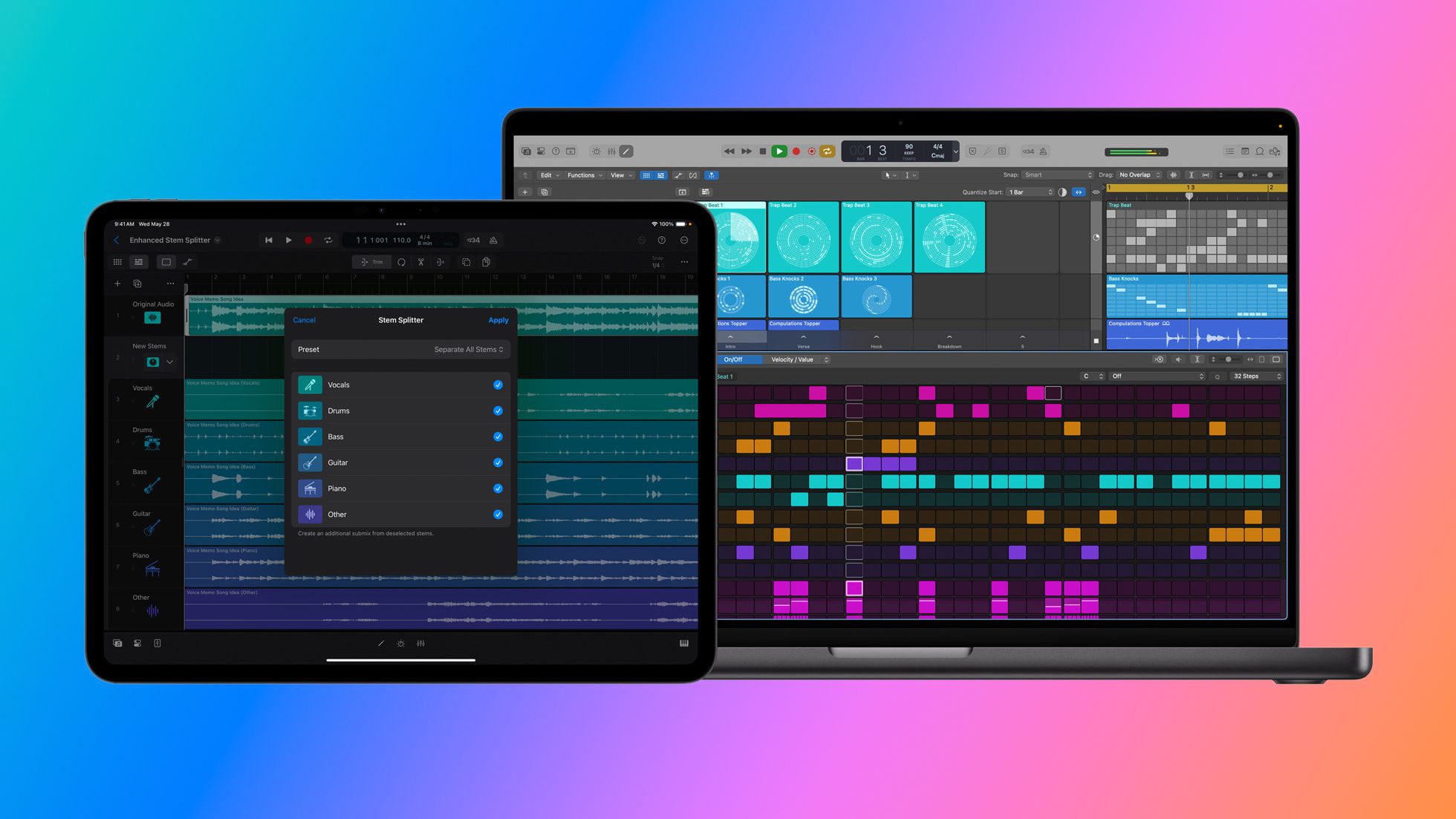
Apple today introduced new Logic Pro updates for Mac and iPad, supercharging beat making and producing. The innovative Stem Splitter feature now offers even greater audio fidelity, and can separate guitar and piano into stems. With Flashback Capture, users can retrieve and restore inspiring performances they may have forgotten to record. And with energetic new sound packs like Dancefloor Rush, beat makers have fresh loops and kits to fuel their next track
 
  • Like
Reactions: Kal Madda
Hoping for a big iOS refresh, but as usual, expecting nothing but translucent buttons and same tired look and feel.

Who would’ve thought google would end up being so far ahead in terms of UX / UI and fun operating system.
As long as they don't follow Samsungs path of killing off devices that are just a few years old in terms of performance.
Tried Android 14 on a 3 year old Samsung today (a model) and it slower than anything i've tried in a long time.
 
As long as they don't follow Samsungs path of killing off devices that are just a few years old in terms of performance.
Tried Android 14 on a 3 year old Samsung today (a model) and it slower than anything i've tried in a long time.
I am probably one of the few who doesn't have an issue with older devices being killed off.
 
As long as they don't follow Samsungs path of killing off devices that are just a few years old in terms of performance.
Tried Android 14 on a 3 year old Samsung today (a model) and it slower than anything i've tried in a long time.
Apple was forced to put a number on it in the EU, so they said 5 years of support via security updates.
They still tend to give 5+ years for full OS releases anyway, but that might change. Those older 3 GB and 4 GB RAM devices are just hard to support without slowing innovation. I don't think we will see any surprising cutoffs with iOS 19, but we could get to a point in a couple years where those older devices just get security patches and that's it.
 
  • Like
Reactions: Reverend Benny
WTF. What does this achieve. Those higher numbers will sound even weirder than what we're at now. I guess this will just be something like a version number that will be mostly hidden from the public? So just "the new iOS this year brings..."?
 
Register on MacRumors! This sidebar will go away, and you'll see fewer ads.