Become a MacRumors Supporter for $50/year with no ads, ability to filter front page stories, and private forums.
It’s definitely buggy.

I’ve had to remove and completely reinstall a couple of apps to make them work properly. Had a couple of old messages show up in iMessage. I always clear browsing history. Tap, tap and tap again.😔
 
  • Like
Reactions: reinem85
Overall, I think that the update is, well, fine.

My complaints generally relate to little things. For example, why in the world does my phone now vibrate when an outgoing call is answered? Somebody must have thought that this would be a great new feature. But why? It does nothing useful; I don't need a vibrating phone to tell me (i) that I placed a call or (ii) that someone answered. The vibration is an unhelpful distraction, making me wonder whether something aside from he call requires attention.

Is there a way to turn it off?
 
What I think of when I see people posting, "You losers always complain a bunch, but eventually you'll get used to it and shut up."

https://happyproject.in/learned-helplessness/

Next, the experimenters raised the partition to close up the chambers. This time, the dogs could not flee after receiving electric shocks. They made frantic attempts to find a way out whenever a shock came through, but they couldn’t.
Finally, they lay down, whimpering every time they felt a shock, without even trying to get up.

The dogs get used to it. But I wouldn't call them happy.

And for the people posting, "It's fresh and new!" in a week the novelty will have worn off and you'll want some other fresh and new things.
 
No way similar to the IOS 7 change!.
This time the contrast is a mess!.
Is not about “ugly” or “pretty”, is about less usability than before!.
It is graphics design school project!.
Is like those transparent screens in sci-di shows. Looks nice in photos, but usability is hindered!.
It is change for the sake of change!.
No real benefit for NOBOBY!.
Users have to find toggles that only power-users can know they are exist.
How is this innovation?. Trillion-dollar company and the best they can do is this poor, slow, battery intensive UI?.
 
The glass is ok on iOS and MacOS. But on WatchOS it just makes it harder to read especially the notifications. Also on the Apple Watch Ultra the action button now does this silly and slow "bloom" animation when activated. It used to be ok with just a short flash animation.
 
As long as we are beating a dead horse with Apple, I find the new update mostly pleasant on its face. It is clear that Apple pushed this mess out the door knowing full well about many of the bugs and went ahead anyway. As the Apple hierarchy continues to dismantle the reputation they built decades ago, they do not seem to care and frankly, neither do I. The hard truth is that until Google or Samsung raise their game, we are stuck with what we have. 🫩
 
I hate hate hate hate having to tap more than once to see my Safari tabs!


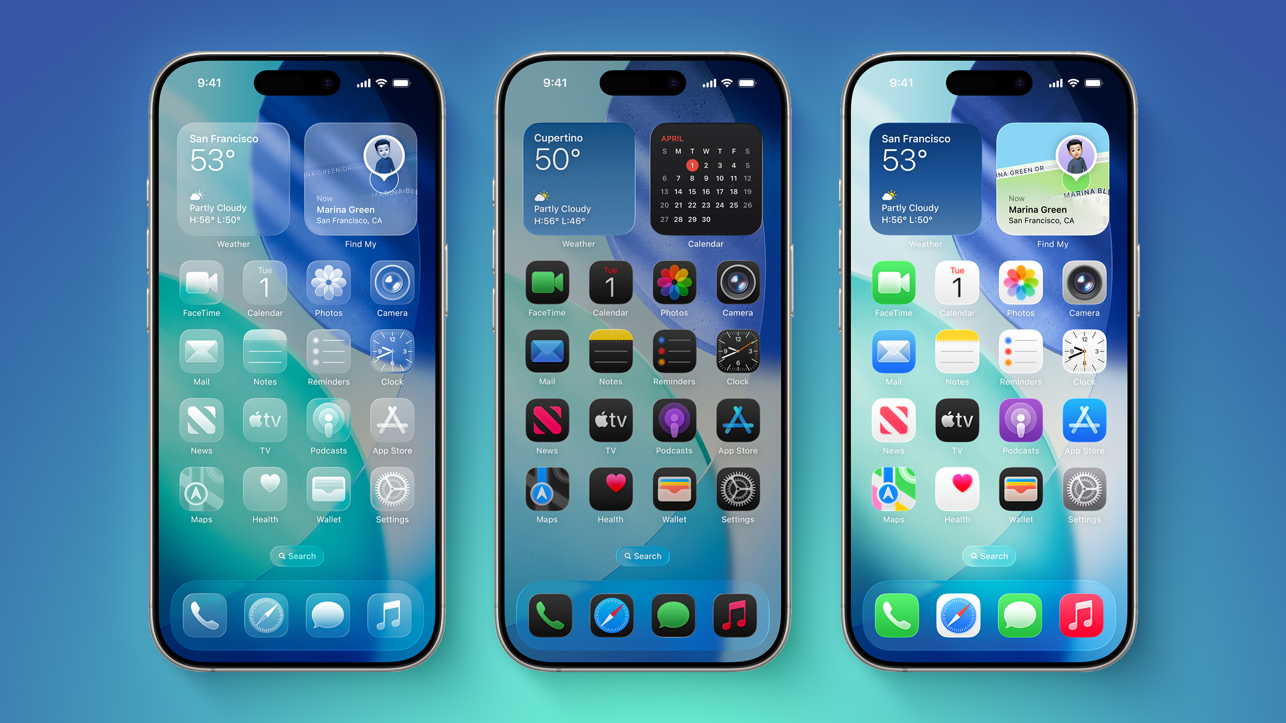
It's been two days since iOS 26 was released, and Apple's new Liquid Glass design is even more divisive than expected.

iOS-26-on-Three-iPhones.jpg

Any major design change can create controversy as people get used to the new look, but the MacRumors forums, Reddit, Apple Support Communities, and social media sites seem to feature more criticism than praise as people discuss the update.

Complaints

There are a long list of complaints about Liquid Glass, from the impact on readability to lag caused by animations. Here are some of the main critiques:
Some People Like It

On the MacRumors forums, complaints about Liquid Glass are interspersed with responses from people who have been using it during beta, and the consensus is "you'll get used to it."

It does always take time to get used to a new look, and Liquid Glass will become less jarring as people become accustomed to the new animations and the behavior of buttons and other interface elements.

Not everyone hates Liquid Glass, and there are also many positive comments from people who prefer the new design. Some of that sentiment:
Media Complaints

iOS 7

Everyone remembers iOS 7, because it was the first big design change that Apple made to iOS. Apple did away with skeuomorphism in favor of a "flat" design, and it was not a change that people were prepared for. A lot of the comments shared when iOS 7 came out mirror the comments we're seeing now about Liquid Glass.
Despite the complaints about iOS 7, Apple stuck with it. There were ongoing refinements to fix bugs and to tweak the overall design, but Apple didn't reverse course. Design updates in iOS 8, iOS 9, and iOS 10 didn't change the fundamentals, but it got better and bette... Click here to read rest of article

Article Link: iOS 26's Liquid Glass Design Draws Criticism From Users
 
Personally, i find it to be significantly better on my iPhone 15 pro and M4 MBA. My battery usage is much better on both devices, but especially the 15 Pro. Most days I'm down to 40% by 8pm having removed charger at 90% at 6am. Today I'm already to 6pm and sitting at 70%. Adaptive power is not on. Usage is the same as normal. I also find it to actually be easier for me to see and more fun to use. The old design gave ne much more fatigue during night use.
 
  • Like
Reactions: aperfectcircle
The basic problem is that Tim Cook has neither good taste nor engineering judgment. All the OS's are increasingly difficult to use. "Design is the way it works"-Steve Jobs. From the persistence of the butterfly keyboard, to the self-driving Project Titan, to the Vision Pro, Tim demonstrates time after time after time that he only understand cheap, and pretty.
 
The compliance are legitimate concerns that Apple needs to address, while the likes mentioned in the article are more about one’s taste for the visual aspect of iOS 26. I would actually prefer a flatter more minimalist style without bug bugs…..
 
Its fine. Its far more readable then i thought it was going to be and i haven't really had any issues reading anything as of yet. It does smack a bit of Windows Vista's areo glass vibe but i liked the IDEA of how that was done all them years back, but not the execution for Windows.

But then again this is Apple we are taking about here, not microsoft, so you know they are putting in far more effort into this then anything microsoft does.

WHAT THIS SHOULD BE IS THE START OF THEMES for IOS.....Because thats what this is... a system wide THEME... most of the functionality is the same. They should open up the system to a themes store where users (Once certified by apple themselves) could sell various themes for their ios devices and open up a whole new market.

Id love to have a modern "Classic" theme of the skewmorphism theme return. I dont see why apple cant do that, and i think eventually they will have to (years down the road) cause lets be real here theres only so much they can do with software updates.
 
  • Like
Reactions: blicked
I like it on my iPhone 15 Pro Max, and on my iPad Pro M4, and it’s fine on my iMac M3, but I’m less impressed by it on my iPad Mini 7

¯\_(ツ)_/¯
 
I'm just waiting for Apple to come out and tell everyone, "You're looking at it wrong." Just like when they screwed up the antennae on the previous iPhone and told us we were just holding it wrong.
 
  • Like
Reactions: reinem85
I think the trick is to make the software taxing on older phones, make it so hard to imitate that it takes special chips to run it. But don't sell the phone with that chip just yet, let everyone update to it so it slows down their phones then introduce the phone that gets the effect so well people want to use it because nobody else can do that. That is a lot of sheisty stuff under the hood. Reminds me of the end of the motorola chips and g4 chips and intel chips. Apples next chips is going to show this off really well if you pony up over a grand for it. 😉
 
  • Like
Reactions: reinem85 and jlnr
If they toned done the horror of the rounded corners and the thin weedy lines and the gappy windows - it would pass as a decent UI. A flat mode would be nice
 
  • Like
Reactions: Wieslawo
Register on MacRumors! This sidebar will go away, and you'll see fewer ads.