Become a MacRumors Supporter for $50/year with no ads, ability to filter front page stories, and private forums.
If they toned done the horror of the rounded corners and the thin weedy lines and the gappy windows - it would pass as a decent UI. A flat mode would be nice
 
  • Like
Reactions: Wieslawo
The liquid glass is fine. Apple did a decent job of taking care of the worst usability issues. It may not be to everyone’s tastes and I personally think it isn’t going to age well. But it’s easy enough to ignore.

It’s the weird bubbly outlines around EVERYTHING that’s the issue. I’ve only used this on my old iPad but I’m assuming the effect is the same across all the platforms. Buttons and sidebars that don’t feel like they are part of the window or app that owns them is just weird. Sometimes it’s downright confusing (like I can’t easily figure out how to minimize a sidebar or exactly which parts can be minimized). It makes the button controls really distracting when these types of UI elements should fade into the background so you can focus on content. It’s just BAD. Not in a “I don’t like change” way. It is objectively worse than what we had before. If they can just tone that part down (or rethink it entirely) this liquid glass update would be much better.
 
I like it. It ran choppy for about 2 hours after I updated, but it runs smoothly now. I like the animation also. I feel like the notifications are more gentle (if that makes sense).

No matter what Apple did, people are going to complain. If they didn’t change it, people would complain about that.

To people who are complaining, it’s a phone.
 
It sounds bad. Wasting RAM and processing power and battery for unnecessary animations. But hearing how bad it is makes me want to update so I can try it out before they get rid of it all. Because it sounds like a cool novelty, but the novelty will wear off quickly, and then it will probably become annoying.
 
The UI elements are inconsistent. I love the gummy/droplet sliders in the General settings. I wish that were used everywhere, such as in browsers and emails, etc. Where the "liquid glass" is needed, it just isn't there.
 
  • Like
  • Disagree
Reactions: Tdude96 and Koneka
With that logic they wouldn't have scrapped Launchpad on macOS - but they did. Instead, they've left everyone with Spotlight. Perhaps, though, since Spotlight has so many fans, they should just scrap the iOS app icons altogether, and everyone can just search for the apps via Spotlight.
you missed my point
 
The best version of iOS26:

Settings > Accessibility > Display & Text Size > Reduce Transparency

Also:
Settings > Accessibility > Motion > Reduce Motion

The ugly lines around everything remain, but all of the search bars/folder backgrounds on the home screen are just blurred, mostly opaque backgrounds now that are much closer to iOS18.

Also:
Press and hold the lock screen > Customize > Click the clock > change from Glass to Solid > click Done in the top right.
 
I didn't like it that much at first but it only took a day to grow on me. The icons flying in when I unlock my phone does feel a little slow though.
 
  • Like
Reactions: Koneka
I don’t think it’s actually being that negatively received, I just simply think that no one wants to read a thread that’s “The New iOS Is Good, I Have No Problems, It Works Great”.
I would love to read an article about someone’s positive experience. I don’t understand how anyone, especially Apple, could feel like there’s anything positive about this at all. I mean, “fresh” is one thing but this is literally like polishing a turd. There are blatant… Sorry, your comment isn’t the place for me to rant.

I just want someone to point at these things everyone is complaining about and provide a counter argument. Give me a legitimate reason why you believe it is a better or even acceptable experience to have text on top of text and a lack of definition when a white icon is on top of a white background. Tell me how it’s more intuitive and a joy to have to go about all four corners of your 6+” screen to find menu items.

To be fair, a lot of complaints are frivolous and will likely be resolved. They shouldn’t exist, for a three trillion dollar company, but they’ll be fixed this version or the next or the next.

The larger issue is the whole design language. The entire concept of “liquid glass” should have been rejected at the concept phase. The concept itself is irrational for a small flat screen that’s already trying to do too much.

So, I want to know from the people who love it, what specifically is it you love and how do you feel about the larger issue of usability? Because I honestly think you’re either lying to us or to yourself.


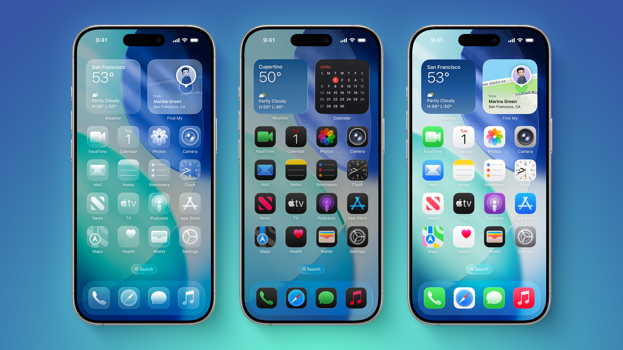
It's been two days since iOS 26 was released, and Apple's new Liquid Glass design is even more divisive than expected.

iOS-26-on-Three-iPhones.jpg

Any major design change can create controversy as people get used to the new look, but the MacRumors forums, Reddit, Apple Support Communities, and social media sites seem to feature more criticism than praise as people discuss the update.

Complaints

There are a long list of complaints about Liquid Glass, from the impact on readability to lag caused by animations. Here are some of the main critiques:
Some People Like It

On the MacRumors forums, complaints about Liquid Glass are interspersed with responses from people who have been using it during beta, and the consensus is "you'll get used to it."

It does always take time to get used to a new look, and Liquid Glass will become less jarring as people become accustomed to the new animations and the behavior of buttons and other interface elements.

Not everyone hates Liquid Glass, and there are also many positive comments from people who prefer the new design. Some of that sentiment:
Media Complaints

iOS 7

Everyone remembers iOS 7, because it was the first big design change that Apple made to iOS. Apple did away with skeuomorphism in favor of a "flat" design, and it was not a change that people were prepared for. A lot of the comments shared when iOS 7 came out mirror the comments we're seeing now about Liquid Glass.
Despite the complaints about iOS 7, Apple stuck with it. There were ongoing refinements to fix bugs and to tweak the overall design, but Apple didn't reverse course. Design updates in iOS 8, iOS 9, and iOS 10 didn't change the fundamentals, but it got better and bette... Click here to read rest of article

Article Link: iOS 26's Liquid Glass Design Draws Criticism From Users
I like it!!! But there are DEFINITELY bugs that need to be fixed on all devices. Yes I remember the change to IOS 7 back in 2012 and the multitude of people that complained about it at first.
 
  • Like
Reactions: aperfectcircle
Of course it would! There's no functional reason to make things transparent. Sure it might look nice, but it's worse in function.

There's a reason why books and computer screens aren't transparent, except in movies.

It's the first time every I've opted for the Accessibility features to reduce transparency.
A lot of those who like the liquid glass design seem overly aggressive and condescending if you disagree. Reminds me of when Apple announced the notch on macbooks.
 
Register on MacRumors! This sidebar will go away, and you'll see fewer ads.