Good thing we're entirely ignoring the fact that they take up the exact same amount of space
The balls definitely take up more space.

I like the bars better too.
Good thing we're entirely ignoring the fact that they take up the exact same amount of space
lol why would you guys/gals believe they fixed all those things in those 2 weeks... the first beta was just for people to get started upgrading their apps, many of the features that were missing from the beta were already in the conference and prob beta 2 was already cooked inside apple, just not released yet. Apple was and still is debugging beta 3 or 4 since the first beta was out. This is all to get more hype w/ every beta so places like macrumors can keep the iOS news hot and trending.
I bet many people at first thought that they changed unlocked gesture to sliding up, because of that arrow just below the "slide to unlock". Eventually, everyone will figure it out after a couple of tries of course. But the point is: if someone shows you a design which shows "slide to unlock" and arrow pointing up, but actually unlocks by sliding to the right, and then tells you that it was thought through and through in all the tiniest details, does that bring you trust and confidence about the quality of all the thousands of other things in their design?
People work perfectly fine with badly designed products (i.e. Android), but does that mean that it's okay for Apple design to become flawed too? Even if it's tiny flaws that are hardly noticeable, is it a good thing that they appeared in the first place?
One does not simply redesign all icons in 2 weeks. Give them time.
Awesome you have inside knowledge. Can you post your source?
I hate to tell you people complaining about the icons, but they are nice and Apple is not going to change them. They are featured on its website.


It actually takes less space loll
I too, can draw lines in Photoshop.
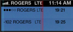
One has wifi and one has LTE. Pick one and have another go.Your balls are mostly empty...
Hey guys, has the Beta 2 fixes up issues with the phone app? beta 1 it was very slow to display the phone menu, multiple freezes etc.
Ludicrous.

Yes, the phone app is much more reliable and responsive now. Switching from the VM tab to another tab and back to VM does not freeze up the phone anymore (which was a documented bug in the Read Me for beta 1). I actually had the phone app crash on me and kill the springboard during a couple of calls with Beta 1. So far, the phone app is almost as responsive as it was in iOS6 (still has a little bit of lag though).
Does anyone know if the podcast app now works better with Beta 2? In Beta 1, it would crash constantly. I can't update until I get home, as my Beta 1 won't let me accept the certificate on the wifi here at work. The button presses, but does nothing.
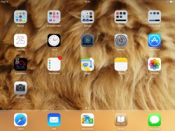
The dock on iPad looks horrible!
I bet it will make it smaller. The LTE font is actually more thiner. I would want to see that too loll
Ludicrous.

Peanuts. Numeric Signal Strength master race still.
Image