Become a MacRumors Supporter for $50/year with no ads, ability to filter front page stories, and private forums.
You can't find a perfect OS. Like swiping to delete in mail...you kinda learn the OS as you use it, and thats with almost every operating system. It doesn't always have to be flat out obvious.

Agree with this, and I can understand that it's not always possible to find a perfect initerface solution for a new problem at first attempt. But iOS 7 is the case when they actually SOLVED the design problem and made it (for example lock screen) flat obvious in iOS since the very first version, but then broke it and made it confusing in iOS 7.
 
Here's the difference for me...

LsYN9NW.jpg


I don't know why I'm sticking my oar in. I'm really bothered one way or another.:)
 
After updating iPad and restoring all the app settings and passwords didn't have to be typed in….I really despise having to do that. Not sure if they use the new keychain to store all of those settings or if its how they are doing the restore from iCloud, but it made life easier.

Its not just the apple apps, several other apps were tested and all settings were still there.
 
They should. Can't get any worse.

----------


They designed the current lot in 5 minutes, 2 weeks is a lifetime.

Ffs... almost everybody (and PLEASE correct me if I'm wrong...) has MUCH more non-Apple apps than core Apple apps. I have about 45 installed, & I do not think is above average by more than a slim margin, if anything. So......... NONE of these at least 30+ apps that we ALL have installed (different ones, obviously) had their icons designed by fancy-pants graphics artists at Apple.
Yet, SOMEHOW.... even though we ALL have many, many more of these small, 3rd party app, much less professionally designed icons on our iDevices.. we NEVER cared even a teeny little bit. We just tapped the icon that loaded our fave app or game, smiled... & enjoyed!
Anybody that is still spewing this ignorant bs is a liar.... or prove me wrong & post a current screenshot of your phone, showing you've tailored your life to only use apps that have the most beautiful and artistic icons. Lol, no? You don't give a damn what an icon looks like, you read the reviews & look at how many stars, then try it out? Huh, same with me & everybody else. Weird.
 
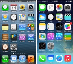
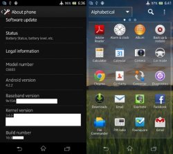
What separates iOS from Android with this UI ? Nothing. People buying Apple products don't want an Android clone.

Exactly how is it an android clone? Because the design style is a little more modern? Because a few basic features have been added to allow mildly quicker hardware control?

The underlying engine and OS organization are clearly the same as in iOS 6. Everyone except grandparents are going to love it.

With all the media attention and OTA updates, it'll be the fastest OS adoption ever

----------

Ffs... almost everybody (and PLEASE correct me if I'm wrong...) has MUCH more non-Apple apps than core Apple apps. I have about 45 installed, & I do not think is above average by more than a slim margin, if anything. So......... NONE of these at least 30+ apps that we ALL have installed (different ones, obviously) had their icons designed by fancy-pants graphics artists at Apple.
Yet, SOMEHOW.... even though we ALL have many, many more of these small, 3rd party app, much less professionally designed icons on our iDevices.. we NEVER cared even a teeny little bit. We just tapped the icon that loaded our fave app or game, smiled... & enjoyed!
Anybody that is still spewing this ignorant bs is a liar.... or prove me wrong & post a current screenshot of your phone, showing you've tailored your life to only use apps that have the most beautiful and artistic icons. Lol, no? You don't give a damn what an icon looks like, you read the reviews & look at how many stars, then try it out? Huh, same with me & everybody else. Weird.

Perfect. Great great point. I totally agree
 
The calendar needs change I think. What happened to the dot indicators for each day.
 

Attachments

  • image.jpg
    image.jpg
    64.7 KB · Views: 118
My only wish list features are a dark background on white text mode (I have a feeling all that white will start hurting my eyes after extended use), being able to set default apps, and a more Expose like multitasker for the iPad (though if they keep multitasking as is, I'll still be happy).

I don't see much to gripe about with iOS7. It looks cleaner, jumps between apps faster, and seems easier to use overall. The default Apple icons being a little goofy looking is only a small, inconsequential ding to an overall solid looking package.
 
For the music app they replaced every other letter with a dot... WHY now i have to look for the closest letter, not be able to do it at a glance? I thought apple was the master at UI?! Im getting real sick of mr ive.

Yeah, it takes a pretty solid understanding of the alphabet. Just wait for first grade-- that one's a doozy!
 
Exactly how is it an android clone? Because the design style is a little more modern? Because a few basic features have been added to allow mildly quicker hardware control?

The underlying engine and OS organization are clearly the same as in iOS 6. Everyone except grandparents are going to love it.

With all the media attention and OTA updates, it'll be the fastest OS adoption ever

----------


Perfect. Great great point. I totally agree

How is removing all color modern ? They took 'simple' to the ugly and boring stages.

My beef with iOS 7 has nothing to do with features, those are all great. Design flow is fine, its the boring ass UI.

----------

Actually a lot of things. The way both OSes work are still vastly fundamentally different.

And for the upteenth time...its not an Android (or any other OS) clone.

I am willing to bet that if you take iOS6, iOS 7 and a common Android, show people the screenshots side by side. Most people will confuse Android with iOS 7.
 
I bet many people at first thought that they changed unlocked gesture to sliding up, because of that arrow just below the "slide to unlock". Eventually, everyone will figure it out after a couple of tries of course. But the point is: if someone shows you a design which shows "slide to unlock" and arrow pointing up, but actually unlocks by sliding to the right, and then tells you that it was thought through and through in all the tiniest details, does that bring you trust and confidence about the quality of all the thousands of other things in their design?

People work perfectly fine with badly designed products (i.e. Android), but does that mean that it's okay for Apple design to become flawed too? Even if it's tiny flaws that are hardly noticeable, is it a good thing that they appeared in the first place?

Ok. I'll agree with that. Still, it is a bit nit picky but a valid point.
 
Anyone having problems with wifi?
I noticed this with ios7 beta 1 that my wifi wouldn't work at first, but now I can't get it to work at all in iOS 7 beta 2
 
Here's the difference for me...

Image

I don't know why I'm sticking my oar in. I'm really bothered one way or another.:)

I wish they had left the "Charging" thunder logo inside the battery...i feel its just a space taker...and also if they could possibly fit the % inside the battery icon when its not plugged in would be great as well.
 
I wish they had left the "Charging" thunder logo inside the battery...i feel its just a space taker...and also if they could possibly fit the % inside the battery icon when its not plugged in would be great as well.

Damn. Responded to wrong comment. Grrrr
 

Attachments

  • ImageUploadedByTapatalk HD1372119989.827778.jpg
    ImageUploadedByTapatalk HD1372119989.827778.jpg
    409.4 KB · Views: 327
  • ImageUploadedByTapatalk HD1372120014.338967.jpg
    ImageUploadedByTapatalk HD1372120014.338967.jpg
    74.9 KB · Views: 283
Last edited:
Ffs... almost everybody (and PLEASE correct me if I'm wrong...) has MUCH more non-Apple apps than core Apple apps.

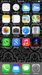
Anybody that is still spewing this ignorant bs is a liar.... or prove me wrong & post a current screenshot of your phone, showing you've tailored your life to only use apps that have the most beautiful and artistic icons. Lol, no? You don't give a damn what an icon looks like, you read the reviews & look at how many stars, then try it out? Huh, same with me & everybody else. Weird.

Hey, guess what? You found one! My first home screen is limited to core app's I use daily, which happen to be Apple stock apps* (my second home page consists of folders based on app functionality). It's not a deal breaker, but it is important. Why? Easy identification produces a faster workflow/access to apps. The iOS 7 apps are so one dimensional and lackluster, if I didn't always keep my apps in the same order I would be searching for the app icon longer than I should. Form does facilitate function, an app with a more distinguishable icon makes a difference. I suppose I'm a liar, along with my friends in Pixar and Cupertino, who were very excited during the iOS 7 keynote, only to be progressively disappointed with further development.

*Aside from Yahoo! weather, Google, Google Maps, WhatsApp (I hardly use it now) and Equalizer Pro. That's 75% Apple iOS core apps.
 

Attachments

  • image.png
    image.png
    250.7 KB · Views: 170
Register on MacRumors! This sidebar will go away, and you'll see fewer ads.