Become a MacRumors Supporter for $50/year with no ads, ability to filter front page stories, and private forums.
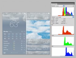
Ive was the wrong choice

There is a certain possibility, that Ive is not a genius for doing software design. First, horrible colors and ugly icons - now text made unreadable.
The practical improvements for access of certain settings do not need mountains of inspiration to invent.
 
I hope they make the icons hot pink just to bring some sort of relevance to these complaints

It should seriously happen. I love the color pink. The icons are hideous. The UI and icons should look like the FlatIcons theme. Then it would be perfect and no one would complain.
 
Is anyone having an infinite loading loop of macrumors.com in iOS7 beta 2 - happens Safari, Roccat and Chrome (all three browser I have) it's really annoying.

Also can't remove or delete apps as every time I hold down it resprings :mad: anyone else having these problems?
 
the time doesn't show up on the lock screen when I'm listening to music. the time is replaced with the music controls that popped up when double clicking the home button. also when the next song plays, the lock screen still shows the previous song playing. everything else seems much smoother tho so i don't mind
 
While male and female voices have been available in other languages, this is the first time English male/female voices can be activated.

Now can they make British Siri understand my American accent? I set Siri to Birtish English soon after I got my iPhone5 because I preferred the genteel English butler sound. But, under the UK English setting, Siri's accuracy dropped tremendously as compared to the American English setting, so I had to go back.
 
dots are generic

I must be nuts, but I actually like the dots.

I like the dots as a general indicator, they're aesthetically pleasing, but cell reception is already pretty well established as having a specific icon. One that conveys the exact same amount of information as the dots, in less space, while being specific to cellular signal.

Bluetooth is there. Battery is there. Wifi is there. They all have their specific icons. Cell signal should as well. The top display has too much going on to risk confusing users with cutesy thermometers. Consistency has benefits in user interface.
 
Apple's updates used to be exciting. New tools. Now they are yawn (new bling) or downright disappointing (loss of old functionality). Apple needs to maintain full backward compatibility so that our old tools (Apps/Applications/Utilities) and data (music, video, spreadsheets, documents, databases, etc) are still accessible in the future. Why don't people upgrade? Because they can't continue using their old data.
 
It's not that it's difficult, but its probably because it uses an unnecessary amount of battery and CPU cycles to pull the info from the Internet all the time.

Really? Because it is already doing that to bring the weather to the notification center. It checks at a regular interval in the background to give you the current forecast in the Today tab of notification center. People act like widgets and live data are battery hogs but when done correctly, there is negligible impact on the battery.

----------

They sure hammered out a lot of bugs in two weeks! Much more stable.

Most likely this build was pretty much done during WWDC but they pushed out a build that was tested for much longer. They didn't finish beta 2 last night and push it out today. That would be quite dangerous.
 
contrast please!

I hope the new iDevices come with a big contrast knob so I can make the type actually legible.

Seriously, I know they're trying to look all modern and dainty, but does no one at Apple glance at the Histogram palette and think "Hey, we could use that bottom half of the color range too!"
 

Attachments

  • fix-the-contrast-1.jpg
    fix-the-contrast-1.jpg
    127.8 KB · Views: 325
  • fix-the-contrast-2.jpg
    fix-the-contrast-2.jpg
    172.3 KB · Views: 311
There's a clock icon on control center.......?

It's for easy access to alarms. Love it when I go to check my alarms before I got to bed. No need to unlock the phone.

However, the white background illuminates the room and is a little hard on the eyes if the brightness isn't automatically brought down.
 
Voicew Memo's App

That red button with a fine black gap around it then a silver frame. It looks so...so... what's the word...skeuomorphic!... that's it.
 
Whoa, I hadn't noticed this before but in the new catalog view, which replaces the coverflow view, in the music app you can pinch in and out and you can increase or decrease the rows of album art, respectively.

Too bad the system bar text is still visible... :/
 
I like the dots as a general indicator, they're aesthetically pleasing, but cell reception is already pretty well established as having a specific icon. One that conveys the exact same amount of information as the dots, in less space, while being specific to cellular signal.

Yes, they take up too much space. If your provider name is longer there is not enough space for all the other icons.
 
the amount of changes in ios is staggering. The API additions rippled fairly significant organization and changes deep into cocoa's traditional frameworks.

To add a complete UI redesign on it is going to take some time to say the least. They are all probably drinking coffee nonstop.

Complain around beta 4, but give them some breathing room right now.

Edit to give you an idea even beyond frameworks and UI:
They enhanced their compilers, including the objective C language itself, and xcode gets big new and powerful features (I'm under NDA so bear with me). Now we are used to xcode getting a bump with the OS ride and a little objective C tweak now and them (we got a few last time including ARC), but this one is rather large.

Folks need to appreciate the breadth of this. Apple is not just hardware and a springboard: They own the development tools, including the damn programming language itself. This massive echosystem needs to move together to work right.
 
Last edited:
That Reminders list view seems to have some remnants of skeuomorphism.
I spy paper texture and letterpress!

Right? I thought I noticed this even in beta 1 (via screenshots as I do not have the new OS on my phone). I did not want to mention it, however, as I thought it was just me seeing it.
 
can anybody comment on the notification banner? does it still block the top buttons when it appears? massive pain in the ass having to wait for it to disappear, or scroll down to make it disappear
 
Register on MacRumors! This sidebar will go away, and you'll see fewer ads.