Become a MacRumors Supporter for $50/year with no ads, ability to filter front page stories, and private forums.
the amount of changes in ios is staggering. The API additions rippled fairly significant organization and changes deep into cocoa's traditional frameworks.

To add a complete UI redesign on it is going to take some time to say the least. They are all probably drinking coffee nonstop.

Complain around beta 4, but give them some breathing room right now.

well said
 
The voice memo app looks like crap.

Just kidding, it looks actually functional for the first time ever.

Anyways, they rearranged Control Centre slightly.
6RvVbkt.png
 
can anybody comment on the notification banner? does it still block the top buttons when it appears? massive pain in the ass having to wait for it to disappear, or scroll down to make it disappear

you can swipe it upwards when you get banner on top and it disappears.
 
can anybody comment on the notification banner? does it still block the top buttons when it appears? massive pain in the ass having to wait for it to disappear, or scroll down to make it disappear

Just push the notification upwards. It'll go away. Kinda like swiping the notification to the left does in iOS 6.
 
With most of the developers' comments on here, at this rate, by the fall iOS7 should be just great!

I hope so because I can't wait to use it. However, knowing the people on this forum they'll probably say it's already boring and dated because it seems like everyone is rummaging through these betas...
 
For someone like me who has very poor eyesight, the extensive use of the "thin" font may make iOS7 a deal-breaker. I love the iPhone, but I can barely read that weather screen, for starters. Fortunately, iOS6 should be adequate for at least a couple more years.

It's disappointing, though. Apple has always been a leader in the universal accessibility arena. This redesign seems to undo so much of what has been accomplished.

There's an option to make the fonts bold so they stand out more and it's actually a lot easier to read. I have it turned on just because it's less eyestrain.
 
FaceTime Audio works over cellular!

Not sure if someone has posted this or not. FaceTime Audio works over cellular. Just did a 20 minute call with myself being on wifi and the other person on LTE driving. Anyone else have this experience? I called her, so Wifi called cellular and it worked!
 
I hope they make the icons hot pink just to bring some sort of relevance to these complaints

So only your opinion matters . . . . got it! ;)

For someone like me who has very poor eyesight, the extensive use of the "thin" font may make iOS7 a deal-breaker. I love the iPhone, but I can barely read that weather screen, for starters. Fortunately, iOS6 should be adequate for at least a couple more years.

It's disappointing, though. Apple has always been a leader in the universal accessibility arena. This redesign seems to undo so much of what has been accomplished.

No, as stated above your opinion doesn't matter. Only those that love everything about whatever Apple does.

I do, however, agree with you and the poster that mentioned contrast. I think someone really missed the mark on making the design scheme functional for a broad range of folks.

Anyways, they rearranged Control Centre slightly.
6RvVbkt.png

Now THAT is much better Apple . . . kudos.
 
Right? I thought I noticed this even in beta 1 (via screenshots as I do not have the new OS on my phone). I did not want to mention it, however, as I thought it was just me seeing it.

I don't think a little of what people are calling skeuomorphism is a bad thing. As long as it's not heavy handed a little texture can be a good thing. It looks nice and light in the notes app.
 
can anybody comment on the notification banner? does it still block the top buttons when it appears? massive pain in the ass having to wait for it to disappear, or scroll down to make it disappear

Dude just swipe from the left of the screen to the right... they did it for a reason
 
For someone like me who has very poor eyesight, the extensive use of the "thin" font may make iOS7 a deal-breaker. I love the iPhone, but I can barely read that weather screen, for starters. Fortunately, iOS6 should be adequate for at least a couple more years.

It's disappointing, though. Apple has always been a leader in the universal accessibility arena. This redesign seems to undo so much of what has been accomplished.

In Accessibility there is an option to make fonts bolder and larger.
 
Not sure if someone has posted this or not. FaceTime Audio works over cellular. Just did a 20 minute call with myself being on wifi and the other person on LTE driving. Anyone else have this experience? I called her, so Wifi called cellular and it worked!

facetime audio and video over cellular was working in beta 1 for me.
 
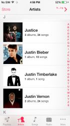
Music App

The Music app shows pictures of the artist rather tan the album artwork [when availible]. Also the Now Playing button top right always shows an ellipses and no longer shows the whole phrase.
PHP:
 

Attachments

  • IMG_1292.PNG
    IMG_1292.PNG
    461.7 KB · Views: 201
They just killed MacRumors on iOS 7

... with Beta 2 it constantly loops and is unreadable. You guys pissed someone off in Cupertino? :D
 
Tivo app and Skype still crashing consistently, and now Candy Crush Saga is crashing for me. Guess I'll be more productive...
 
Can read the time on a lock screen with white bg now

I did a quick search in this thread for "lock screen" and didn't see anyone post, so hopefully this isn't a dup...

I've been using a lock screen that has a lot of white in the background, and this made it impossible to read the displayed time except in the half second where the screen was fading in.

Beta 2 addresses the problem, apparently by making sure there are no truly white parts of the background (probably some grey overlay with opacity). It's nice to be able to see the time in the lock screen again. :)
 
Does anyone know if the podcast app now works better with Beta 2? In Beta 1, it would crash constantly. I can't update until I get home, as my Beta 1 won't let me accept the certificate on the wifi here at work. The button presses, but does nothing.

Still broken. :mad:
 
It's not that it's difficult, but its probably because it uses an unnecessary amount of battery and CPU cycles to pull the info from the Internet all the time.

Yes exactly. Plus, the Today view in notification center is Apples answer for "live weather information at a glance." A design decision, not a matter of difficulty. Not by having the icon constantly updating regardless of whether or not you're asking for the weather, but by having it available one quick swipe away whenever you feel compelled to check weather information.
 
Apple's updates used to be exciting. New tools. Now they are yawn (new bling) or downright disappointing (loss of old functionality). Apple needs to maintain full backward compatibility so that our old tools (Apps/Applications/Utilities) and data (music, video, spreadsheets, documents, databases, etc) are still accessible in the future. Why don't people upgrade? Because they can't continue using their old data.

Better send out a memo to the 93% of all iOS users that run the latest public release to let them know they can't access their data... oh. wait. :rolleyes:
 
Register on MacRumors! This sidebar will go away, and you'll see fewer ads.