Got a tip for us?
Let us know
Become a MacRumors Supporter for $50/year with no ads, ability to filter front page stories, and private forums.
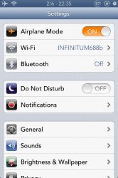
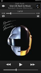
iOS 7 Realistic Settings Concept (Added Messages, Music, Maps, Passcode, Home screen)
- Thread starter GoGa
- Start date
- Sort by reaction score
You are using an out of date browser. It may not display this or other websites correctly.
You should upgrade or use an alternative browser.
You should upgrade or use an alternative browser.
Yes, Avenir must be the default font, look how beautiful iOS looks!
Font looks too feminine.. girly.
We've never seen Apple Flat so how can you say something is or isn't
Want to see Apple Flat? Go to Passbook, Music app and iTunes 11. Now that's Apple Flat.
Font looks too feminine.. girly.
For those who didn't know what feminine meant lol
u made my music app concept look crappy.
but nice job OP! best ios7 concept ive ever seen.
Pretty good concept here but there is no way the volume slider and scrubber would be the exact same size and shape.
Wow - love it - modern, clean and fresh. However, I really don't get the rounded corners at the top of the wallpaper; look really out of place IMO.
Any chance of posting a version with normal, squared corners? Just think it would look a little better
Yes, Avenir must be the default font, look how beautiful iOS looks!
reminds me of the WebOS font.
I couldn't be bothered to do the whole home screen, but you get the general idea:

I would love to, but I would have no idea where to begin!

if apple doesn't use this concept could you make this a theme and put it in cydia?
I would love to, but I would have no idea where to begin!
This upsets me, because Apple probably won't do something this amazing.I couldn't be bothered to do the whole home screen, but you get the general idea:
Image
Is there any chance we could see one of these icons sitting next to the new WWDC icon, for a comparison?
Is there any chance we could see one of these icons sitting next to the new WWDC icon, for a comparison?
Sure

I couldn't be bothered to do the whole home screen, but you get the general idea:
Image
I would love to, but I would have no idea where to begin!
You have to do the whole screen, would love to see what it would look like! Those icons are beautiful!
These look amazing. If I had to guess, I think the icons in iOS 7, some of them at least, will be similar to these. With the app UIs adopting the look of the WWDC app (almost unnoticeable gradients, highlighted icons instead of pressed down buttons). And hopefully some surprises
I love all of these, although one thing I'm hoping for in the music app along with iTunes 11's semi-flat design language is 11's 'Up Next' feature as well.
I'd actually love to see the music app look something like this, but really stunning work on all of these concepts OP!!!
I actually made another thread here about that concept.
I'd actually love to see the music app look something like this, but really stunning work on all of these concepts OP!!!
I actually made another thread here about that concept.
I couldn't be bothered to do the whole home screen, but you get the general idea:
Image
I would love to, but I would have no idea where to begin!
I think this could be similar to what Apple does. I have mixed feelings on it, though.
It's nice, but it looks a bit cartoon-y and a bit Samsung-y.

Font looks too feminine.. girly.
agreed. i can't be bothered to be thinking about women when i look at my phone. i need something bolder that reminds me of muscles. maybe something even something with some stubble.
----------
That is horribly amateur looking and very child like.
may I ask what exactly makes you think it looks amatuer and childlike?
IMO it looks like the OP put a lot of time and finesse into it. Everything is well proportioned, the lines are clean, the fonts are of the same size, all the buttons are large enough for use by fingers but small enough to not be obtrusive.
it looks very professionally done, honestly, I invite graphic designers to tell me their thoughts if I'm wrong.
moreover, I don't see the use of childlike elements.. the font is professional, the colors are those that Apple uses on a standard basis, I don't see any references to cartoon characters, there's no grammatical or spelling errors, none of the words are shortened the way children like to do with text messages...
I think I'm missing something that you're seeing?
I couldn't be bothered to do the whole home screen, but you get the general idea:
Image
I would love to, but I would have no idea where to begin!
Do it man! That looks really neat!
I'm 99% sure that the main font wont be Helvetica Neue Ultra Thin as it would be unreadable at that small of a size.Can you adjust your mockups so they use the Helvetica Neue ultra thin font? I'm assuming that's going to be the default font since the WWDC banners seem to use it.
They both look pretty different to me, but I guess we are all entitled to our own opinion.Could of at least mentioned how you just took mantia's design. http://dribbble.com/shots/1012172-Settings?list=users
Last edited:
Register on MacRumors! This sidebar will go away, and you'll see fewer ads.


