Got a tip for us?
Let us know
Become a MacRumors Supporter for $50/year with no ads, ability to filter front page stories, and private forums.
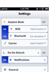
iOS 7 Realistic Settings Concept (Added Messages, Music, Maps, Passcode, Home screen)
- Thread starter GoGa
- Start date
- Sort by reaction score
You are using an out of date browser. It may not display this or other websites correctly.
You should upgrade or use an alternative browser.
You should upgrade or use an alternative browser.
Toggles themselves are skeumorphic in nature since they emulate the workings of a physical switch. I'm curious to see if they even make the cut or are replaced by something else entirely.
This is sort of proof that people don't actually know what skeuomorphic means. Switches are not skeuomorphic because they provide a function. The definition of skeuomorphic is resembling a real thing without providing function. The leather on notes doesn't provide a function, but a switch that looks like a switch does.
This is sort of proof that people don't actually know what skeuomorphic means. Switches are not skeuomorphic because they provide a function. The definition of skeuomorphic is resembling a real thing without providing function. The leather on notes doesn't provide a function, but a switch that looks like a switch does.
It isn't "sort of proof" of anything. That's an oversimplification of the concept. It's not black and white, there are varying degrees. I would not argue that toggles are at the same level as faux leather and stitching, but they are still a reference to a familiar, real-world design as a cue to how they function. There is no reason for a toggle to be represented in such a way in a digital environment and it is by no means the simplest or clearest way of doing so.
Nobody would argue that the flipping animation of calendar pages was not skeuomorphic even if it is "providing a function". There are other ways to provide function without visual cues grounded in the physical world.
Keep in mind that the broader definition of a skeuomorph is "A skeuomorph is a physical ornament or design on an object made to resemble another material or technique."
I do agree that when most people are referencing skeuomorphic design with regards to the iPhone they are using a narrow definition of ornamental and without function (and rightfully so), but toggles are definitely skeuomorphic in a broader sense.
Last edited:
Nothing's loaded on the map...
Seems just like Apple maps to me.
Do you expect iOS 7 to have flatter maps?
Looks amazing - Very modern, but clean and minimalistic. If iOS7 looks like this then I'll definitely upgrade from iOS5! 
----------
That or it's a *flat* ocean
----------
Nothing's loaded on the map...
Seems just like Apple maps to me.
That or it's a *flat* ocean
i need this now.
Are you on deviantART or anything like that?
Last edited:
Toggles themselves are skeumorphic in nature since they emulate the workings of a physical switch. I'm curious to see if they even make the cut or are replaced by something else entirely.
That is what I'd like to see, more than simple on-off or go to detail for each item in settings surely there is enough screen space to have on-off and go to details for each.
Sorry for butchering the concept but something like this...
SwitchWithDetail
Attachments
That is what I'd like to see, more than simple on-off or go to detail for each item in settings surely there is enough screen space to have on-off and go to details for each.
Sorry for butchering the concept but something like this...
SwitchWithDetail
I like the idea but it looks very messy
The message app looks a bit too much like a Winterboard theme. Maybe it's a bit too flat and rigid. Is would like the message app to remain friendly since we use it to talk to people. The heading font looks slightly too bold to me.
The music app in the other hand is GORGEOUS. It would make it a joy to use be music app again. Right now everything is list after list and opening the and choosing something I can't to listen to feels like a chore. Apple has to not be afraid of change. Not every tab bar needs icons and can be pill shaped text which allows text to be bigger and even more recognizable than icons and small text.
The music app in the other hand is GORGEOUS. It would make it a joy to use be music app again. Right now everything is list after list and opening the and choosing something I can't to listen to feels like a chore. Apple has to not be afraid of change. Not every tab bar needs icons and can be pill shaped text which allows text to be bigger and even more recognizable than icons and small text.
That is what I'd like to see, more than simple on-off or go to detail for each item in settings surely there is enough screen space to have on-off and go to details for each.
Sorry for butchering the concept but something like this...
SwitchWithDetail
Wow that is most ugly unintuitive interface mockup yet. Game over . Please try again.
Here is what I think iOS 7 will look like:
Image
Toned down shadows and gradients, but not completely flat.
What do you think?
This is exceptionally well done. Way better than anything else I've seen.
Register on MacRumors! This sidebar will go away, and you'll see fewer ads.


