Become a MacRumors Supporter for $50/year with no ads, ability to filter front page stories, and private forums.
The multitasking switcher looks a tad slower.

It appeared to be much snappier in earlier betas, but this gives it a much more natural look that still seems to be a bit faster than iOS 7's switcher.
 
Last edited:
Hmm, my Control Center looks different than the screenshot. The Brightness and Volume tracks don't have transparency/vibrancy, they are white. Same with the selected WiFi, Blutooth, Airplane, etc. They are just white circles with a black glyph.

Anyone else missing the transparency/vibrancy?
 
Could someone take screenshots of the Tips icon on the iPhone Homescreen, in Spotlight search and in Settings (so 120, 80 and 58 sizes), then upload the screenshots here in .png format?

It would be great if someone could also do the same for the Health app icons.

Thanks!

Here you GO!
IMG_0177_zps6d17a0b3.png
 
Finally UI improvements that make sense on a flat interface made by Apple. That Bookmarks icon in Safari was driving me crazy.
 
What are you talking about? If there's another app that is 10MB or so that I want to download, but a stock app is taking up my space, it is significant.

I can understand Mail, Safari, Calendar, Clock, etc. because Apple doesn't have a way to set default apps, but the Podcast app, the Compass, etc. are useless to me and probably a lot of people. I'd rather recoup that lost space for ME; let me decide what I want to use and what I want to get rid of.
If a stock app is not letting you download a 10 MB app then there are bigger issues really. Realistically you don't want to get down to less than about 1 GB of free space on your phone anyway as it will affect the performance.

I'm all for being able to get rid of any app and/or have a way to change default apps, all I'm saying is that the space they take up wouldn't really be one of the main reasons behind it though.
 
Have you actually tried going back to iOS 6? It looks absolutely horrible.
Purely subjective as to many others it looks just fine if not even better. Not much to argue about there really as everyone has a different taste, and none of it is actually right or wrong or better or worse.
 
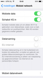
I'm VERY intrigued by this EU internet feature. What does it mean exactly? How is it different from roaming?
 

Attachments

  • iOS-8-eu-roaming-settings-225x400.png
    iOS-8-eu-roaming-settings-225x400.png
    29.9 KB · Views: 192
I'm sure IBM can't wait to incorporate those emoji in their software. Real professional.
 

Attachments

  • emojikeyboard.jpg
    emojikeyboard.jpg
    14.3 KB · Views: 193
That Tips app looks familiar.

Image

And yet nobody believed me when I said the leaks were real... :(

I mean, this screenshot was the first we even heard of Tips, and yet a lot of people dismissed it, even after they mentioned the app's existence at WWDC.
 
bless u can finally disable those silly and stalkery favorite contacts bubble heads from the app switcher
 
Register on MacRumors! This sidebar will go away, and you'll see fewer ads.