Got a tip for us?
Let us know
Become a MacRumors Supporter for $50/year with no ads, ability to filter front page stories, and private forums.
iOS 8 May Streamline Notification Center, Remove Game Center App, and More
- Thread starter MacRumors
- Start date
- Sort by reaction score
You are using an out of date browser. It may not display this or other websites correctly.
You should upgrade or use an alternative browser.
You should upgrade or use an alternative browser.
Everything about this, throw in the OS X one as well.
After submitting detailed crash reports that are specific and reproducible, and dealing with Safari et al. crashing constantly, I installed 7.1 and I haven't had one single crash (and I really really tried to bring it down).
I can't change the iOS 7 look for you, though.
I'm on 7.1 and Safari has crashed about 5 times so far.

Hmmm I may have to jailbreak to get the old look back. But that will probably cause even MORE crashes. Le sigh.....
Honestly, I hope Apple adds a preference pane (or whatever they're called) for the camera to iOS that will allow you to specify the frame rate, and audio bit depth/sample rate.
or just changes the default to 24fps 24 bit, 48khz, lossless.
or just changes the default to 24fps 24 bit, 48khz, lossless.
What they really need to do is:
1) focus on the iPad - really, it's just a blown up iPhone version - and the most obvious proof of it is the number of apps displayed on a folder;
2) add more features on the notification center and control center. I personally like to kill running apps while I don't use them - and to activate the multitasking I need to double click the home button - why not add a multitasking and home on the control center instead of timer and camera? I'd love to be able to also chose what displays there. As a plus, it would avoid the home button to get loose over time;
3) I like to use the orientation lock on the iPhone, it's simpler. However, when I watch videos, there isn't a simple button to enter full screen without unlocking the orientation. They could change it;
4) To answer a message within the notification center would also be great;
5) And to hide unnecessary apps like Game Center or Stocks - I like a clean home screen and that doesn't help;
6) Let developers add animated icons - for example - the clock moves (pretty useless since it's so tiny), but the weather app - which could display the temperature - doesn't, forcing me to open the app;
7) Add a dark theme and keyboard - specially at night, my eyes bleed. Do it just like tweetbot 3 did;
8) Let users have access to files data - like when the picture was taken, the size of a song, etc.
I guess that's what I'd want for now. Aesthetically speaking, I personally don't think iOS looks needs to be changed other than updated (specially certain icons).
I look forward to a more intuitive Notification Center. Perhaps they can also un-bork the Shift key and not highlight it when it's not supposed to be. I can't believe how dumb that is.
They highlight it because the first letter is automatically capitalized...
----------
textedit has the option to remove special formatting?
Yeah, hit command shift T to switch between plain text and formatted text.
Preview also is a PDF viewer. But since we now have iBooks, there is still another PDF viewer in both iOS and OS X. And iCloud document storage is app-specific. So you won't find your PDFs unless you remember which app you used them with. The simplicity of not having a file system.Can anyone tell me why Preview would be a good app to have? Isn't it just a photo viewer??
Note: I have just woke up so I might be loosing the plot.
Getting rid of the Game Center app sounds like a worthy goal to me. That should be their first priority.
If they were to take away the Game Center standalone app and instill a small part of it on every game would that not take up a lot more space then the game center app alone? Thus taking away more space for the consumer?
No, not at all. Basically they would just take away the app icon and have the app as an integrated function of the OS instead of an app. It would still work exactly the same when you are in a game as it does today. They would probably have game center as a little section in the settings app instead or something.
What does Game Center have to do with iOS 7? It existed before that.Omg I love Game Center !! Nooo
Said no one
Apple finally fixing the terrible iOS 7
Thanks
As far as i'm concerned apps like stocks and voice memos offer very little to be standalone. Stocks can stay as part of notification center with option to not show them and voice memos can reside in the control center and recorded files can be saved to the camera roll with options to futher edit them if needed.
Game centre if stopped existing right now actually would be a plus for me because its a wasted space right now for me. Other apps like passbook and newsstand should be optional or at least with option to hide them like nike+ iPod is.
Game centre if stopped existing right now actually would be a plus for me because its a wasted space right now for me. Other apps like passbook and newsstand should be optional or at least with option to hide them like nike+ iPod is.
It would be nice for the USER to get rid of any app they want to.... nice to see stupid game center going away, that was useless. I would love to get rid of other buklshit apps like Passbook (which does NOTHING!), Stocks, newsstand and Apple Maps
While we're at it, refresh the icons so they are pretty again....
Passbook does nothing?
Huh, so I must be imagining paying for Starbucks every day with it or using it as a replacement for my YMCA card so I don't have to carry a wallet to the gym. Or the fact that I used it to gain entry onto my business flight last week.
geeze....the Big Apple has really doubled down on the iOS UI. Frankly, I've grown tired of it. OK, that's an UNDERSTATEMENT. They really need to update the whole "tile board" UI / app navigation and focus more on user flow. I wouldn't even mind a different UI for iPhone vs. iPad. Things really haven't changed since the first iteration on the first iPhone. Is this rocket science....hell no. But somebody at Apple surely must think it is. These painfully small, baby-step-type incremental updates are getting pretty annoying.
I would like to see a couple of the screens (say #1 & possible #2) dedicated to provide more dynamic information with a new layout (thinking a combination of cover flow and existing tiles). Then have the app tiles on the subsequent pages. Would also like to have several options for organizing / navigating / managing apps. For example, have a toggle that reorganizes based on most frequently used apps / alphabetical / most recently updated ... etc.
Again...this is not rocket science but obviously getting things done at Apple is more political than Washington, DC. I wish they would "refocus" their attentions on the big picture and get over dawdling over the minutia.
Apple is focusing on the big picture which is why you see incremental updates.
Stick Control Center where the Missed section is and use swipe up to get to multitasking. Double tapping the home button is archaic and not at all fluid.
While we're just asserting our own preferences as though it's universal...Double tapping the home button makes as much sense as anything else you would do, but putting control center where the missed section of notification center is makes no sense at all. First, it adds an extra step to get to control center, in part defeating the purpose of the feature. Second, control center has no logical business being in the same place as notification center. You go to notification center for information, and control center to manipulate things on your phone.
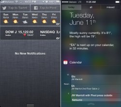
How about making "Today" actually useful, ie Google Now.
It is utterly useless in its current form. How about giving me information it thinks I will need to help make me productive.
My "Today" pane shows me TODAY's weather, TODAY's traffic conditions to work (in the morning) and from work (in the afternoon), TODAY's schedule, TODAY's stock prices....
So what you really want is something OTHER than the Today pane. Because as it stands, that portion of the notification center does exactly what its supposed to do.
Now I do wish they'd get rid of the "Missed" tab. That is worthless.
Still don't understand how iOS 6 is better than iOS 7 - I mean look at this....
Attachments
Last edited:
What they really need to do is:
1) focus on the iPad - really, it's just a blown up iPhone version - and the most obvious proof of it is the number of apps displayed on a folder;
2) add more features on the notification center and control center. I personally like to kill running apps while I don't use them - and to activate the multitasking I need to double click the home button - why not add a multitasking and home on the control center instead of timer and camera? I'd love to be able to also chose what displays there. As a plus, it would avoid the home button to get loose over time;
I hardly ever use the home button on my iPad. I use a 4-finger pinch to exit apps to the home screen and 4-finger swipe up to go into multi-tasking. 4-finger swipe sideways to access last used app. Can't help your iPhone home button though.
how about an option to be able to leave a group chat in messaging. That is a must!
yes please.
Isn't anybody noticing an app called tips..?
What is that..?
Additional Tips on how to get more from your device...
What does Game Center have to do with iOS 7? It existed before that.
The colors the interface etc
Don't kill me for asking, but what's the purpose of TextEdit now that Pages is free and we've had Notes since forever? I never use it on the Mac.
Most notably, I don't want pages on my phone. It takes up a fair amount of space. It also isn't free for everyone, only people that have bought a new device since the announcement.
Register on MacRumors! This sidebar will go away, and you'll see fewer ads.