Become a MacRumors Supporter for $50/year with no ads, ability to filter front page stories, and private forums.
Why would Preview have a white background and TextEdit a black Background. In OS X they both have transparent backgrounds, so they should be the same here.

Does it really matter? They obviously don't go in line with the iOS7 design guidelines so we should stop freaking out about these icons. They will not be there when iOS8 comes out.
 
I love how the Macrumors community is just totally convinced that Apple makes icons first and only then starts to engineer the actual software.

ha. yes. i am becoming further convinced that this site is densely populated w/ high school kids....
 
I guess you never heard of placeholders being used in alpha software...

I've seen plenty of placeholders before; remember the sketch-like ones that showed up in early iOS 7 betas? Also, why are the iMessage, Phone, and FaceTime app colors not consistent with the new ones from 7.1?
 
I think they could definitely be placeholders while the icons are being designed. Apple needs to do something else to the UI besides adding more stock apps, not necessarily widgets but maybe allowing users to change where they are placed or expanding the size of an icon to bring up more info.
 
But I thought iPads were for more than content consumption? If it is indeed also for creating that organization goes hand in hand with that mate. All I'm saying is that all other mobile platforms allow you to place folders with shortcuts to specific files or documents on the home screen or desktop; with Apple claiming that iOS is the "Most advanced mobile operating system in the world" (direct quote) why can't iOS do the same? I choose iOS because I'm an Apple fan. I want better ways to keep organized because I'm a fan of getting things done.

It's not that it can't, but Apple choose to do things in a different way. There're pro and con on both sides. I'm on Apple side in this case. I'm just tired of manually managing folders/files.
 
Haven't had time to read all the incredibly insightful comments on this thread, but here's my take on WHY we might see a Preview App and a TextEdit app....

(1) Tighter iCloud integration from OS X to iOS - utilizing the same programs across both platforms = simplicity.

(2) Apple's own PDF editor - I know the rumors are that these would be read-only, but I'll bet additional features would follow if not included at launch.

(3) But the MAIN reason is....better email attachment system - Think about this: its very easy to attach multiple photos or videos to an email via the Camera Roll (a default app). Think of these apps as file folders as well - in iOS, files are stored within the apps. So in order to beef up email attachments (sorely needed), Apple needs to provide a DEFAULT place for PDFs and DOCs to go. Personally, I'd prefer for them to simply use iBooks and iWork instead of ADDING more apps, but there are some hurdles with utilizing these two options - iBooks holds more than just PDFs and the iWork suite can hold a wide range of files from .docx, .pages, .pdf, .xlsx, .pptx, .numbers, .keynote etc.....

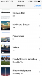
In order to start more simply, Apple can add a quick and dirty text editor (TextEdit) and pdf viewer/annotater (Preview). These are the default locations for pdfs and docs to go (which can easily be pulled from into other apps) and the attachment interface (which currently looks like the attached picture) would simply include "PDFs" and "Docs" as well. Selecting either would bring up a listing within preview or textedit just like the current selection of photos brings up the camera roll.

In my mind - this would be a welcome feature and would more than make up for adding two other icons (which would easily be placed in my utilities folder).

And for those asking "Why add TextEdit when there's already Notes and Pages" - why does Microsoft include NotePad when Word and OneNote are easily available? Why is TextEdit included on Macs? Perhaps someone doesn't want/have/need Pages - just a quick and dirty document editor.

Regardless, there really isn't any downside if it more closely aligns iCloud between OS X and iOS and bolsters email attachment options.
 

Attachments

  • Photo Mar 13, 3 28 04 PM.png
    Photo Mar 13, 3 28 04 PM.png
    68.7 KB · Views: 80
  • Photo Mar 13, 3 28 12 PM.png
    Photo Mar 13, 3 28 12 PM.png
    272.4 KB · Views: 84
Pages is only sort-of free.

That is, it's free as long as you opt to install the whole Pages/Numbers/iPhoto/Find My Friends package when iOS is first installed (only have to do this once per account), but otherwise it is not.

It's free with any new iOS (and Mac I believe too now), and you don't have to download the whole package that at once. When I got my iPad Air, I just downloaded numbers the 1st day. Also on my iPhone 5 it shows up in the purchased area, so yes its free now. The only way it's not free is someone who is running an iPhone 5 on iOS8, but like others said, you have the note app.
 
Those sure are some ugly icons... Apple is going flat.... they would never put the OS X icons there. I could design something 1000x better in 10 min. Please.

Plus many of their OS X icons suck, so why would they have double suckage????
 
Those sure are some ugly icons... Apple is going flat.... they would never put the OS X icons there. I could design something 1000x better in 10 min. Please.

Plus many of their OS X icons suck, so why would they have double suckage????

Placeholder icons..
 
I'm in favor of 'merging' silos rather than outright killing them.

Pages and Text Edit and Notes should all see the same files, yes.
This has already been done on iOS. It is called a library. Photos and addresses work this way and are accessible from multiple apps. In iOS 8, PDFs will be in a library too.

----------

The answer here is to remove the bloody silos that files are stuck in within each apps.
Not going to happen. The sandboxes have made iOS the most secure platform of its size and they aren't going anywhere. Deal with it. Or buy Android. Whatever.
 
No way. It would take me 5 min to make something much better.

What? Placeholder means not the final, they just had to use something. The icon is the least important part - they would focus on the app itself and the UI/function of the app before they would worry about the icon.

It'd be very easy to make something better - they know that, and they would obviously not use this as the final, that's why it's a placeholder.
 
Can't stand pink, orange, and green together - and I won't be using healthbook anyway. Just other newsstand to bury in my "other" folder.

I wonder what "tips" is though...
 
So if this is real...what does it mean for iOS? The main thing that sticks out is Preview.app - does that mean that we are going to get some kind of sharable filesystem (So every app doesn't need a copy of every file)? Or is the fact that it is an app mean that you will have to open a file into preview.app. That would be disappointing as Mail and others already open file preview windows...
 
Macrumors, you normally do your homework very well. But still you make the mistake of keeping this blood glucose rumor alive. Do some research please. You could improve the quality of your news articles by removing nonsense.
Normally I would agree. A lot of nonsense here. But the icon clearly indicates that it records info about your food, heart, and blood. If not blood glucose, then what?
 
The answer here is to remove the bloody silos that files are stuck in within each apps. iOS is beginning to feel like a bunch of disconnected messes. iOS is actually becoming more and more cumbersome and getting more counterintuitive as time goes on. App silos just aren't how people work. When people work on a project, they keep all files for that particular project in one folder all together so they can review the files and keep up to date with a particular project all at once. If I standardly use 7 files of varying file types for a typical publishing process and I'm running out the door and need to check to make sure I have everything I need, I don't want to have to sit there and open up and go into and out of 7 different apps to check on the files I need for 1 bloody project. Let me put all the files for that project in one folder all, all files for a project all together. I look in one folder glance to make sure I have what I need, then off I go. Please Apple, don't be so hell bent on 'simplicity' that you actually making it MORE bloody confusing than all the other 'confusing' mobile OS's you polk fun at for being 'confusing'. :confused:

I think that's where Finder's tags are going. Your file lives in the app's silo, but if all the files for one project have the same tag, it's easy to view them all together in their own folder. I agree that it's a mess though, especially when you want to open a file in a different app.
 
It's free with any new iOS (and Mac I believe too now), and you don't have to download the whole package that at once. When I got my iPad Air, I just downloaded numbers the 1st day. Also on my iPhone 5 it shows up in the purchased area, so yes its free now. The only way it's not free is someone who is running an iPhone 5 on iOS8, but like others said, you have the note app.

I opted out of the download at first and was only offered the option to buy it afterwards. That is, until I needed to reinstall iOS where it gave me the option.

My memory is fuzzy, but I remember specifically not being able to download just one or two of them, just a popup with two buttons that functioned along the lines of:

"[download and install all these great apps]" "[Not interested]"

It may be different now.
 
Register on MacRumors! This sidebar will go away, and you'll see fewer ads.