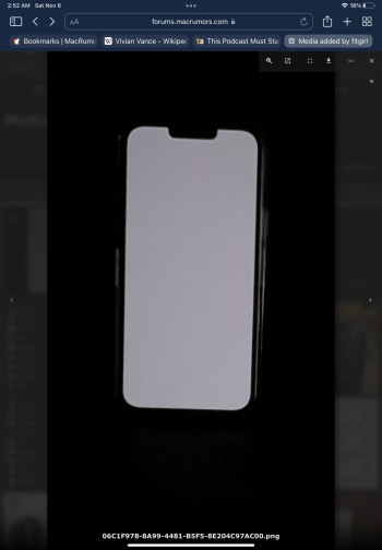
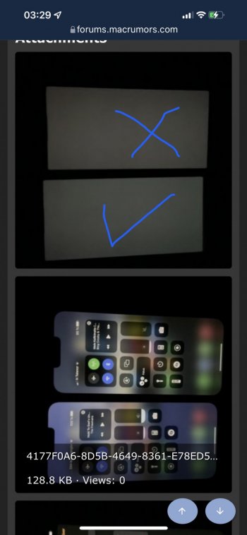
Annnnnnd this is the rub!! You may get the perfect screen all to have another issue. I’ve said it before and I’ll say it again, you are highly likely to get some other defect outside of the screen (gaps, dust in the lens, scratches on the screen or body, uneven buttons, mushy button feel, clicking back glass); the list sadly goes on and on, and, to find a unicorn is rare!! And what blows even more is if you do have one it’s a conundrum at upgrade time, cause this **** will (like clockwork) all happen again. SIGH 😔One of the ERS units came out of the box with a pretty noticeable dent at the top left on the stainless steel band. There were also micro scratches along the bottom band. I thought Apple replaces the outside components that users touch? There's no way that someone doesn't notice that type of thing, since the dent caught light
pretty significantly.
As far as the other units, I only saw the back when opening the phone and front when I turned on the display to compare. I didn't look too closely at earpiece gaps at the top, scratches in the frame or cameras, flush SIM tray, etc. but nothing really stood out to me in all the phones I have tried.
Got a tip for us?
Let us know
Become a MacRumors Supporter for $50/year with no ads, ability to filter front page stories, and private forums.
iPhone 13 Pro iPhone 13 Pro screen uniformity issue
- Thread starter Prepay16
- Start date
- Sort by reaction score
You are using an out of date browser. It may not display this or other websites correctly.
You should upgrade or use an alternative browser.
You should upgrade or use an alternative browser.
At that point the device becomes not so fun any longer lol … I’ve had years where I swapped like 7, and I was almost ready to just get a POS burner and call it a day!!40!!!!and your account didn't get flagged? No, I am not anywhere near that number!
So... I guess this is like "pick your poison"...
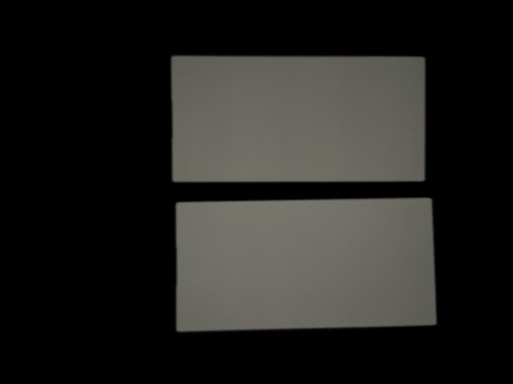
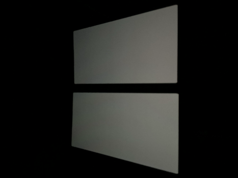
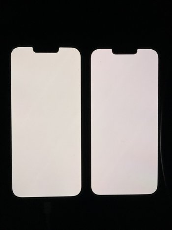
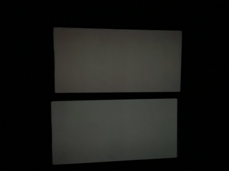
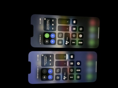
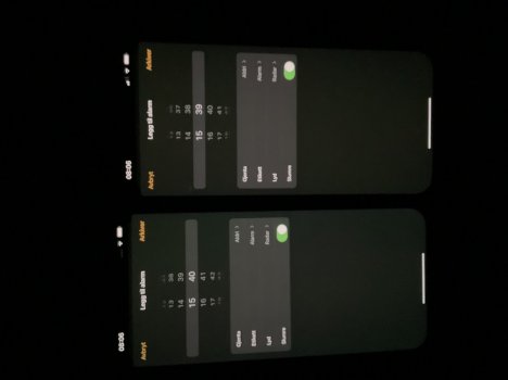
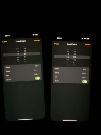
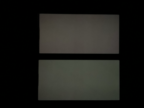
Here are some pictures of my 13PMs... one is on the more "red side" and one is on the "yellowish" side...
The first is from the ever popular "set an alarm" page, and the other twos are using one of the "try this grey image" pictures that have been posted in this thread..
I´m not sure if I've any of these are particularly good... but, if you had to choose one... which would it be? The "yellow" or the "red"?
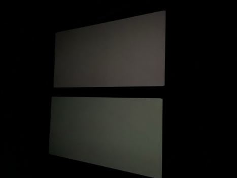


you're lucky, they looks both uniform!So... I guess this is like "pick your poison"...
Here are some pictures of my 13PMs... one is on the more "red side" and one is on the "yellowish" side...
The first is from the ever popular "set an alarm" page, and the other twos are using one of the "try this grey image" pictures that have been posted in this thread..
I´m not sure if I've any of these are particularly good... but, if you had to choose one... which would it be? The "yellow" or the "red"?
View attachment 1903824View attachment 1903825View attachment 1903826
in my opionion you should go with the "red poison", in the whites it ususally oerforms better. Try!
I prefer the one on the left. The green seems less noticeable to the human eye at night than the orange, and the left seems to have less dark/dim area from what I can see.So... I guess this is like "pick your poison"...
Here are some pictures of my 13PMs... one is on the more "red side" and one is on the "yellowish" side...
The first is from the ever popular "set an alarm" page, and the other twos are using one of the "try this grey image" pictures that have been posted in this thread..
I´m not sure if I've any of these are particularly good... but, if you had to choose one... which would it be? The "yellow" or the "red"?
View attachment 1903824View attachment 1903825View attachment 1903826
is this at full brightness?Thanks for the feedback
I forgot that True Tone was enabled on those pictures... here are some with TT off... what do you think?
LView attachment 1903837View attachment 1903839View attachment 1903840View attachment 1903841
Last edited:
Your brightness is too high.So... I guess this is like "pick your poison"...
Here are some pictures of my 13PMs... one is on the more "red side" and one is on the "yellowish" side...
The first is from the ever popular "set an alarm" page, and the other twos are using one of the "try this grey image" pictures that have been posted in this thread..
I´m not sure if I've any of these are particularly good... but, if you had to choose one... which would it be? The "yellow" or the "red"?
View attachment 1903824View attachment 1903825View attachment 1903826
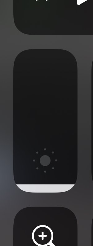
No, this was taken at about 25% or something.. (the middle of the sun icon in the brightness slider)is this at full brightness?
The pictures you’re talking about was shown well below the sun icon in the brightness slider… just where the round corners turn into full width (hard to explain, as English is not my native language)Your brightness is too high.
Here. The attached or lower.The pictures you’re talking about was shown well below the sun icon in the brightness slider… just where the round corners turn into full width (hard to explain, as English is not my native language)
Attachments
They both look good, this is mine not sure yet if I’ll keep it.Here we go… what´s your opinion?
Attachments
The second one in each pic.Here we go… what´s your opinion?
You mean the one with the «darker/redder» tint or the «brighter/greener» one?The second one in each pic.
You mean the one with the «darker/redder» tint or the «brighter/greener» one?
Attachments
Thank you so much for your time and your patience… I see that there are some mixed opinions, but so far the one I consider «green” is the one that is preferred.
I still think that the colors area tad better on the other one, but the other one is more even across the screen.
Any more opinions are welcome, as I know very little about screen calibration and what is “good or bad”
I still think that the colors area tad better on the other one, but the other one is more even across the screen.
Any more opinions are welcome, as I know very little about screen calibration and what is “good or bad”
My phone looks green if I point another phone at it and use night mode/long exposure. My eyes haven't noticed anything and it looks very uniform at night. I would say 100% green phone and return the one with the orange.
Yeah I’d try a few new ones each month hoping the quality control would get better and it never did.At that point the device becomes not so fun any longer lol … I’ve had years where I swapped like 7, and I was almost ready to just get a POS burner and call it a day!!
I would absolutely keep the one with the red tint.Thanks for the feedback
I forgot that True Tone was enabled on those pictures... here are some with TT off... what do you think?
View attachment 1903837View attachment 1903838View attachment 1903839View attachment 1903840View attachment 1903841
Thank you so much for your time and your patience… I see that there are some mixed opinions, but so far the one I consider «green” is the one that is preferred.
I still think that the colors area tad better on the other one, but the other one is more even across the screen.
Any more opinions are welcome, as I know very little about screen calibration and what is “good or bad”
Just a suggestion, choose the one that has a more uniform screen to you.
You can always adjust the screen tint to your liking in Settings/Accessibility/Display & Text Size/Colour Filters/
Adjust to what seems acceptable to you.
Register on MacRumors! This sidebar will go away, and you'll see fewer ads.


