Become a MacRumors Supporter for $50/year with no ads, ability to filter front page stories, and private forums.
Damn, if that really does end up being the final pill-hole design, it’d be a tragedy.

It looks so darn distracting, especially the space in between the two different shapes (Apple are you okay?).

Can’t believe I’m saying this but the notch really does look better. It’s symmetrical and uniform and less of an eye sore.


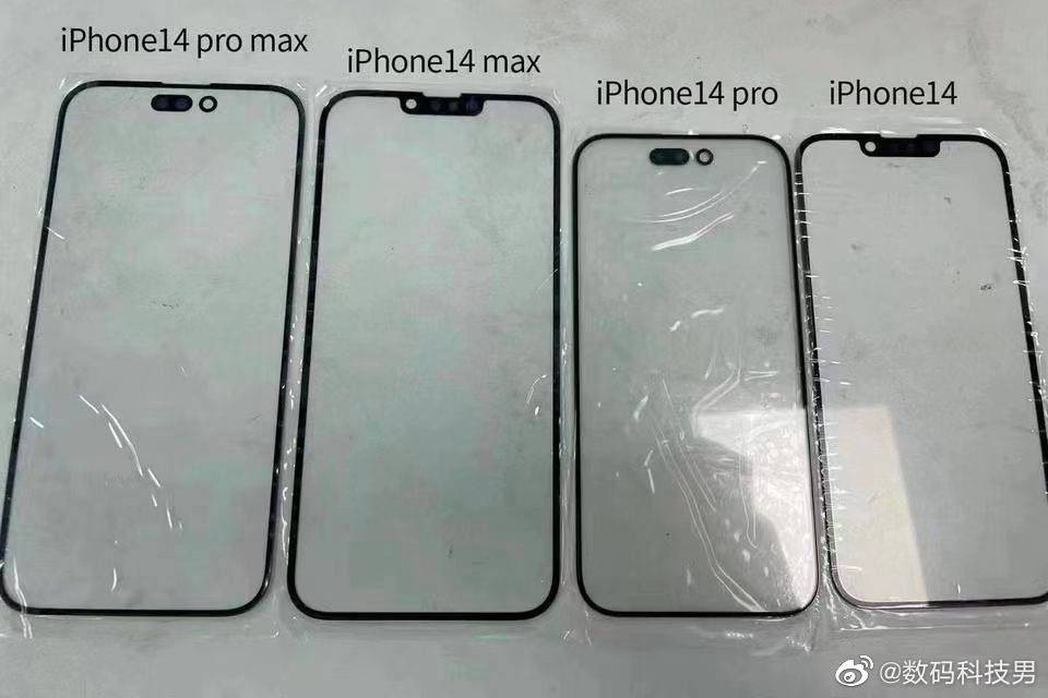
Apple's upcoming iPhone 14 Pro models are widely rumored to feature new displays with a pill-shaped cutout and a hole for the Face ID sensors and front camera, respectively, and now a real-world look at this design has seemingly surfaced.

iphone-14-front-glass-display-panels.jpeg

Front glass panels for all four iPhone 14 models have allegedly surfaced on Chinese social media website Weibo, as shared on Twitter by @SaranByte and reported by 9to5Mac. The panels reveal not only the rumored pill-and-hole design for the iPhone 14 Pro and iPhone 14 Pro Max, but also slightly thinner bezels and a taller aspect ratio for those models.

As expected, the image also shows that the standard iPhone 14 and iPhone 14 Max models will retain the same notch as iPhone 13 models.

While it is unclear if the image is legitimate, the front glass panels line up with all rumors that we have heard about iPhone 14 models so far, and similar leaks have occurred in the past. Last year, for example, MacRumors exclusively shared an image of front glass panels for all iPhone 13 models that proved to be accurate.

The pill-and-hole design for iPhone 14 Pro models has been reported by sources including display industry consultant Ross Young and Bloomberg's Mark Gurman. Other rumored iPhone 14 Pro features include a 48-megapixel rear camera, an upgraded front camera with autofocus, and more, with full details available in our iPhone 14 and iPhone 14 Pro roundups.


Article Link: iPhone 14 Pro Display Panels Reveal New Pill-and-Hole Design Replacing

I know this is likely how they will be, even if these particular examples are fake. And I stand by me original assertion that I prefer the current notch. I don’t like the asymmetry of the pill and hole.
 
The only thing going for the cutout is the novelty factor. There is a negligible difference between that and the reduced notch. It doesn't give that much extra real estate, and I'd be surprised if Apple puts it to any good use. Again, it will just be a status symbol for people to showoff the latest and greatest.

I might be tempted with the 14 Max. I generally prefer the matte aluminium sides on the vanilla iPhones as opposed to the glossy steel on the Pros. However, 60Hz on the standard 14 models could be a dealbreaker.
 
From what I see, if you want the biggest possible unobstructed rectangle (say for display of text), this actually gives less space, since the holes are located further down into the display. I don’t see this as a win.
From the report, it sounds like they made the screen a little taller on the Pros to allow for that and it looks like the active area remains the same.
 
  • Like
Reactions: CarlJ
I'm trying to think of a device that had a pill-shaped hole-punch cutout that big in the centre. Most of them put it to the side, like the Huawei Mate 40 Pro.
 
My LG V60 has the pill cutout but no facial recognition. I’m not sure how I feel about this from Apple. Guess I’ll need to wait and see. I just got a 13 Pro Max and it’s likely I’ll be keeping it at least two years like my 11 Pro Max. Perhaps longer depending on price and trade in deals.

I wanted to give up iPhones all together actually but that trade in deal of $700 was very appealing when my 11 PM was not 5G and the battery was going fast.

Overall, I think it looks nice but it feels oddly dated?
 
Imagine going from a symmetrical cutout to two different size cutouts? Who approved this? None of that space is useable.
Jobs would have thrown this back at the designer.
 
The empty space above the pill looks like a good place for the iPad-style window management ellipsis.
 
If they don't announce some way to use that space with the next version of iOS, even just the horizontal gain (at the cost of a vertical loss) on the 13 series, then I'm starting to seriously question their thinking here. Doesn't seem to be any unity between the hardware and software team. Why do they keep messing with the notch in useless ways?
Exactly. Other than people trying to justify their jobs, there doesn’t seem to be an inherent need to redesign a feature that they have already JUST redesigned when the ultimate goal is to not have said design in the first place.

Why do multiple interim steps? Just for marketing? That seems like a silly reason to spend time and money on engineering something. Especially when it will probably be around for just a few years.
 
  • Like
Reactions: CarlJ
They have some iPhone 14 devices there, some are with brush metal frame, impossible to know if it is brush stainless steel or titanium, however the volume buttons are round!
 
If you ask me Apples Design language is a mess since Ivy’s depature. We used to get radical design changes every 2 years. Now it’s maxed out to notches and pills.
 
They have some iPhone 14 devices there, some are with brush metal frame, impossible to know if it is brush stainless steel or titanium, however the volume buttons are round!
I know this is probably a lie but I'm huffing the hopium anyway.
 
Register on MacRumors! This sidebar will go away, and you'll see fewer ads.