Become a MacRumors Supporter for $50/year with no ads, ability to filter front page stories, and private forums.

MacRumors

macrumors bot
Original poster
Apr 12, 2001
68,072
38,799


Apple plans to bring the classic iOS battery indicator back to the status bar directly on the upcoming iPhone 14 Pro and iPhone 14 Pro Max, taking full advantage of the added screen space at the top of the display thanks to a new pill-shaped notch replacement.

iphone-14-pro-battery-status-bar-2.jpg

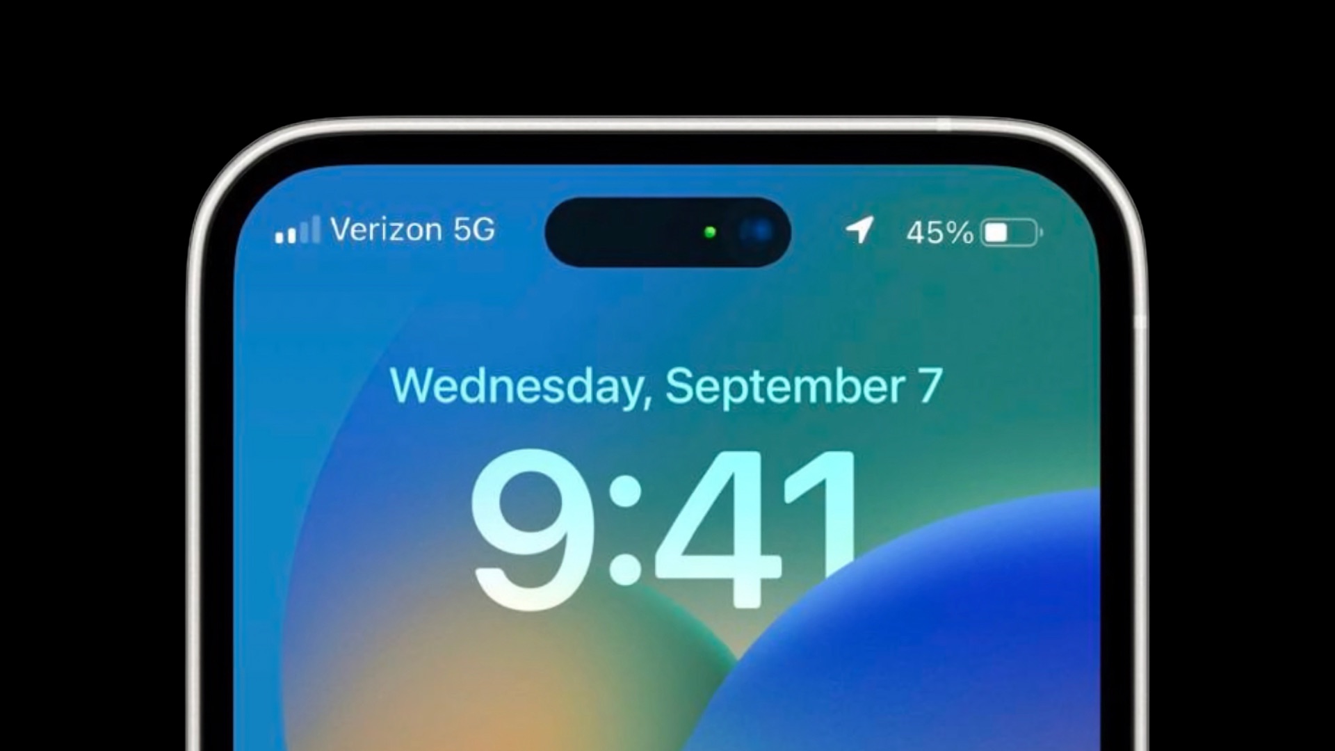
According to information shared with MacRumors and images posted on the MacRumors forums, Apple will bring back the classic iOS battery indicator to the status bar of the upcoming iPhone 14 Pro, which will include the battery percentage and battery icon separate from each other.

While Apple brought the battery percentage back to the status bar in an iOS 16 beta, the battery percentage is placed inside the battery icon and is not separated from it due to limited space at the top of the display.

ios-16-beta-5-battery-percent.jpg
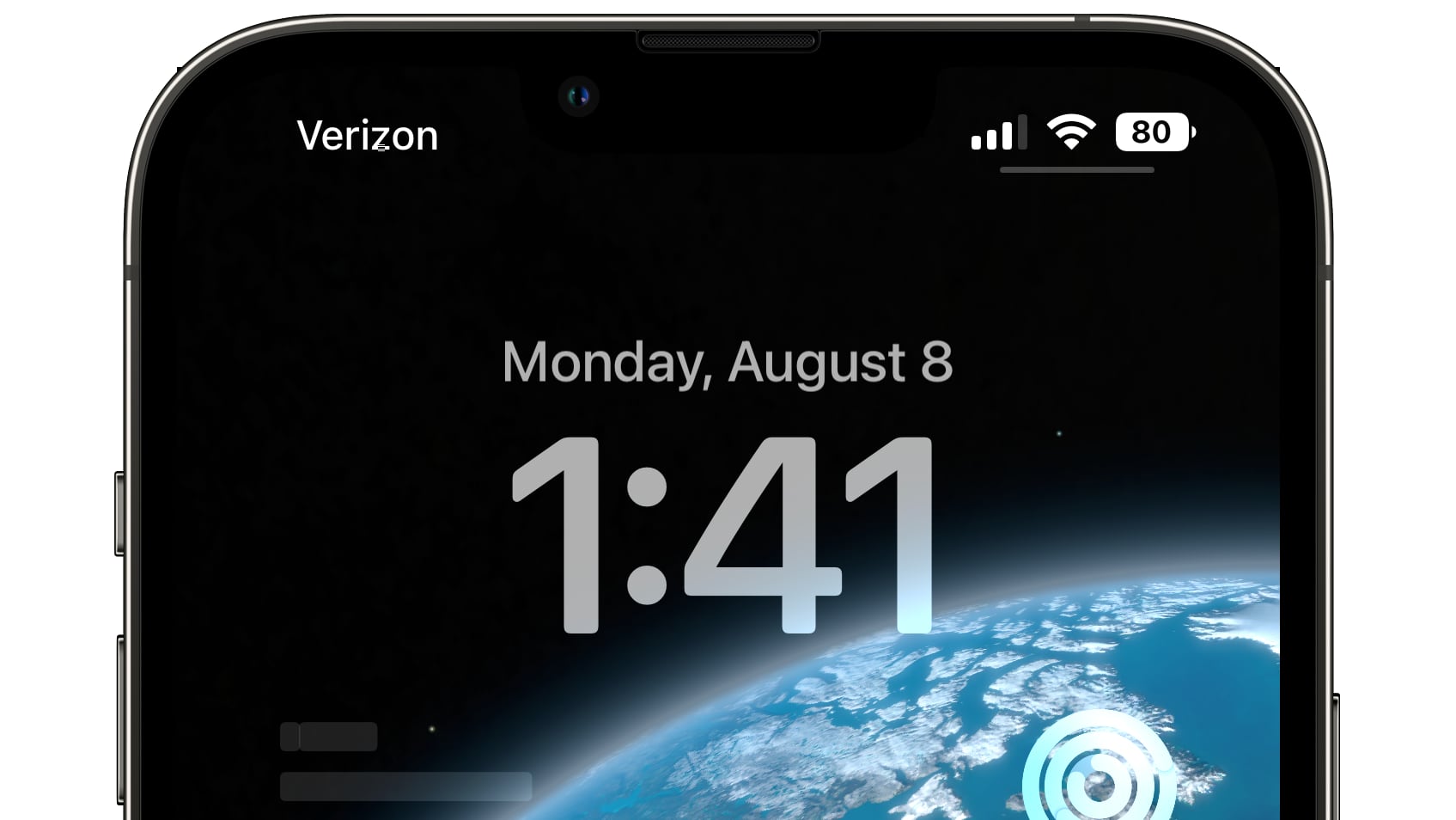
iOS 16 battery percentage currently on iPhones with a notch

Alongside the classic battery indicator, Apple will rearrange other elements of the iOS status bar on the Lock Screen and notification center for the upcoming iPhones, including moving the cellular signal indicator to the left, according to the latest information.

It's unknown whether the classic battery indicator will be present in the status bar when the device is unlocked and in use, given the need to display the time on the left, reducing the overall amount of available width.

The latest tidbit is one of several new aspects of the iPhone 14 Pro iOS 16 experience we're learning about just days before Apple's "Far out" event. Earlier today, MacRumors reported new details on the always-on display experience for the iPhone 14 Pro and iPhone 14 Pro Max, including the behavior of the always-on display and different design elements.

Article Link: iPhone 14 Pro Status Bar Rumored to Include Classic Battery Indicator
 
Last edited:
That is a feature only for the pro models with the pill cut, the notch iphones probably not enough room for it
So, 2 iOS already features only for the new pro models...AOD and Classic battery percentage
 
Why not have a single smaller pill-shaped cutout in the first place without the superfluous space that they have to blacken out apparently to make it look more esthetic and cram in the indicators? Ah lemme guess - so that they can "shrink" the pill a couple generations down the line and brand it as the latest and greatest thing that ever happened to any smartphone! i(ngenious)phone indeed!
 
  • Like
Reactions: Victor Mortimer
A black bar at the top would have several advantages. It could house a speaker or even two, a notification indicator that even many cheap Android smarthones have, two cameras for 3D videos streams, the Face ID stuff and a very powerful light. At the same time the screen could have real corners instead of those curves.

At Apple designers have too much power. Designers find a rectangular screen boring or old fashioned.
 
I really wish we could get some type of status light up there. A blinking light for missed calls, emails, texts would be awesome.
I really loved to have that back, like in old days, when i had the Sony Xperia 1II for +/-10 months, they still have one.
 
This was always a first world problem since you could always drag down the Control Center shade to see battery life at a glance anyway. We are really in a period of aesthetics and refinements right now with the iPhone. The areas they can probably spend more time really is Siri and Maps.
 
I'm amazed they actually ported the battery percentage to the older models.
Steve would have kept it as a reason to upgrade to the iPhone 14 for everybody.
 
  • Like
  • Disagree
Reactions: 3530025 and jkev57
This was always a first world problem since you could always drag down the Control Center shade to see battery life at a glance anyway. We are really in a period of aesthetics and refinements right now with the iPhone. The areas they can probably spend more time really is Siri and Maps.
Bitching on MacRumors is a first world activity in the first place, so why not do it about first world issues? There's a big difference between 20%, 10% and 1%, not having to perform additional guestures is a big improvement for those who find themselves in low battery situations often and want to see how much juice is left at a glance. (The iOS 16 indicator solves this issue already, though)
 
Register on MacRumors! This sidebar will go away, and you'll see fewer ads.