Become a MacRumors Supporter for $50/year with no ads, ability to filter front page stories, and private forums.

MacRumors

macrumors bot
Original poster
Apr 12, 2001
67,564
37,954


The alleged design of the iPhone 16 Pro was today showcased in new CAD renders shared by 91Mobiles.

iphone-16-pro-cad-renders.jpg

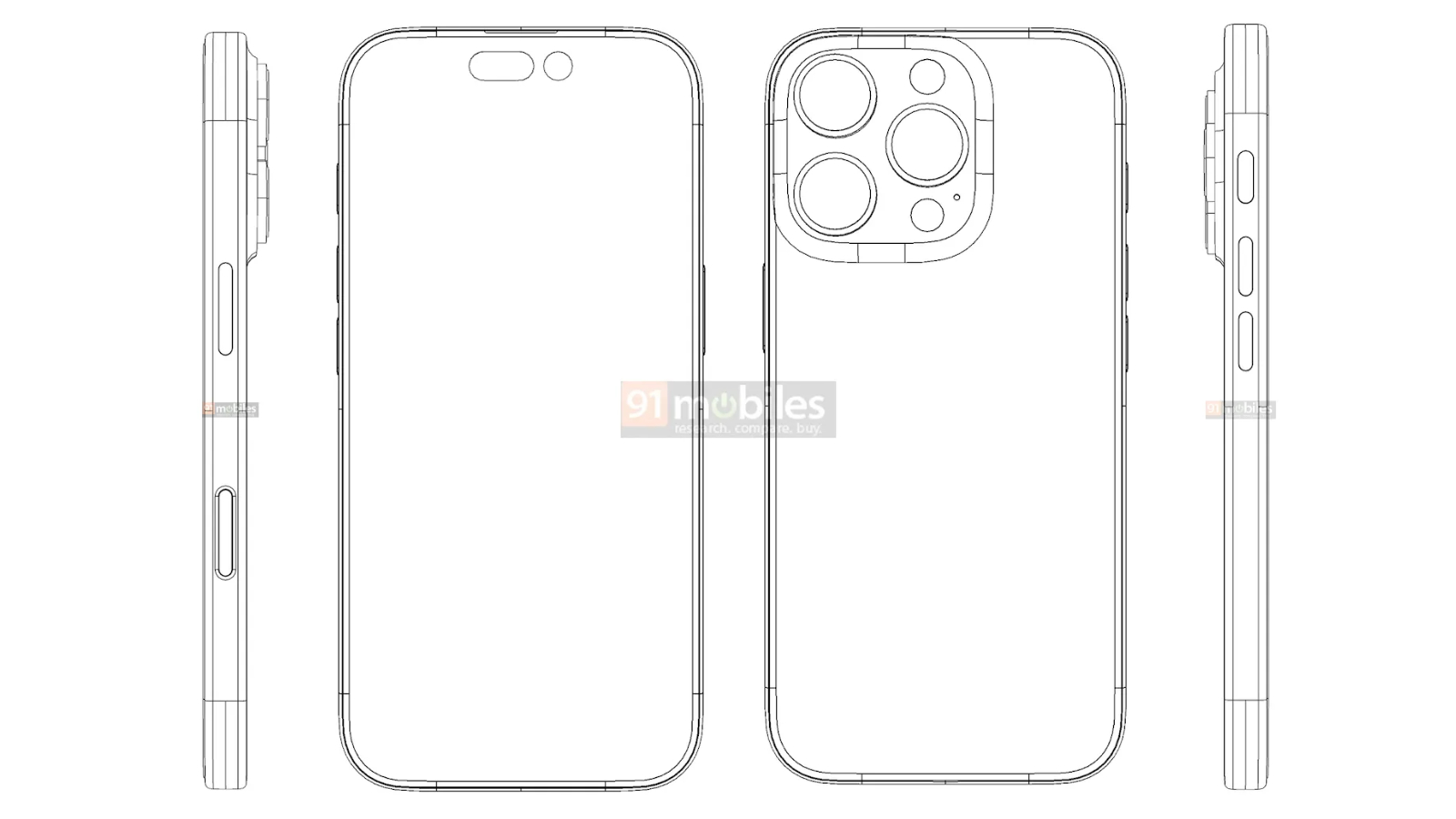
The drawings show a design that is similar to that of the iPhone 15 Pro, with a small number of changes relating to some of the buttons. The Action button is slightly longer, now resembling a similar length to one of the volume buttons, but with a slightly wider shape to distinguish it. The all-new "Capture" button is present on the left-hand side of the device where the mmWave antenna was located on previous models. While it is a similar length to the Side button, it is completely flush with the device.

91Mobiles previously revealed accurate CAD renders of the iPhone 13 Pro and iPhone 14 Pro, but its Apple Watch Series 7 designs were ultimately incorrect. The website recently shared renders purporting to depict the design of the upcoming 12.9-inch iPad Air and the fourth-generation iPhone SE.

In January, MacRumors provided the first look at the design of the iPhone 16 Pro, including a Capture button that is flush with the side of the device, which was today broadly corroborated by 91Mobiles' CAD file. MacRumors subsequently obtained information suggesting that while Apple tested a longer Action button design, it has since scrapped the idea and the Action button is now expected to look virtually the same as on the iPhone 15 Pro.

The main change to the design of the iPhone 16 Pro and iPhone 16 Pro Max is rumored to be larger displays, increasing from 6.1- to 6.3-inches and 6.7- to 6.9-inches, respectively. Following a significant redesign with the switch to a titanium frame and more rounded edges on the iPhone 15 Pro last year, little else is expected to change with the look of the new devices this year this year. The iPhone 16 lineup is expected to launch in the fall.

Article Link: iPhone 16 Pro CAD Renders Reveal Button Design Changes
 
Can I map any camera app I want to the Capture button? Or is it going to be like the camera button on the Home screen, which can only launch Apple's camera app even if I subscribe to an app like Halide?
 
Can I map any camera app I want to the Capture button? Or is it going to be like the camera button on the Home screen, which can only launch Apple's camera app even if I subscribe to an app like Halide?
One will probably have to be able to reassign it to a third party camera app, at least in the EU. But I'd expect that to be world wide.
 
In a time when other phone manufacturers are adding better cameras, bigger batteries, and pushing the boundaries of software with cutting-edge AI features, I'm glad Apple is focusing on what's really important in the world of mobile phone technology: strategically placed buttons.

I can't wait for the new iPhone, it will truly be the most revolutionary and magical™ iPhone ever. :p
 
If "spatial video" is important to me, I design new phones with the camera lenses used for that spaced differently... at roughly average human eye distance apart. That should improve the effect of spatial video shot on iPhones... with no real consequence other than altering the perfect triangular placement of lenses in the existing camera pack.

So when I see these renderings in all rumors, I simply doubt it when the camera pack doesn't show that evolution... as it seems like a simple thing that "fits" and doesn't involve a lot of added cost, etc. In short: why not (do it) so that iPhone can shoot even better spatial video?
 
I wonder whether this will also serve as an input for the rumoured AI features - similar to ‘circle to search’ but it captures your screen contents
 
  • Like
Reactions: Surf Monkey
I really don’t like the action button. I press it by mistake when trying to press volume up etc. Just an all-round nuisance I never use except by mistake.

I agree, I much prefer the mute switch.

The action button has some issues: 1) When using a case that “raises” it, it is easy to confuse with the up volume button, happens to me all the time. 2) When using a case that has it “flushed” it is difficult to access.

There is also little benefit to the added functionality it offers. The switch was perfect as it was.
 
Because that's where it belongs.
The old way doing screenshots by pressing power and level up should be replaced by this extra button.
So, I'd agree that power button can be moved somewhere. Maybe to the top edge.
 
This is the state of iPhone innovation at the moment, unfortunately - we're talking about how a button has a slightly different location or how the camera is slightly improved.

Apart from that, there's little else to get excited by.

Let us pray some magic happens on the software side in the form of AI or we're all going to collectively fall asleep.

Disclaimer: I get that this is a mature product and that there's not that much more innovation happening elsewhere. Still, the whole thing has become boring af.
 
The action button has some issues: 1) When using a case that “raises” it, it is easy to confuse with the up volume button, happens to me all the time. 2) When using a case that has it “flushed” it is difficult to access.
This I agree. I have the case with "flushed button" variant and it is difficult to access.

There is also little benefit to the added functionality it offers. The switch was perfect as it was.
But this one I disagree. I never used silent switch. I however use action button almost every single day to toggle my flash light. Much more accessible at night than via touch button on lock screen.
 
  • Like
Reactions: GeoStructural
Register on MacRumors! This sidebar will go away, and you'll see fewer ads.