killhippie
macrumors 6502a
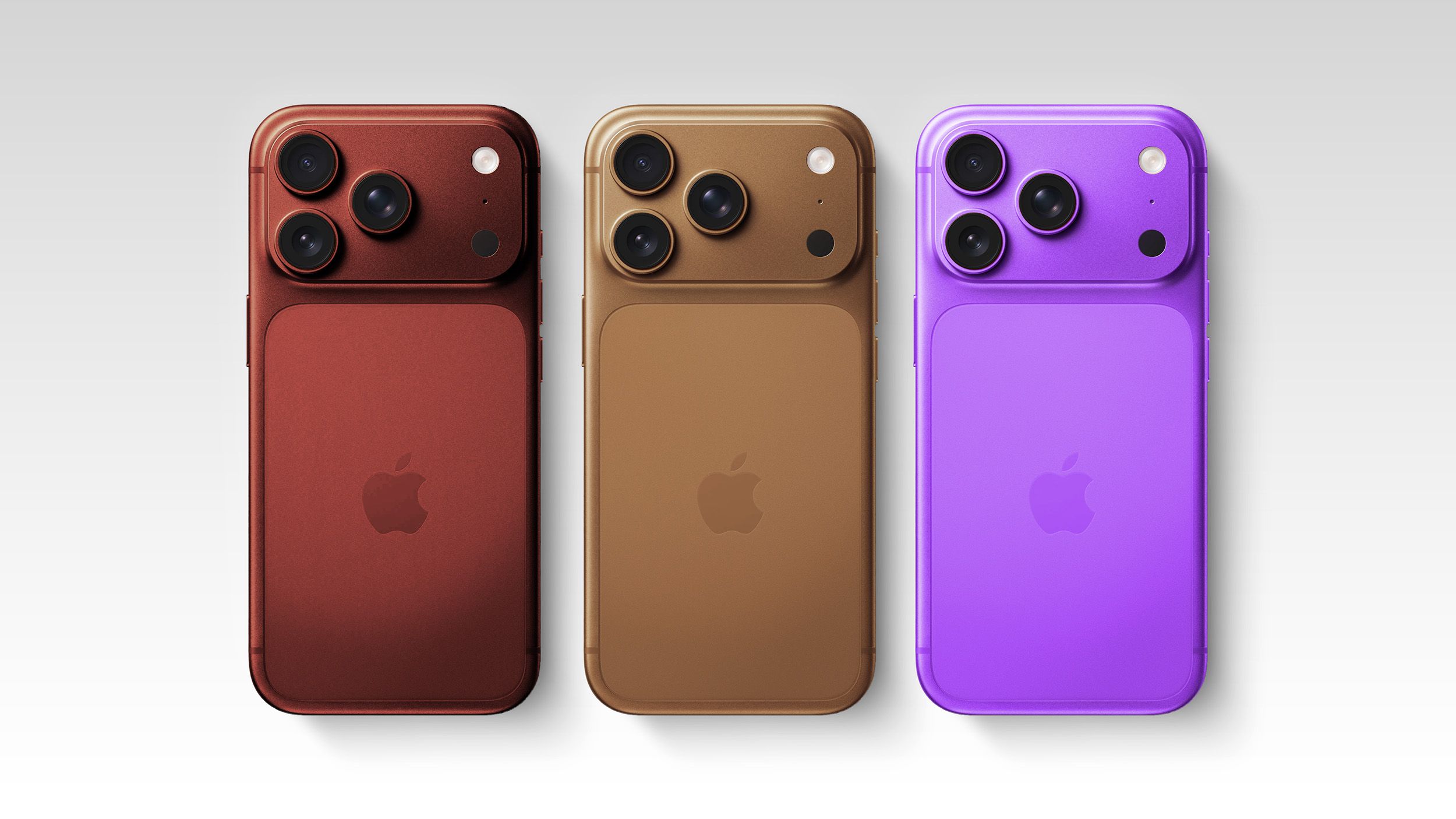
Putting lipstick on a pig doesn’t change anything for me. I understand we all like different things, so I’m not having a go at anybody here, but for my own aesthetics that is the ugliest iPhone I’ve ever seen and this year’s colours still don’t hide the fact that it’s probably gonna be made out of aluminium. It’s still probably gonna dent and scratch just as easily, because you can’t cover sharp corners with a decent amount of anodising to stop them scuffing. It’s a bad design in my eyes.
Also iOS 26 and macOS 26 are jelly and elastic hellholes. Precision used to be moving a slider in Pixelmator Pro and not it acting like it’s a cross between jelly and a bungee cord. Also, providing toggles in iOS to control glass seems to suggest that they know it’s not ideal. Things just don’t need changing for the sake of it, and yeah, I used to prefer the days when, like with Leopard and Snow Leopard, your operating system took two years before the next one so all the bugs got really ironed out and yeah, you paid for the upgrade, but that also felt like maybe you were getting something better. And now iOS 26 isn’t getting the updates that were promised. It’s iOS 27 and I refuse to buy new hardware for something they promised me in 2025.
The quality of iOS 26 and macOS 26 is not great. Don’t get me wrong, I like my M4 Studio, I like my XDR monitor, it really does what I need for the workflow, but it shouldn’t have to cost £3000 for a monitor to completely tie into the Apple operating system and its niche little functions. And then you’ve got subscription models on top of everything else, as if Apple don’t make enough money out of people already. It just feels like an insult and when people say “oh I want the latest and greatest”, except I don’t think that really applies anymore.
The latest might not be the greatest because you’ve got new chips that are very young technology with bugs and issues with holding onto Wi-Fi or Bluetooth or cellular. It feels like instead of having mature components from other companies Apple’s made their own ones because they can make more money and control everything even more, but they controlled everything just fine before. They’re just penny-pinching, so maybe the older phones and computers were the latest and greatest and the new ones are the latest and most immature now. Apple just leaves me with a bad taste these days, I guess. We all like different things and I do understand that, so this is just my point of view and not an attack on anybody wanting any of the latest gear.
Also iOS 26 and macOS 26 are jelly and elastic hellholes. Precision used to be moving a slider in Pixelmator Pro and not it acting like it’s a cross between jelly and a bungee cord. Also, providing toggles in iOS to control glass seems to suggest that they know it’s not ideal. Things just don’t need changing for the sake of it, and yeah, I used to prefer the days when, like with Leopard and Snow Leopard, your operating system took two years before the next one so all the bugs got really ironed out and yeah, you paid for the upgrade, but that also felt like maybe you were getting something better. And now iOS 26 isn’t getting the updates that were promised. It’s iOS 27 and I refuse to buy new hardware for something they promised me in 2025.
The quality of iOS 26 and macOS 26 is not great. Don’t get me wrong, I like my M4 Studio, I like my XDR monitor, it really does what I need for the workflow, but it shouldn’t have to cost £3000 for a monitor to completely tie into the Apple operating system and its niche little functions. And then you’ve got subscription models on top of everything else, as if Apple don’t make enough money out of people already. It just feels like an insult and when people say “oh I want the latest and greatest”, except I don’t think that really applies anymore.
The latest might not be the greatest because you’ve got new chips that are very young technology with bugs and issues with holding onto Wi-Fi or Bluetooth or cellular. It feels like instead of having mature components from other companies Apple’s made their own ones because they can make more money and control everything even more, but they controlled everything just fine before. They’re just penny-pinching, so maybe the older phones and computers were the latest and greatest and the new ones are the latest and most immature now. Apple just leaves me with a bad taste these days, I guess. We all like different things and I do understand that, so this is just my point of view and not an attack on anybody wanting any of the latest gear.