Become a MacRumors Supporter for $50/year with no ads, ability to filter front page stories, and private forums.
Just bought a new car, and needed a wallpaper for the ipod touch that will permanently be hooked up to the car's media system. So I made this to match my new car.
I wanted Audi's rings logo to pop out of the wood background a bit, so i used "multiply" instead of overlay after darkening the rings a tad. I think this adds a sort of three dimensional look to them. Let me know what you think, and keep in mind this is for a first gen. ipod touch, not meant for an iphone 4.

Nice. I do like the "3D" effect of the rings. (Nice car, the Audi, too.)

I need some better PS chops. And I hate the RTFM method :p but maybe I'll sit in a bookstore some lazy day and read up on a few tips.
 
Last edited:
Nice. I do like the "3D" effect of the rings. (Nice car, the Audi, too.)

I need some better PS chops. And I hate the RTFM method :p but maybe I'll sit in a bookstore some lazy day and read up on a few tips.

Good call, I have a doctor friend who subscribes to a bunch of different PS mags for his waiting room, I'm gonna see if I can have some of his old ones.
 
I had to improvise these, so I hope they are all right:
 

Attachments

  • Kobenhavn Wood.png
    Kobenhavn Wood.png
    956.7 KB · Views: 153
  • Kobenhavn Wood2.png
    Kobenhavn Wood2.png
    1.1 MB · Views: 151
  • Kobenhavn Wood3.png
    Kobenhavn Wood3.png
    1.1 MB · Views: 155
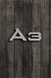
Made another wallpaper for my phone, related to my car. This one is different than any wood wallpaper I've ever done though. Fabricated a brushed metal looking badge, added a drop shadow, and laid it over the wood so it looks like it's attached to the wood (rather than being painted onto the wood).
 

Attachments

  • A3 Badge Shadow Wood2.png
    A3 Badge Shadow Wood2.png
    1 MB · Views: 171
Made another wallpaper for my phone, related to my car. This one is different than any wood wallpaper I've ever done though. Fabricated a brushed metal looking badge, added a drop shadow, and laid it over the wood so it looks like it's attached to the wood (rather than being painted onto the wood).

Big fan of the brushed type look on metal. Very nice, my man.

After you did the original Audi logo some posts back, I was playing around with the idea of making one using the 3D technique for my ride I purchased last year.

But since the logo is jet black (with some highlights), I wasn't having much success. And there's a different model of the vehicle, with the same basic logo, but all chrome colored (with highlights.) Not much success either.

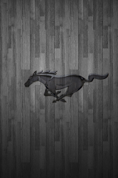
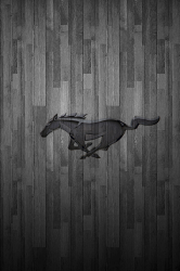
Anyway... the GT logo in various sizes & recentered:
 

Attachments

  • 2010GT-Wood-1.png
    2010GT-Wood-1.png
    518 KB · Views: 149
  • 2010GT-75pc-recentered.png
    2010GT-75pc-recentered.png
    481.5 KB · Views: 141
  • 2010GT-70pc-recentered.png
    2010GT-70pc-recentered.png
    484 KB · Views: 145
Last edited:
Big fan of the brushed type look on metal. Very nice, my man.

After you did the original Audi logo some posts back, I was playing around with the idea of making one using the 3D technique for my ride I purchased last year.

But since the logo is jet black (with some highlights), I wasn't having much success. And there's a different model of the vehicle, with the same basic logo, but all chrome colored (with highlights.) Not much success either.

Anyway... the GT logo:

Very nice. The only critique I have is the centering and sizing of the logo on the background. Allow me to elaborate:
I would make the GT logo smaller, and re-center the logo so that the horses torso is centered on the background... I feel like the tail is such a small and insignificant appendage that it shouldn't have any weight on how you center the logo.
So yea, maybe try making it like 80-65% smaller (obviously find a size that you think is appropriate), and re-centering it.
Other than that... Great job. I really like the new texture you have chosen. Could you upload just the background, I may want to use that in the future.
 
Very nice. The only critique I have is the centering and sizing of the logo on the background. Allow me to elaborate:
I would make the GT logo smaller, and re-center the logo so that the horses torso is centered on the background... I feel like the tail is such a small and insignificant appendage that it shouldn't have any weight on how you center the logo.
So yea, maybe try making it like 80-65% smaller (obviously find a size that you think is appropriate), and re-centering it.
Other than that... Great job.

To me, critiques are like free learning, thanks for taking the time.

I hear you: it's like a visual "center of mass" perception issue, complicated by the fact that this particular object is in motion from right to left. So that makes sizing/centering a bit more involved.

I reduced the logo 25% & 30%, and moved the torso to a more centered position, & played w/the background level... (attached to original post.)


I really like the new texture you have chosen. Could you upload just the background, I may want to use that in the future.

I'm not sure where I picked it up (probably from one of those freebie Wallpaper Apps at the App Store). I have two versions w/very slightly different tile patterns (if you look closely, the positioning of the slabs don't quite match up.)

One light version, and the other very dark:
 

Attachments

  • Smooth-Slab-Wood.png
    Smooth-Slab-Wood.png
    443.5 KB · Views: 267
  • Smooth-Slab-Wood-Dark.PNG
    Smooth-Slab-Wood-Dark.PNG
    429.4 KB · Views: 789
Last edited:
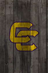
Wood Wallpaper Request - Justin

Hey everyone,

Is there someone who could possibly make me a wood wallpaper for my iPhone 4 with a "Justin" logo? Preferably, something like this but without the "boots" in it and the circle where boots is closed in. I wouldn't even mind of variation of this logo if someone didn't want to use this exact one. As for colors, maybe red where the white is, a gold color where the black is, and then a royal blue J?

I got the gold and royal blue color ideas from Draac's Color Chart.

If someone didn't feel comfortable changing the colors or using those specific colors, I'd be find with the way the colors are now or a variation.

Thanks in advance. :)
 

Attachments

  • Justin%20logo.jpg
    Justin%20logo.jpg
    53.7 KB · Views: 1,798
Last edited:
I get what you are saying. I think I do prefer the first one. Thank you so much. I really appreciate it.
 
:) Would you want to maybe do one where the yellow is lighter blue and the red is white? And then perhaps do a darker purple J? I only ask because I really like what you've done and would love to be able to alternate.
 
Current Bucks logo?

Any chance you can do one for the current Milwaukee Bucks logo? The one in the NBA section above is 4 years old and their old colors. Here are some of the new logo and also one retro. Also, can you post the background that you end up using? It would be great to switch to that as the background to the buttons on an iphone (have the logo drop out). Many thanks!
 

Attachments

  • New Bucks.gif
    New Bucks.gif
    33.4 KB · Views: 152
  • Original Bucks.jpg
    Original Bucks.jpg
    42.3 KB · Views: 147
  • Bucks2.gif
    Bucks2.gif
    36.1 KB · Views: 172
Last edited:
Needed to get a new monitor, haven't calibrated colors yet... so I'm not sure what will show up on your screen. (Original background is attached to post 635 in this thread.)

My stab at them:
 

Attachments

  • NewBucks.png
    NewBucks.png
    636.2 KB · Views: 147
  • Orig-Bucks.png
    Orig-Bucks.png
    522.5 KB · Views: 135
  • Bucks3.png
    Bucks3.png
    636.3 KB · Views: 163
Last edited:
Register on MacRumors! This sidebar will go away, and you'll see fewer ads.