Steve Jobs also said 2 weeks before releasing the new ipod, that hed never release a video capable ipod?
Got a tip for us?
Let us know
Become a MacRumors Supporter for $50/year with no ads, ability to filter front page stories, and private forums.
iPod Video Photo
- Thread starter MacRumors
- Start date
- Sort by reaction score
You are using an out of date browser. It may not display this or other websites correctly.
You should upgrade or use an alternative browser.
You should upgrade or use an alternative browser.
Boardslippy said:Steve Jobs also said 2 weeks before releasing the new ipod, that hed never release a video capable ipod?
As you said, good ol' Stevie said a lot of things...
Boardslippy said:Steve Jobs also said 2 weeks before releasing the new ipod, that hed never release a video capable ipod?
All Apple has to do is call that new device something else than "iPod".
As someone mentionned earlier in the thread, "Mac mobile" has a nice ring to it.
AlanAudio said:By all means believe in this picture if it makes you happy, but tell me how often you see an accurate unofficial photograph of an Apple product prior to launch.
Alarmingly, when we see accurate unofficial pictures, no-one seems to be very happy and calls them fakes accordingly. The 5G iPod was said to be a fake because it wasn't different enough and who'd want to watch video on so small a screen. The Dashboard pictures (before WWDC in 2004) were declared definitely fake since the orange calculator and red calendar were shouted down as so ugly that Apple couldn't have designed them. They were both exactly as the real thing showed up a few days later.
So since everyone seems to like this without much criticism of the concept, it's bound to be fake!
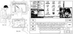
ANyone gone through all those patents, see how many images suit this 'fake' design, some ones already mention the plastic forming, i agree its just to right to be wrong theres no doubt after a few lame announcements its time to start off the year with something big
mazola said:MacPod
wow... that actually has a nice ring to it. And what a way to extend the iPod 'halo' to the Mac!!
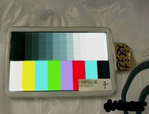
lars steenhoff said:Collecting the evidence so far, it seems even the wrapping paper in the background is the same material.
Interesting point about the wrapping paper!
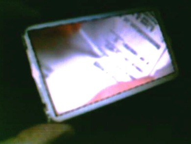
But how come everyone is ignoring the other pic? They're clearly the same thing, except that the "broom cupboard pic" has fingers for scale
AlanAudio said:Simon & Garfunkel - The Boxer
All lies and jest, still the man hears what he wants to hear
And disregards the rest, hmmmm
Some of you guys want to believe it so much that you won't see what's really there.
Still, only a few more days to go and then we will see for sure.
You're personifying exactly what you're trying to communicate with that lyric.
There have been several times where we've gotten accurate leaked photos. You fail to realize that one of the main reasons leaked photos are released so close to product releases is due to the fact that Steve delays product manufacturing for as long as possible in order to keep the product secret from competitors.
TMA said:My point was directed at AlanAudio, who doesn't seem to believe it's possible or efficient to display test images like this on this devices screen.
Possible? I think he was saying that there just isn't much reason to use this particular test signal on a computer monitor. I tend to agree with this. This signal is one used for plain old television, I've never seen it used for computer monitor calibration.
But most of all, those color bars aren't even right. The color bars are a STANDARD image used for calibration. The colors are specifically selected for technical reasons and are always the same, so that they may be used for calibration.
The layout of the bars doesn't match any standard set of bars, the number of colors isn't right, and the colors are way off from how they're supposed to look. For example, the blue on the right is supposed to be dark blue, instead it's almost the same as the light blue on the left. Why would Apple use a corrupted version of a standard calibration image? Can anyone find this "test image" anywhere online? My guess is it's something someone pasted together instead of using the real color bars.
http://en.wikipedia.org/wiki/Color_bars
lorien said:Interesting point about the wrapping paper!
But how come everyone is ignoring the other pic? They're clearly the same thing, except that the "broom cupboard pic" has fingers for scale


I actually don't believe they are the same. The aspect ratio looks different to me, but there are more experts here who could probably confirm.
I still can't get over the fact that it seems to look like the 5G in size and with a bigger display then the battery life will suck, it just can't of improved that much since October and if this is truely the iPod video with music capability then 2 hours (or less with the bigger display) is just not going to cut it.
I personally am not excited by an iPod video, I still prefer the concept of a MacPod with video capability, but I think that would require a stylus and I'm not sure where it would be housed in this model. I'm going with fake, put out by Apple to put us off the scent.
Who knows!!
If the photo is real I think I know the reference to iCal..
Where do you see iCal??
In the "Dock"
If it's truly a touchscreen the dock will have the following icons :
iTunes
iPhoto
iVideo
iCal ( to schedule dates for movie,video and music releases from the new iMovie/iTunes )
And the actual "Dock" icon.Used to connect it to the new MacMini Media Center.
Where do you see iCal??
In the "Dock"
If it's truly a touchscreen the dock will have the following icons :
iTunes
iPhoto
iVideo
iCal ( to schedule dates for movie,video and music releases from the new iMovie/iTunes )
And the actual "Dock" icon.Used to connect it to the new MacMini Media Center.
milo said:Possible? I think he was saying that there just isn't much reason to use this particular test signal on a computer monitor. I tend to agree with this. This signal is one used for plain old television, I've never seen it used for computer monitor calibration.
But most of all, those color bars aren't even right. The color bars are a STANDARD image used for calibration. The colors are specifically selected for technical reasons and are always the same, so that they may be used for calibration.
The layout of the bars doesn't match any standard set of bars, the number of colors isn't right, and the colors are way off from how they're supposed to look. For example, the blue on the right is supposed to be dark blue, instead it's almost the same as the light blue on the left. Why would Apple use a corrupted version of a standard calibration image? Can anyone find this "test image" anywhere online? My guess is it's something someone pasted together instead of using the real color bars.
http://en.wikipedia.org/wiki/Color_bars
Ok, I may be stupid, but couldn't the bars be wrong because it's in TESTING and not actually calibrated properly? I mean there must be a reason people calibrate and it's not because the colours look right.
And why would the make up fake bars when they could just copy your wiki image?
If we're going to start a vote, I vote real.
David
it looks like the previous ipod picture, have chinese charastor[someone correct my spelling] on it. Maybe quite a few of assemble workers in PRC have seem and assembled it. Funny.
You can tell it's a fake...
You can tell this is a fake; it wasn't taken from within elevator and it's not BLURRY enough!

You can tell this is a fake; it wasn't taken from within elevator and it's not BLURRY enough!
These are all fake
Here is the link to the real one!!
http://cache.gizmodo.com/archives/images/iPod_5G.jpg

Here is the link to the real one!!
http://cache.gizmodo.com/archives/images/iPod_5G.jpg
Darn I just bought a video ipod a month ago. Now I gotta flip it. Oh Mr. Jobs thank you for keeping us on the bleeding edge of technology. Now how about some media center photos..
Just curious if it is real, what do you think apple witll do about finger print oil left on the screen after you select what movie you will watch? will it be like a PDA or DS and use a pen? or have they devolped some kind of plastic coating thats is different from current ipods? 
milo said:Possible? I think he was saying that there just isn't much reason to use this particular test signal on a computer monitor. I tend to agree with this. This signal is one used for plain old television, I've never seen it used for computer monitor calibration.http://en.wikipedia.org/wiki/Color_bars
The way I understood AlanAudio's comments was that it would somehow be difficult or a waste of resources to product a test image like this for this use. I am questioning...
a) Why would it be difficult to create and display this image on an LCD display - surely you can display pretty much any image you like on any LCD screen?
b) Inefficient - greyscale, black to white bars, I have seen used on mobile phones and pda's as a good measure for contrast and brightness. The colour bars do seem unusually bright, but perhaps this test scheme is devised as purely a brightness test (perhaps for outdoor conditions?) and by using bright colours a better idea for its outdoor or low light performance could be achieved. I'm not a colour expert, but it doesn't seem to me that this image was meant to test accurate colour representation, which leads me to...
c) This could be 1 image of many used for test purposes. The next slide could have been the one illustrated on wikipedia that you linked to.
d) Given all of this, why AlanAudio claims that a photo of U2's Bono (ROFL!) would have ultimately and deffinately been a better test! A better test of what exactly?
mackensteff said:
if that is real damn i want one lol
Register on MacRumors! This sidebar will go away, and you'll see fewer ads.


