I cannot stand this about the MacOS. It is a throw back to the horrible UI/UX of the mid-nineties. Mac sucks, Windows rules! I just HATE that they are so effing small. MacOS has not been properly updated except to add a bunch of nearly useless features that only work half the time. Make the dots bigger! I would like switch except for this one thing. I CANNOT STAND IT ANYMORE, Apple fix this! It is shameful that Apple has not given us a proper UI/UX update in decades.
Got a tip for us?
Let us know
Become a MacRumors Supporter for $50/year with no ads, ability to filter front page stories, and private forums.
Is there any way in God's green earth to make the traffic light dots BIGGER?
- Thread starter Cape Dave
- Start date
- Sort by reaction score
You are using an out of date browser. It may not display this or other websites correctly.
You should upgrade or use an alternative browser.
You should upgrade or use an alternative browser.
It's not a flaw, it's working as intended. Looks like you would be better off staying on Windows.
No there's no way to make them bigger other than scaling, but then you will make everything else bigger too.
Also, maybe you should give this thread a read:

 ux.stackexchange.com
No there's no way to make them bigger other than scaling, but then you will make everything else bigger too.
Mac OS didn't have buttons in mid 90s like it has now.horrible UI/UX of the mid-nineties
Yes they have. Mac OS has had UI refresh several times.Apple has not given us a proper UI/UX update in decades
Also, maybe you should give this thread a read:
Is there a benefit to Mac OSX red/yellow/green title bar buttons being so small?
In Mac OS X, the red/yellow/green buttons in window title bars are much smaller and closely-spaced compared to other UI elements like toolbar buttons. Making UI elements small makes them harder to
Well, we see you leave and yes, thanks for any - if there was - constructive contribution here in the past. 🤜🤛I cannot stand this about the MacOS. It is a throw back to the horrible UI/UX of the mid-nineties. Mac sucks, Windows rules!
It's not a flaw, it's working as intended. Looks like you would be better off staying on Windows.
No there's no way to make them bigger other than scaling, but then you will make everything else bigger too.
Mac OS didn't have buttons in mid 90s like it has now.
Yes they have. Mac OS has had UI refresh several times.
Also, maybe you should give this thread a read:
Is there a benefit to Mac OSX red/yellow/green title bar buttons being so small?
In Mac OS X, the red/yellow/green buttons in window title bars are much smaller and closely-spaced compared to other UI elements like toolbar buttons. Making UI elements small makes them harder to
If it was a "proper" refresh, they would have fixed this. It speaks to inaccessibility.
Good article. This sums up my argument:
"In Mac OS X, the red/yellow/green buttons in window title bars are much smaller and closely-spaced compared to other UI elements like toolbar buttons.
Making UI elements small makes them harder to click, especially at higher resolutions on smaller screens, when using non-mouse (trackpad) interfaces, or for elderly/young/disabled users."
Also, they really do not even have to make them actually bigger. Just increase the "active" area around them like Windows did with their - _ X in the upper right of each window. A no brainer, Apple!
Last edited:
In the Accessibility section of System Settings (or Preferences) you can enable Zoom to toggle between 2 zoom levels using keyboard shortcuts. Then you'd:
- press a key to toggle Zoom on
- move over the red/yellow/green button you want
- click it
- press the key again to toggle Zoom off
 support.apple.com
support.apple.com
support.apple.com
- press a key to toggle Zoom on
- move over the red/yellow/green button you want
- click it
- press the key again to toggle Zoom off
Zoom in on what’s onscreen on Mac
On your Mac, zoom in on part of your screen using your keyboard, mouse, or trackpad.
Change Zoom settings for accessibility on Mac
On your Mac, set options to make items on the screen appear larger.
I'm not sure this would satisfy your needs, but perhaps you could try the keyboard shortcuts instead of clicking some of the buttons? Command+W for close, Command+Q for quit, Command+M for minimize, and Control+Command+F for full screen.
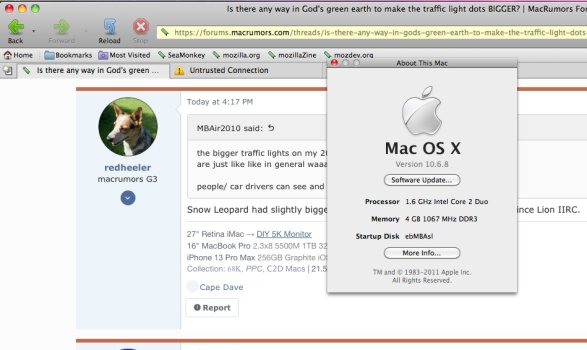
Snow Leopard had slightly bigger ones, but the size hasn't changed again since Lion IIRC.the bigger traffic lights on my 2012 Mini and Macbook Pro- Mountain lion osx
are just like like in general waaaaaay back in 2012,
people/ car drivers can see and adhere to them
Making UI elements small makes them harder to click, especially at higher resolutions on smaller screens, when using non-mouse (trackpad) interfaces, or for elderly/young/disabled users."
You don't always have to click on things
🔴 command-W to close the window. (If it's a window with multiple tabs, command-shift-W to close them all, command-W to close one tab)
🟠 command-M to minimize the window to the dock.
🟢 command-ctrl-F to make the window full screen. Same combo to leave full screen, or press ESC.
There. Now you don't have to click at all. If you pay attention (instead of just ranting), you'll find you can do what you need without even using the mouse.
Also, since you mention accessibility, there's a HOST of features for elderly/young/disabled users in the Accessibility settings, which is a lot more comprehensive than just "make everything bigger". The solution to every problem isn't to just make a blown up Fisher Price version of the UI.
Last edited:
What is MacOS?I cannot stand this about the MacOS.
It is a throw back to the horrible UI/UX of the mid-nineties. Mac sucks, Windows rules!
ChatGPT please generate the rest of the response from the point of view of a OS/2 Warp fan.
I just HATE that they are so effing small.
Do you have a 8K monitor on a laptop with the display set to 'More Space'?
Apple has not given us a proper UI/UX update in decades.

Thank you. I had not thought of that.In the Accessibility section of System Settings (or Preferences) you can enable Zoom to toggle between 2 zoom levels using keyboard shortcuts. Then you'd:
- press a key to toggle Zoom on
- move over the red/yellow/green button you want
- click it
- press the key again to toggle Zoom off
Zoom in on what’s onscreen on Mac
On your Mac, zoom in on part of your screen using your keyboard, mouse, or trackpad.Change Zoom settings for accessibility on Mac
On your Mac, set options to make items on the screen appear larger.
Yes, thank you. I kind of tried that, but I have been clicking for so long it is hard to change. If Windows keeps up with their insane ads, I may have to try againYou don't always have to click on things
Red button: command-W to close the window. (If it's a window with multiple tabs, command-shift-W to close them all, command-W to close one tab)
Orange button: command-M to minimize the window
Green button: command-ctrl-F to make the window full screen. Same combo to leave full screen, or press ESC
There. Now you don't have to click at all. If you pay attention (instead of just ranting), you'll find you can do what you need without even using the mouse. Also, since you mention accessibility, there's a HOST of features for elderly/young/disabled users in the Accessibility settings, which is a lot more comprehensive than just "make everything bigger". The solution to every problem isn't to just make a blown up Fisher Price version of the UI.
")
LOL! Good one! ChatGPT please generate the rest of the response from the point of view of a GeoWorks fan. LOL!What is MacOS?
ChatGPT please generate the rest of the response from the point of view of a OS/2 Warp fan.
Do you have a 8K monitor on a laptop with the display set to 'More Space'?
And, like I said, they do not even have to make them bigger. Just change the "active" area to include the space ALREADY AROUND the circles.You don't always have to click on things
Red button: command-W to close the window. (If it's a window with multiple tabs, command-shift-W to close them all, command-W to close one tab)
Orange button: command-M to minimize the window
Green button: command-ctrl-F to make the window full screen. Same combo to leave full screen, or press ESC
There. Now you don't have to click at all. If you pay attention (instead of just ranting), you'll find you can do what you need without even using the mouse. Also, since you mention accessibility, there's a HOST of features for elderly/young/disabled users in the Accessibility settings, which is a lot more comprehensive than just "make everything bigger". The solution to every problem isn't to just make a blown up Fisher Price version of the UI.
Thank you all for your responses. I know it was a bit of a "rant", but I was getting no action from my usual categories in my favorite forum. Now I got action! And I did actually think that MAYBE there was actually a way to change this with some sort of theming app. This would take Apple about 15 seconds to fix (by changing the "active area" around the dots). I mean, they did manage to create and manufacture the Vision Pro.
Yes i know!Snow Leopard had slightly bigger ones, but the size hasn't changed again since Lion IIRC.
Attachments
It’s always fascinating to me to see what causes issues/concerns for different people. For the OP it’s the size of the close/minimize/maximize buttons on macOS and for myself it’s that Apple removes my way of working, which used to be the default e.g. leaving volume buttons with identical functions regardless of orientation on the iPad. (I still use the wrong button depending on orientation).
This really is a case of Apple Knows Best being a block to improving the system. When Macs were limited to a handful of screen sizes and resolutions it was less a concern, but comparing OSX Jaguar on a 15” 1024x768 iMac with macOS 14 on a dual 32” 6K Mac Studio should allow for more flexibility in UI/UX elements… not to mention the impact from using one/several of the myriad and seemingly limitless screen sizes and resolutions available from third parties such as a 49” 32:9 1800R curve 5120x1440 240Hz monitor…
Don’t even get me started on the complete waste of screen real estate (and unsuited to purpose) attempting to access Settings on macOS has become… on my dual 32” 4K displays. Really looking forward to a 6” box in the middle of my 40” 8K monitor when that becomes a thing. /end rant
I have great news, however! You’re going to find elements of eye scratching inanity in all OSes… I use Windows a bit and still hate it much more than I dislike macOS (especially when it comes to resolution handling). And I’m not about to take the weight of Linux on my shoulders except on a Steam Deck…
for myself it’s that Apple removes my way of working, which used to be the default e.g. leaving volume buttons with identical functions regardless of orientation on the iPad. (I still use the wrong button depending on orientation).
- Open the Settings app on your iPad
- Choose Sounds on the left-hand sidebar
- At the bottom, you can toggle on Fixed Position Volume Controls
Also, make the traffic lights more realistic, arrange them vertically to the right (most of us drive there).
Vertical window controls were a thing for some time in iTunes, though still on the left side.
Those have different aspect ratios, so I doubt it.There is scaling to account for higher resolution. With proper scaling, macOS can look on 6K screen same as it looked on 1024x768 screen.
This option is unavailable on newer iPad models (since 2021 or so), unfortunately. Apple decided to not allow fixed controls anymore when you buy a new device. The toggle is only for old devices released when fixed controls were standard.Fixed Position Volume Controls
Last edited:
I think designers like to make things small because to them it looks better.
I bought my first airtag the other day and the instructions in the box were so small i had to get my phone out to magnify the words. The tiny letters could have been etched onto an atom. And there was about 80% unused whitespace as well
I bought my first airtag the other day and the instructions in the box were so small i had to get my phone out to magnify the words. The tiny letters could have been etched onto an atom. And there was about 80% unused whitespace as well
That worked until the M2 iPads. Apple removed that option. I could do that on my M1 iPad Pro but on neither my M2 nor M4 iPads…
- Open the Settings app on your iPad
- Choose Sounds on the left-hand sidebar
- At the bottom, you can toggle on Fixed Position Volume Controls
Register on MacRumors! This sidebar will go away, and you'll see fewer ads.