Become a MacRumors Supporter for $50/year with no ads, ability to filter front page stories, and private forums.
Personally, it is the sensors. These are ones that I would like to quickly have a glance of all of them together in one place.
Great, thanks.

I reckon I've been using this since v2, and have always loved it, so it was an instant upgrade.

I'm loving it so far! I'm not quite happy with how I have it set up yet, but I'll play around with the customisation more when I'm not working. 😆
Thank you so much!

I've been using iStat Menus 6 since I got my first Mac in 2019; it's an essential. I'm very happy to see that development is ongoing, and that you've put so much thought into the new version.

That said, having tried out version 7 for about an hour, I decided to roll back to v6 for the moment. This was for two reasons.

First, in the v7 menu items, I wasn't able to find a history graph for memory or a vertical icon for battery. v6 had both (seen in my attached screen-grab). None of the v7 alternatives worked as well for me as those v6 items do.

Second, I found that even with Compact spacing enabled and all text item fonts set to Bold, the v7 menu-bar items felt less compact and less readable for me than the v6 ones do. If I try v7 again in the future, as I'm sure will happen, I'll grab screenshots for comparison to see whether that's really true or just a subjective reaction.

Thanks for listening here and responding to so many posters!
Not a problem! If you’re looking to save a little more space, the history graph widths can be changed to be narrower.

CPU Cores from me.
Thanks. Good to know.

Do you see how much smaller the v7 graphs are compared to v6? Why is there so much wasted vertical space in the v7 graphs?
My screenshot is of the internal screen of a MacBook Pro, which has a taller menu bar, due to the camera housing (the notch). The 14-inch MacBook Pro menu bar is 37pt, while the standard menu bar is 24pt for iMacs and Macs using external displays. The bar graphs in my screenshot are 16pt for the bar portion (not the border). The bars in your screenshot are also 16pt. They’re the same height.

We have an article covering the menu bar heights for macOS over the years, and the standard sizes of macOS menu bar icons: Designing macOS menu bar extras
 
The “bandwidth format” setting on the network tab lets your choose various formats, including one that uses KB/s and MB/s, as well as Kb/s and Mb/s. Showing “0” when two decimal places is used was an intentional choice. Would you prefer “0.00” when the value is “0”? I’m not sure you gain any extra precision from that?

Ah ok I looked again and I was looking at the wrong place. I was looking under the settings where you set the color and unit/decimals and the only unit I can see are M / MB / MB/s. Didn't notice the KB/Kb option is under Item Settings.

Regarding the decimal places - Then the behavior is inconsistent. If I set the decimal place to 2:
When bandwidth format is set to "KB/s, MB/s":
- It shows 0 KB/s when idle (this also mean it doesn't display any traffic that is below 1KB/s, which in version 6 it does show them)
- When traffic is below 1 MB/s, the KB/s number also have no decimal places, the decimal places only appear when traffic is over 1 MB/s

When bandwidth format is set to "MB/s", the decimal places will always appear
 
I updated to v7 from v6 and while I like the new version, there's one thing that I miss a lot compared to v6: A proper history of the battery graph (incl. the ability to hover over the graph). I hope that the devs will bring back this feature soon 🙏

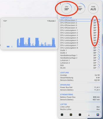
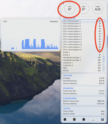
Also, I seem to be having one issue. However, this has ALSO been an issue in v6. This is it: Sometimes (it seems like it's the case after my MacBook Pro got a bit warmer than usual, e.g., when I charge it), the temperature sensing is bugged. What I mean: Normally, the temperature is around 38 - 40 °C but after the bug has been triggered, it sometimes jumps down to 6 °C and then back up to the normal value. This up & down then goes on for forever and can usually be fixed by rebooting my MacBook Pro. I'll include 2 screenshots here: The first one shows the normal values while the second one shows the unusually low values. These up and down jumps can also be seen in the history graph on the left.

Bildschirmfoto 2024-08-02 um 12.18.17.pngBildschirmfoto 2024-08-02 um 12.13.44.png
 
While I appreciate Bjango's passion and drive, this update is completely unusable for me.

Mostly it's the crazy pop-ups/pop-outs that litter the settings and the menus as I move the cursor around. I realize this is a general trend in interface design, but as someone with visual processing disorder, my resulting experience is a chaotic and literally nauseous mess. I miss the days when the UI was relatively 'quiet' unless I clicked something actively.

I also find the pink/purple color scheme to be pretty much the very worst combination for my eyes. I know there's a (huge) color/theme carousel, but using it was overwhelming (see previous point), and never seemed to change the jarring color scheme anyway.

Best of luck to you & your users who can use your software happily. I'm moving over to Stats (+ Vitals), with it's far simpler, clearer, quieter design.
 
So happy to see this! I've been using iStat Menus since version 4, and once or twice a year I'd check the Bjango website to see if there was any new activity because I thought maybe version 6 would have been the end of it. Which would have been fine - it was working well enough - but I'm thrilled to see that things likely became quiet because they were working on version 7. So far, I love the upgrade and the way it displays information, especially on my Apple Silicon system. It's strange how you get accustomed to the data as a way to understand what your programs are doing; once you get used to it, though, it's unnerving to go without it, and so iStat Menus has become one of my "must-have" programs on each of my systems.

People who are happy to see that Bjango isn't subscription-only may not appreciate that they've also lowered the price for first-time buyers. Their license used to be $18. I'm surprised that they've lowered the cost; given inflation and some new features, I'd think they would have been justified to boost the price a bit.

The upgrade process from version 6 was overall smooth, intelligently keeping what items I had in my menu bars and thoughtfully showing me some version 7 changes that could be made, contrasting with what I currently had (and offering to let me keep them). The only thing that didn't transfer over was my calendar menu item, which I had to manually enable and set up as if it hadn't been there before. Setting up the calendar item was a bit less intuitive than everything else had been - it initially wasn't clear to me how to get something other than the system time, but once I saw how to do it, everything else became easy.

My only wishlist item would be for iStat Menus to include SNMP support, so I could monitor network devices through it. That would allow me to dump a different program that I have running in my menu bar. But I know that's not the focus of this program, and don't expect it - I doubt it's a feature most people would use, too.

Congratulations on the release, Bjango, and thank you!
 
  • Like
Reactions: Bjango
Cool. Out of interest: What is it you tweak on your Mac?
How many resources I allocate to virtual machines, for one. Experimentation with local AI models is another reason I'm going to buy iStat. It will help me understand the demands of various models and help me evaluate whether I recommend others use a given model based on their hardware. Tools like this and Activity Monitor also help me work with open source developers to help diagnose bugs and improve their project's performance.
 
  • Like
Reactions: Bjango and Ledgem
My screenshot is of the internal screen of a MacBook Pro, which has a taller menu bar, due to the camera housing (the notch). The 14-inch MacBook Pro menu bar is 37pt, while the standard menu bar is 24pt for iMacs and Macs using external displays. The bar graphs in my screenshot are 16pt for the bar portion (not the border). The bars in your screenshot are also 16pt. They’re the same height.

I'm using a 2013 Mac Pro running Sonoma with a 1440p monitor. The very first thing I noticed after installing v7 was how much smaller the menu bar items were than they were in v6. Likewise, I noticed how much larger v6 was when I switched back. I can't compare the VM to the host machine, but someday I'll re-install v7 and take some screenshots.
 
  • Like
Reactions: cueball73
Maybe it's a hot mess, but I think I FINALLY found my ZENubar happy place... from L > R
Stats CPU > NordVPN > Stats Net Activity > iStats Menu v6 Day/Time/Weather > Fantastical > Little Snitch 5.7.6 > Apple Wifi > Apple Battery > Apple Control center > Apple Notification Center
 

Attachments

  • Screenshot 2024-08-02 at 10.38.27.png
    Screenshot 2024-08-02 at 10.38.27.png
    23.5 KB · Views: 67
  • Like
Reactions: Bjango
I upgraded almost right away when I came across this thread the other day. I think it I have it pretty much set-up the way I want given current options. I'll be a bit less dramatic about it, but I agree the circle graphs aren't my favorite thing; I'd appreciate having the option to have bar graphs throughout. Regardless, iStat Menus is always one of the first apps I install.
 
  • Like
Reactions: JohnD and gank41
Which parts don’t you like? It’s very configurable.
I don’t like how flat and material-esq the design language in general is, no matter how configurable the color scheme. The previous iStat menus 6 all the drop downs were beautiful with a nice blur effect and icons that feels at home on macOS. It should feel like an extension of the native control center design language, not a google website.
 
  • Like
Reactions: DavidSan and JohnD
SetApp reviews are devastating. I agree, it's totally broken and I don't even understand how is it OK to auto-update an app and loose all settings, with no way to migrate from the old version.

1722634458870.png

1722634592555.png
 
  • Like
Reactions: Populus and JohnD
My revised list of what I feel has been lost or is just wrong. Party lost functionality, partly look and feel. At a minimum there should be options to restore lost functionality and to use a more appropriate graph format.

Lost functionality:
  • No option to show cache and free memory separately
  • Active, inactive, etc. memory (and its graph)
  • CPU history graph by core
  • Multi-valued graphs (e.g. load average, memory)
  • GPU memory graph (edit: I fount it!)
Lost/inappropriate look and feel:
  • Graphs have lost grid and Y-axis scale
  • Bar charts inappropriate when x-axis is a continuously varying quantity (time) - better to use line and area/stacked charts *
  • Charts having zero as lower bound compresses visual range of y variable
  • Horizontal bars are more vertically compact than large circles **
  • Small circles are hard to read compared with small bars
*Little Snitch has sadly done the same thing. For examples of appropriate graph/chart usage https://www.atlassian.com/data/charts/essential-chart-types-for-data-visualization

**Strangely the battery levels for trackpad, etc. are still bars.

-------------------

A few (I think) bugs that I have found, some of which may be particular to my Mac with 580X GPU:
  • In combined dropdown some sections have a heading (e.g. CPU and sensors), others do not (e.g. memory and network)
  • Swap graph aways zero (2019 iMac) (edit: fixed in build 2196)
  • Shows non-existent fans (e.g. GPU)
  • GPU (Radeon 580X) memory always zero
  • Fan circles are not filled (edit: fixed in build 2196)
  • “Double” item sensors in menu bar don’t respond to font change (edit: fixed in build 2194)
------------------

Even as is, iStat Menus is superior to the alternatives. In particular the system load of Stat Menus is minimal and has improved further with v7. So I am purchasing in spite of my unhappiness with the changes. $10 or so is top value.
 
Last edited:
@Bjango

Would really like to see ethernet link speeds somewhere. I have a lot of 10GbE/2.5GbE connections with my Macs.

Yes, well aware that Macs don't have native 2.5GbE, but some TB docks do.
 
Which Mac model? iStat Menus definitely works on Intel Macs. I have two Mac here, and one of them is Intel. :D We’ll do what we can to add support. If you’ve purchased iStat Menus 7 and you’d like to run iStat Menus 6 for now, get in touch and we can give you a free license to the older version.
Model MBP mid 2012. It is not showing CPU and FAN rpm sensor information. I went back to iStat 6 version which shows everything.
 
@Bjango - Amongst the many design changes that are a step backwards in UI technology, you have so many bugs in v7 I'd consider it an alpha, not even a beta, let alone a release version. SO much functionality is missing, and a few things you've already admitted might be bugs. How can you call this a release? Did not not alpha test this internally, or beta test this publicly? OWC Thunderbolt RAID's do not even show up as drives. This screams zero testing was performed.

Menu bar graphs are much smaller than v6, and have thicker and brighter borders. This is just one of so many things I noticed when testing v7. Your best bet would be to have a choice of v6 vs v7 UI style. I'd gladly pay for the new features in v7, if they looked like v6. Happy you think v7's UI is a step forward - I think it's a huge step backward.

I will not be spending any money on v7, which I feel is a MAJOR downgrade from v6, nor would I accept YOU paying ME to use v7's UI at any cost. If you don't allow v6's UI in a future version of v7, when v6 no longer works on a new Mac I buy, I'll simply uninstall iStat and move on to another product. I hope this isn't goodbye, but you guys thinking v7 is an upgrade tells me this is the beginning of the end of a long-time relationship. It was good while it lasted...
Version 6 is more complete, in the network menu it displays all the information about the Ethernet adapter, something that is missing in version 7, in addition to displaying all the information about the sensors in detail. The new version of iStat seems like a beta. I agree with you, it is not worth upgrading to the next version.
 
  • Like
Reactions: JohnD
The vertical battery icon is there:

I should have been clearer. v7 has a vertical icon, but not one that's vertical and has the plug/charge symbol like the one I'm using in v6. Not a dealbreaker on its own, but I'd prefer it if all the items available in v6 remained available in v7.

The lack of a history graph menu-bar item for memory is my biggest sticking point right now.
 

Attachments

  • iStat Menus 6 battery icon.png
    iStat Menus 6 battery icon.png
    1.6 KB · Views: 41
  • Like
Reactions: Larsen2k4
I should have been clearer. v7 has a vertical icon, but not one that's vertical and has the plug/charge symbol like the one I'm using in v6. Not a dealbreaker on its own, but I'd prefer it if all the items available in v6 remained available in v7.

The lack of a history graph menu-bar item for memory is my biggest sticking point right now.

I‘m missing this one as well. I‘ve colored the vertical bar with different colors depending on battery status, but I also would love to have these icons back.
 
@Bjango I really am missing the battery history graph that was there in version 6 (and the one that is currently available doesn't have any X or Y axis which is very confusing).

Also, I can't seem to find a way to have borderless graphs in the menu bar (for example network usage history) and graphs seem to have gotten smaller. Any way to customize that?
 
Last edited:
  • Like
Reactions: JohnD
Change it to analogue clock and just use it to show system notifications.
This is a great tip. I personally do this as well. Using an analogue macOS clock, and removing some system menu bar items that are available from Control Center recovers lots of space that can be used for other things.

Model MBP mid 2012. It is not showing CPU and FAN rpm sensor information. I went back to iStat 6 version which shows everything.
Ok, thanks for letting us know.

Version 6 is more complete, in the network menu it displays all the information about the Ethernet adapter, something that is missing in version 7, in addition to displaying all the information about the sensors in detail.
Did you take a look at the sub-menu for the network interface?

This was what's listed for version 6, can imagine version 7 being the same.
We’ve worked really hard to get the iStat Menus 7 App Store version as close as possible to the web version. The only difference now is fan control. Weather was added. The Helper is a separate download for the App Store version (the web download also uses the Helper, but it’s bundled with the app).

Here’s the help page on the topic: https://bjango.com/help/istatmenus7/macappstore/

@Bjango I really am missing the battery history graph that was there in version 6 (and the one that is currently available doesn't have any X or Y axis which is very confusing).

Also, I can't seem to find a way to have borderless graphs in the menu bar (for example network usage history) and graphs seem to have gotten smaller. Any way to customize that?
Borderless graphs are possible, and getting them set up is like iStat Menus 6 — click on the item you’d like to see the settings for, then the background can be removed and the border can be set to transparent, or any colour you’d like. The image below doesn’t show a transparent border, but it can be done by setting the opacity of the colour to 0.

We also now keep the history of recent colours in the picker, for situations where you’re editing many items and want to quickly make them all match (that’s new for iStat Menus 7). Here’s some more info on that:


welcome-show-background.jpg
 
Last edited:
Register on MacRumors! This sidebar will go away, and you'll see fewer ads.