Got a tip for us?
Let us know
Become a MacRumors Supporter for $50/year with no ads, ability to filter front page stories, and private forums.
iTunes 9 Redesign
- Thread starter MBX
- Start date
- Sort by reaction score
You are using an out of date browser. It may not display this or other websites correctly.
You should upgrade or use an alternative browser.
You should upgrade or use an alternative browser.
Where are the 'old' functionalities...?
Where is my 'shopping cart'?...I used it to keep track to the items I intend to buy in a near future....If it's lost well I'll buy them on amazon store ( I don't give a damn to 128Kbs vs 256 Kbs..) at least my shopping basket it's still there...
Now it's impossible to have a shopping basket???
Where are the option to upgrade to iTunes Plus the items not DRM free in my library?
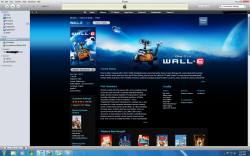
Jesus it's just me or the white background is ridiculous? It's almost impossible to notice white cover albums....
The cool thing is if you downgrade you get the old store back.
That would be the worst
May be a test to see what people think of the look. If it's well received they may make it the main OS X theme.
Not a good start though
That would be the worst
Where is my 'shopping cart'?...I used it to keep track to the items I intend to buy in a near future....If it's lost well I'll buy them on amazon store ( I don't give a damn to 128Kbs vs 256 Kbs..) at least my shopping basket it's still there...
Now it's impossible to have a shopping basket???
Where are the option to upgrade to iTunes Plus the items not DRM free in my library?
Jesus it's just me or the white background is ridiculous? It's almost impossible to notice white cover albums....
The shopping card functionality has been replaced by the Wish List. Everything from your cart should still be in there now.
Itunes 9 is so ugly. And for once, can we please have a unified GUI for the ENTIRE operating system! I've been missing itunes 8 since I downloaded this to day. The volume control is ugly as is the gradient in the menu bar. Yuck, Yuck.
I cant stand it. I think it is worse then when you reverse the colors on the iphone. The redesigned store is kind of annoying too. the "tabs" at the top are too small.
Another annoyance is the store really feels like a website, because on my large resolution the store doesn't resize to fill iTunes entirely like it did previously.
I also miss cover-flow and wonder why it's gone, that was really cool in the store.
I also miss cover-flow and wonder why it's gone, that was really cool in the store.
Actually I really like it.
Another annoyance is the store really feels like a website, because on my large resolution the store doesn't resize to fill iTunes entirely like it did previously.
I also miss cover-flow and wonder why it's gone, that was really cool in the store.
I am not a fan of the new black menu bar either... It doesnt "belong"
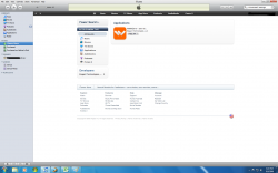
I agree. It looks terrible on my 22 inch monitor:
Attachments
I really despise the gradient they have now, It is very ugly.
Agreed. The buttons, gradient, volume slider it all looks like software that would have been around a good 8 years ago.
After all this push in the GUI for adding black backgrounds, right clicking on the dock, Quicktime X, iphoto, and even the iphone....
Why now do they give us the white backgrounds? What is with this constant mismatch with the GUI, especially when it comes to itunes?
Being an artist, stuff that don't match really bugs me.
Why now do they give us the white backgrounds? What is with this constant mismatch with the GUI, especially when it comes to itunes?
Being an artist, stuff that don't match really bugs me.
It actually looks like iTunes 9 was designed to appeal more to windows users than mac users, mac users already have iTunes, it's the windows people who apple needs to get to increase the share of iTunes. iTunes 9 fits nicely within the windows GUI.
Can't say I like 9 too much. The new look & gradients look a bit cheesy and cheap to me; iTunes 9 looks much better.
Don't care about the white background one way or the other, but I can't say I like the iTMS changes. Much less organised, harder to find what I'm looking for.
And it's a pain that the columns in the list box when you do a search aren't resizable!! If you find a dozen songs with remixes, they all appear "My song name (..", "My song name (..", the only way to differentiate between them is to mouse over each of them in turn until the full title pops up.
I'm just glad we finally got drop shadows on iTunes for Windows. I've been waiting for those since 7.x after Vista came out. 
Good grief what on earth were they thinking? There has to be something wrong, it looks just like a unselected window.
Another thing that is horrible in the store is how they list the shows now in certain sections. Only thumbnails, no list-view. So if the title is longer than maybe 10 characters you can't even figure out the show episode name. And there's no "i" (for info) either where you can read more about the particular episode like before.
All in all the new store layout is a step backwards in my opinion.
All in all the new store layout is a step backwards in my opinion.
I'm still on the fence, but definitely leaning towards liking it (including the white bg and gradient).
I'm just glad we finally got drop shadows on iTunes for Windows. I've been waiting for those since 7.x after Vista came out.
haha really? well at least you're happy.
I went back to 8. I won't use the new features and I MUCH prefer the dark gray backgrounds. I actually went out of my in the last couple months to change all of my media folders to that dark background/light text to match. The white is way too bright and straining on my eyes.
Register on MacRumors! This sidebar will go away, and you'll see fewer ads.


