Become a MacRumors Supporter for $50/year with no ads, ability to filter front page stories, and private forums.
In case you have not read news lately, the new Steve Jobs movie is getting released on Friday and it shows the most unfavorable side of Steve. So Apple is doubling down on PR!

Awesome, I might actually watch this movie then, it's likely the most accurate portrayal.
 
Right because no one needs to hear from the people that actually worked with Steve later in his life and knew him intimately. What would you expect Ive to say about a movie that doesn't reflect the person he knew? That's the problem with these movies. You don't get a balanced portrait of the man because those closer to him later in his life and/or those currently working at Apple won't cooperate or contribute. The Steve Jobs of 1984 is not the same man that came back to Apple in 1997.
We don't want to hear them every year.. year after year.. it kind of gets tiring, you know?
 
This Johnny Ive guy, given his promoted status, really needs to be given a window office facing the incoming sun. Right now, he's stuck in the bowels of his ultra secret laboratory that does not see the light of day. That way, Johnny can appreciate how disgusting it is to use his glossy screens in offices that are streaming with sunlight. Some office workers are assigned desks by their company, and so it's not a solution to tell people to just shift their computers to a place with less glaring sunlight.

What I'm saying is, Apple needs to give us the option of anti-glare screens.

I am not saying everyone needs these, so don't tell me how you love glossy screens.

I am just asking for the option, for those people that do need them.

Office lighting is bad enough to trigger this. It's really quite an incentive to question what Apple's internal content creators use to do their work...
 
Awesome, I might actually watch this movie then, it's likely the most accurate portrayal.
So basically you're not interested in a balanced view of the man but something that confirms your existing opinions of him.

We don't want to hear them every year.. year after year.. it kind of gets tiring, you know?
But all these new movies and books and quotes from Woz, Andy Hertzfeld, John Sculley etc. every year are a-ok.
 
Last edited by a moderator:
But all these new movies and books and quotes from Woz, Andy Hertzfeld, John Sculley etc. every year are a-ok.
I am not saying that's ok either. Steve is a legacy and let it be. We don't need to keep hearing about his good or bad side of it every year. Apple has better things to do than do this. Let me ask the simple question: Why is Apple hell bent on this PR campaign, if Steve Job was not good. Or does Apple think that people are dumb and this movie will sway them away from Steve? Did Social Networking movie do anything to change the image of Mark? Did Mark do the same thing then what Apple is doing now just for a movie? Give some credit to people. But no, Apple always thinks people are dumb. And they think that because people keep buying new iPhones with incremental features. I wonder who is at fault here..
 
And iPhone sales would have tanked and Tim Cook would've been out on his rear. Fact is most people want phones larger than 3.5" or 4".
Mind to share where you got the stats of "Most people"?
Also, it would be a good idea to compare how many people with 3.5" or 4" iPhones got the new larger phones while their older phones were not slowed to a crawl with the new iOS updates.

I'm pretty sure I heard that the plans for the iOS redesign happened before Steve Jobs or Forstall even went out. Might be wrong, but just something I wanted to add.

I have been decently satisfied with the progression of iOS, EXCEPT FOR HOW ******* BUGGY AND LAGGY it can be!! My mini 2 is awful, iPhone 6 is eh, especially for only being a year old. Not acceptable. What's worse is that this is on the update that was touted as performing better than before! Yeah, the mini 2 is now 2 years old, "ancient" in terms of mobile technology, but simple things like opening/closing apps, rotating the device, spotlight, THE APP SWITCHER (absolute worst of it all) should not be completely butchered. The iPod 4 on iOS 6 and iPad 1 on iOS 5 perform many of these animations smoother than my iPad mini 2. Just sad.
The very same reason why my iPad 3 will not see anything beyond iOS 6...
 
Is that true? can you link me an article? That seems hard to believe. When I was in retail, the only iPhone buyers were already iPhone owners. There was hardly anyone that was switching from an android device.

That was a figure cited by Tim Cook at a quarterly earnings call. It was a while ago, so it may have gone up since.
 
Smaller screen iPhones?
Maybe,maybe not but definitelly without protruding lenses and rubber antenna bands.
and no Apple watch;in it's current form at least..
and no under powered Macbook either..
he would not approve launch of products with flaws and limitations present.
 
  • Like
Reactions: Benjamin Frost
This so-called design president has done nothing less than cripple what Jobs invented...

If anything, he made it impossible to capture the Moment with the Camera... Now, when launching the Camera, first it has to blur in nicely with an animated effect - and when it is done, the awesome moment you wanted to photograph in the first place is long GONE !

Voice Recording wind up being over-written as it is totally unclear whether one has made a NEW memo or is recording to an old one. After recording there is NO undue. Nothing. SO goodbye memories.

After entering the unlock code, one is met with a thousand notifications about this and that and before one can get to do what one opted to do when entering the unlock key, one has to click away all the stuff that Jony Ive loves...

iOS and OS X is NOT progress. They are the opposite. Bloat-ware which satisfies the bored programmer and designer incapable of inventing. Jobs was the inventor, Ive the Executor. Without Jobs - Ive has NOTHING to execute !
 
Right like video on the iPod which Jobs pooh-poohed until he released one. And how web apps were the future until the App Store was a thing and then it was native FTW. How nobody read books and then we get the iBooks store. Jobs would have released a bigger phone and would've made everyone believe bigger is better.

That's a lovely account of Jobs's beliefs as understood through him talking up the products that were currently available.

Now, if we hone in on the question of success, well, no CEO was more successful, end of story.

Stop cherry-picking for examples to prove something that isn't true; that he was a failure. No CEO was more successful.
 
  • Like
Reactions: Benjamin Frost
I concur-

I love Apple, and have been a customer since 1988- some "not so good" years mixed in there. Its impossible to quantify what Jobs brought to the table, but there is no way certain products would have been released under his leadership -Apple Watch being first, and the iTunes/Apple music interface being the later.

The Watch is useful, but the interface is laggy and un-intuitve. Ive had one for months now and still can't remember what different directional swipes lead to. And iTunes is terrible to navigate. iOS is getting more sophisticated, but perhaps more bloated too- at least in my opinion.

You just don't get the sense that someone who is as feared as Jobs was is in charge. He whipped the horse on every bend, and never let up. Moreover, he had a vision which transcended a single product and went across the entire design and craft spectrum.

Yeah, it is easy to be simple when your company has have several hundred billion of reserves in the bank. Stay hungry Johnny, Stay hungry!

I couldn't agree with you more, "something" is missing from Apple today. I bought my first Apple product, a 128k Mac, in 1984, it was magical and many of their products still are. However the Watch isn't one of them. Apple Music and iTunes are a confusing mess. Jobs idea behind the Mac was to make something that just worked, right out of the box. That concept is being lost, the current OS's are obtuse with many of the features going unused because the end user can't figure out how to use them.

Ive's design of iOS and OS X may be beautiful but the "white on light" interface is hard to see if you don't have 20/20 vision. The sad part is you can't change it to make it more readable. You must accept Ive's concept of beautiful over usability.

Sigh, I am looking forward to seeing "Jobs" this weekend. I feel he was a visionary and a genius, I don't really care if he wasn't the nicest guy in town, I don't care that he had outbursts, he got the best from the talented people who worked for him, that was his job and he did it well.
 
  • Like
Reactions: Benjamin Frost
This so-called design president has done nothing less than cripple what Jobs invented...

If anything, he made it impossible to capture the Moment with the Camera... Now, when launching the Camera, first it has to blur in nicely with an animated effect - and when it is done, the awesome moment you wanted to photograph in the first place is long GONE !

Voice Recording wind up being over-written as it is totally unclear whether one has made a NEW memo or is recording to an old one. After recording there is NO undue. Nothing. SO goodbye memories.

After entering the unlock code, one is met with a thousand notifications about this and that and before one can get to do what one opted to do when entering the unlock key, one has to click away all the stuff that Jony Ive loves...

iOS and OS X is NOT progress. They are the opposite. Bloat-ware which satisfies the bored programmer and designer incapable of inventing. Jobs was the inventor, Ive the Executor. Without Jobs - Ive has NOTHING to execute !
Ive has maybe himself to execute...
Removing Forstall was a big mistake...
I couldn't agree with you more, "something" is missing from Apple today. I bought my first Apple product, a 128k Mac, in 1984, it was magical and many of their products still are. However the Watch isn't one of them. Apple Music and iTunes are a confusing mess. Jobs idea behind the Mac was to make something that just worked, right out of the box. That concept is being lost, the current OS's are obtuse with many of the features going unused because the end user can't figure out how to use them.

Ive's design of iOS and OS X may be beautiful but the "white on light" interface is hard to see if you don't have 20/20 vision. The sad part is you can't change it to make it more readable. You must accept Ive's concept of beautiful over usability.

Sigh, I am looking forward to seeing "Jobs" this weekend. I feel he was a visionary and a genius, I don't really care if he wasn't the nicest guy in town, I don't care that he had outbursts, he got the best from the talented people who worked for him, that was his job and he did it well.

Beauty is to the eyes of the viewer...I am absolutely disgusted by the Ive's "design".
And even with 20/15 vision, I am still having a painful time to see and use the current Mac OS...
Is it really that freakin' hard to have some more color contrast in the file names?
 
  • Like
Reactions: Benjamin Frost
Beauty is to the eyes of the viewer...I am absolutely disgusted by the Ive's "design".
And even with 20/15 vision, I am still having a painful time to see and use the current Mac OS...
Is it really that freakin' hard to have some more color contrast in the file names?

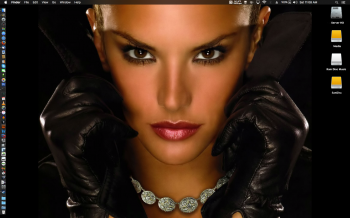
Oh I dunno... despite Ive's changes my "dark" El Capitan Desktop is looking pretty damn good.... :D

Screen Shot 2015-10-10 at Oct 10, 11.08.07 AM.png
 
Jony Ive is so eloquent. I love the way he chooses his words so carefully well.

A genius in product design and seems like a nice guy too.
 
And why do I have to limit my choices of wallpapers?
The point is, it was working fine previously and it is not working right anymore...

What exactly isn't working? I've got around 14 desktops set up across two monitors all with their own wallpaper (not all dark and even if I turn dark off, the menu bar still looks fine, just medium gray instead and the dock isn't as "light" even in "light" mode with darker backgrounds now and is more transparent. The dark mode dock looks like Mountain Lion's dock and the bottom dock looks like Mountain Lion's side dock so there's consistency even if it's not 3D. Besides, it looks quite similar to all docks before Leopard's 3D dock. Some people thought that was stupid looking when it came out too). All the background images "work" fine. Yeah, the new icons aren't great, but unless you make them huge, they aren't that noticeable. Besides, most of my dock icons are 3rd party apps and you should be able to replace the icons if they really bother you. Yosemite's font (I didn't use Yosemite so I can't comment directly except on screenshots) wasn't so great, but I don't have readability issues with El Capitan's font. I don't know how bad the drop shadows were on Yosemite, but I don't have problems telling windows apart either. I do think they should have more of a difference between the windows in terms of the active vs inactive ones.

El Capitan's Mission Control is an improvement over Mavericks (you can see all your windows even if there are multiple windows per App and yet you can switch that back to Mavericks behavior if you prefer it). Dashboard still exists (I was concerned they'd ditch it altogether; I still have some widgets I like to use (iStat Pro and Sloth Cam, the latter viewing the Panama Canal web cams). Notifications new "Today" pane is nice (weather reports and instant calculator access here along with calendar events).

I reorganized my Launchpad setup with all programs in their own folder categories so it's actually easy to find "types" of programs now rather than one giant arse "Applications" folder (I did split "Games" out into its own folder long ago, but some have to be linked from there and that leaves Applications still messy looking). They really should have a tool or preference pane to make organizing faster and easier, though, so it's more usable (I organized it once before, but it broke out of the sub-folders somehow one day).

Launchpad (blurry Katy Perry in background): Launchpad.png

I will say Safari constantly nagging me to change it to my default is (bleeping) annoying, though. It's just like Google nagging me to change to Chrome every other visit to their web site. If I wanted to change it, I would change it. How many damn times is it going to ask?

I do also hate the stoplight buttons (the classic "gem" look was so much better), but the world isn't going to end over a button design.

I don't like that it broke some programs (I had to upgrade VMWare Fusion from 5.x to 8 when 5.x was doing what I needed it to do just to play old XP games and despite their claims of speed improvements across generations, it doesn't run XP games any faster that I can tell; now if they added DirectX 11 support for Win7 and newer it would be worthwhile; not much uses DX10 over DX9 compared to DX11 that had a lot of fancy gaming support options. Pinball Arcade is night and day different with DX11, for example). Spotlight seems weird starting in the middle of the screen, but it does provide more information now (you do have to give it time to cache everything when you first upgrade). The disc icons aren't as good as the old ones, but again, the world won't end.

Other than that, I'm hard pressed to think of any other differences I've noticed offhand (I did have problems with the background screens not sticking when I got my 2nd monitor working again; oh yeah that did require me to get a new adapter; Amazon's $10 "Basics" model worked fine, though. I was using some Taiwan cheap thing, but it worked fine in Mavericks). El Capitan feels about the same as Mavericks GUI/speed wise (although XBench says certain things are noticeably slower, but I don't know if I can trust all of the tests at this point since it hasn't been updated in like 9 years!) Metal should hopefully provide a boost to some games at some point (Aspyr has said they may even update some of their older games where it could provide a good boost; I'm hoping for Borderlands 2 to get an update so I can turn up the settings higher).

Honestly, on a day-to-day basis, iOS was the bigger shock since the music player went "bright" and what not and it's hard to look at compared to the old interface for that reason. Icons there are huge and you can't change their size or appearance so ugly icons are more noticeable, etc.
 
  • Like
Reactions: Benjamin Frost
Gosh, the interviewer looks extremely gaunt - or is he just of advanced years, dressing as a 20-something? I am not making any kind of nasty remark against him - that would be awful, I just can't work out whether he is ill or old.

Thanks for posting this! :D
 
Register on MacRumors! This sidebar will go away, and you'll see fewer ads.