Become a MacRumors Supporter for $50/year with no ads, ability to filter front page stories, and private forums.

MacRumors

macrumors bot
Original poster
Apr 12, 2001
68,353
39,189


The latest Mac OS 10 Leopard seed that was released on Friday to developers has introduced a number of notable visual tweaks to the operating system. Notes and screenshots have been gathered from public forums which reveal the improvements found in the latest version of Mac OS X Leopard.


ichat_300.png


iCal's icon reflects today's date

- The Welcome Video to Mac OS X 10.5 now has a new audio track and has been posted to YouTube.
- iCal's Dock icon now reflects the current date (image)
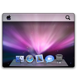
- New Desktop images (image)
- New Spaces Icon (image)
- Front Row has its own icon (image) and seems identical to Apple TV
- Menus and dialog sheets now overlay with a translucent filter, allowing you to see a hint of the underlying windows.
- Screen sharing "finally works right" and seems very fast at full resolution
- More user interface consistency across the operating system

Article Link
 
Ooh, so we're onto visual changes. Just a nice reminder that launch isn't so far away any more.
 
I know that music from SOMEWHERE but where???its really bothering me now! It was used in some other ad but I don't remember what...or even if it was apple related.
 
The new intro music is awful - it doesn't even remotely fit in with the video. It's like they just pulled the name of a song out of a hat or something.
 
the new music the same as the new Imac commercial, the one where all they do is twirl around.
 
i kno im a newbie here, but on insanelymac im numberz, the one that posted most of the images, and supplied the music for the youtube video(<3 colonel :D) glad u like them!
 
Ok, honestly, who cares about the intro music? You'll only ever hear it once in your life (if you're not a Developer), so what's the big deal?

Otherwise, the new icons look cool, and I have yet to find the new desktop pictures... Anyone? Hopefully ThinkSecret posts a gallery of some sort, even if it's a small one.
 
oh i'm very glad to see the little title balloon above dock apps now... it has always been a little unpolished, as text characters that hung low like "g" and "p" and "q" would always be slightly cut off at the bottom... this is nice...
 
Register on MacRumors! This sidebar will go away, and you'll see fewer ads.