Become a MacRumors Supporter for $50/year with no ads, ability to filter front page stories, and private forums.
When the third-generation iPod nano came out, I remember how there seemed to be a broad consensus amongst users here that it was ugly, and a terrible misstep on Apple's part. Now that they're (probably) switching back to the former form-factor, we're getting exactly the opposite reaction.

No, the fatty iPod was ugly when I first saw it, and it's still ugly. But so is this curved one. :p
 
oh yeah?

I don't think anyone wants to go back to the clam ibook!!!
What a mistake apple made. Something they will never repeat again! :D

It still scares me looking at that monstrosity :rolleyes:

That really made me laugh. I agree that the original iBook was ugly - some even called it "Barbie's toilet seat". Funny thing is, I seem to recall I quite liked it at the time. Maybe I just drink too much Apple Kool-Aid ;)
 
That really made me laugh. I agree that the original iBook was ugly - some even called it "Barbie's toilet seat". Funny thing is, I seem to recall I quite liked it at the time. Maybe I just drink too much Apple Kool-Aid ;)

Laughing... I hate to say this but I liked mine.... until I realized how right you were about the toilet seat.

Oh the shame
 
The last one I didn't think I would like but they proved me wrong. The only thing that discouraged me from the last one was I always had the strongest urge to hurl that baby into a calm pond like a skipping stone ;). It just felt so right. this new design again I don't like much... more then likely apple will bait me in with impressive features:rolleyes:.
 
The only reason why iPod fatty survived was because of its thinness. Who would ever buy the fatty that was thick in depth.

Apple knows this to be true and thats why they've decided to change the form factor back to long slim. I don't think they'll be repeating this mistake.

Long slim is here to stay!!! :D Hopefully this will encourage people to lose weight. I would argue that Apple introduced the fatty nano targetting the every increasing fatty population :D

And now we are all on a fitness crave they've decided to introduce slimness once more. I really do believe there is a correlation :rolleyes:
 
The phatty is lovely and doesn't deserve the bashing it is getting from some quarters in my opinion. The 4G may be really nice too. Looking forward to actually seeing them.
 
Well, I'll have to see how this pans out with possible iPod Touch price reductions and whatever happens to the classic before I pick one up for my girlfriend.

If the 8GB iPod Touch drops about $50 it'll be a touch choice between it and a 8GB Nano.
 
Well, I liked the 2G iPod Nano (Wife has one). I disliked the early "photos/mocks" of the 'fatty' iPod Nano and even the real photos on Apple's site when they were released. I went to the store and saw them in person and liked them a bit but not the best.
This design is good. I like the tall and thin look. Maybe the CD Artwork will be displayed to the entire edge making teh artwork larger overall.

nice work.
 
still think and hope its fake

why..... because the design does not make any sense
i just had the current one in my hand and its way better
not even work wise but also with the hole ipod design at this point

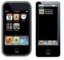
again i say that the ipod nano can only be better if apple turns it into a nano touch
like an ipod touch but with half the screen size
f_iPodntouch1m_b0b01b1.png


i know steve sad a while back that having a full touchscreen and no extra buttons there is more room to improve on future updates

with the hole ipod line being touch accept the shuffle they would make it alot easier to work on interfaces and updates (and don't forget the itablets etc.)

so why does everybody think that ugly yellow/orange thing is the real deal
do you want apple to go back in time and not foward?
:confused:
 
Fatty versus Slim?

Of course with the slim the buttons are smaller in size.

Still debating which I like.
 

Attachments

  • compare.JPG
    compare.JPG
    16.7 KB · Views: 21,767
I saw a good mockup when you turn the nano to its side it has the cover flow and up right it has tiny little ipod touch icons on the bottom of the screen rather then the usual ipod menu. I think that would make sense.

EDIT:
Mockup

That mock-up looks the business. The only thing that would be better than that would be the Nano touch listed above. I couldn't get either because I have way too much music, but still. Both very good looking products. Nano touch not being so visionary (same design as iPod touch and iPhone,) nonetheless handy!
 
Zune comparison

I don't really get the Zune comparison - it seems that this is based simply on the portrait screen, which seems a fairly tenuous similarity. It may be more accurate to say that the Zune is Microsoft's answer to the iPod.

But then, like the new Seinfeld ad, there's so much I just don't get about Microsoft.

(Off topic, but let's be honest, Curb Your Enthusiasm demonstrates where the real talent from the Seinfeld show lay. Enough said).
 
again i say that the ipod nano can only be better if apple turns it into a nano touch like an ipod touch but with half the screen size
f_iPodntouch1m_b0b01b1.png
I would disagree with you.

IMHO, the Touch is a bit too small as it is -- coming from the Newton perspective. Gut feeling is that a smaller Touch screen would be hard to use and not all that useful. YMMV.
 
Yeah, if the click wheel actually turned in sync with the device, this new nano wouldn't be so bad after all.

Maybe there's a little motor that turns the physical clickwheel.
...
Or there's just a weight a the play/pause side an the clickwheel rotates...
Or there are some OLEDs on the clickwheel that display the appropriate icons. WOuld be great for games and movies when the buttons don't do what the labels suggests anyway.

But let's be honest here, does anyone look at the labels after 1 minute of use? You car doesn't have labels on the pedals right?
 
Register on MacRumors! This sidebar will go away, and you'll see fewer ads.