Become a MacRumors Supporter for $50/year with no ads, ability to filter front page stories, and private forums.
nmk said:
First of all, Quartz is also a vector based GUI. That is why you can scale your icons infinately without losing any quality. I don't quite know what you mean by scaleable, but graphics in Quarts can be physically scaled to any level. If you are talking from a development point of view, you shuld clarify. Jobs does realize that people like to customise, he just doesn't give a ****. He feels that he has better taste than you do, and doesn't want to give you to opportunity to deface his creation.

Longhorns GUI is in no way more advanced than Quartz. Visually it is gaudy, which is to be expected from MS. They can try to copy Apple, but taste is something you either have or don't (and MS don't). OS X is elegant and understated. Apple has actually made the interface less colorful in Panther. In the initial releases of OS X they were trying to impress people with their flashy new 3D GUI. Over time, as they have gotten used to the technology good taste has prevailed. I've heard people complain that the Powerbook doesn't have fancy flashing lights on it like Windows Notebooks. I believe that the Longhorn GUI will appeal to this group, but not the typical Mac user.


Hmm were you at the longhorn preview launch in LA? It is quite difficult to explain why it is better than the quartz system (sadly) in terms of UI responsiveness. Until Apple can make Quartz run as snappily (on my dual g5 with a 9800) as system 9 did on the fastest Mac way back when, They are behind M$. I dont want to wait around for some fancy effect to finish its animation, I want instant resizing etc. I hate having to run a PC as well, but it REALLY breaks my heart that XP has a much faster responsiveness than OSX.

Yes, the M$ interface sucks, which is why at the ground level it is fully customisable this time around.

I, for one, would prefer a darker interface and the complete dropping of metal. More like what they have going in Studio Pro and Shake (palette wise for Shake not icon-wise).The stripes and the metal are not good for your eyes.
 
applekid said:
Arn, any plans for one last rumor round-up before the big day? :D

God, I hope not - there are already too many separate threads going on which all essentially touch on the same topics. How many times can people rank and comment on the same topics? I pretty much lost count of all the "updated PowerMac" threads a couple weeks ago...
 
wrldwzrd89 said:
Don't forget that Apple Legal acts when not acting would be detrimental to Apple - whether they act or not usually is not related to whether the rumors are true or not. Apple Legal's goal is to help Apple and baffle the rumor sites.

I would think Apple would have viewed that as detrimental. I mean when the screen shots are provided by person named gary niger of the GNAA and the G and the N stand for Gay ******s I'm sure they'd be quick to attempt to disassociate themselves from that.

I think the mac community just got trolled big time, and the twits that get off on doing this are having a huge laugh at the communities expense. I was shocked when I read the page 2 section and saw Arn actually posted this knowing the source..
 
nmk said:
First of all, Quartz is also a vector based GUI. That is why you can scale your icons infinately without losing any quality.

First of all, what icons are you talking about?
 
I wasn't at the Longhorn Preview launch, but I've seen a lot of screenshots and read a lot of reviews. The screenshots look gaudy (kind of like what rap stars do to their cars). Functionality wise, its seems to be following in XP's footsteps. I believe XP tries to do too much, and ends up not doing anything particularly well. It is difficult to find the settings you are looking for (the Windows control panel is a sadistic joke). The regular wizard driven view doesn't let you access anything you want. The classic view has icons scattered all over the place and they usually don't logically indicate what options will be located in them. Then when you open a particlar controll panel, there are tabs within tabs within tabs.

After working with OS X, it is hard to believe how a company with the resources that MS has could create a mess like windows. There are ten different ways to do the same thing, located in ten different places. I think the only place where the OS X UI responsiveness really needs to improve is window resizing. Most other problems seem to have been sorted out. I really could go on, but we are digressing.

As far as the screenshots are concerned, I hope that we have a lot more comming. As others have mentioned, I believe that some of the more major changes to Tiger may be under the hood. The could improve networking performance and compatibility with Windows. Perhaps bring in a degree of native Linux support. If they could find a way to run KDE or Gnome applications natively rather than through X11 that would be a major step. Metadata support with the ability to organize and search for your files more inteligently through the GUI would be a huge step (think smart folders the way you have smart playlists in iTunes).
 
123 said:
First of all, what icons are you talking about?

I'm talking about application icons. They can theoretically be scaled infinately (the GUI poses restrictions on how much you can scale). This would be impossible using traditional gif, jpeg, bmp sort of technologies.
 
bitfactory said:
uh oh...

Konfabulator creator Arlo Rose must know something.

he doesn't sound too happy - and i doubt he's going by rumor alone.

http://www2.konfabulator.com/forums/viewtopic.php?t=3903

looks like some kind of Dashboard app IS coming, imo.

Interesting little discusison - thanks for the link. This does bring a little more validity to the rumors, but of course, they're essentially going off the same rumors we are. Although I agree, Arlo makes it sound like he knows something...

Tomorrow all will be revealed! :cool:
 
Wow this doesn't bode well

As I remember the Sherlock Watson thing, they didn't let them know in advance that they had stolen their ideas. This time it appears as if Arlo has some foreknowledge.

bitfactory said:
uh oh...

Konfabulator creator Arlo Rose must know something.

he doesn't sound too happy - and i doubt he's going by rumor alone.

http://www2.konfabulator.com/forums/viewtopic.php?t=3903

looks like some kind of Dashboard app IS coming, imo.
 
uh huh

Manuel Moreno said:
don't wait for longhorn. xp has various features that mac os x don't.

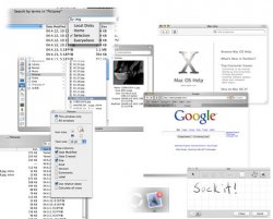
Two can play that game. I counter your lame collage with my (less) lame collage.
 

Attachments

  • counter_collage.jpg
    counter_collage.jpg
    38.3 KB · Views: 535
newamiga said:
I don't want to start a flame war here, but man you have got to be kidding if you think that Win XP as it currently exists is anywhere near as visualy appealing or useful as OS X even in its 10.3 form.

Defrag or speed your brain activity, before use Windows. If you think that windows is not that fast, customizable, full-featured, comparing with mac os x, then i recommend u to make a random pool outthere.
I've seen various websites trying to ranking (mostly are made by mac zealots) both systems. In my opinion, and macuser since 1995 (pc >1990), studing computer enginieering, apple's surprise me with some inovations (quartz, rendevouz, expose) but that part of the system that should be dedicated to the user itself (help, notification, customization, advanced features for views, specially in finder, dock) are very basic.


newamiga said:
First of all, Quartz is also a vector based GUI. That is why you can scale your icons infinately without losing any quality.
Yes, they call this tecnology Apple Lossless Icon... :D
 
beg_ne said:
Two can play that game. I counter your lame collage with my (less) lame collage.

HAHA - sweet, that's the best laugh I've had all day - well done! I was confused by the previous poster's useless collage as well. Thanks for this! :) :cool:
 
nmk said:
First of all, Quartz is also a vector based GUI. That is why you can scale your icons infinately without losing any quality. I don't quite know what you mean by scaleable, but graphics in Quarts can be physically scaled to any level. If you are talking from a development point of view, you shuld clarify. Jobs does realize that people like to customise, he just doesn't give a ****. He feels that he has better taste than you do, and doesn't want to give you the opportunity to deface his creation.

Longhorns GUI is in no way more advanced than Quartz. Visually it is gaudy, which is to be expected from MS. They can try to copy Apple, but taste is something you either have or don't (and MS don't). OS X is elegant and understated. Apple has actually made the interface less colorful in Panther. In the initial releases of OS X they were trying to impress people with their flashy new 3D GUI. Over time, as they have gotten used to the technology good taste has prevailed. I've heard people complain that the Powerbook doesn't have fancy flashing lights on it like Windows Notebooks. I believe that the Longhorn GUI will appeal to this group, but not the typical Mac user.

First off most of Aqua is Vector based, but Icons are not. Note that Aqua is the UI, Quartz is the rendering technology. It is probably possible to render Aqua on a different backend (as long as it supports at least the same features as Quartz) and it's certainly possible to use Quartz to do non-Aqua things. Anyway icons on OSX are at most 128x128 pixel sprites in 32 bit colour. They cannot be scaled without a loss of quality as they are not Vector based.

The Longhorn renderer does seem to be a little more advanced than the current Quartz renderer (Quartz Extreme). In Quartz Extreme the rendering of each window (possibly of each control, but I think it's done at a window level) is done by the CPU in main memory. These windows are then transfered to the graphics card to be composited (i.e. layered one on top of each other with transparency). The longhorn renderer seems to draw most of the UI on the graphics card as well as rendering it. So it should be faster. It is possible that the next version of the Quartz engine will put more of the work on the graphics card than the current one.
 
ThinkSecret images...

The ThinkSecret article (link: UPDATE #1) is still hosting the images (bottom of page). Surely Apple Legal will bring them down soon?...
 
the silver fox said:
Until Apple can make Quartz run as snappily (on my dual g5 with a 9800) as system 9 did on the fastest Mac way back when, They are behind M$. I dont want to wait around for some fancy effect to finish its animation, I want instant resizing etc. I hate having to run a PC as well, but it REALLY breaks my heart that XP has a much faster responsiveness than OSX.

My guess is, that Apple would have no problem in making the OS X Interface at least 8x as fast as it is now... That is, if it breaks with every rule in clean and standards-based programming.

M$ doesn't give a rats ass about compatibility with old software or building a foundation for new. They code for the moment. Don't forget, that PDF 1.3 is completely integrated into Quartz. So it's not just about looks.

Of course, if Apple would throw away everything and just make a fancy looking interface it would also be snappy from the beginning. But that's not that they are making an ARCHITECTURE for...

It is esentially like with QuickTime: It is not a Video Format or Codec. It's a Foundation/Architecture.

--- --- --- --- ---
Free Desktop Pictures &
Digital Apple Collectibles!
http://homepage.mac.com/nuber
 
Avalon

To clarify why the Longhorn UI is vector-based and the Mac OS X UI isn't:

Let's assume you have two 17" monitors, one has a resolution of 1024*768 and the other one is a very expensive high resolution monitor with 4096*3072 pixels. The expensive monitor has a resolution of 300dpi so it is able to display text and graphics as sharp as a laser printout.
However, instead of displaying everything more sharply on that great screen, Mac OS X will make everything extremely tiny, so that 16 times as much fits on the screen. You will hardly be able to read the fonts. You could tell InDesign or Word to display everything at 400% and you would have the desired effect, but that would only work in some applications and it would NOT make the UI (window title bars, controls, menus etc.) any bigger. And if you use the zoom feature (of Mac OS X itself), you will just make the pixels bigger, so that your 300dpi display will look like a standard display with only 72dpi.

Longhorn, however, will be resolution-independant. If you connect a 300dpi monitor, you will see that everything is pin sharp, but as large as on a standard 72dpi screen.

The Longhorn UI will have some other useful advantages, if Mac OS X doesn't beat Longhorn to it, e.g.:

1.) It's a LOT faster and more responsive than the current Quartz 2D.
2.) It runs great over a network or the internet. It still works quite good if you're connected to the Terminal Server with a 56k Modem. Try to use vnc or Apple Remote Desktop with a 56k Modem :(

The Longhorn graphics system ("Avalon") has been created in two years by a group of 200(!) developers, so yes, it will really be THAT GOOD when it will be released in another two years. And Avalon will not be the only innovative new feature of Longhorn. And who knows, maybe Microsoft will even find out how to make a decent interface - no, that's too absurd. :D

I really hope that Apple will update the Mac OS in time to stay ahead of Microsoft. Yes, Tiger will probably be out in early 2005, while Longhorn will be out in 2006, but that means that the version after Tiger will probably be released at about the same time as Longhorn. In order to really prevent Microsoft from catching up Apple should have some corresponding features in Mac OS X Tiger now, not only in the next version.
 
jessefoxperry said:
ooooo sweet sweet controversy!! thanks for the linkage! ;)

btw, can someone fill me in on who apple stole sherlock from?

They didn't someone took the principal of Sherlock and added features and called it ( cough ) Watson then when Apple added their own similar features to Sherlock people cried foul ... Konfabulator is another case of blagging an idean and then crying foul when someone does the same back. A application called Object Desktop used the principal years back.
 
Two can play that game. I counter your lame collage with my (less) lame collage.

sure, i can't even compare...
you show me..
.safari, instead a finder window showing me google...
.the view options floating window, instead a right button click above columns
.column view on finder, that thing that can't be sorted in another way...
.dock applications, not the status of system resources

So, my collage is lame because it shows some basic features that should be addressed in mac os x.

so, make a new collage, if you can, deniing that:

.The organization model in network is far superior in windows;
.Windows interface is fully customizable, even effects can be turned off/ not like Mac OS X
.You can't copy files to a ftp mounted volume...
.You can't access google from the finder...
.Finder don't create thumbnails for video and images on the fly for icon view..only in column mode, with a 2 second lag per click..
.Menu bar system items don't have a good instant visual notification
.Mac OS X Help is poor, based in questions that are linked to flat topics, sometimes without any relationship.
 
365 said:
They didn't someone took the principal of Sherlock and added features and called it ( cough ) Watson then when Apple added their own similar features to Sherlock people cried foul ... Konfabulator is another case of blagging an idean and then crying foul when someone does the same back. A application called Object Desktop used the principal years back.

Exactly.
 
Manuel Moreno said:
In my opinion, and macuser since 1995 (pc >1990), studing computer enginieering, apple's surprise me with some inovations (quartz, rendevouz, expose) but that part of the system that should be dedicated to the user itself (help, notification, customization, advanced features for views, specially in finder, dock) are very basic.

As someone that also studied computer science, I can assure you that the average computer scientist or software engineer knows very little about interface design.
 
Manuel Moreno said:
sure, i can't even compare...
you show me..
.safari, instead a finder window showing me google...
.the view options floating window, instead a right button click above columns
.column view on finder, that thing that can't be sorted in another way...
.dock applications, not the status of system resources

So, my collage is lame because it shows some basic features that should be addressed in mac os x.

so, make a new collage, if you can, deniing that:

.The organization model in network is far superior in windows;
.Windows interface is fully customizable, even effects can be turned off/ not like Mac OS X
.You can't copy files to a ftp mounted volume...
.You can't access google from the finder...
.Finder don't create thumbnails for video and images on the fly for icon view..only in column mode, with a 2 second lag per click..
.Menu bar system items don't have a good instant visual notification
.Mac OS X Help is poor, based in questions that are linked to flat topics, sometimes without any relationship.


Ugh, trolls go to GNAA please or somewhere else, and about the status of system resources there's an utility called Activity Monitor, it comes with Mac OS if you didn't know or have never used Mac OS X.
 
Register on MacRumors! This sidebar will go away, and you'll see fewer ads.