Become a MacRumors Supporter for $50/year with no ads, ability to filter front page stories, and private forums.
365 said:
They didn't someone took the principal of Sherlock and added features and called it ( cough ) Watson then when Apple added their own similar features to Sherlock people cried foul ... Konfabulator is another case of blagging an idean and then crying foul when someone does the same back. A application called Object Desktop used the principal years back.

My thoughts exactly. We also heard the same crying when Apple added command-tab application switching enhancements in Panther as well when it was M$ if it was anybody that Apple was copying in that instance. :) It's virtually unavoidable for Apple to avoid stepping on a few toes as OS X progresses, so there is no use crying over spilled milk.
 
soosy said:
Arn had a post referencing old threads where people gave all sorts of reasons why the Panther screenshots were fake (which turned out to be real). Entertaining.

Which is why I'm not saying outright (anymore!) that they're fake.

My latest thought is they are mock-ups of what someone with a bit of inside knowledge has seen or heard.

PS I can't find any Search box (Finder, iTunes, Safari) that doesn't have the triangle - even if there's no previous searches.
 
picklescott said:
The ThinkSecret article (link: UPDATE #1) is still hosting the images (bottom of page). Surely Apple Legal will bring them down soon?...

How do things like that work? If Apple sent ThinkSecret an e-mail (like Arn said happened to him), how long do they have until they have to take them down? Couldn't ThinkSecret just argue that the administrator(s) didn't read their e-mail (it is Sunday afternoon after all) and then just leave the photos up until Monday?
 
why dont all of you go try to look the screen shots again...you will see that they have been removed at request of apple legal...which means they are real or at least very close representation... so all of you little kiddies that think you know so damn much about how os x looks and should look...please just shut up and wait untill tomorrow
 
Although I agree that it's inevitable for some toe stepping in the evolution of System X, I don't think that leaving the creators out in the dark is good. It would behoove Apple to at least talk to the developers and hopefully work with them in some sort of way that is beneficial to both parties.

With that...

I wonder if Dashboard is going to be powered by AppleScript, rather than JavaScript as in Konfabulator.
 
homebrew31182 said:
why dont all of you go try to look the screen shots again...you will see that they have been removed at request of apple legal...which means they are real or at least very close representation... so all of you little kiddies that think you know so damn much about how os x looks and should look...please just shut up and wait untill tomorrow

No need to be mean about it, it is a rumors site anyway. We are here to discuss all of these screenshots, just our opinion. Just because Apple legal stepped in doesn't mean that they are anywhere close to being right. BTW, some of us do know what Mac OS X should look and feel like, because we have read the Apple Human Interface Guidelines (HTML or PDF. Just be nice, please.
–Chase
 
Manuel Moreno said:
sure, i can't even compare...
you show me..
.safari, instead a finder window showing me google...
.the view options floating window, instead a right button click above columns
.column view on finder, that thing that can't be sorted in another way...
.dock applications, not the status of system resources

So, my collage is lame because it shows some basic features that should be addressed in mac os x.

so, make a new collage, if you can, deniing that:

.The organization model in network is far superior in windows;
.Windows interface is fully customizable, even effects can be turned off/ not like Mac OS X
.You can't copy files to a ftp mounted volume...
.You can't access google from the finder...
.Finder don't create thumbnails for video and images on the fly for icon view..only in column mode, with a 2 second lag per click..
.Menu bar system items don't have a good instant visual notification
.Mac OS X Help is poor, based in questions that are linked to flat topics, sometimes without any relationship.

Manuel,
I think that you're not getting the point of beg_ne. I think he made a moreless random mix of window/menus, because that's exactly what yours looked like (to me and, clearly, others).
I don't know if you have a point, you might. But to make it, you have to make sure that people know what you're talking about.
If your selection of windows was carefully chosen to show the superiority of XP, than that wasn't clear to anybody but you.
So next time, instead of a collage of apparently random images, try to make a logical exposition of your points and you might get a logical response
 
this might have been mentioned earlier....
but look at your safari google search bar.
notice the magnifying glass and the drop-down triangle?

the system preferences window doesn't have the triangle, despite a drop-down list being present.
 
WTF are YOU on?

the silver fox said:
Hmm were you at the longhorn preview launch in LA? It is quite difficult to explain why it is better than the quartz system (sadly) in terms of UI responsiveness. Until Apple can make Quartz run as snappily (on my dual g5 with a 9800) as system 9 did on the fastest Mac way back when, They are behind M$. I dont want to wait around for some fancy effect to finish its animation, I want instant resizing etc. I hate having to run a PC as well, but it REALLY breaks my heart that XP has a much faster responsiveness than OSX.

Yes, the M$ interface sucks, which is why at the ground level it is fully customisable this time around.

I, for one, would prefer a darker interface and the complete dropping of metal. More like what they have going in Studio Pro and Shake (palette wise for Shake not icon-wise).The stripes and the metal are not good for your eyes.

Um, I don't know about you, but I get better response on my '04 SD eMac with Panther than I did with my Bondi Blue iMac on OS 9, ever.
 
also... people talking about typos...

on a multi-user system, with two accounts logged in, go to apple-> shut down. click shut down, and then it will prompt for an admin name/password.

there is no period in the last sentence of the notification
 
picklescott said:
this might have been mentioned earlier....
but look at your safari google search bar.
notice the magnifying glass and the drop-down triangle?

the system preferences window doesn't have the triangle, despite a drop-down list being present.

it has, but the whole point of the arrow is to store your previous searches OR select different types of search (as in mail and itunes). In system prefs you won't need a list of your last searches nor will you need to select a type of search.

Therefore, there is no need for an arrow to be there.
 
These pics can't be real.

Tomorrow Apple is going to reveal the next step in OSX history. Somehow I doubt it would be as lame as these awful improvements look. Remember last time when everyone was creaming them selves over the idea of 'Piles'?? and what was the one minor thing we overlooked in all our predicting? thats right; Expose.

If you're still not certain, why not read this line a few times, and then look at the pictures.

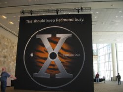
Preview the highly evolved Mac*OS*X “Tiger.”


Exactly, they are hardly highly evolved! ;)

i guess we'll all find out one way or another tomorrow, but i seriously doubt Apple will want to make everyone cry, which is exactly what would happen if they projected these pictures up infront of an audience.
 
As someone that also studied computer science, I can assure you that the average computer scientist or software engineer knows very little about interface design.

Professional people are behind Apple and Microsoft, working in UI designs.
So, they are good on booth companies.

In fact, the Mac OS classic interface has 20 years. Even in Mac OS X, there's no practical revolution... (even expose, released in 2003 is a solution to an old problem - the leak of multiple document interfaces on mac, and application workspace) So, if you think that 20 years without innovating is a good thing for Apple, i bet for Microsoft.

Microsoft started integrating something in windows called task based ui.
Task based UI is the future, because normal people don't have to learn too much. Also, an operating system that allows booth modes and custom settings for this new model are ideal OSes.

More one time, apple's irrationality will stagnate the OS, one OS that would be able to be one of the best of the world for the consumer and pros (or to 95% of them)

(my opinions are based in the final consumer. i love my powerbook :p)
 
The organization model in network is far superior in windows;
.Windows interface is fully customizable, even effects can be turned off/ not like Mac OS X
.You can't copy files to a ftp mounted volume...
.You can't access google from the finder...
.Finder don't create thumbnails for video and images on the fly for icon view..only in column mode, with a 2 second lag per click..
.Menu bar system items don't have a good instant visual notification
.Mac OS X Help is poor, based in questions that are linked to flat topics, sometimes without any relationship.

1) One of my collegues was looking at me while I was browsing a wireless network. He was very impressed by the way the finder browses Local Networks.

2) Many effects can be turned off in OS X. The remaining effects do not take any resources or time to render. Windows looks like crap regardless of what settings you choose.

3)Correct, you cant transfer files to ftp mounted volumes (there are free third party alternatives.

4) Not being able to access google from the Finder can be considered a feature. It would be a security risk to allow the Finder to act as a http web browser (IE).

5) It does create thumbnails for pictures in realtime for icon view. There is no lag per click.

6)No they don't have too much visual information. Dock items do. Most windows notifications are irritating anyway. I don't need to know I've plugged in a new peripheral in OS X. I know it's plugged in becuase I'm the one who plugged it in and it started working the instant it was plugged in. "Network Cable has been removed". Wow, I really needed to know that since I'm the one who removed it.

7)OS X help is far better than Windows help. MS's attempt at a task based help system has failed. Most of the time you cant find the answers to your questions. When answers are found, the solution is unclear. OS X help is brief and to the point. More importantly, instructions are clear and concise.
 
ThomasW said:
To clarify why the Longhorn UI is vector-based and the Mac OS X UI isn't:

Let's assume you have two 17" monitors, one has a resolution of 1024*768 and the other one is a very expensive high resolution monitor with 4096*3072 pixels.

*snip*

The Longhorn graphics system ("Avalon") has been created in two years by a group of 200(!) developers

So you're telling me that it took 400 man years of labor to make a 4096*3072 monitor behave like a 1024*768 monitor? I mean, if you're not going to show more stuff why have all those extra pixels? It's not like you can see anything at those resolutions unless you scale everything anyway.

Yes, a full vector system would be nice. But, no, I don't think it will matter for a long time. A few companies seem to *love* rewriting their applications from scratch every couple of years. But most people don't like doing that just so people can use obscene monitors.
 
".You can't access google from the finder..."

What kind of fool wants to access a website from the file browser? They're totally separate activities.

".Menu bar system items don't have a good instant visual notification"

LOL Now I know you're crazy. You prefer 32*32 icons that are barely visible on most PC monitors over 128*128 application icons that can update themself while running. Oh-kay
 
nmk said:

1"by the way the finder browses"
(what way?)
2"not take any resources or time to render"
(LOL?)
3"alternatives"
(a leak, right?)
4"security risk"
(why?)
5"does create"
(the finder, or the application?)
6"are irritating anyway"
(one OS without choises?)
7"task based help system has failed"
(don't u know that X help is equally task based)

14 years old?
Speak to the end cause the face won't listen.
 
Lancetx said:
My thoughts exactly. We also heard the same crying when Apple added command-tab application switching enhancements in Panther as well when it was M$ if it was anybody that Apple was copying in that instance. :) It's virtually unavoidable for Apple to avoid stepping on a few toes as OS X progresses, so there is no use crying over spilled milk.

I think we need to wait and see on this question. All we have are screen shoots...how useful this "Dashboad" is will depend a lot on how it is implemented. It may turn out to be quite different from Konfabulater.
 

Attachments

  • IMG_1093.jpg
    IMG_1093.jpg
    42 KB · Views: 198
  • IMG_1094.jpg
    IMG_1094.jpg
    41.8 KB · Views: 186
  • IMG_1095.jpg
    IMG_1095.jpg
    40.3 KB · Views: 201
  • IMG_1096.jpg
    IMG_1096.jpg
    47.9 KB · Views: 168
Certainly getting very exciting :D

I really hope there is a Quicktime stream - watching it last time (MWSF) was a lot of fun :D
 
Register on MacRumors! This sidebar will go away, and you'll see fewer ads.