Become a MacRumors Supporter for $50/year with no ads, ability to filter front page stories, and private forums.
...As for a feature the Mac OS has that Windows doesn't... how about folder sizes? Is it so much to ask to be able to see how large a folder is? Sure, I can get that information by getting properties on the folder, but why can't it just display it? Why won't it let me sort a bunch of folders by size? This is something that absolutely drives me nuts! Mac OS has had this since System 7, if not before.

Agree!!! It's a pain to have to do a Get Info on a folder just to know if the content will fit in one CD (or DVD)... :(
 
So "Show icon preview" isn't good enough for you?
'Fraid not
If you want a better preview than that, what's wrong with the column view for getting a larger preview of an individual file?
Actually "show icon preview" with the size cranked up to 128x128 is better than the preview column, strictly in terms of being able to make out the tiny details in photos and complex graphics well enough to be able to choose a selection from a disk with 700 graphics on it, or with 700 photos all named MSP493*.jpg. "Better", but not "good enough", no.

Downside is, the icons are now too huge for practical use. I find column view most convenient for jumping around dozens of different files, but I can't make out the details in the preview in anything more complex than basic logos.

Believe me, this is the ONLY thing I will give windows over mac, is the filmstrip view.

I'll quite happily second the call for other sorting options in column view.
The option, that's all I want!


Press Apple and 3 in finder gets you to the Column view. It allows you to preview the photo and some files. Column view has been available since year 2001, if not earlier.

OSX has Preview selected images as slide show. Not sure when it's introduced. Ctrl click (for the windoze trolls, it's right click) on selected images and choose: "Slideshow"

Thanks for the Mac101 lesson, but I've been using Column view as my preferred default since 2001. Although I prefer it for day to day, when I have to review and select from a lot of large graphics, column preview just doesn't cut it, and neither does "Show Icon Preview" and neither does Preview.app.
When I'm not looking at graphics, I'm often digging around complex directories using column view, and that's when I wish the folders were at the top of the list

Anyways, all I was trying to say was that I really really hope Coverflow in Finder fixes this deficiency.
 
I find column view most convenient for jumping around dozens of different files, but I can't make out the details in the preview in anything more complex than basic logos.

Sounds like you'll really appreciate Leopard's new Quick Look feature, as well as CoverFlow, which is really just an area on top of a standard List view: you can drag the divider to make the coverflow area or the list area as big as you wish.

I expect I'll use CoverFlow instead of List most of the time (when not in the new date-sorted Column view) but I will resize the CoverFlow area as small as I can (still a bigger view--and showing multiple files--than Column view's preview). Best of both worlds!

EDIT: And I'll enable the path breadcrumbs at the bottom. The old reliable, powerful, customizable List View, framed with a CoverFlow multi-file preview on the top and Columns-style path access at the bottom (all with QuickLook and Spring Loading a spacebar-tap away) sounds like a VERY powerful and efficient workspace! And for simplicity the rest of the time: Column View with my most recent files sorted (finally!) to the top.
 
im curious how "fast" the new finder will render my 300MB photoshop images in coverflow... :rolleyes:

Unless you've disabled Photoshop's thumbnail feature... pretty darned quick I'd guess! Just like OS X has always rendered Photoshop documents in Finder view :)

And a whole LOT quicker than opening the document into an application to remember what it is.
 
'Fraid not

Actually "show icon preview" with the size cranked up to 128x128 is better than the preview column, strictly in terms of being able to make out the tiny details in photos and complex graphics well enough to be able to choose a selection from a disk with 700 graphics on it, or with 700 photos all named MSP493*.jpg. "Better", but not "good enough", no.

Downside is, the icons are now too huge for practical use. I find column view most convenient for jumping around dozens of different files, but I can't make out the details in the preview in anything more complex than basic logos.

Believe me, this is the ONLY thing I will give windows over mac, is the filmstrip view.


The option, that's all I want!

Yes, I'll grant you that the film strip is nice. I don't like the way that it dominates the view, though (only one row of icons below?). In any event, it looks like cover flow for Finder will answer that request.

As to options, sure, I'm all for options, at least most of the time. I imagine that you'd be happy even if it were only an option that was available through a 3rd party app like TinkerTools, right? It would keep with Apple's tendency to avoid cluttering the view for "the rest of us" (i.e. people like my parents), you know?
 
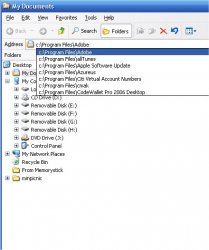
I still wish Apple would have a command line and auto fill option in finder. I can run rings around finder in terms of navigation with that command line. How many clicks to get to the location? 0. Usually just 3 tabs. The command line in the file browser is the single best feature in Windows IFAIC.

attachment.php
 

Attachments

  • WindowsBrowser.jpg
    WindowsBrowser.jpg
    46.4 KB · Views: 965
I still wish Apple would have a command line and auto fill option in finder. I can run rings around finder in terms of navigation with that command line. How many clicks to get to the location? 0. Usually just 3 tabs. The command line in the file browser is the single best feature in Windows IFAIC.

Macs don't have something that works that exact way, which does have its merits if you're used to it--but they do (even pre-Leopard) have four OTHER ways (not counting the literal command line in Terminal) to get around by typing paths, with zero mouse clicks. One of them has limited auto-complete and the other three have very advanced auto-complete. They allow you to type just part of a directory name and then hit a key to accept or cycle through suggested (live) matches, and get around fast with no mousing:

1. "Go" > "to Folder" (Command-Shift-G) pops up a command line at the top of the Finder window, with the current path pre-entered and selected for editing (with auto-complete but no dropdown of other suggestions).

2. Spotlight (Command-Space) pops up a line where you can type just part of a folder name (not even knowing where it is--even more advanced than mere auto-complete) and get there with another keystroke or two. (Works for anything of course, not just folders, but you can choose to have folders listed first instead of apps. In which case, after typing your search you can simply hit Command-Return to open the top matching folder, or down-arrow to go to other matching folders.)

3. You can just type with a Finder window open--no text field needed--and navigate like an "invisble" command line--with auto-complete. In any view. Just start typing, and matching files and folders will be selected. Command-O or Command-Down to open one (taking the place of typing a slash, essentially) and then keep typing the path from there. If you don't like the first auto-match, tab and shift-tab will cycle through other files in order.

4. The Finder's built-in spotlight search is there in the Finder title bar, ready to do a more targeted form of search just in the current directory--making it better for drilling-down than the system-wide Spotlight. (Plus it can filter your matches in many ways--although that normally is done by mouse, not keys alone.)

I zip around the Finder mouse-free at light speed with option 3, myself.

Meanwhile, speaking of literal command lines (DOS, UNIX), you can drag and drop from the Mac's GUI filesystem into a command line, and the path is automatically entered. Not so with Windows. In fact, (at least on my XP system here), I can't even PASTE into the command line.

(EDIT: I guess Go To Folder does have some limited auto-complete--I was going too fast to notice. Snowy_River beat me to it! :D )
 
I still wish Apple would have a command line and auto fill option in finder. I can run rings around finder in terms of navigation with that command line. How many clicks to get to the location? 0. Usually just 3 tabs. The command line in the file browser is the single best feature in Windows IFAIC.

http://att.macrumors.com/attachment.php?attachmentid=87019&stc=1&d=1191961862

I bet you that I can keep pace with you using keyboard navigation. For example, I keep my TV show downloads in my Movie folder (rather than letting iTunes hang on to them - it just makes it easier to move files on and off my computer). I frequently go in there to move things around, etc. All I do is type Cmd-N (gives me a new window open to my home folder), 'M' then Cmd-Down Arrow (highlights the Movie folder then enters into it), then the first letter or few letters of the name of the show that I want to access followed by Cmd-Down Arrow.

Now, if that doesn't work for you, you can also use the Goto command, which does auto fill. I can type Cmd-Shift-G, then start typing the path that I want. Just like the command line in Windows, it will fill in and tab will complete. (Now, I'll grant that it's not lightning fast, as one might like, but it is there!)

[Edit] Nagromme beat me to it! [/edit]
 
I have to say though that every time I use coverflow in Leopard I find myself wanting to swipe my finger across my display lol.

Swipe your finger sideways on the Mac mouse's scroll ball. It's not multi-touch but it's a workable second-best :) (I'd like the option to reverse the scrollball direction for CoverFlow though.)
 
Imagine the day when there will be an OS that will render your thoughts on screen. :D
 
you can scroll left or right with the scrollball in coverflow view.

Yeah, I mean I wish you could reverse it so the finger motion was in the same direction as on the iPhone (which is the opposite direction of using a Mac scrollbar--just like when you flick an iPhone list up to scroll down--which makes sense for touch).

In other words, I'd like the scrollball to feel like I'm moving the covers themselves, not moving the CoverFlow scrollbar (one goes left while the other goes right).
 
I don't like it.

I don't think this is good. The new Finder looks too much like iTunes.

At this rate, all apps will eventually look like iTunes and you're going to find it really difficult to differentiate between them
 
I don't think this is good. The new Finder looks too much like iTunes.

At this rate, all apps will eventually look like iTunes and you're going to find it really difficult to differentiate between them

Certain apps with similar functions (browsing and using files--which iTunes, Finder and Mail all do) are meant to work alike--and look alike--for ease of use. You can still tell them apart by their entirely different toolbars and Dock icons, among other things.

I do like variety (I never minded GarageBand's wood look for instance, and I can see why widgets should all be different colors) but when things work the same, having them look similar makes some sense.
 
I'm not a fan of the new finder. Maybe that will change once I have a chance to play with it. But so far cover flow in itunes has been nothing more than a gimick.

I still think Pathfinder is a better choice.

I do hope the new finder has thumbnail previews of video files.
 
Along with Stacks, Quicklook seems like a feature that will really change my computing experience greatly :)
 
Does Finder now open the files when hitting RETURN or is it still trying to rename it?

I would like to be able to sort all my folders together and not have them mixed with files - just makes it harder to navigate deep file hierarchies.

from what i understand, it still does rename the file; however, in Leopard it only selects the name and does not attempt to change the file extension. a smart tweak.
 
just like we all love ds_store
I'll be happy if they finally get rid of that misfeature, but I'm not holding my breath. The thing is I've read stuff by Apple engineers acknowledging .DS_Store is broken, but they still don't get rid of it.
 
Register on MacRumors! This sidebar will go away, and you'll see fewer ads.