Become a MacRumors Supporter for $50/year with no ads, ability to filter front page stories, and private forums.
Why, exactly, did they have to do something other than "because old hard drive is old"?

If this were a change being proposed for Mac OS X 10.3 or earlier, then I might agree with you because the anatomically-correct internal hard-drive icon was always a terrible design (at least compared to common alternatives, including the icon used in Mac OS 9 or earlier). But now that icon has 20+ years of being ingrained as the standard internal hard-drive icon for Mac OS. Changing it now does nothing to help with making the OS more intuitive.
Twenty years of people like my mom still not knowing what the hell that chunk of steel is!

The icon should be either intuitive (which it never was, nobody knows what that stainless steel hunk of metal is) or accurate (which it hasn't been since the SSD era started).

If I could go back in time I'd try to convince them to make it a filing cabinet…
 
Bleh. I'll stick with Ive Drive icons.
 

Attachments

  • icons.png
    icons.png
    101 KB · Views: 28
Fine

But the new icon is horrible and not at all representative of what's currently in use.

I don't even know what the hell that icon is supposed to be.
It's nonsensical if trying to represent an internal storage drive.
It kinda reminds me my old Transcend SATA USB case :) Not the best design tbh, bought it simply because it was cheap and aluminum, it looks almost invisible near old aluminum iMac.
1754503998187.png

Used to keep my old HDD in it before it died, now it keeps SSD inside. Idk why Apple decided to go with this design but would say that most external SSDs kinda look like that, including my main storage Samsung T7 one. But considering icon is ought to imitate internals, it should have looked like something resembling a microchip or logic board and maybe with tiny Apple logo, or idk


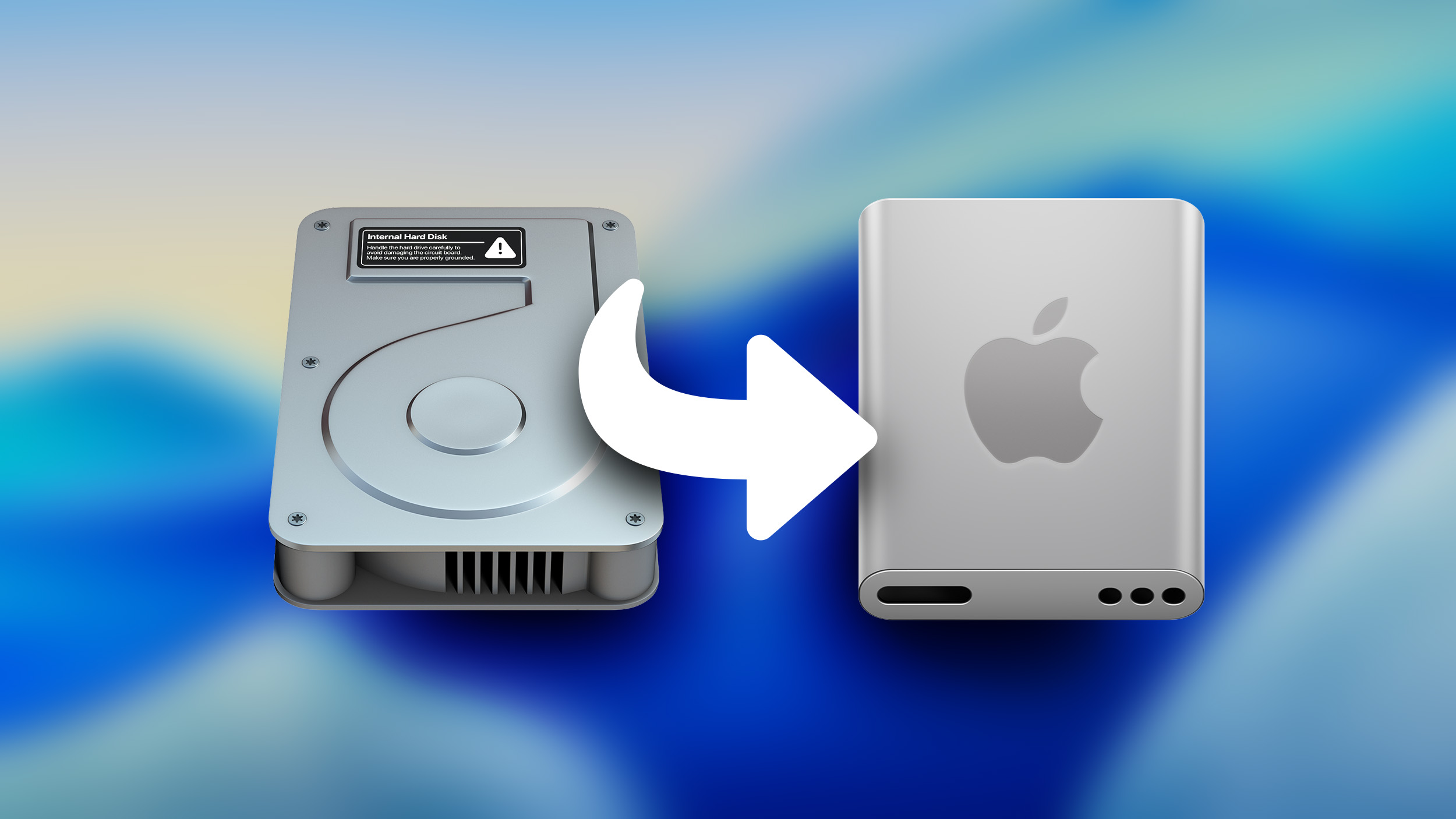
Apple has been updating some classic Mac icons during the macOS Tahoe beta, upsetting some longtime Mac users who prefer the original look. In beta 5, Apple changed the design of the built-in Mac storage icon, which you'll notice if you have it on your desktop.

macOS-Tahoe-Beta-5-Macintosh-HD.jpg

The existing icon still resembled a hard disk drive, but the new icon looks like a modern solid state drive. Apple's Macs stopped using hard disk drives starting more than a decade ago. The low-cost 21.5-inch iMac was the last Mac that had a hard drive component, as it used Apple's SSD + HDD Fusion Drive. All current Macs use SSDs.

If you don't want to see the new icon, you can hide Macintosh HD from view entirely. To do so, open up the Finder app's settings and click the check mark next to "Hard disks."

Apple also updated Disk Utility and the Finder icon in earlier betas. With the Finder icon, Apple initially reversed the color scheme with the light shade on the left and the dark on the right, but the uproar was so significant that Apple had to return it to the classic color arrangement.

Article Link: Macintosh HD Gets a New Look in Latest macOS Tahoe Beta


I can understand the reasoning, but It's hard to wrap my mind around the execution.

It no longer looks like a hard drive, true, but.. it really doesn't look like... anything?

The whole point of an icon is to visually tell you what the file, app, drive is/does.

How, exactly, does this.. do that?

It looks more like a white polycarbonate-cased dock with a SD card slot than anything else. It doesn't look like internal storage of any kind, that's for sure.

I'll just edit it to look like what I want it to look like I guess, been editing icons since high school CAD lab... Not a big deal for me...

But, this seems like a change that will confuse and frustrate people more than anything.

Feels like change, for the sake of change.

Oh well.
 
You can open Get Info and paste in your own icons for anything. That may even have been in System 7, but it's been in OS X and now macOS all along.

ResEdit was my first icon editor... ;-) Made my hard drive a sailboat. Which impressed me, because I can't draw for love or money.
 
A must watch video


Source:

View attachment 2535084


I don't understand how they didn't end up with the fixed version, regardless of what the weird holes are supposed to be
 
  • Love
Reactions: turbineseaplane
I get that an update is probably long overdue, but the original HD icon's whole purpose was to make it glaringly obvious to the user that they are interacting with the local "internal" drive, rather than a network share or an external drive. Changing the icon to what looks like an external SSD kind of defeats that purpose.

There's a reason why the save button in so many applications is still a 3.5" floppy disk.

Amen!
 
  • Like
Reactions: turbineseaplane
Imagine getting upset over a icon :rolleyes:

I don't see anyone who's upset?

I see people making perfectly reasonable criticisms of a change to the OS that breaks a visual convention, making internal storage harder to distinguish from external storage.

The new icon really doesn't look like.. anything? A white polycarbonate dock maybe?

Now, the new TimeMachine drive icon, that just looks like ass. That bull-butter is upsetting.. (mostly kidding, because it does look like ass.)
 
Last edited:
  • Love
Reactions: turbineseaplane
The best camera review person around by a lot, Thom Hogan, calls it "moving the cheese" when a manufacturer moves buttons or dials on a camera. Moving the cheese is generally a bad thing for photo UI because it at least temporarily reduces the efficiency of photogs who shoot tens of thousands of pix and then are forced to change how they do it.

Apple with its OSs needs to be hella careful when moving the cheese [I arbitrarily include changes to icons that are meaningful to operation] because it at least temporarily reduces the efficiency of all users. Moving the cheese should not be done just because some manager thinks it is time for a change. Moving the cheese should only be done for a very good UI reason.

Hear here! Amen!
 
  • Like
Reactions: turbineseaplane
Wow, that's pretty weak. Apple can do so much better. I always replace my HD icons with custom icons anyway. Usually from iconfactory.
 
I don't really care much about the icon. But, I don't understand what it's supposed to be. I mean, technically are all new machines using SSD these days. So, what is the iomega external drive looking thing supposed to be?

I think it's funny that MR post on latest What's new in macOS Tahoe had 30-ish comments and the HDD icon has around 190 at the time of my comment.
 
The top, front, and logo are all different perspectives. It’s glaringly obvious and they don’t even have enough QC to fix this simple flaw.

This might actually be Ai generated.
I'm glad to see that others are having issues with this icon. It's actually hard for me to look at because it immediately registers to me as wrong.
 
  • Like
Reactions: jwdsail
Somethings are just not meant to be tampered with, and have degrees of nostalgia - like the floppy disk being the save icon - makes no sense this day and age, but it's cool and nostalgic, and we all know what it means.
 
  • Like
Reactions: jwdsail
Register on MacRumors! This sidebar will go away, and you'll see fewer ads.