Become a MacRumors Supporter for $50/year with no ads, ability to filter front page stories, and private forums.
Status
The first post of this thread is a WikiPost and can be edited by anyone with the appropiate permissions. Your edits will be public.
Putting the cursor on a letter does place the selection after it and won’t include said letter. I can reproduce that without fail. I just don’t see the issue as I always place the cursor somewhere before it.

I can’t reproduce the other two though.
 
Can anyone with an M1 iMac previously running Sequoia confirm if the performance/feel of the computer has:

A) Worsened after upgrading to Tahoe;

B) improved after upgrading to Tahoe;

Or

C) Has remained t same after upgrading to Tahoe.
 
Putting the cursor on a letter does place the selection after it and won’t include said letter. I can reproduce that without fail. I just don’t see the issue as I always place the cursor somewhere before it.
if i click directly on a letter (am trying this in pages), the insert point sometimes shows after the letter, sometimes before. but i also always click exactly where i want to go (ie before or after a letter)... 🤔
 
screw Tahoe......too many AI revisions as I try to type.
the UIG is tiring after a month and I am tried of system settings.
not that Monterey is better but I miss using MY MacBook M1.
 
  • Like
Reactions: Cape Dave
1) Not sure if I follow the issue. If I want to select an entire word I just put the selection cursor in front of the first letter. Or double click the word if I just need to select a single word. I genuinely don’t notice a difference here.

2) Hover to open works just fine on my end. I just dragged a file onto a folder icon, hold it for a moment, the folder icon will blink and open. Releasing the file will move it to the folder I just opened.

3) Not the case here either. I can click the green button anywhere to go full screen as long as the cursor is somewhere inside the green dot.
Thanks, I refer to my M2 MBP 16". OS 26.0.1
I just reproduced the problem of hovering 10 seconds above the icon of a folder, it didn't open and the dragged item landed in the enclosing folder (hierarchy upwards).
I also reproduced the "cursor meets a letter" problem that happens when I want to mark part of a sentence (not a word, that I mark by double click of course). If the cursor hits not on the first half of the first letter of a word, the first letter is not included. An exact aiming is difficult when working with 12pt font Times (my default), but it also occurs with other fonts.
My third point may be based on a wrong impression. I withdraw this complaint.
Are these points something to report to Apple?
 
  • Like
Reactions: Cape Dave
I’m just wondering: are you dragging an item from the Finder (like the desktop or a folder) or from the Dock (stack)? Because the latter doesn’t seem to work. Not sure if it did in previous versions.
 
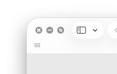
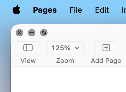
The window control widgets when using graphite are white now. I think they were always black before? Looks kinda nice and offer more contrast.
 

Attachments

  • Screenshot 2025-10-29 at 18.04.48.png
    Screenshot 2025-10-29 at 18.04.48.png
    44.6 KB · Views: 15
Last edited:
Update: Non-updated apps still get black window control widgets when using graphite in macOS Tahoe...

Was it really that hard to update the smaller version so there’s at least some consientcy in that? It really seems Apple kept the entire legacy macOS Big Sur interface in place ‘as is’ while adding the macOS Tahoe next to it. It's weird, in the entire history of Mac OS X/OS X/macOS I’ve never seen something quite like this.
 

Attachments

  • Screenshot 2025-10-31 at 11.57.08.png
    Screenshot 2025-10-31 at 11.57.08.png
    73.3 KB · Views: 18
Been using MacOS 26 since few days and, guys, what a mistake I've done to update: I can't stand most of the "new" things. Am I the only one to hate those anonymous little white icons for pdf, dmg, jpg etc... that have taken over the very different from one another icons of previous systems? WHY? WHY on earth make them all equal in color and shape and the only differentiating thing is a an extra tiny grey gliph on top of a tiny icon... WHO has passed that unfortunate decision as a good one???? All icons in list view on large monitors are all the same at first sight... APPLE... this is the worst EVER OS you have created.. SHAME!
 
Been using MacOS 26 since few days and, guys, what a mistake I've done to update: I can't stand most of the "new" things. Am I the only one to hate those anonymous little white icons for pdf, dmg, jpg etc... that have taken over the very different from one another icons of previous systems? WHY? WHY on earth make them all equal in color and shape and the only differentiating thing is a an extra tiny grey gliph on top of a tiny icon... WHO has passed that unfortunate decision as a good one???? All icons in list view on large monitors are all the same at first sight... APPLE... this is the worst EVER OS you have created.. SHAME!
You sir, are 100% correct. How stuff like that gets by supposedly intelligent business people is beyond my brain to process. Stupidest thing Apple has ever done. And that is saying something! I like the way you think. I have not upgraded and will not until forced to. I have Linux on a back burner for when I need to make that decision.
 
..thanks for the support! ... and of course I haven't even mentioned the demise of Launchpad, the windows' toyish, dumbest round corners, the blinding white of windows, even screenshots are rounded on the desktop... am I using an OS or playing with a Play-Doh for Gen Z ?
Sorry for the rant!
Sorry for the contrarian opinion, but Launchpad (IMHO) was really a Gen Z thing... it makes no sense on a computer screen. I've never used it except to uninstall some applications. A folder with apps in the dock works much better and faster.
 
Sorry for the contrarian opinion, but Launchpad (IMHO) was really a Gen Z thing... it makes no sense on a computer screen. I've never used it except to uninstall some applications. A folder with apps in the dock works much better and faster.
No problem of course... However, I'd gladly trade launchpad anytime with sharper corners and less blinding white randomly scattered around the system.
 
The Music toolbar is no longer adaptive (not sure if it's a bug) and the title/artist text is more opaque and easier to read in 26.1.

New Control Center animation in 26.1:
 
..thanks for the support! ... and of course I haven't even mentioned the demise of Launchpad, the windows' toyish, dumbest round corners, the blinding white of windows, even screenshots are rounded on the desktop... am I using an OS or playing with a Play-Doh for Gen Z ?
Sorry for the rant!
The funny thing is most complained and hated on Launchpad when it got introduced by OS X Lion. Anyway, I haven’t seen it mentioned anywhere (could be I missed it though) but the new app launcher got increased in size by v26.1.
 
Register on MacRumors! This sidebar will go away, and you'll see fewer ads.