What's with the Big Sur redesign and use of tons of shading? Did they purposely design it so that in the future when they add touchscreen support it would be easier to navigate? And for some reason I have a feeling this type of redesigned icon pack will be coming to iOS as well.
Got a tip for us?
Let us know
Become a MacRumors Supporter for $50/year with no ads, ability to filter front page stories, and private forums.
macOS Big Sur Adds Battery Usage History and Brings Back Remaining Battery Estimates
- Thread starter MacRumors
- Start date
- Sort by reaction score
You are using an out of date browser. It may not display this or other websites correctly.
You should upgrade or use an alternative browser.
You should upgrade or use an alternative browser.
It seems a Shrek's condom to me....Who came up with that battery icon. Ugliest thing I’ve seen in years!
Who came up with that battery icon. Ugliest thing I’ve seen in years!
Not to mention the padding on the sub items on the left and right (Usage history, Battery, Power Adapter etc...)
Don’t like how the controls and title bar are melded together. Window title and close, minimize and zoom should be on top of back and forward controls with icon menu and search bar.
See Window Anatomy:
Human interface Guidelines - Window
The Finder side bar in Big Sur also breaks this as the sidebar extends up into the window “frame” instead of living in the “body” area.
App icons are also bad, they look all the same.The old icons’ shapes used to carry semantic meaning: circles for (generally) single-window apps (Safari, App Store, music), slanted rectangle for document-based apps (iWork, notes, preview), upright rectangle/square for utilities (preferences, terminal, activity monitor). Put the app icons in gray scale and it’s hard to differentiate them.
Last edited:
How does something as obviously bad as the battery icon end up in Apple's major next release? I hope this is a rushed placeholder icon. Wouldn't mind a flat black and white battery icon.
This UI looks like a child mocked it up in Photoshop. Everyone has already mentioned the disgusting battery icon, but what about the way the “usage history” is not properly centred and the “y” is almost clipping the right hand side of the box? And how the “Last 24 hours” has a little more space on the right compared to the left? I’m hoping these (and many other items) are first beta oversights and will be remedied in time for release.
I'm so glad to see other people are as appalled by the design work here as I am. I am equally aghast to see the return of many skeuomorphic elements and that old OS X 'glossy bubble' look in many of the icons present in yesterday's Keynote. I really feel like we're seeing the results of Jony Ive's departure in real time now.
With that cheap battery icon though... I didn't expect Apple to sink so low so fast.
With that cheap battery icon though... I didn't expect Apple to sink so low so fast.
Sur is really the most promising WWDC thing out of the bunch. I just installed the OS and I am pleasantly surprised with the redesign and stability given that this is just the first Beta. To me, the new design feel fresh, unlike the lackluster iOS and iPad 14 releases.
Pick a design language Apple. I personally don't mind a bit of depth when it comes to flat design, in fact, occasionally I miss the old look, but I agree with 99% of posters in this thread, that battery icon has got to go.
The biggest negative surprise to me with the new MacOS was the seemingly inexplicable use of weird iconography based on flat designs, but with purposeless added bulbous depth effects. It's not skeuomophic, but nor does it have the purpose-driven clarity of true flat design. It's a desecration. It's like spitting on something beautiful, just because.
Also, check out that weird sidebar text alignment. Elvis has truly left the building.
Also, check out that weird sidebar text alignment. Elvis has truly left the building.
No offense, but battery icon is very hideous, oh my….it’s my first time OSX MacOS give me an OCD as desktop OS…
[automerge]1592954305[/automerge]
They slapped iOS GUI which is intended for touch with large spacing for accommodate fingertips, and this is what happened when touch oriented interface slapped on desktop, more jarring, also Apple is deliberately discouraged Mac with touch screen but they gave touch screen interface which is oxymoron.
[automerge]1592954305[/automerge]
The biggest negative surprise to me with the new MacOS was the seemingly inexplicable use of weird iconography based on flat designs, but with purposeless added bulbous depth effects. It's not skeuomophic, but nor does it have the purpose-driven clarity of true flat design. It's a desecration. It's like spitting on something beautiful, just because.
Also, check out that weird sidebar text alignment. Elvis has truly left the building.
They slapped iOS GUI which is intended for touch with large spacing for accommodate fingertips, and this is what happened when touch oriented interface slapped on desktop, more jarring, also Apple is deliberately discouraged Mac with touch screen but they gave touch screen interface which is oxymoron.
macOS Big Sur does away with the "Energy Saver" section of System Preferences, replacing it with a new "Battery" section that expands the battery reporting capabilities of the Mac.
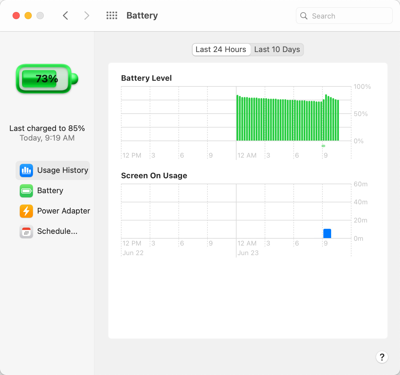
A new Usage History feature provides details on the Mac's battery life over the course of the last 24 hours or the last 10 days, broken down into Battery Level and Screen On Usage so you can see how your battery is performing.
There does not appear to be a detailed rundown on which apps used the battery the most as there is on iOS, but it does provide a better look at how the battery is being consumed over time.
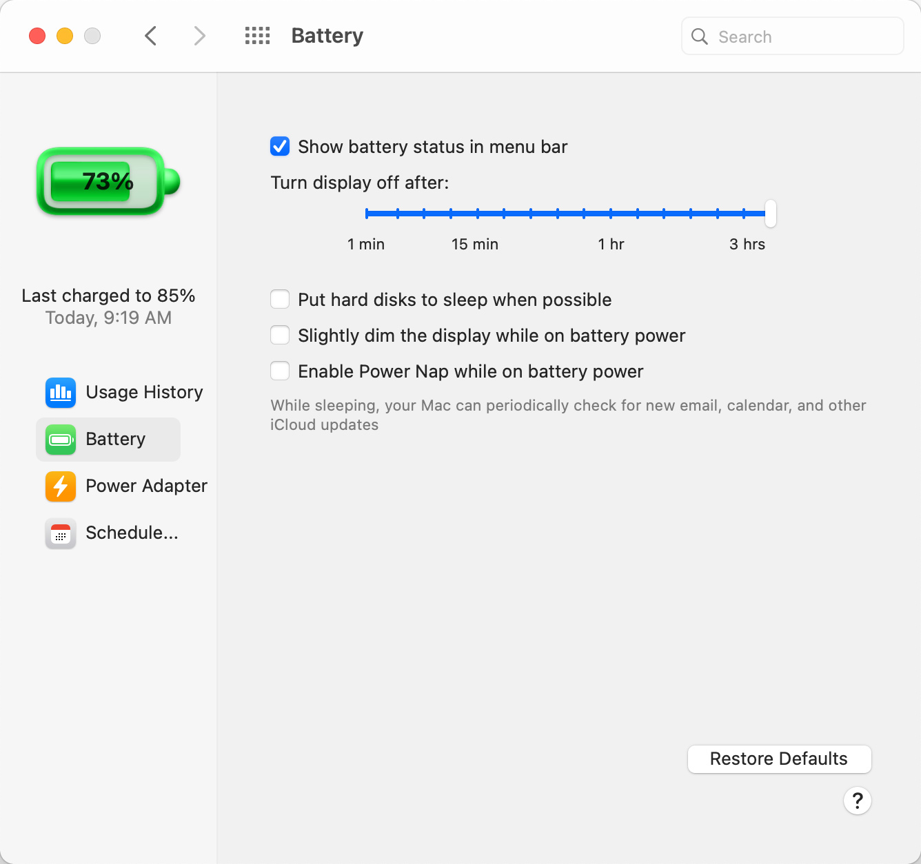
Along with the Usage History section, there are Battery and Power Adapter sections that replace the functionality that was previously available through Energy Saver. You can choose when to turn the display off, enable or disable power nap, and more, with the settings split for battery usage and usage when connected to power. The schedule feature is also present.
In the menu bar, clicking the battery icon now provides an estimate of remaining battery life, a feature that was removed from macOS Sierra back in 2016. At the time, Apple said that the battery life indicator in macOS Sierra was inaccurate and led to confusion about battery performance.
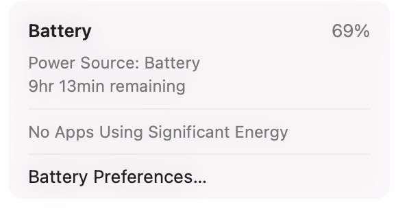
The menu bar battery icon also displays apps that are using significant energy, as in macOS Catalina, and it provides an option for opening up Battery Preferences. There does not appear to be an option to display current battery life percentage right in the menu bar, however.
macOS Big Sur is limited to developers at the current time, but Apple plans to make a public beta available this July ahead of when the software sees a full release in the fall.
Article Link: macOS Big Sur Adds Battery Usage History and Brings Back Remaining Battery Estimates

My buggy Catalina suddenly looks much more adorable to me. That Bug Sur UI is terrible.
ugh what why is everything so bubbly and cartoon looking. Not a fan...
Ya stick to the flat design like in ios. It feels like a work in progress, but I think it will get better and they'll tweak it as it in later versions of 11. The elements that are more flat and iOS like, look pretty darn clean though.
Who approved the battery icon? Alan, Craig or Tim? I prefer this one......

[automerge]1592975843[/automerge]
macOS Big Sur does away with the "Energy Saver" section of System Preferences, replacing it with a new "Battery" section that expands the battery reporting capabilities of the Mac.
A new Usage History feature provides details on the Mac's battery life over the course of the last 24 hours or the last 10 days, broken down into Battery Level and Screen On Usage so you can see how your battery is performing.
There does not appear to be a detailed rundown on which apps used the battery the most as there is on iOS, but it does provide a better look at how the battery is being consumed over time.
Along with the Usage History section, there are Battery and Power Adapter sections that replace the functionality that was previously available through Energy Saver. You can choose when to turn the display off, enable or disable power nap, and more, with the settings split for battery usage and usage when connected to power. The schedule feature is also present.
In the menu bar, clicking the battery icon now provides an estimate of remaining battery life, a feature that was removed from macOS Sierra back in 2016. At the time, Apple said that the battery life indicator in macOS Sierra was inaccurate and led to confusion about battery performance.
The menu bar battery icon also displays apps that are using significant energy, as in macOS Catalina, and it provides an option for opening up Battery Preferences. There does not appear to be an option to display current battery life percentage right in the menu bar, however.
macOS Big Sur is limited to developers at the current time, but Apple plans to make a public beta available this July ahead of when the software sees a full release in the fall.
Article Link: macOS Big Sur Adds Battery Usage History and Brings Back Remaining Battery Estimates
love the new direction of the art.
How does something as obviously bad as the battery icon end up in Apple's major next release? I hope this is a rushed placeholder icon. Wouldn't mind a flat black and white battery icon.
Pretty sure there are a lot of placeholder icons there. Apple used to do that all the time in betas.
Who came up with that battery icon. Ugliest thing I’ve seen in years!
I came to this topic just to reply about the battery icon.
 . It is horrible.
Apple should just buy Coconut Battery already and use its features on both the Mac and iOS devices!
Right now, in Mojave, I'm looking at my menu bar and I can see the % of battery and a nice battery icon (those two are Apple's), and time left until I run out of juice (CB's). I can click on the time left and get all sorts of good info on battery health, cycles, etc. thanks to CB.
In older iOSs, we could bring up Battery in settings and see which app was running for how much time over the past 24 hours and past 10 days -- how much time they were running in the background, too. That way we could figure which apps were battery hogs and which were, weirdly, unexpectedly, running in the background.
Time to bring all those features to both Mac and iOS (again)!
__________
Completely off topic, but wish that, in IOS, they would separate out "In-app restrictions" from Screen Time! They're unrelated. I want to restrict purchases within apps 9avoid any inadvertent buys), but do NOT want Screen Time!
Register on MacRumors! This sidebar will go away, and you'll see fewer ads.