Become a MacRumors Supporter for $50/year with no ads, ability to filter front page stories, and private forums.

MacRumors

macrumors bot
Original poster
Apr 12, 2001
67,805
38,417


In the third developer beta of macOS Monterey, which came out this morning, Apple has overhauled the design of Safari, making the tab bar more similar to the current tab bar in macOS Big Sur.

macos-monterey-safari-beta-3.jpg

The prior Safari design did away with the dedicated URL and search interface, instead allowing any individual tab to be used for navigation input. Tabs were also all arranged at the top of the display to minimize the space taken up at the top of a Safari window.

In macOS Monterey, Apple has walked this back. There's a dedicated URL/search bar at the top of the Safari window, with the tabs arranged below it. Clicking on a tab makes it the active window and it's easier to drag tabs for rearranging or opening in a new window.

It's still quite far off from the current Safari design in macOS Big Sur, but it's certainly an improvement over the initial macOS Monterey design.

The new and separate tab bar is enabled by default when upgrading to macOS Monterey beta three, but Apple has included an option to revert to the original Monterey design. If you to go View and toggle off "Show Separate Tab Bar," you can use the original design.

macOS Monterey beta 3 also appears to lay the groundwork for Universal Control. Under System Preferences -> Displays -> Add Display -> Advanced, there are now preferences that can be selected for the Universal Control feature.
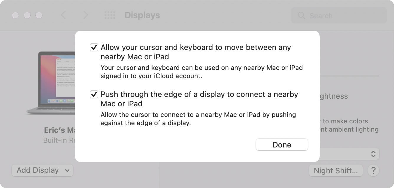
universal-control-settings-monterey.jpg

Unfortunately, Universal Control is not functional and we'll have to wait for a later beta to experience a working version.

Article Link: macOS Monterey Beta 3: Apple Redesigns Safari Tab Interface Following Complaints
 
Last edited:
I feel like I’m the only person that liked the change! Oh well, not a big deal to me at the end of the day as I’m one to never really have more than 5 tabs open and close them as soon as I’m done. I mostly appreciated how the interface stayed thin with more than one tab open. Oh well, can’t please everyone!

edit: as others have pointed out, there’s a choice between the two styles! Happy day :)
 
Last edited:
Should I write developer feedback or “complaints”, which will get me the most comments and arguments. 🤓
 
I feel like I’m the only person that liked the change! Oh well, not a big deal to me at the end of the day am I’m one to never really have more than 5 tabs open and close them as soon as I’m done. I mostly appreciated how the interface stayed thin with more than one tab open. Oh well, can’t please everyone!
No, you weren’t the only one. I liked it as well, but it would be awesome to have a toggle to switch between the Monterey compact design, and this classic Safari UI.
 
I'm so glad they walked this back, I hated the new design.

On one hand, it would be nice if they gave us an option to switch between the old way and new way to make everyone happy, but on the other hand that's more code to maintain so I understand why Apple doesn't want to go there.
 
Isn’t this the design everyone was roasting Firefox for a few months ago? Either way, it’s great that they’ve pivoted away from the train wreck design in those first betas.
This is an option, not the default
 
Hang on, this is an option!! The new merged address/tab bar is the default and you have the option to have a separate tab bar like above in Preferences.
Thanks. I ran to see Monterrey marketing page to check if something had changed, and it seemed really un-Apple to remove a feature without making like it never existed.
 
Last edited:
Register on MacRumors! This sidebar will go away, and you'll see fewer ads.