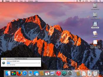
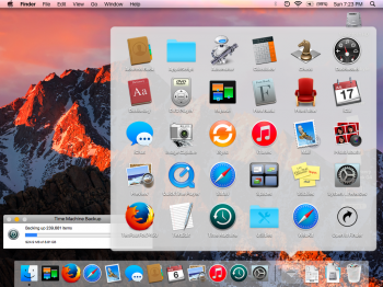
I've been watching the progress on this and anxiously await the release to 'modernize' my G5.
Thanks to everyone working on this.
Thanks to everyone working on this.
Nice! Looking great. Oh, and how's your progress on the dock?Here's where I'm at so far with my mods-

Nice! Looking great. Oh, and how's your progress on the dock?
if ou see the previous posts in page 5 , i manged to replace all the Docks png so that it look much better . Stacks are readable now, and the dock is much more consistent.Nice! Looking great. Oh, and how's your progress on the dock?

Yes, I saw your dock, and thanks for the new stacks, they look much more like real Sierra ones. But I'm not talking about that, I'm talking about the bug where you can't click things a little bit above the dock. For example, if I'm on MacRumors and the "Post Reply" button is at the bottom of the screen, right above the dock, it wouldn't be clickable unless I shrink the dock. I hope this clears up confusion.if ou see the previous posts in page 5 , i manged to replace all the Docks png so that it look much better . Stacks are readable now, and the dock is much more consistent.
Ps: tested on my powerbook 12'

Yes, I saw your dock, and thanks for the new stacks, they look much more like real Sierra ones. But I'm not talking about that, I'm talking about the bug where you can't click things a little bit above the dock. For example, if I'm on MacRumors and the "Post Reply" button is at the bottom of the screen, right above the dock, it wouldn't be clickable unless I shrink the dock. I hope this clears up confusion.
Oh, and I've also been working on a dock using some of your resources (merged some different versions together). Would you mind if I released it?
Well, I think it's worth it, the dock (to me) is a very important part of the theme. All you have to do is resize your windows.I've done a ton of experiments with the dock to figure out the issue.
The problem with the dock is that it's coded in a way that anything filling up the center of it will cause the problem of not being able to click anything a few pixels above it. If you want a lookalike dock, you'll just have to hide it when it's not being used... unless someone can figure out how to change the shade from black to something else. It's hard-coded somewhere...
I have an idea: Perhaps for next year's 10.13 theme, we could modify the actual programs. For example, update some images in the Calculator program to make it look more like the newest version.
hey sorry i didn't realize you where talking about that bug. I won't mind at all if you upload your version, its gonna be awesome in the how the dock has became closer to modern macs.Yes, I saw your dock, and thanks for the new stacks, they look much more like real Sierra ones. But I'm not talking about that, I'm talking about the bug where you can't click things a little bit above the dock. For example, if I'm on MacRumors and the "Post Reply" button is at the bottom of the screen, right above the dock, it wouldn't be clickable unless I shrink the dock. I hope this clears up confusion.
Oh, and I've also been working on a dock using some of your resources (merged some different versions together). Would you mind if I released it?


@swamprock, remember the SArtFile you made? That changed the window frames? Well, I was experiencing crashing is random areas on my iBook G4, like in certain System Prefs. panes and Mail. A reboot didn't help. So I replaced your modified SArtFile with the original Leopard one and the crashing stopped. So, your SArtFile is causing crashing. If you'd like a complete list of every crash I've discovered so far I can make one. Thanks for your effort, though!
The Finder and Spotlight files would be a great release! Please do post them! Thanks.This theme looks fantastic on Tiger, and I've noticed no UI or app issues there, as there aren't any artfiles (CoreUI) on Tiger to reference. I've done some mods to the search.bundle (Spotlight) and Finder.rsrc on Tiger for a couple of minor UI changes as well. I'll post those in a separate thread with instructions if there's a desire to try them out. I may pick up and finish this theme for Tiger, if not just for myself, but for others as well if they're interested.
The Finder and Spotlight files would be a great release! Please do post them! Thanks.
Alright, great to hear you're going to keep doing Extras files! Maybe you could help them out on a Tiger version of the theme.Will do. I need to fix up the Finder.rsrc though. The buttons are square at the moment and I want to round them out a bit to match the others. I get this done tonight.
I've decided to continue working on the Extras.rsrc and the other resource files, but my version of the theme will be for Tiger PPC only. I've gotten pretty far on it (the scroll bars have been fixed) and really only have the drop-down arrows and other minor things to finish up. No point in stopping now...
Alright, great to hear you're going to keep doing Extras files! Maybe you could help them out on a Tiger version of the theme.
Screenshot?OK, so I modified the About This Mac screen to be a little bit more realistic. There are a few small changes, the most notable being that I removed the word "Leopard" entirely. This theme is meant to cover that up.There a a few other small changes also. I figured I'd upload it because why not? Install it the same way you did the last one.
If @SourceSunTom or anybody else working on the theme wants me to take this down, just ask.
We already discussed that earlier, and yes, there were already a few ideas pitched. I even described precisely what codec was used for the original and was able to shoehorn a custom one in with no issues. The only demand for the video itself is that the audio is in a separate audio file, and that it must fade to black as the original video does that too, because the first window pops up on a black backdrop.Oh, and will a welcome video be included? That would be a nice addition when @Orizence makes his Leopard install disc. Many of them had been made in the El Cap thread. This one is my favorite: https://www.dropbox.com/s/6y9a7dh951j45zz/El Capitain.mp4?dl=0
Sorry, I was unaware that this was already discussed. Thanks!We already discussed that earlier, and yes, there were already a few ideas pitched. I even described precisely what codec was used for the original and was able to shoehorn a custom one in with no issues. The only demand for the video itself is that the audio is in a separate audio file, and that it must fade to black as the original video does that too, because the first window pops up on a black backdrop.

