Sorry, but “modern” in today’s world doesn’t necessarily mean good, polished, or well thought out. More often than not, modern design nowadays means rushed, half-baked, buggy, and changed purely for the sake of change.
Example time.
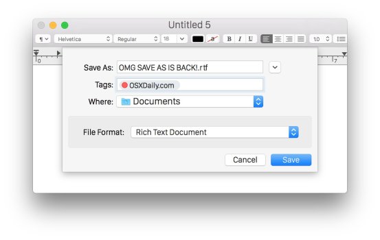
Take modal windows in macOS. Look at how beautiful and coherent the modal dialogs were in OS X. The modal window opened directly from the parent window and stayed visually attached to it. It communicated intent and hierarchy clearly. The animation was fluid and naturally showed where the dialog came from.
It felt logical, elegant, and purposeful.
View attachment 2629667View attachment 2629668
Now, look at today abomination:
View attachment 2629669
A simple fade effect. A new window just appears on top of the old one. That’s it. Very “JavaScript-style.”
Sloppy. Ugly. It throws away everything that made the previous design feel coherent and refined. Sad, honestly.
You know what this is? Cheap. Cheap design. Kitsch masquerading as modernity.