24H option is available by changing your language preference in the user control panel.
Got a tip for us?
Let us know
Become a MacRumors Supporter for $50/year with no ads, ability to filter front page stories, and private forums.
MacRumors Forums Feature Request Wiki
- Thread starter arn
- WikiPost WikiPost
- Start date
- Sort by reaction score
You are using an out of date browser. It may not display this or other websites correctly.
You should upgrade or use an alternative browser.
You should upgrade or use an alternative browser.
- Status
- The first post of this thread is a WikiPost and can be edited by anyone with the appropiate permissions. Your edits will be public.

grahamperrin
macrumors 601
ER: improve the 'Insert Quotes…' review dialogue
Enhancement request (ER).
In the following screenshot, of a review dialogue, it's impossible to see – to review what was written by one of the authors:

Improvements to the dialogue might involve suppression of the '… said:' quote box.
Enhancement request (ER).
In the following screenshot, of a review dialogue, it's impossible to see – to review what was written by one of the authors:
Improvements to the dialogue might involve suppression of the '… said:' quote box.
Last edited by a moderator:
grahamperrin
macrumors 601
Some threads are just more interesting for the pictures and not the individual posts.
Also please consider https://xenforo.com/community/media/ – if I recall correctly, those gallery features are thanks to an add-on for XenForo.
post: 21387047 said:… Red scroll to bottom button go to last post. …
The phrase last post is ambiguous. It may be misinterpreted as meaning the last post on the page.
I'd prefer that down arrow to make visible the reply dialogue beneath the last post on the page.
Already there's a grey button for 'Go to First Unread'. That grey rectangular area could be enhanced. Something like:
First unread ↓ Most recent ↓↓
Side note, primarily @arn: four nonbreaking spaces (after that first down arrow) are
misrepresented as a single space.
misrepresented as a single space.
… Every time I click the arrow I end up scrolling back up to the last post.
Every time I want the reply field, I have to go to the end of the page then scroll or page up until the field becomes visible.
fhall1
macrumors 68040
Probably a "feature" of Xenforo that can't be changed but here goes.
My old workflow on MR - go to the main Forums list page, scroll to forum I wanted to read, read new posts I wanted to, hit the "forum tools" dropdown and select mark all posts in that particular forum (and all its sub-forums) READ. Hit the back button and I'm back to my spot on the main forums list page so I can choose the next forum to read.
Now - go to main forums list page, scroll to forum "box" to find forum title (can't see if any new posts are in it from this page any more - have to actually enter the forum now), enter forum, read new posts I want to read, scroll to top of page to "Mark Forums Read" button. This opens a new web page where I can mark the posts in the current forum (and only the current forum - no subforums least as I can tell) or ALL forums as READ. I select the current forum. This then takes me back to the first page of the forum I was reading (with all messages marked as read), but when I hit the browser back button, I am once again at the "Mark Forums Read" page, back button again takes me to the page of the forum I just read, back button again and I'm finally back to the main forums list page.
So instead of two clicks to get back from a forum to the main forums list page, it now takes four...plus you have to mark each forum read separately, you can't get all in one group in one click (e.g. OSX, OSX10.9, and OSX10.10, etc. used to be able to be all marked as read in one click when you said to mark all posts read in the main OSX forum). This is a bigger PITA on an iOS device than on my Mac, but it's a pain there too.
You might say "read all the forums you want - then hit the mark all forums as read choice"....that's fine if you can spend an entire session and get through all the forums you want at one sitting. Sometimes you can't and have to come back later and you don't want posts in forums you haven't read yet, to be marked as read.
I hope all that made sense....
drewsof07
macrumors 68020
Would be nice to have an advanced filter. For marketplace threads in particular. Sorting by prefix, to hide SOLD or ENDED items would declutter the marketplace.
Also struggling to find the default setting to always show the most recent post when I open a thread. 9/10 times I'm opening a thread in my subscription group and have already read the first 10 pages.
Thanks for all the hard work MR team!
Also struggling to find the default setting to always show the most recent post when I open a thread. 9/10 times I'm opening a thread in my subscription group and have already read the first 10 pages.
Thanks for all the hard work MR team!
AZhappyjack
Suspended
Can we make the little blue dot (to the left of the thread title) a little bigger? It's a link to the first unread post in a thread, and it's darn near impossible to hit consistently.
haxrnick
macrumors 6502a
Just clicking on the thread title will take you to the first unread as well. No need to click the dot.Can we make the little blue dot (to the left of the thread title) a little bigger? It's a link to the first unread post in a thread, and it's darn near impossible to hit consistently.
S.B.G
Moderator emeritus
Clicking on the thread title to the right of the little blue dot accomplishes the same thing.Can we make the little blue dot (to the left of the thread title) a little bigger? It's a link to the first unread post in a thread, and it's darn near impossible to hit consistently.
tobefirst ⚽️
macrumors 601
Added "I'd love to see poster location below their avatar." to the wiki. I'd never edited a wiki post before. I like it.
Also please consider https://xenforo.com/community/media/ – if I recall correctly, those gallery features are thanks to an add-on for XenForo.
It’s not really what I had in mind, but I suppose it would make sense if Macrumors had a dedicated gallery section for future collections. I thought of something along the lines of a richer attachment viewer. In the previous vBulletin forum you could click on the paperclip icon next to a thread title in the forum overview. It opened a popup and showed a list of links of all the attachments within that thread. Wouldn’t it be great if there was a similar button that just showed all these attachments in a gallery? Or perhaps an option to hide all posts in a thread that don’t have images or attachments in them.
Added "I'd love to see poster location below their avatar." to the wiki. I'd never edited a wiki post before. I like it.
I think that was there yesterday, but has since been removed to make the layout more compact (other user requests).
iDuel
macrumors 6502a
While I understand where you are coming from, I really liked seeing the join date and location information attached to each post. Hopefully this can be added back in a different format as to preserve the compact layout.I think that was there yesterday, but has since been removed to make the layout more compact (other user requests).
cambookpro
macrumors 604
Agreed - I thought it was quite useful seeing date, posts and location. It let one judge how 'trustworthy' a user may be. Whether that's right or wrong, I know a post full of links is much more likely to be spam if it's from a new member than a member who's been here for a decade.While I understand where you are coming from, I really liked seeing the join date and location information attached to each post. Hopefully this can be added back in a different format as to preserve the compact layout.
We still have user titles, but I found dates/post count easier.
boshii
macrumors 68040
I agree. That info is useful in some instances.While I understand where you are coming from, I really liked seeing the join date and location information attached to each post. Hopefully this can be added back in a different format as to preserve the compact layout.
I know you can access it by clicking on the username but I liked it better when it was attached to each post.
grahamperrin
macrumors 601
Abandon the confusing, superfluous, little coloured dots to the left of titles/subject lines
It's not only superfluous, it's also a significant source of confusion – especially to users who were accustomed to the little icons in vBulletin.
If you agree, give a thumbs-up; simply mark this post as likeable.
… little blue dot (to the left of the thread title) …
It's not only superfluous, it's also a significant source of confusion – especially to users who were accustomed to the little icons in vBulletin.
I vote to abandon the little dot approach.
If you agree, give a thumbs-up; simply mark this post as likeable.
grahamperrin
macrumors 601
… dark-theme/night mode?
That's already in the wiki. As often as you like, please review the opening post on the first page of this topic.
… location …
Click any person's avatar.
Glance at the statistics for the user. The neat overlay (against a dark background) should become a far more effective way of gaining a sense of an author's background, location, status, state of mind and so on.
Simple, quick, informative, focused, easily seen, easily dismissible:
- click
- glance
- key Escape.
… removed to make the layout more compact (other user requests).
Not only for compactness.
The masses of repetitions of metadata (echoes of vBulletin) were an eyesore, relative to the clean redesign. On and on and on, again and again and again and again.
And again. And on and on, and again. Annoyingly, annoyingly, annoyingly repetitive.
And again. And on and on, and again. Annoyingly, annoyingly, annoyingly repetitive.
Kicking the ball around: another idea
Friday evening, the last weekday before the migration, I added a suggestion:
… The profile overlay could appear in response to simply pointing at (hovering over) an avatar. In much the same way that we already saw, in the open test site, the opening post overlay when pointing at the title of any topic within a list of topics. …
… disable the large red arrows …
Mac user here. From the first day of the open test, I found the size and volatility of those arrows frequently annoying. Other testers were similarly annoyed.
Hint
If you have not already done so, try the toggle width feature – an icon near the foot of any topic.
Observation
I'm no longer annoyed by those arrows. I barely notice them, I no longer find them intrusive in any way. I can't be certain, but it's likely that my extreme change of opinion (away from annoyance) was largely thanks to the improved width of content.
… workflow … mark all posts in that particular forum (and all its sub-forums) READ … choose the next forum to read.
… I hope all that made sense....
Whilst that workflow differs considerably from my own, it does make sense. (I previously spent much time in a private forum where little coloured dots were amongst the multiple types of icon that served to mark a thing, or collection of things, as read. Many newcomers learnt, the hard way, to not click those icons!)
I do have a suggestion that might help you, I'll think it over then make the suggestion in a separate post (where it might gain thumbs-up, if it's likeable) …
tobefirst ⚽️
macrumors 601
Click any person's avatar.
Glance at the statistics for the user. The neat overlay (against a dark background) should become a far more effective way of gaining a sense of an author's background, location, status, state of mind and so on.
Simple, quick, informative, focused, easily seen, easily dismissible:
- click
- glance
- key Escape.
Not only for compactness.
The masses of repetitions of metadata (echoes of vBulletin) were an eyesore, relative to the clean redesign. On and on and on, again and again and again and again.
And again. And on and on, and again. Annoyingly, annoyingly, annoyingly repetitive.
Yes, I know I can click on their name or their avatar. However, I find it useful enough information that I feel it should always be displayed. That, and join date, are infinitely more useful to me than the "macrumors 68040" under my name. If we're all about getting rid of stuff...grahamperrin
macrumors 601
… macrumors 68040 …
Such things remained a mystery to me until years after I joined.
I'm 68030 but honestly, I can't remember exactly what it signifies. (Off-topic: I don't seek help relocating the page that solves the mystery. If I can be bothered, I'll go looking.)
It's inoffensive, but cliquey. It might help some of the people in the 'in club' to recognise me as being somewhere in their club, maybe above or below them, but I don't feel part of that club.
It's traditional, and I do like tradition, but if the site folks decide that all that 68030/68040 stuff can be shifted/demoted (to the profile overlay, I guess) – if they decide that these cliquey nuggets can be less in each others' faces – I'll not mind. I'm fairly ambivalent.
If asked to select just one item of metadata to appear below my username (above my avatar), I'd say:
- date of joining
Ability to edit forum threads.
Edit what, specifically?
Please give an example of (link to) something that you would like to edit.
Last edited by a moderator:
MacNut
macrumors Core
My mistake, forum thread titles.Edit what, specifically?
Please give an example of (link to) something that you would like to edit.
MacNut
macrumors Core
And I agree bring back the user data on the forum pages. Since everyone has avatars now we really can't tell how long a member has been here. I would like to see the date joined brought back.
redheeler
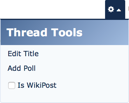
macrumors G3
1. Click on the thread tools icon to reveal this menu (the icon is easy to miss):My mistake, forum thread titles.
2. Click "Edit Title".
MacNut
macrumors Core
Ooooh, ya that's not easy to find. 😀1. Click on the thread tools icon to reveal this menu (the icon is easy to miss):
2. Click "Edit Title".
It would still be nice to have the inline editor.