Originally under
https://forums.macrumors.com/posts/21443469:
I can explain why the extremely negative change of opinion occurred, but that explanation belongs in a different topic …
Now, towards that explanation. From elsewhere:
… the new design, with XenForo, is
somehow more Mac-like than the old. That's a good thing. Credit to
@Audentio and everyone involved.
Mac-like; the potential to be
outstandingly good.
Clutter and disorder on a Mac would take the shine off the user experience.
As the redesign for MacRumors is
essentially clean and clear, it's peculiar to have clutter and occasional disorder. Not fitting; it feels as if some old baggage has been bolted on. A few days ago I thought long and hard about why my opinion, of parts of the redesign, became so negative for a while. The likeliest explanation is that
old baggage feels dreadfully heavy in the otherwise light, clean, new environment.
https://diigo.com/07pn94 around a month ago mentioned
shine, and promised some specifics …
… cluttered. I'm sure we'll get used to it though.
Users of Microsoft software might overlook or appreciate clutter. We should not expect the same appreciation from Mac users

As time passed, I did not become accustomed. The opposite: general
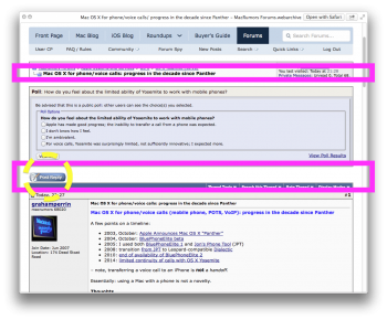
clutter to the left of – and above – every post became more annoying than interruptions from animated paper clip servants and other nonsense from the early 1990s. That paper clip was solo, and easily dismissed. The clutter now is repetitive, and less easily hidden. Advertisements (Google etc.) are relatively nonintrusive. Post-related and user-related clutter is relatively intrusive.
Related:
The heaviest divisions, the coloured horizontal line near the head of each post
With or without post numbers: wherever things become non-sequential or temporarily misplaced, there should be a much stronger visual hint that what's on screen is intentionally mashed.


