Become a MacRumors Supporter for $50/year with no ads, ability to filter front page stories, and private forums.
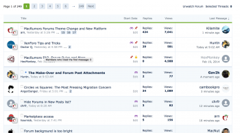
I find the white/light blue row colouring too distracting to skim over the topic titles. I liked the old one because it was clear what was a new post (in bold). Now, it's a tiny blue dot and I really have to read everything rather than just skim over it.

If I had it my way I'd make the row colouring white/light grey, or just have them all white like it was before. New topics can still have the blue dot but having them in bold too would be a lot better.

New topics are on bold. Maybe you need to "mark all as read" and start new?

Screen Shot 2015-06-01 at 12.30.56 PM.png
 
  • Like
Reactions: kolax
I'm sure this is plainer than the nose on my face but how do you know if a forum has "new posts" or "no new posts" by looking at the forum index without clicking and going into the forum? :confused: (<---- My fav emoticon). LOL
 
  • Like
Reactions: Benjamin Frost
I mostly like the new look and feel.

However, the lists of threads in a forum seems to have a lot of wasted space or something. Previously this was quite space-efficient and I could quickly look over far more thread titles than I can do. Now I have to do a ton of scrolling and go to next pages.

Same for inside a thread. All of the posts are just so huge now. Scroll scroll scroll scroll scroll scroll... sheesh. Someone is a huge fan of having acres of white space and giant controls.
 
@arn Thanks for changing the thread page numbers. Much easier to scan the lists now.

I have another question - I have been getting the red notification icons as expected at the top of the page under the flag icon, but I just had a second notification under my username. When I hovered over it, the notification was also an 'alert' though. What's the difference between the two?
 
I reported a few but there were dozens and dozens of new threads from the same user and same title and content.
That happens. Some spammers go on a spree and happen to do so when no staff members are online at the time. Rest assured though that once a moderator does come online and checks the open reports, that they will take care of them promptly. It's a volunteer service and they work on reports when they're here and have time.
 
  • Like
Reactions: stridemat
I may be missing it in the settings, but I can't find the setting to change the time format. Not everyone in the world uses the am/pm system and I would really like to put it back to the 24h time mode (or military time as it's sometimes called in the US)
 
I could have overlooked this somewhere in settings, and although I tried to keep up with this thread might have not seen it discussed earlier, but are there still options to not display avatars as well as not display images in posts/threads?

I see the option to not display signatures. And I recall in the previous version of the forums I was able to turn off avatars and images in posts (they would just appear as links, rather than load as actual images)--it allowed me to focus on the content of the posts easier and basically load and scroll through threads better as well without all these items. Would be great if these options were also available in the new version of the forums.
 
I am very pleased with the changes the migration has brought.

A very well done effort from those involved - a "thank you" too.

If I have any further comments, I'll be sure to post them after using the refreshed forum a bit longer.
 
I've noticed some previously banned users no longer show as banned. Perhaps the new forum software doesn't work the same way w.r.t. banned users? Or perhaps they were accidentally unbanned?

Just FYI...
 
I haven't noticed this.

This has also been happening to me, although it seems to have stopped in the last hour or so.
Also, I clicked 'keep me signed in' yet every time enter the forums from the front page it asks me to log in
 
Hmmm, well if that's true, there are two previously banned members who definitely appear to be reactivated. Based on their history, I find it unlikely they've been intentionally unbanned. ;)

Can you send me their names in pm
 
the entire forum appears chaotic and disorganized.
everything is gigantic and take much more space than before.

Is that on iOS? Everything is the same size here (more or less) on Firefox, but then I can resize the screen with a mouse button press in Firefox.

The biggest problems I see:

* Alerts for posts or quotes to messages no longer appear to have a link on them to go to that new message to look at it. As far as I can tell I have to go to watched threads. But that might be due to the next issue.

* Many "buttons" are not the least bit obvious to be buttons (e.g. view to newest thread in a post is a blue circle, but it does not give the slightest visual indication you can click on it by its shape/design; I gather this is an issue in Yosemite as well and a good reason why skeuomorphic, like it or not has its place in GUI designs as buttons were almost always obvious with them as they LOOKED like something you could press).

* The messages themselves need a light grey background like before (too white now and same as overall background where it was grey/white before).

* The new avatars are huge (limits on size before do not scale well to the new ones after the upgrade).

* Many very old watched threads showed up as new after the update here (but that goes away when you view them briefly).

* Quick replies appear at the bottom of the screen instead of at the bottom of the message you're replying to (probably makes little difference in practice though since posting brings you to the end of the thread anyway so I use a middle mouse click in Firefox to respond so it opens to a new tab instead, preserving where I was reading in the thread on the previous tab).
 
* Alerts for posts or quotes to messages no longer appear to have a link on them to go to that new message to look at it. As far as I can tell I have to go to watched threads. But that might be due to the next issue.

These should be links. See:

Screen Shot 2015-06-01 at 3.59.10 PM.png
 
Naa. I don't agree with that. People should be able to publicly show their interest in a particular post, otherwise 'likes' don't mean anything. They don't contribute towards anything so then they're just numbers on a screen. Seeing who liked your post makes them far more meaningful.

I still think there should be a DISLIKE button as well, even if I have to put my name on it. It would save me and others from having to reply to just to indicate a simple disagreement of opinion. This "PC" world of "positive" only is a load of horse manure and gives people a false indication that everyone agrees with them when in fact 10x more may disagree than agree, but aren't allowed to indicate their opinion. Others may simply not care about clicking on such things either way, so only getting "2 likes" may indicate nothing but laziness or only a few reading the thread or a disagreement with the system in general. In summary, the system is largely MEANINGLESS to begin with when it's one-sided. People that can't stand any disagreements should get a thicker skin, IMO.

These should be links.

I'm not getting such links thus far. I get a * at the end, but I can't click on it and that includes the alert for your post.
 
Register on MacRumors! This sidebar will go away, and you'll see fewer ads.