Become a MacRumors Supporter for $50/year with no ads, ability to filter front page stories, and private forums.
I like the badge. I'd prefer a single word, lowercase staff but I'm in no way upset by seeing Staff Member.

I'm surprised by that, to me they are large, distracting, inconsistent, and not very useful. I like the smaller red user title with "(Staff Member)" under it like shown in my screenshot above a lot more.

Important to some members, but too many appearances of titles are cliquey, far from self-explanatory, easily misleading. With those observations, combined, I can't generalise it as 'good'.

Some titles, and thoughts evoked evoked by each title

63030
  • LC II, Performa
  • slow, conflicting extensions, system crashes
  • outdated
  • early 1990s
65816
  • what?
68000
  • a nice round number
6502a
  • what?
  • Is that more or less than, older or newer than 68000?
6502
  • what?
  • I didn't find that one until I scrolled to the top of a page, above a 6502a
regular
  • appearing just once per month, week or day
  • posts from a newbie can be regular
moderator
  • self-explanatory
god
  • creator of the site
  • highest authority; superior to moderators
demi-gods
  • creators of large or highly significant parts of the site, or of the code for the site
  • superior to moderators
:D

Something I suggested earlier in this thread would help with that:
Perhaps the post count could appear when hovering over a user title?
This includes special titles like "demi-god", which are a bit less useful at showing how many posts someone has made.

By the way, with demi-god/demi-goddess titles, my script makes them smaller and green with "(Contributor)" underneath. This isn't a change I expect the site to implement, but it does make those titles a bit easier to understand.
 
This may have been discussed already, but I don't want to plow through 878 posts...

In the previous forum, if you replied to the same thread within a few minutes, it would simply combine your two posts into one. Now, it creates a separate post. Is there any plan to return to the old way, so you don't end up with multiple posts in a row. And yes, I know how to use multi-quote, but sometimes, I'm a little quick on replying.
 
If I recall correctly, care was taken to make contrast greater for (at least) quoted texts. Greater than with vBulletin.
There is a difference, but it's not a big deal to me. Quote comparison:
vB-Quote.png

Xen-Quote.png
 
- Added "thread starter" indicator

Thanks very much for this. I was just wondering the other day if it was an option or not and whether I didn't have it selected. This is very useful instead of having to scroll around.
 
… matches the font size with the front page …

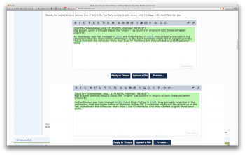
Please be aware that various aspects of the design are not compatible with zooming in (to compensate for the reduction). Contextual menus separated from context (screenshot below), misplacement of images (thumbnail below), and so on.

screenshot 2015-06-22 at 21.45.07.png


2015-06-22 21-55-21 screenshot.png

Postscript

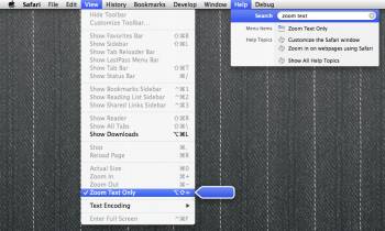
I can learn the Safari keyboard shortcut to switch on, switch off Zoom Text Only but from past experience with that option I suspect that throwing of the switch, one way or the other, will be frequent. The effect can be weird.

zoom text only.png

It would be better to not have the UI glitches (the contextual menu and so on).
 
Last edited:
user info.png


In this screenshot:
  • The text size for the location/join date info has been decreased. It is less distracting, longer locations will fit on one line, and it takes up less space on shorter posts.
  • The "(staff member)" descriptor has been tweaked slightly from my previous screenshot. I felt the use of inconsistent sizes for user titles wasn't a good idea, and this is still a lot less distracting than the badge shown by default.
  • The "thread starter" descriptor has been made a little more aesthetically pleasing.
  • User titles have been changed from the ugly gray color, which also matches the under-avatar info better and places more emphasis on them.
These are all changes I suggest the site make to the user info beside posts.
 
Any chance this will be user-configurable? Some of us are getting older and prefer "large print".

Hint: Use Firefox. Select ZOOM IN (Command-Plus). I have it and Zoom Out tied to my 4th/5th mouse buttons on my Microsoft Optical mouse (yeah they really did make the best mouse ever). It's really simple to scale up entire web pages. (fonts scaled here so you can read it). You could also try a newer pair of prescription lenses. I've had to wear mine since 1st grade so I know what it's like to not want to wear glasses, but I have no choice. I don't want to wear them either. But surgery is risky.
 
Hint: Use Firefox. Select ZOOM IN (Command-Plus). I have it and Zoom Out tied to my 4th/5th mouse buttons on my Microsoft Optical mouse (yeah they really did make the best mouse ever). It's really simple to scale up entire web pages. (fonts scaled here so you can read it).

Safari has this feature as well. But I find that a single zoom-in step makes the text a bit TOO large. I may just have to get used to it. And I'm not sure if it'll remember my setting between sessions.
 
Oh no! Macrumors is being "flatten" following Apple's revamps. Am still holding on to IOS6. I love leather on my notepad, reel-to-reel on my player, 3D icons. No!!!!!!!! :(
You might have overlooked quite a bit of discussion as to the reasons for the change and all that.
 
Username beneath the username

That's often confusing; a click on one is very different from a click on the other.

screenshot 2015-06-23 at 06.00.37.png

Suggestion

The two-column row with the darkest blue background can be reduced to a single word:

Profile

… name at the top of the page …

Most often when I see 'Preferences' beneath my name and know that it can not lead to a dedicated page for preferences, I click my name (to avoid the overlay approach) then find no link to preferences.
 
Last edited:
Username beneath the username

That's often confusing; a click on one is very different from a click on the other.

View attachment 563240

Suggestion

The two-column row with the darkest blue background can be reduced to a single word:

Profile


Most often when I see 'Preferences' beneath my name and know that it can not lead to a dedicated page for preferences, I click my name (to avoid the overlay approach) then find no link to preferences.
When avatars are enabled, that view also gives you a larger version of your avatar. I will admit, I have clicked on the smaller username link expecting to see my profile like with the larger one.
 
Last edited:
  • Like
Reactions: grahamperrin
Register on MacRumors! This sidebar will go away, and you'll see fewer ads.