Become a MacRumors Supporter for $50/year with no ads, ability to filter front page stories, and private forums.
Re: I have an idea...

Originally posted by smashedapart
It's a little out there, but, has anyone considered that Apple might be turning Mail into an entry-level mail program? Think about it, iTunes, iPhoto, iMovie, all of these consumer-oriented apps sport the metal interface. Maybe there's more to this than what's on the surface. Perhaps Apple is working on a pro Mail app like Outlook and is planning to use the metal theme to separate the two...? It kinda fits with the rumors that Apple has been working on their own Office suite. Just an idea...

-- smashedapart

I don't think that's out there at all. This was my first thought, as well. The post indicated that Mail will have a look similar to iChat and Safari and everyone instantly jumps on the "metal" look. There's more than just the metal look in those two apps, folks. Those two apps, along with the other iLife apps, have one other thing in common -- simplicity in design. Mail, while fairly easy to set up and use, has a more complicated interface than is necessary for the functionality that it provides. Turning it into something closer to what iChat is, for example, would make it easier to integrate Mail into the OS.

And no, it's not yet integrated into the OS. It's bundled with it, and it sports a (minimal) level of integration with other apps (primarily Address Book), but further integration is possible.

I think smashedapart is right on the money with the idea of a "Pro" version of Mail, especially with Microsoft's recent announcement of Exchange support for Entourage. The new app, probably not called "Mail", would likely integrate the functionality of iCal, Address Book, iSync, iChat, and possibly some other iLife apps. Not necessarily an all-in-one app, but an app that just pulls all the disparate pieces together into a cohesive whole.

And if it offers better integration with Keynote, and other potential office-type apps that Apple would hopefully come out with, all the better. :)
 
Re: Not again...

Originally posted by coolsoldier
Apple is going WAAAAY overboard with the metal stuff. It looks good in simple apps that usually only have one window (i.e. iTunes, iCal, Calculator), but for apps like Safari, Mail, etc. I just have to go in there with Interface Builder and take the metal out...just means more work for me. Metal only looks decent if they leave some border room around the edge of the window.

Remember how strict apple used to be about interface guidelines? Now it seems they're swinging to the other extreme:mad: .


relax, its just a color change...You guys/gals get all flustered...I think it looks cool...
 
Originally posted by awulf
Mail is the only Apple app with the Aqua interface. So that would have been expected to change.

I hope they add a formatting tool bar for composing emails.

Actually, Sherlock, Preview, Image Capture, Chess, Keynote, and many of Apple's apps in the utilities folder are not Brushed Metal. Personally, I like it...I think it adds some style to the apps. and I think it blends well with Aqua anyway. Many of my friends who use PCs really like the brused metal appearance.
 
Originally posted by Backtothemac
...I wish the entire OS was metal. If only I could do that somehow.

If you really want that, then check out Unsanity's Metallifizer haxie. It let's you turn the metal look for apps on or off, your choice. Look for it on VersionTracker.

Personally I think the brushed metal look is getting to be used on too many apps' intefaces. Wasn't the brushed metal supposed to be used only for apps that accessed some hardware directly, like iTunes and QuickTime, etc. It seems like Apple's breaking their own rules, but I seriously wish they'd just make up their damn minds already about which look to go with. Is it going to be Aqua or metal? :rolleyes: Sheesh!
 
i sense an online petition coming......

anyway, i guess i dont mind. personally, i prefer the aqua look over the brushed metal, except in apps like iTunes, QT, etc. also, sherlock's also probly due for a makeover as well...
 
Your Future MUAHAHAHAHAA

Seriously though, metal fits digital life apps. Aqua for utilities, OS, etc. and Tha pro grey shaded look for pro apps... Now all Apple has to do is open that (Pro Grey) look to developers, Maya just looks silly in aqua.
 

Attachments

  • metalpathfinder.jpg
    metalpathfinder.jpg
    58.1 KB · Views: 1,523
I, personally, really enjoy the brushed metal in many apps: Mail, System Preferences...
Just gives those apps a more refined feel to the interface.
It is slightly away from the norm, but c'mon, just because it looks slightly different, does not make it less functional.

Personally, I have always had a little grudge with the stop lights and the pinstriping, makes the OS look childish in some aspects.

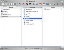
I would like to see what finder windows would look like with a real metal appearance. Since it is only carbon, it can't be metallified. Themes are too static, unlike the dynamic look of apple's textured UI.

I agree that it should be an option built into the system though. It should be my choice wether I want a lickable UI, or a strictly-business UI.
 
I think it would be smart for Apple to work with Theme developers. I LOVE Metal and HATE Aqua. So I use a theme. It's that easy, but it would be better if they implemented it into the system. Maybe I'm wrong and people shouldn't have a choice.
 
how about speed...

maybe instead of making Mail look like a cheesy imitation of a 1980s stereo component, they should, like make the damned program faster!

i tried using it for about 6 months, and had to go back to eudora.

the program is amazingly slow...like, the only way it could be as slow as it is is if you intentionally went out of your way as a developer and *tried* to make it slow.

and all the damned thing does is sort and display text files, with the occasional attachment!

i'm a big Mac fan, but I think Mail is a piece of ****.

So, they might as well make it look like one, too.
 
Which loads faster, metal or aqua? if metal loads faster, then I
don't care, but if it is slower, then I think apple shouldn't do it.
But all in all, it doesn't matter. ;)
 
Re: New machine style?!

Originally posted by Malic
I just had a thought ... Aqua's pinstripe style mirrored (in spirit) the physical design style of the iMac. With the metal look, is this a sign of things to come? Will all Mac's have a brushed metal "PowerBook" style to them?

More than just the iMac. My 17" flat panel -- and, I think, all their other flat panel displays -- have the pinstripe. As a matter of fact, the stripes I am looking at now exactly mirror the ones on my aquafied Safari.

To think that the transition to a brushed metal GUI may lead to brushed metal desktop units is an interesting observation. Imagine, however, that if Apple does it, eventually, the entire computer industry -- and a huge chunk of the general retail market -- will go brushed metal. Imagine brushed metal vacuum cleaners. ; )
 
I see no difference in how fast they load. I use metallifizer on almost everything.

Is this really that bad?! I think it looks better!
 

Attachments

  • picture 4.jpg
    picture 4.jpg
    18.2 KB · Views: 1,343
on Perversion Tracker They talk about how Apple wants brushed metal for Apps that represent Devices.
QT = TV\VCR
DVD Player = Duh!
iTunes = Jutebox
iMovie\FCP = Two VCRs and an Editing Board
iPhoto = Photo Album
Safari = (IE?)

So it makes sense for Mail to be brushed metal
Mail = Mail Box

Apple Works really should be Metalizied
AW = Typewriter/ Paper and pencil

My 24,601 Cents Worth (BTW thats $246.01, some one should grab it and buy a Game Cube (And 4 Games) or a refurbished iPod with it.)

TEG
 
Take it a few steps further...

Personally, I prefer the Metal GUI to the Aqua GUI. At the very least, I would like for Apple to give us the option to use either look system wide.

I've been using Path Finder alot lately, and it has the option to run it with the Metal GUI. I think it looks much better. One of the best looking themes out there is Max Rudberg's Brushed theme. It eliminates the problems many designers have with Aqua - namely, the brightness of the white areas can be quite harsh to look at all day. I personally find a more neutral grey nicer to look at.

So, if Mail does go metal, that's fine with me. Just take it a step further and give us the option to use Metal throughout the entire UI. Apple's logic behind using the Metal GUI is now been broken, so let's see it systemwide!
 
not bad

Actually, i like the metal interface...i got burned out on the aqua thing after a while. Actually what would be even better is if you could switch between aqua and metal, but i suppose that will be left to ResEdit.

Call me wierd, but i find the metal GUI attractive. :)
 
I personally don't think they ever really had a set system saying "these will be metal, these will not". I think Apple thought that these certain apps looked nicer with metal. It is great to give developers that option, too. I believe that it was a widely requested option by developers to offer something that wasn't so kindergarten-ish.

I really think safari looks horrid with Aqua. So does iChat.
 
Originally posted by seven5
[quote from the HIG]

Hey - good catch on that. I personally think that it's a bit of a stretch to say that Mail.app represents the "mail box" device...:rolleyes: So, in having said that it seems to me that they're rewriting the rules as they go along (whatever mood Jobs is in at the moment)... so nothing's changed... ;-P

Personally, I don't care... like others have said: it makes Windows users drool, and might actually add a little functinality (draggable-from-anywhere windows).
 
Register on MacRumors! This sidebar will go away, and you'll see fewer ads.