Become a MacRumors Supporter for $50/year with no ads, ability to filter front page stories, and private forums.
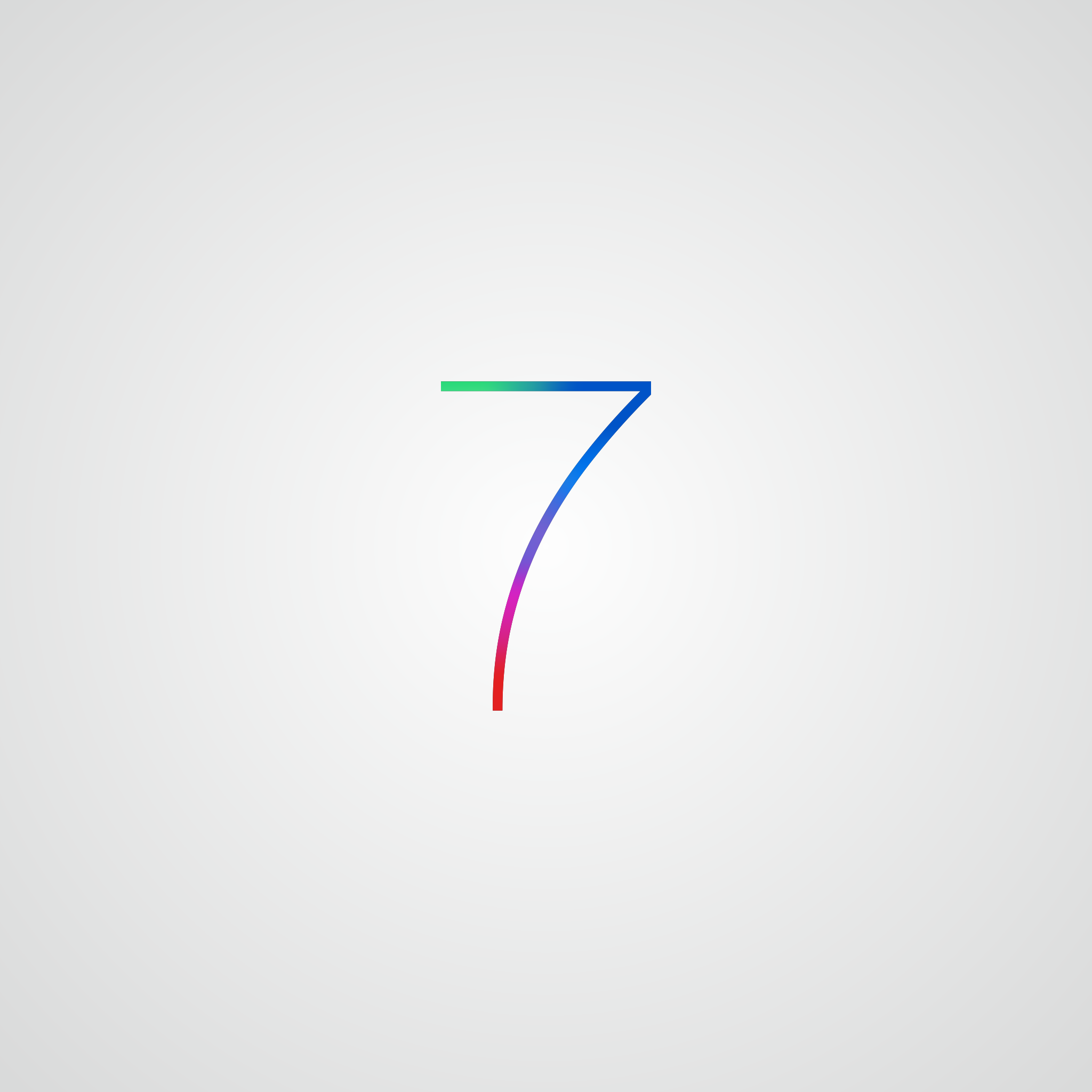
I'm really disappointed there's not a lot more obsessive speculation on the colors in the 7. Everyone's talking about the font (obviously minimalist Ive influence) and the background (probably the new linen), but there's this whole other aspect, people! The colors!

Anyway, I'm most looking forward to seeing pictures of drape-covered banners on Monday before the keynote. What will be under them? Much more interesting than these generalized 7 and X banners.
 
10.9 becomes 10.10

There will likely be an 11 at some point, but it doesn't have to be the next one.

I'm not sure if someone has already made fun of this person, but 10.9 does NOT become 10.10. 10.10 is 10.1. Rocket science is apparently alive and well.
 
Retina display approved

Needs a retina display to really show off the thin crisp lines...

Waiting for a retina Cinema Display...
 
iOS 7 Wallpapers!

Head over to http://deepakselvaraj.deviantart.com/art/iOS-7-Wallpaper-376610850 for wallpapers of all sizes

ios_7_wallpaper_by_deepakselvaraj-d6882si.png
 
I'm not sure if someone has already made fun of this person, but 10.9 does NOT become 10.10. 10.10 is 10.1. Rocket science is apparently alive and well.

You really shouldn't make fun of people if you don't understand how the OS numbering works. You just end up looking dumb and overeager to show it. They are not decimals and 10.10 is not the same as 10.1
 
Obviously, this banner hints that iOS 7 will feature a color accented UI that will shift color depending on the orientation of the device, using the accelerometer.
 
I actually discovered Helvetica Neue Ultralight while doing a paper a few days before these banners went up and I loved it. Previously I used Myriad for everything. Now Myriad looks so dated and fat.

----------

I'm really disappointed there's not a lot more obsessive speculation on the colors in the 7. Everyone's talking about the font (obviously minimalist Ive influence) and the background (probably the new linen), but there's this whole other aspect, people! The colors!

Actually I was thinking about the colours, specifically for the app squares and they way they're overlapping and transparent. I have a feeling transparency will be a major theme in iOS 7.
 
I wish I'd taken photos of the signage on the Metreon and in Moscone west. There is an overarching theme of transparent icons and stacked icons. I wonder if we will have "stacks" in IOS now? The colors are also much closer to primary or at least very saturated hues. Kind of a throwback to the candy colored CRT iMacs in a way.
If anything, aside from the anorexic 7 banner everything else is much less monochrome and stark than prior WWDC signage.
But as someone else pointed out, much less forthcoming as well.
 
I'm not sure if someone has already made fun of this person, but 10.9 does NOT become 10.10. 10.10 is 10.1. Rocket science is apparently alive and well.

10.1 is not the same as 10.10....... it's all about the decimal places. No need to try and belittle someone when you yourself made an error.
 
So much talk over a... font... Apple has trained their minions well not to expect much.
 
Forgive me if someone has already said this. However, maybe the wave is a metaphor for a cleansing of the OS.
 
So much talk over a... font... Apple has trained their minions well not to expect much.

And yet the "non minions" talk about it incessantly. Apple has trained you well too
 
Register on MacRumors! This sidebar will go away, and you'll see fewer ads.