Got a tip for us?
Let us know
Become a MacRumors Supporter for $50/year with no ads, ability to filter front page stories, and private forums.
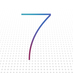
Minimalist iOS 7 Banner Goes Up at Moscone West for WWDC 2013
- Thread starter MacRumors
- Start date
- Sort by reaction score
You are using an out of date browser. It may not display this or other websites correctly.
You should upgrade or use an alternative browser.
You should upgrade or use an alternative browser.
Does this remind anyone else of the minimalist Windows 7 logo? That wasn't as much a font though. I do realize the "7" is just a coincidence")
That's the surprise! Microsoft Windows .exe application will now run on iOS!
Is this hinting that all text in the new iOS will be multi-colored on a white background?
Of course. This confirms all backgrounds will be white. The new thinner font. Etc.
Don't you know how this works. Everything you need to know is in the banners.
Where is Robert Langdon to decipher it for us
Attached link for reference:
http://typographica.org/on-typography/roboto-typeface-is-a-four-headed-frankenstein/
Back to the point, the font is Helvetica Neue UltraLight.
I hope that we will see at least some of Jony's influence and taste in OS X 10.9.
I know iOS is the main focus, the cash cow, but OS X is were the allegiance sits ... so please a fresh Jony Ive breeze for OS X!
I know iOS is the main focus, the cash cow, but OS X is were the allegiance sits ... so please a fresh Jony Ive breeze for OS X!
Of course. This confirms all backgrounds will be white. The new thinner font. Etc.
Don't you know how this works. Everything you need to know is in the banners.
Where is Robert Langdon to decipher it for us
Is it a metaphor?
No, the map is an actual location, Robert!
x100
No, no, no! It's the iPhone 7! They're skipping 6 completely and going right to 7! And it's going to be thin!
I hope that we will see at least some of Jony's influence and taste in OS X 10.9.
I know iOS is the main focus, the cash cow, but OS X is were the allegiance sits ... so please a fresh Jony Ive breeze for OS X!
There will definitely be changes to the styling in OS X 10.9. If nothing more, they will need to update all of the cross-platform apps for consistency (Notes, Reminders, Mail, Calendars, iMessage, Safari, etc).
No, three more days. Sorry.
Today is almost over. Monday does not count because that's when the announcement will happen.
I can see it now. "This is our thinnest and lightest seven ever."
This definitely looks like a hint toward a new visual style. Monday should be the most interesting Apple keynote of the past couple years.
I hope so. I really want to hear them say 'last fall we gave you our thinnest hardware ever, this fall we are going to give you our thinnest software.'
So much in iOS is bloat. Unneeded fluff tricks, no longer needed utility apps, fonts, languages etc that most folks never use. Remove it all together or move it to DLC to get if you need it but not until then. Same in their App Store apps and same in new APIs etc to let third party apps do the same (and make them use them). Even splitting up 'universal' apps to be the same SD/HD pairs as video would be an improvement.
I'm excited.
Mocked it up a little clearer in Photoshop.
It says to me pixels and thin.
It will be the seventh iteration of the Macbook Air when it is released.
Therefore I think it confirms Retina MBA!
Font
It's Helvetica Neue, UltraLight.
Reading into this a bit, what font is that 7?
It's Helvetica Neue, UltraLight.
No, no, no! It's the iPhone 7! They're skipping 6 completely and going right to 7! And it's going to be thin!
Technically the iPhone 5 is the 6th generation iPhone.
Helvetica Neue Pro Ultralight ? i am probably wrong.
I do believe we have a winner!
have you guys ever noticed that the seven has the same colour pattern as the apple logo that was put up at the key note they have in october a few months years ago before steve passed? correct me if im wrong but i think it was his last keynote before resigning off the team.

No, no, no! It's the iPhone 7! They're skipping 6 completely and going right to 7! And it's going to be thin!
Skipping? But the next iPhone *is* the SEVENTH iPhone. iPhone 7 makes sense.
No, you're not.
http://myfonts.us/td-Mzwnml
Wish Apple used a unique, custom designed contemporary typeface family, or licensed one. Helvetica doesn't work good everywhere. They could definitely afford best type designers.
By definition, Helvetica works perfectly almost everywhere. It's one of the most versatile fonts out there. Look around you, its everywhere!
Register on MacRumors! This sidebar will go away, and you'll see fewer ads.