A new paint job is cool and everything but I want to see iOS opened up. Let me make third party apps default.
Got a tip for us?
Let us know
Become a MacRumors Supporter for $50/year with no ads, ability to filter front page stories, and private forums.
Minimalist iOS 7 Banner Goes Up at Moscone West for WWDC 2013
- Thread starter MacRumors
- Start date
- Sort by reaction score
You are using an out of date browser. It may not display this or other websites correctly.
You should upgrade or use an alternative browser.
You should upgrade or use an alternative browser.
Today is almost over. Monday does not count because that's when the announcement will happen.
No. Look at the countdown on the homepage. 3 days minus half an hour. 1 PM EST Monday and it is 1:30 now. So tomorrow at 1 will be 2 days and Sunday is one day.
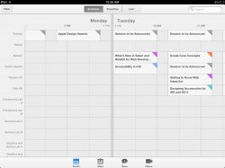
It is exactly as I suspected. The WWDC app is probably the glaring sign of what 7 will look like. Everyone launch the WWDC iPad app you know you have and look at the day separator a in the events calendar. Little grey dots, matching the banner's dots. Could just be a WWDC branding pattern, but compelling nonetheless.

Attachments
The 7 is cool, but the background is way too skeuomorphic.

Steve would never have approved this 7.
By definition, Helvetica works perfectly almost everywhere. It's one of the most versatile fonts out there. Look around you, its everywhere!
yep... Helvetica was designed for sole purpose of being the "perfect font" and most versatile.
Two more days! Two more days! Two more days! Two more days! Two more days! Two more days! Two more days! Two more days! Two more days! Two more days! Two more days! Two more days! Two more days! Two more days! Two more days! Two more days! Two more days! Two more days! Two more days! Two more days! Two more days! Two more days! Two more days! Two more days! Two more days! Two more days! Two more days! Two more days!
Oh, I forgot to mention: "Two more days!"
Don't you mean this
It is exactly as I suspected. The WWDC app is probably the glaring sign of what 7 will look like. Everyone launch the WWDC iPad app you know you have and look at the day separator a in the events calendar. Little grey dots, matching the banner's dots. Could just be a WWDC branding pattern, but compelling nonetheless.
Image
Yep. I suspect that the dotted pattern is the new linen.
Also, it looks somewhat familiar...


Skipping? But the next iPhone *is* the SEVENTH iPhone. iPhone 7 makes sense.
Oh god here it goes again...
Of note, Apple started using Myriad Pro Light for the iPhone 5. As a designer, I'm a big fan of Helvetica Neue UltraLight...I hope it makes its way into iOS!
I wonder when we will get getting these new controls in xcode. Hopefully they atleast release beta on WWDC day.
A mid-century modern spin on iOS makes me happy in strange and exciting ways.
The little grey dots remind me of hardware parts on the Mac Pro and generally gives it a hardware vibe. I think Jony Ive is doing a pretty good job on merging the software with his iconic Dieter Rams-inspired designs.It is exactly as I suspected. The WWDC app is probably the glaring sign of what 7 will look like. Everyone launch the WWDC iPad app you know you have and look at the day separator a in the events calendar. Little grey dots, matching the banner's dots. Could just be a WWDC branding pattern, but compelling nonetheless.
Image
I personally wish for a typeface change to something slimmer than in that app. I like the one used both in the "WWDC" and "7" and think there's still hope for that.

Register on MacRumors! This sidebar will go away, and you'll see fewer ads.