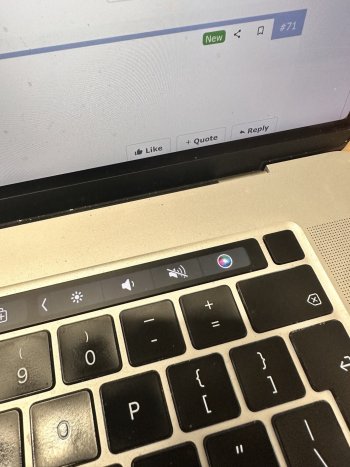
Compared to my US MBA M3 Midnight keyboard. Delete key says “Delete”. Return key is rectangular and says “Return”.
Got a tip for us?
Let us know
Become a MacRumors Supporter for $50/year with no ads, ability to filter front page stories, and private forums.
New MacBook Air Quietly Fixes This Decades-Long Design Oversight
- Thread starter MacRumors
- Start date
- Sort by reaction score
You are using an out of date browser. It may not display this or other websites correctly.
You should upgrade or use an alternative browser.
You should upgrade or use an alternative browser.
Next they need to replace the # symbol above the number 3 with the £ symbol on UK models.
Also, I don't need quick access to the $ symbol.
Also, I don't need quick access to the $ symbol.
Post title made this sound so much more dramatic than what it was lol
That's the defining characteristic of click-bait.
I presume that's because you're using an US English keyboard, which has a wider return key. However, pictured in the article aren't US English keyboards. The return key is much narrower, so putting the "return" text on it would be a problem.Compared to my US MBA M3 Midnight keyboard. Delete key says “Delete”. Return key is rectangular and says “Return”.
? The UK English keyboard for the MBA doesn't have £ key there? It does on the British English USB-C Magic Keyboard.Next they need to replace the # symbol above the number 3 with the £ symbol on UK models.
Also, I don't need quick access to the $ symbol.
Every person with IQ beginning with 8 knew that it meant mute. This was no design oversight or anything. It’s just different now. Lol.
This is a strange statement to make. I guess they ARE known for attention to detail, but in this case, there was NO attention to THIS detail for 26 years.The keyboard change is typical of Apple's meticulous attention to detail, even if it took more than a quarter-century to implement.
Ugh and I thought they put back the keyboard backlight brigtness keys. Instead, we still have the focus and dictation keys. Who even uses these? I mean, you can turn on focus from control center, but try to find easy way to change keyboard backlight brightness, such a pain...
TIL there is a mute button. Wow. (I have been using Macs exclusively since 1987.)
In a move that probably won't make headlines but should delight detail-oriented Mac users everywhere, Apple has quietly corrected a 26-year-old design inconsistency on its keyboards.
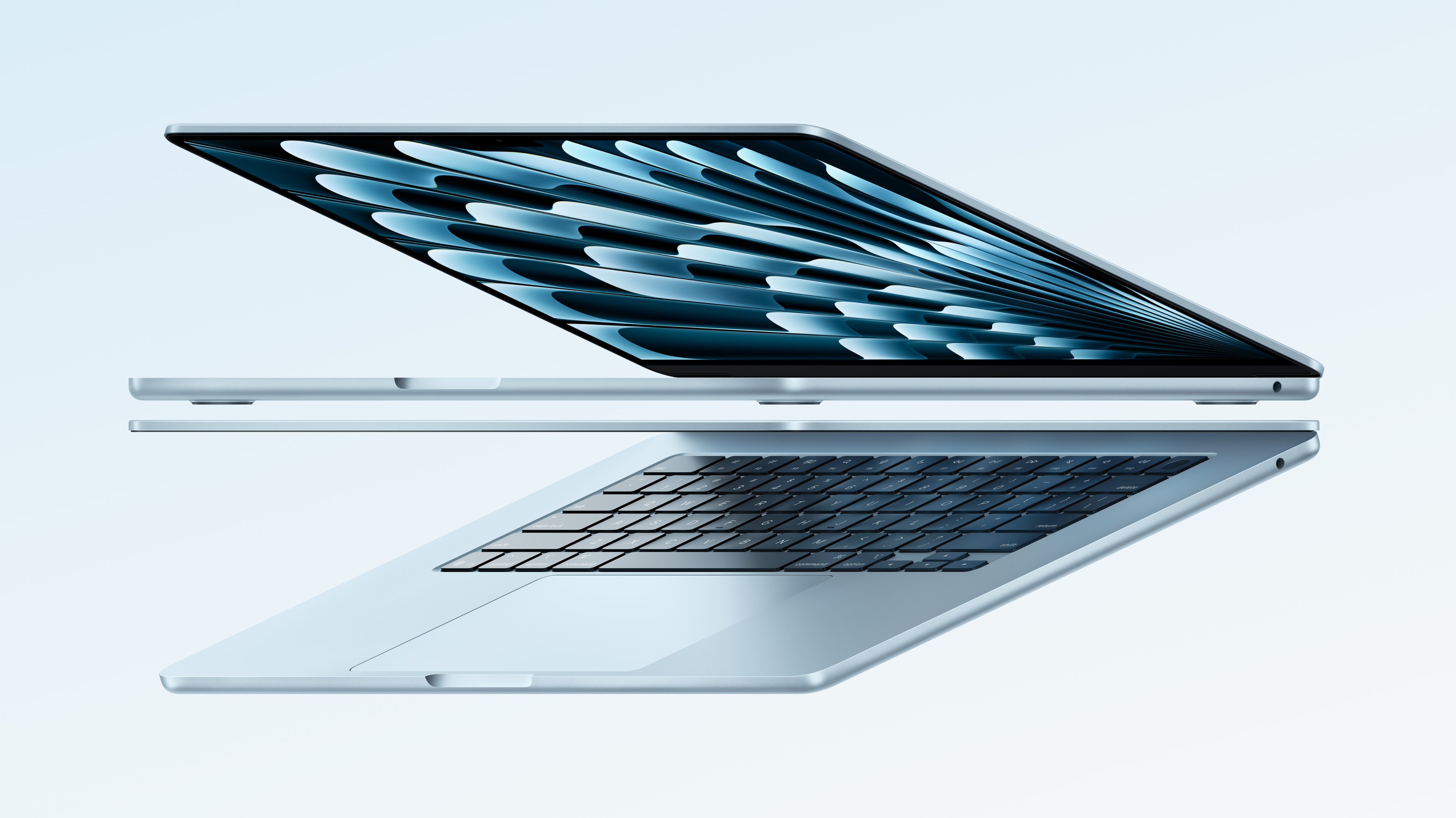
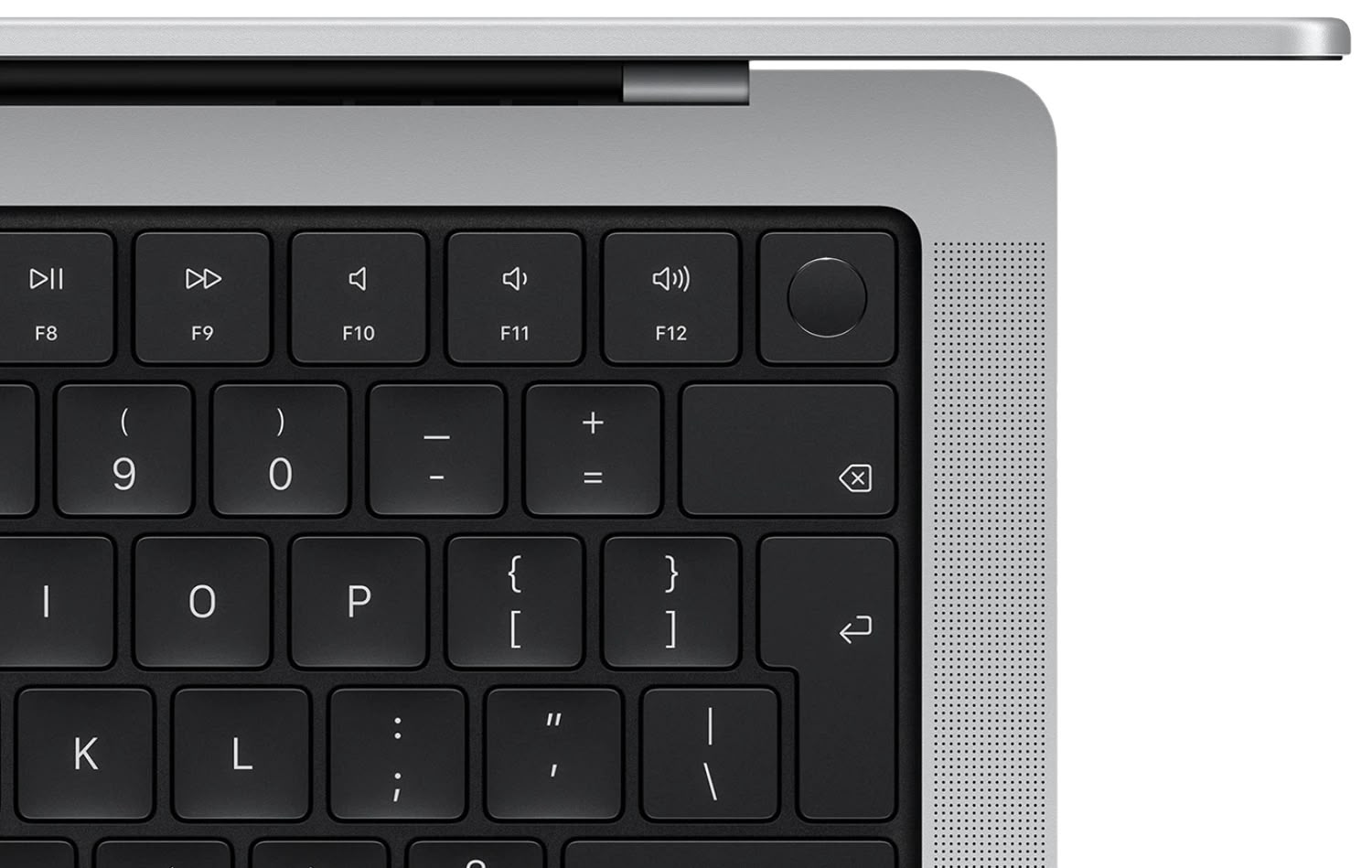
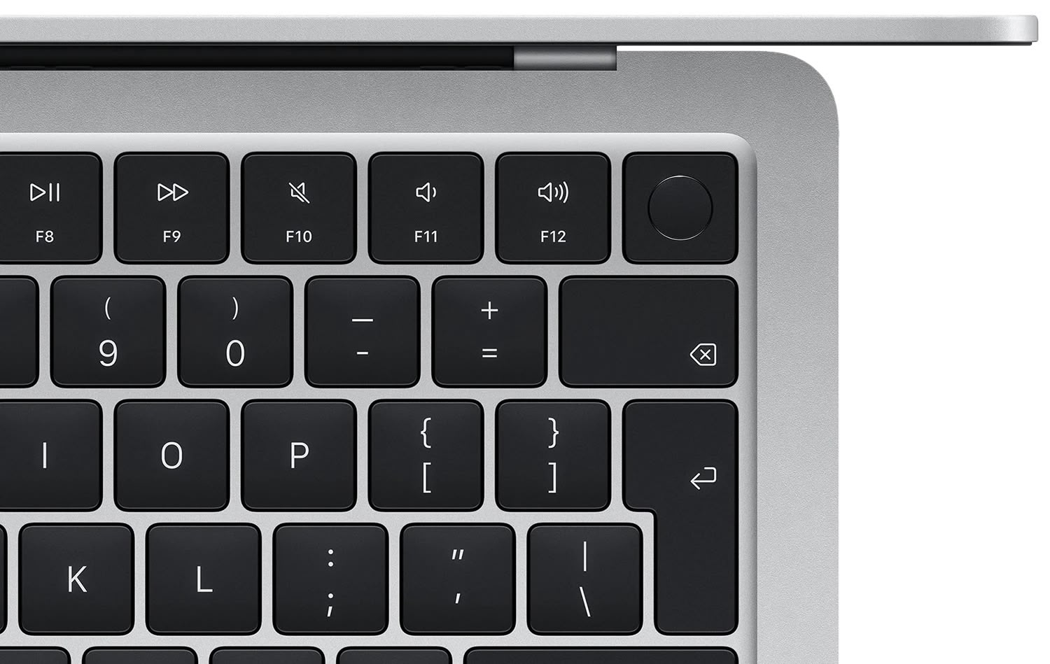
The Mute key, a staple on Mac keyboards since the PowerBook G3 'Lombard' debuted in 1999, has finally received a logical redesign on the new MacBook Air with M4 chip. As spotted by iCulture, the key now displays a speaker with a strike through it – matching the actual on-screen indicator that appears when you press it in macOS.
For over two decades, the Mute key has confusingly shown just a speaker icon, providing no obvious visual indication that it silences your Mac. Meanwhile, pressing it would display a completely different but more accurate symbol on screen: a speaker with a line through it. To be fair, it is a toggle key that both mutes and un-mutes audio, but the new mute icon more recognizably informs what the key does – just like on the Apple TV Remote.
Mute key symbol on previous Mac keyboards
This small but meaningful correction resolves a surprising design inconsistency that has persisted through countless keyboard iterations across dozens of Mac models.
Mute key symbol on new MacBook Air
The redesigned Mute key isn't limited to the MacBook Air, either. The new iPad Air's Magic Keyboard also incorporates the corrected icon. In fact, you could call this a "double upgrade" for iPad Air users, as previous Magic Keyboard models have lacked function keys entirely.
The keyboard change is typical of Apple's meticulous attention to detail, even if it took more than a quarter-century to implement.
It seems likely that all future Mac models will adopt this revised Mute key design. The next expected release, a MacBook Pro with M5 chip anticipated around October, will presumably incorporate the updated key icon.
Article Link: New MacBook Air Quietly Fixes This Decades-Long Design Oversight

It's no wonder apple "quietly" did this. Can you imagine the ridicule if they had issued a press release or made any type of announcement for that matter...
I didn’t realise I was supposed to be confused by this. I shall go back to my MacBook and be confused immediately!")
Yup, I prefer the simpler version. When icons get too complex, they remind me of non-Apple products.
Looks like changes also made to Delete and Return keys
Ugh, I hadn't noticed the Return key on these latest laptops... I can't stand narrow double-height Return keys! I can't believe that Apple has moved to that design! And the icon instead of "return"... ugh, what is happening to our beloved company!?! 😱
EDIT: That keyboard screenshot in this article seems to be the non-US/Canada layout. Good to see they've retained the horizontal return key in the US/Canada layout.
What next, the "command" key moves positions to match PC keyboards?
Last edited:
It's already been posted in this thread, but contrary to popular hysterics, the sky is not falling.Ugh, I hadn't noticed the Return key on these latest laptops... I can't stand narrow double-height Return keys! I can't believe that Apple has moved to that design! And the icon instead of "return"... ugh, what is happening to our beloved company!?! 😱
What next, the "command" key moves positions to match PC keyboards?
I feel seen by this story. Not because I ever noticed the icon mismatch, but this is exactly the kind of detail-oriented, historically-minded post I would hope to see from a fan community such as this.
Three cheers for the new mute key and the fellow nerd who noticed! 🍻
Three cheers for the new mute key and the fellow nerd who noticed! 🍻
"Design oversight" and "design decision you didn't like" are not the same thing. Not even the same thing as "poor design decision"...
I like the key with the slash through the speaker better, too, but I can guarantee you the speaker without the line wasn't an accident or oversight.
I like the key with the slash through the speaker better, too, but I can guarantee you the speaker without the line wasn't an accident or oversight.
LOL… decades from now Apple will remove the slash and the headline will be “Apple quietly fixes the unmute button design”. This whole thing is a point of view. If your computer is already muted, then this button is “Unmute” and the design is appropriate as is.
Take a risk. Be bold. Just say, "In a move that won't make headlines..."In a move that probably won't make headlines...
It's not a big risk.
No, it's a striking out a speaker, ie. muting that speaker.Isn’t this a double negative? Striking out a silenced speaker?

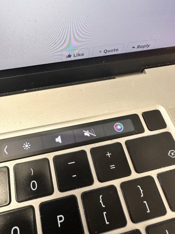
yes i noticed that. see my pic of my touch bar how it should be --- a full speaker with a strike. You guys gave up on touch bar way too early.Isn’t this a double negative? Striking out a silenced speaker?
touch bar changes status when you press it. I guess touch bar wasnt that bad after all.LOL… decades from now Apple will remove the slash and the headline will be “Apple quietly fixes the unmute button design”. This whole thing is a point of view. If your computer is already muted, then this button is “Unmute” and the design is appropriate as is.
Attachments
Register on MacRumors! This sidebar will go away, and you'll see fewer ads.