Become a MacRumors Supporter for $50/year with no ads, ability to filter front page stories, and private forums.
Just thinking out loud here, could Apple not add an option to simply drop the menu bar down below the notch and black out the top section? I don't have a problem with the notch itself, but I am concerned how a crowded menu bar will work. My current set up doesn't leave much wiggle room...

View attachment 1870964

Holy Menu Bar Icon Overload Batman!! 🤯
 
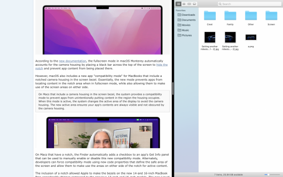
so let's say a developer decides to use the right and left size of the notch in full screen.

What happens when you have two apps open side by side in full screen as shown in the screenshot below?

This notch is an absolutely unnecessary headache just to get ~3% more vertical pixels. what a joke
 

Attachments

  • Screen Shot 2021-10-19 at 12.50.02 PM.png
    Screen Shot 2021-10-19 at 12.50.02 PM.png
    1.2 MB · Views: 109
Love the response! I am wanting to get mine in my hands to see how distracting it might be as welll!! I am hoping it won’t be a big deal or I can just tweak my background to help it disappear more :p

One thing though is you always get 74 pixels more since the menu bar that uniformly went across the display is now moved up. The menu bar itself doesn’t get the whole extra space but your desktop does. But you are right, it is only 3% extra space, but the number of times I wish I could just fit a little more on my display…..lol

who knows, excited to see if I like it or not, but it is also likely here to stay so it’s not like I have a choice anyway!
Oh yes, you're absolutely correct. I should edit my post to fix that.

I thought maybe if you set the Mac to dark mode and put a black background behind the menu bar, it might hide the notch... but of course this article is about apps utilizing that extra space, so it might still show up in some circumstances. Regardless, I hope it's not too noticeable and that you enjoy your new Mac!
 
so let's say a developer decides to use the right and left size of the notch in full screen.

What happens when you have two apps open side by side in full screen as shown in the screenshot below?

This notch is an absolutely unnecessary headache just to get ~3% more vertical pixels. what a joke
As per the developer documentation, apps can just choose to move the menu bar down to where it was before and it is all taken care of. Users can also set this individually by app by using the Info panel on any app.

It is super strange that people are trying to “gotcha” Apple on this, like they just came up with it and threw it into the laptops last minute. 🤷🏻‍♂️
 
People don't realize that the notch area is extra screen space.View attachment 1870940
This is a good summary. Initially I was worried that the notch will also be included for full screen apps, but if it's just for menu bar under MacOS' system, with no full screen apps activated, this is actually quite good, and I dont mind it.
 
What I would like to know is how the pointer will behave in the notch-area.
Will the pointer get "stuck" on the notch? Will the pointer "jump" to the other side? Will the pointer be "invisible" in the notch area?
 
I cannot begin to fathom why people cover their MacBook webcams with tape, for so many reasons.

1) The camera cannot physically activate without turning on the LED. It just can’t. If the camera has power, the LED has power.

2) If someone has so thoroughly owned your computer that they can spy on you through your webcam, then they already have total access to your system and you’re screwed anyway, so worrying that they’re going to catch you picking your nose while they riffle through every file on your system seems a bit hysterical to me.

3) How do you disable the microphones? Or do you just take extra care to never say anything sensitive within earshot of your MacBook?

It’s all quite silly, isn’t it?
If people are so concerned about their webcams, then they could use Oversight.
 
Folk can spin this as they like but its a major design fail, an abomination, having to look at this all the time - no thank you.

Jobs & Ives would never have allowed this.

Time for Tim Cook to retire, hopefully to be replaced by the return of Jony Ives.
 
Exactly.

I never understood why people take so much care to cover their cameras with tape... but leave the microphone untouched.

Let's say I wanted to hack a CEO's laptop. Spying, espionage, James Bond stuff. But I already know what the CEO looks like... so I don't need to see his webcam.

But I'd LOVE to hear what he says in his office. Secret conversations and whatnot. That's the real prize. Voice!

It's the same reason phone conversations get tapped and recorded... but hardly anyone hacks security cameras.

:p
Ponr 🥸
 
Folk can spin this as they like but its a major design fail, an abomination, having to look at this all the time - no thank you.

Jobs & Ives would never have allowed this.

Time for Tim Cook to retire, hopefully to be replaced by the return of Jony Ives.
Not sure about Jobs, but the 2015/6 era of dongle-life, paper thin keyboard and chassis, and 'touchbar' is signature Ives. I am happy for what we've got, and like the iPhone, you'll just get used to it.
Or not, whatever, the world keeps on spinning.
 
so let's say a developer decides to use the right and left size of the notch in full screen.

What happens when you have two apps open side by side in full screen as shown in the screenshot below?

This notch is an absolutely unnecessary headache just to get ~3% more vertical pixels. what a joke
The API for developers is seperate for left and right. I'm gonna guess that if split screen, then only the left or right part is shown.

----

Funny how people here would rather a bigger bezel rather than have two extra bits of screen space to use, unless its still a case of people thinking the notch is taking away space, which is isnt.
 
That is why I put my menu to autohide, because it wastes space and I don't want to see it when I don't need it. The notch is just really pointless.
If there was no notch, you would not have got the extra height on the screen, they would have left the smaller 16:10 screen. So its not wasting space - because that suggests its taking something away - instead you gained more vertical space. You now have more space, not less.
 
It’s far too wide for what it contains. Either they dropped Face ID late in the design, or they want it in future and don’t want to have a bigger notch on a future machine that’s supposed to be ‘better.’

Either way, it’s a poor compromise. The Photoshop menu bar barely fits.

View attachment 1870947

I bet this is a webcam-only stop-gap solution before a refresh next year with FaceID in the notch.

I can already hear it: "We're bringing FaceID to the notch."

Something they should have done right away, imo.
 
  • Like
Reactions: Akzel
My reasons are just aesthetic. It just looks crappy. I don't see the problem with a thicker bezel to hide the cam, so this is just a design choice made by Apple. I was looking to finally upgrade from my 2016 Intel MBP, now this has made me think maybe not. It definitely looks awful.
If this stops you buying one, then you really did not need a new laptop.
 
I bet this is a webcam-only stop-gap solution before a refresh next year with FaceID in the notch.

I can already hear it: "We're bringing FaceID to the notch."

Something they should have done right away, imo.
Theres probably a good reason they didn't add it already - maybe waiting on a thinner version they don't have yet.

Wait for the teardown, we can see how much of the notch is empty space, or if its all used up.
 
I suppose Finder will always be running in fullscreen mode.

So how will this behave then?
Finder window dragged to the top & menu bar automatically hidden.
I suppose a Finder window cannot be dragged into the areas left and right of the notch.
What will be displayed above the Finder window if the menu bar is hidden? The desktop background? Or will it not be possible anymore to hide the menu bar?

 
Last edited:
Register on MacRumors! This sidebar will go away, and you'll see fewer ads.