Become a MacRumors Supporter for $50/year with no ads, ability to filter front page stories, and private forums.
Status
Not open for further replies.

arn

macrumors god
Original poster
Staff member
Apr 9, 2001
16,399
5,843
Hi,

We made some tweaks to the site design today. There are some cosmetic changes and some functional changes.

Responsive

The new site is now fully responsive. That means no more mobile and non-mobile versions. The forums have been fully responsive for a while but now the front page is as well.

We also have a wider default size for the site.

Blogs Retired

The iOS and Mac Blog sections have been retired. This means the front page is a single feed. We made this change because the distinction between Blog and Front page has gotten blurred over time. Our Mobile feed has been a single feed forever, and our social channels (FB, Twitter) also display stories in a single feed. That really only left Desktop as a divided feed. And that caused some confusion when users would see a story on mobile but not see that same story at the top of the Desktop feed.

As a result, we have merged all the feeds into a single feed.

Featured Block

Alongside merging the feeds, we have added a "Featured Block" that will fill the gap on what we think are important or interesting stories. This will make it easy to catch up on the big stories of the past week, and also can draw attention to major stories that might get pushed down the front page.

Screen Shot 2020-03-09 at 1.17.15 PM.png


If you don't like the new featured block, you can dismiss it by clicking on the "X" in the top right corner. And you can toggle it on and off with a link on the bottom.

Work in progress

As always, there are minor bugs here and there we are fixing. Let us know if there are any specific issues.

arn
 
Glad to see the featured block has a way to hide it. For people visiting the site infrequently, I imagine it's quite helpful. For the more hardcore that look at every story posted, it just meant more to scroll past to get to the articles.

Sad to see the separate channels go away. At this point, that's mostly out of habit, I suppose. The single feed is probably the better way to go, but I'll miss clicking on each of the three sections (yeah, I'm a weirdo).

Congrats on getting the site updated! Are there more changes planned, or does this complete what you were aiming for?

Edit: one suggestion: on the forum alerts page, the distinction between new and old alerts seems to rotate through several shades of gray. A few of them are pretty darn close to each other, and can be hard to distinguish (especially on differing screens, under differing lighting conditions and differing viewing angles, I sometimes have to tilt my old MBP's screen forward and back to get more contrast between these grays) - could I suggest either making them more distinct shades of gray, or perhaps tinting them other colors? It's really helpful to be able to quickly see what are new reactions/replies, and what are "old" ones I've already seen.
 
Last edited:
Have to say that I'm not a fan of the thing where the comments (if any) are followed by "Top Stories" continuing on down the page. I know where the front page is, and can go back and look at what's next (I probably have the ones of those stories that interest me already opened in other tabs). To me it's unnecessarily cluttering the page. I suppose it might help with "viewer engagement", but... well, I'm not a fan of this bit.
 
There is too much padding on the mobile view. Take inside a content box, I would have it 50/75% of what it currently is
 
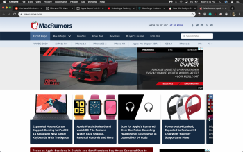
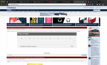
Hi Arn! Liking the general aesthetic of the redesign, but have to say I'm not really a fan of the information density. This is a full screen view of the site on a 15" retina macbook pro at 100% scale. Everything feels huge, too zoomed in.
[automerge]1583788922[/automerge]
For example, "Fluid HD" scaled at 50% gives me the layout I'd expect from a desktop website, but text is a bit small and hard to read. :/
 

Attachments

  • Screen Shot 2020-03-09 at 5.14.41 PM.png
    Screen Shot 2020-03-09 at 5.14.41 PM.png
    1.3 MB · Views: 503
  • Screen Shot 2020-03-09 at 5.20.05 PM.png
    Screen Shot 2020-03-09 at 5.20.05 PM.png
    916.2 KB · Views: 522
Hi Arn! Liking the general aesthetic of the redesign, but have to say I'm not really a fan of the information density. This is a full screen view of the site on a 15" retina macbook pro at 100% scale. Everything feels huge, too zoomed in.
[automerge]1583788922[/automerge]
For example, "Fluid HD" scaled at 50% gives me the layout I'd expect from a desktop website, but text is a bit small and hard to read. :/
Agreed. I'm all for not having wasted space, but this is just overwhelming.
 
Hi Arn! Liking the general aesthetic of the redesign, but have to say I'm not really a fan of the information density. This is a full screen view of the site on a 15" retina macbook pro at 100% scale. Everything feels huge, too zoomed in.
[automerge]1583788922[/automerge]
For example, "Fluid HD" scaled at 50% gives me the layout I'd expect from a desktop website, but text is a bit small and hard to read. :/

Let me play with fluid hd. It’s not a mode I use regularly so it’s certainly possible there are oddities.
 
The site looks great and I'm glad you consolidated the blogs into a single main one. It was weird having posts show up on some devices but not on others. Thanks for the good work!
 
  • Like
Reactions: Populus
As I stated in the other thread, I think it looks good other than the new top bar color in Light mode, it looks like a dark mode element, and is very jarring/out of place. Should be lighter, even if it's darker than the old, the current is very very dark.

Screen Shot 2020-03-09 at 6.23.45 PM.png
 
  • Like
Reactions: Jessica Lares
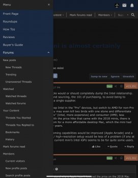
Hi, from my iPad Pro I’m having this look. Question: is this still the desktop version (iOS13) or we’re back to mobile view on iPad?

EDIT: not longer Desktop view available on iOS for the front page???

EDIT2: Excuse me ARN, I posted without thoroughly read the entire article. So now we’re all in with responsive website huh?

EDIT3: I miss the sidebar on portrait, and featured bar looks awful in portrait (iPad)

EDIT4: To give some positive feedback, I like the idea of single feed, I always liked that from the mobile site. And hey, thank you all for investing so much in making the site better.
 

Attachments

  • 0C770584-21A8-418C-B9A2-A2101FAE2CF7.jpeg
    0C770584-21A8-418C-B9A2-A2101FAE2CF7.jpeg
    229.6 KB · Views: 362
Last edited:
Hi, from my iPad Pro I’m having this look. Question: is this still the desktop version (iOS13) or we’re back to mobile view on iPad?

EDIT: not longer Desktop view available on iOS for the front page???

EDIT2: Excuse me ARN, I posted without thoroughly read the entire article. So now we’re all in with responsive website huh?

EDIT3: I miss the sidebar on portrait, and featured bar looks awful in portrait (iPad)

EDIT4: To give some positive feedback, I like the idea of single feed, I always liked that from the mobile site. And hey, thank you all for investing so much in making the site better.

Yep... responsive, so that's how it looks on portrait iPad.

You can trigger the sidebar by hitting the icon in the top right. I know it's not very intuitive.

You can turn off the feature bar.
 
Get rid of the annoying up/down arrows! Or just make them not appear and disappear constantly. It's so annoying!
 
  • Like
Reactions: justperry
D3F52A09-2B29-47AE-B714-EB3B623CD691.png
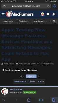
My biggest complaint with this update is the colour of the thread title text against the dark mode background. Maybe a lighter blue like we had before would look better?
 
  • Like
Reactions: Trin813
Status
Not open for further replies.
Register on MacRumors! This sidebar will go away, and you'll see fewer ads.